Wow, that's pretty lucky!Great panning skills, I guess. That's one of the things I need to try out.
This photo, plus the chocolates in the photo, are what I'm giving my girlfriend for Valentines day.
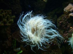
I cropped the photo a bit, added vignetting, and made it a lot more contrasty. It looks too saturated from where I sit, but I'm hoping someone here can tell me if they agree. The original photo didn't come out as well as I had hoped in terms of contrast, but the colours turned out VERY saturated. I had to play with the luminance of the red colour to get it looking decent. It was a pretty miserable day outside in terms of weather and light, so maybe that had something to do with it.
Which one is better?
Thanks Abstract.
I read about your situation on the To do List thread, and of the two that you have here, I prefer the one on the Right. The left one is a little too saturated and contrasty. Too bad about the crummy weather though
I can't see the vingetting on eithier one, the water on the upper left still looks a little overblown. Might just be my monitor though
Anyway, I 'm sure she's gonna love it. You can tell her they're salt-water chocolates.
Have you tried your hand at the other idea yet?