spyerdsm said:i want to get rid of it and get a dell 30" lcd or a 30" cinema display
Just because of the resolution or are there any other drosses which don´t make it recommendable?
spyerdsm said:i want to get rid of it and get a dell 30" lcd or a 30" cinema display


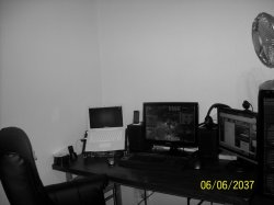
Which Macs were released between now and 2037?Elven said:A few of my setup.

yaaay - I just found this app - it looks way more pimping in real life!
Here you go
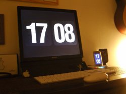
Macbook Pro 15.4" (2.4Ghz) + 24" LED Cinema Display
Here you go
Macbook Pro 15.4" (2.4Ghz) + 24" LED Cinema Display
Link to the wallpaper please and you have pretty much the exact same set up as mine but with the new tech
D
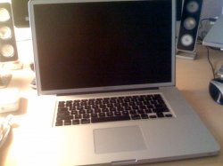
Woot - FedEx dropped off my 17 Inc MBP with no glare option.
In terms of of aesthetics alone the top-section does not really match the rest of the design. That's just my most likely unpopular opinion, but a small price to pay for some anti-glare goodness.Whoa, the 'matte' option makes the whole thing look totally different, even kind of strange.
Link to the wallpaper please and you have pretty much the exact same set up as mine but with the new tech
D
Here you go
http://www.3dwallpapers.in/images/wallpapers/3d smilies__2560x1600-972334.jpeg
A simple "smilies wallpaper" should also did the job with our best friend named Google
Just because of the resolution or are there any other drosses which don´t make it recommendable?