Thanks! I don't use a trackpad... I use the MM2, been contemplating getting a trackpad. But I'll be disappointed to buy one only to have my MM2 pushed to the side.They are there, but i still like the trackpad gesture better (two finger swipe).
Got a tip for us?
Let us know
Become a MacRumors Supporter for $50/year with no ads, ability to filter front page stories, and private forums.
So far, I like Safari on iOS 15
- Thread starter Aoligei
- Start date
- Sort by reaction score
You are using an out of date browser. It may not display this or other websites correctly.
You should upgrade or use an alternative browser.
You should upgrade or use an alternative browser.
Agreed. I’ve disabled it. Much prefer the cleaner look (especially on iPad). Option can be found in Settings > Safari > Advanced > Never Use Background Colour in Navigation BarThe colored title bar is nice when it blends well at the top of a website but once you start scrolling down mostly white pages (like news articles) the colored title bar starts to contrast too much with the page.
It's a big set of changes, but they're changes I feel like I'll get used to and that I think bring more functionality in an intuitive way.
My only issue is that I tend to have a lot of tabs open (several dozen), and I'm used to having the top several tabs ones I visit regularly. On iOS 14 and prior, I could open the list of tabs, and no matter where in the list I was, I could touch the top of the screen, which invoked the same kind of 'shoot to the top' action we're used to seeing everywhere. This would bring me to those top tabs allowing me to select the one I wanted easily.
The 'shoot to the top' is still there ... but the tabs are in reverse time order as compared to before. This means when I shoot to the top, I'm going to the most recently opened tabs instead. This is also the default spot the UI brings you when you open the tabs interface. Which places the tabs I want all the way at the bottom, and there's no elegant way to get down there. My options are to scroll down through dozens of tabs (ick), or click the '+' sign to open up a new tab which, interestingly, places down at the bottom, then close that tab, and now I'm at the bottom. Slightly better than scrolling though a bunch, but definitely clunky.
In the end, I do think the added functionality and the tighter tab view is 'worth it', I just wish they hadn't reversed the time order they're displayed in")
My only issue is that I tend to have a lot of tabs open (several dozen), and I'm used to having the top several tabs ones I visit regularly. On iOS 14 and prior, I could open the list of tabs, and no matter where in the list I was, I could touch the top of the screen, which invoked the same kind of 'shoot to the top' action we're used to seeing everywhere. This would bring me to those top tabs allowing me to select the one I wanted easily.
The 'shoot to the top' is still there ... but the tabs are in reverse time order as compared to before. This means when I shoot to the top, I'm going to the most recently opened tabs instead. This is also the default spot the UI brings you when you open the tabs interface. Which places the tabs I want all the way at the bottom, and there's no elegant way to get down there. My options are to scroll down through dozens of tabs (ick), or click the '+' sign to open up a new tab which, interestingly, places down at the bottom, then close that tab, and now I'm at the bottom. Slightly better than scrolling though a bunch, but definitely clunky.
In the end, I do think the added functionality and the tighter tab view is 'worth it', I just wish they hadn't reversed the time order they're displayed in
Nope, it jumps to the top and the ui ends up looking more like the iPadI’m disappointed that the address bar isn’t at the bottom of the screen on iPad as well. Does it stay at the bottom on landscape mode on iphone?
I really can't get used to it. I'm tempted to start using another browser as the default.
What do you mean no dark mode? The interface is still in dark mode if your device is on this mode. If you talk about the entire web pages to be « forced » in dark mode like Firefox or some extensions on desktop Safari, the extensions on iOS will exactly do that with new ones coming out when the official version comes out.If there’s no dark mode then = EPIC FAIL
So far no one spoke about this
Hello, any options to toggle the position of addr bar between top and bottom? Also option to choose tag view between grid and spin? Grid view is good for larger screen but not for SE.I don’t know if it is related with VPN or beta being beta, Safari is very slow on iPhone 7.
So far, beta experience isn’t very bad. Phone is running really hot and performance is subpar. I understand this is beta, so this is something expected.
However, one annoying things about this Safari is all the tool bar functions like refresh, reader mode, translate etc are all in share sheet. If you want to refresh certain webpage, you need tap three dots icon, tap refresh. Just one extra tap, but certainly something I don’t like.View attachment 1788786
furthermore, I see the Chinese translation. Do they extend it to cover Traditional Chinese?
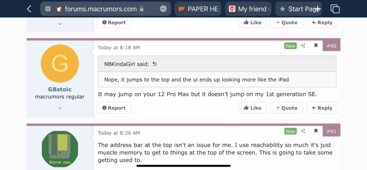
It may jump on your 12 Pro Max but it doesn’t jump on my 1st generation SE.Nope, it jumps to the top and the ui ends up looking more like the iPad
The address bar at the top isn't an issue for me. I use reachability so much it's just muscle memory to get to things at the top of the screen. This is going to take some getting used to.
Yeah mine does this. Yours stays at the bottom? Maybe it’s a screen size thing. Either way, it doesn’t particularly bother me because I rarely, if ever, use Safari in landscape.It may jump on your 12 Pro Max but it doesn’t jump on my 1st generation SE.
Attachments
Hello, any options to toggle the position of addr bar between top and bottom? Also option to choose tag view between grid and spin? Grid view is good for larger screen but not for SE.
furthermore, I see the Chinese translation. Do they extend it to cover Traditional Chinese?
I do not see option for changing address bar position nor I see option to choose tab view.
I do believe Traditional Chinese translation is available.
Yeah mine does this. Yours stays at the bottom? Maybe it’s a screen size thing. Either way, it doesn’t particularly bother me because I rarely, if ever, use Safari in landscape.
Address bar is in the bottom if you are in portrait position. I think this is how most people using Safari.
Address bar is on top if you are in landscape position.
This is the iPhone SE equivalent.Yeah mine does this. Yours stays at the bottom? Maybe it’s a screen size thing. Either way, it doesn’t particularly bother me because I rarely, if ever, use Safari in landscape.
Attachments
This is the iPhone SE equivalent.
iPhone 7 landscape vs portrait position. So it must be related with iPhone’s screen size
Yeah definitely. And that would bother me too. I’m glad I don’t really use mine on landscape because I don’t like how the last tab overlaps with the plus sign to add a new tab. I’m surprised they didn’t really take into consideration the different screen sizes, especially with the SE.Of course it is related to the screen size. The point is that the new Safari is pretty well unusable on an SE.
Not enjoying Safari in iOS 15 beta.
I like fresh new user interfaces but common functions take many more taps/swipes with this new UI, it's far slower and more annoying to use than old Safari:
The speedup from bottom bar and swipe tabs is not worth the friction and pain caused by hiding all the common functions like reload, bookmarks, etc. that I use more often than switching between tabs.
All sent individually via Feedback app.
I like fresh new user interfaces but common functions take many more taps/swipes with this new UI, it's far slower and more annoying to use than old Safari:
- reload page
- request desktop version
- tab view (sorted backwards!)
- bookmarks
The speedup from bottom bar and swipe tabs is not worth the friction and pain caused by hiding all the common functions like reload, bookmarks, etc. that I use more often than switching between tabs.
All sent individually via Feedback app.
Last edited:
I really hope so, because so far only Firefox for iOS has true dark mode. While forced dark mode isn’t perfect it was pretty pathetic for Apple to implement this for the entire system and disregard the browser.What do you mean no dark mode? The interface is still in dark mode if your device is on this mode. If you talk about the entire web pages to be « forced » in dark mode like Firefox or some extensions on desktop Safari, the extensions on iOS will exactly do that with new ones coming out when the official version comes out.
Also looking for Adblock to work with other browsers besides Safari... Is there a way to do this?
Agreed. Me too I'm a 100% dark mode guy and I want my browser to be all in dark as well. The dark reader extension on desktop is fantastic with preserving the design colours of website while converting white background/dark fonts into dark background/white text. Firefox on mobile is okay, but like you said, its not perfect because it also convert already darker websites and some website don't conserve their design colours. I suggest you to try iCab mobile for now if you really like dark mode. You can switch to the "alternate" dark mode if the default one isn't right, and in most situation, it does the job.I really hope so, because so far only Firefox for iOS has true dark mode. While forced dark mode isn’t perfect it was pretty pathetic for Apple to implement this for the entire system and disregard the browser.
Also looking for Adblock to work with other browsers besides Safari... Is there a way to do this?
But yeah, I really hope we'll see this kind of extensions in iOS Safari in September, but I can't see why it couldn't be done. I just hope the Dark Reader developper will bring his extension on iOS because I didn't found a better version of dark mode on web browser than this one.
Sadly, no.Also looking for Adblock to work with other browsers besides Safari... Is there a way to do this?
The refresh button is now removed from the toolbar from all devices in this years OS updates. iOS, iPadOS, and macOS. It is now hidden in the address/search bar which shifts with the open tab which is hard to find in all cases except iOS which is where the new Safari is best implemented.Pull down to refresh is great but not being able to tap the refresh button (with one step) is extremely stupid in my opinion. Most often I want to refresh when at the bottom of the page. (I.e. See a new post on a thread etc)
Is the refresh button hidden on the iPad as well?
I’m not on the beta, so obviously I haven’t tried out the new Safari but I do have quite a few concerns about usability and visibility of controls, especially for those who are less tech savvy than me.
Screens are getting bigger and devices more sophisticated yet it seems everything gets hidden away with each update. The iPad should become more like a computer (whilst retaining its ease of use) instead of hiding every single function under one button/share sheet.
Simple but practical becomes so simple it actually becomes complicated!
the solution is supposed to be that you will drag down to refresh on all devices, including the desktop, but for some of us that doesn’t work. Pull to refresh doesn’t work in macOS on my 2019 MacBook Pro. If I hadn’t been told about the feature I wouldn’t have known to submit a bug report.
We all know that. It’s the issue that you have to hunt down this small submenu wherever the active tab is just to invoke a refresh. It’s dumb really.Press the '...' button and press Refresh.
Register on MacRumors! This sidebar will go away, and you'll see fewer ads.