It is easy for tabs to get lost and really looked smushed and kinda sloppy on the ipad mini. But my experience hasn't been great in Monterey either. I don't understand how it's a great implementation for the desktop. But overall I like the iOS implementation. I don't like the sidebar, but I've never liked sidebar UI elements since I saw my first one in Netscape 7. They are just large, clumsy, space-wasters. I'd like to get a new tab button back on the bottom that can be opened with a thumb tap but also where private browsing can be invoked right there with a tap at the same place.Having spent more time with it - I’n kinda iffy on how the top and bottom attempt to color match with websites. It rarely works out well. But then at the same time when you turn color matching off the UI looks a bit awkward with the status bar. I wish they would have true full screen option iOS where time and status icons hide and the screen just is one continuous webpage. Other than that I’m still really enjoying it on iOS 15 and Monterey. Overall a meh experience on iPad mini however. I think the screen is too small for the iPad design to be effective (specifically tabs/address bar).
Got a tip for us?
Let us know
Become a MacRumors Supporter for $50/year with no ads, ability to filter front page stories, and private forums.
So far, I like Safari on iOS 15
- Thread starter Aoligei
- Start date
- Sort by reaction score
You are using an out of date browser. It may not display this or other websites correctly.
You should upgrade or use an alternative browser.
You should upgrade or use an alternative browser.

Well, that's been a feature of browsing for years. I believe Chrome first adopted it and every popular browser followed suit.I think there should be an option for both macos and ipados to toggle on/off a dedicated address/search bar.
Idk..I also went back and looked at the private browsing feature it's a much slower implementation. Not only is it easier to get to from the bottom, but you click the little box and it's pretty much the first choice. It'll get faster with muscle memory, but it will never be as quick as it was before because there's too much UI in the way and you can't pretty much tap it twice in the same spot one-handed.
The sidebar is a way to have the tabs/address bar to be the focus of the new design, like how the tabs/address bar dynamically change to whatever is active.I don't see anything I like about the sidebar or anything I would have wanted this new UI menu for that wasn't handled with dedicated and persistent UI elements before.
It is easy for tabs to get lost and really looked smushed and kinda sloppy on the ipad mini. But my experience hasn't been great in Monterey either. I don't understand how it's a great implementation for the desktop. But overall I like the iOS implementation. I don't like the sidebar, but I've never liked sidebar UI elements since I saw my first one in Netscape 7. They are just large, clumsy, space-wasters. I'd like to get a new tab button back on the bottom that can be opened with a thumb tap but also where private browsing can be invoked right there with a tap at the same place.
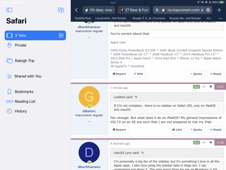
I'm personally a big fan of the sidebar, but it's something I love in all the Apple apps. I also love using the sidebar tabs in Edge too. I can understand not liking it. The only weird thing for me on Monterey is the same as on all platforms - the color matching is...weird. On most websites.
Could you explain what you mean by a “sidebar”? I can’t see anything on my SE.I'm personally a big fan of the sidebar, but it's something I love in all the Apple apps. I also love using the sidebar tabs in Edge too. I can understand not liking it. The only weird thing for me on Monterey is the same as on all platforms - the color matching is...weird. On most websites.
If I'm not mistaken.. there is no sidebar on Safari iOS, only on iPadOS and macOS.Could you explain what you mean by a “sidebar”? I can’t see anything on my SE.
You’re correct about that.If I'm not mistaken.. there is no sidebar on Safari iOS, only on iPadOS and macOS.
Fair enough. But what does it do on iPadOS? My general impressions of iOS 15 on an SE are such that I am not prepared to risk my iPad.If I'm not mistaken.. there is no sidebar on Safari iOS, only on iPadOS and macOS.
To be fair I don’t think the sidebar should be gone. Most browsers have a type of sidebar menu UI element one way or another. I think it should be there if it serves the workflow of certain users. I don’t like it and I don’t think I should be compelled into it as an alternative to better implementations that could be left alone. An example being a Bookmark button living on a toolbar. You can click it and you’re right in. Another is the option to click the little square button that is on the right of the toolbar to open a new tab. Before you could see a tab overview with snapshots of open tabs. Now you have to open the sidebar and invoke it from there. It’s a more convoluted method. It may only be one additional click, but it’s more clumsy and then you have to do it over and over again. It doesn’t default to tab overview which is great for iPadOS where the little tabs get truncated and I can’t and don’t remembered what favicons go to which sites.I'm personally a big fan of the sidebar, but it's something I love in all the Apple apps. I also love using the sidebar tabs in Edge too. I can understand not liking it. The only weird thing for me on Monterey is the same as on all platforms - the color matching is...weird. On most websites.
What it does is it hides elements previously available at a touch in the toolbar. If you want your favorites you have to open this. If you want tab overviews you have to go here. You don’t have to go to the sidebar to create a new tab, but for tab management and tab groups management this is the menu for that.Fair enough. But what does it do on iPadOS? My general impressions of iOS 15 on an SE are such that I am not prepared to risk my iPad.
It seems primarily designed for managing tabs but it also eats up favorites, tab overview goes away as a default behavior, and reading lists are now stuck here.
Attachments
Thank you. Now I understand what people are talking about. First impression - meh!
Bookmarks button in the top left is a disaster. 😡Is there a faster way to get to my list of favorites/bookmarks? In iOS 15's Safari, you have to tap the bottom of the screen to get the address bar up, then tap the URL, then reach all the way to the top left side of the phone to press the bookmarks button. Wasn't it just a single tap pre-15???
I do not like search/address bar at all on the iPhone. It first appears on the bottom, and then jumps to the top while you are still typing. I feel, when the search/address bar appears, it should be static until you hit enter. This feature and the occasional crash of safari is why I went back to iOS 14. When I go back to iOS 15 at some later beta, I’ll use chrome or another browser, but then I lose the synergy of the same browser with form filling (passwords) from my iPad and Mac. I’ll have to choose which I dislike more.
iPhone 12 Pro Max.
I like everything about the new Safari except that the type-able address/search bar jumps to the top after you tap on it on the bottom. It's jarring, can be confusing at first, and is always inconvenient to have to use two diametrically opposed positions to engage the bar, and then type in it. I'm holding out slim hope that they'll not do that jump by the time this thing goes live, but I'm certainly not holding my breath.
I like everything about the new Safari except that the type-able address/search bar jumps to the top after you tap on it on the bottom. It's jarring, can be confusing at first, and is always inconvenient to have to use two diametrically opposed positions to engage the bar, and then type in it. I'm holding out slim hope that they'll not do that jump by the time this thing goes live, but I'm certainly not holding my breath.
I don't know if Apple listened all the complaints but at least it seems they listened. With iPadOS 15 b4 Safari is now almost like before with the possibility to bring the tabs in the bottom just like it used to be and its enabled by default.
I’m glad they kept the compact tab/address bar, I prefer it over the separated one. However, if changes aren’t made to to this below. I will have no choice but to go to the separated one.

Register on MacRumors! This sidebar will go away, and you'll see fewer ads.