There you go; Confirmed your GM isn't today

Though iOS, watchOS, iPadOS and tvOS final releases tomorrow was a bit unexpected. Guess we're not getting GM warnings, it's just "It's out now!"
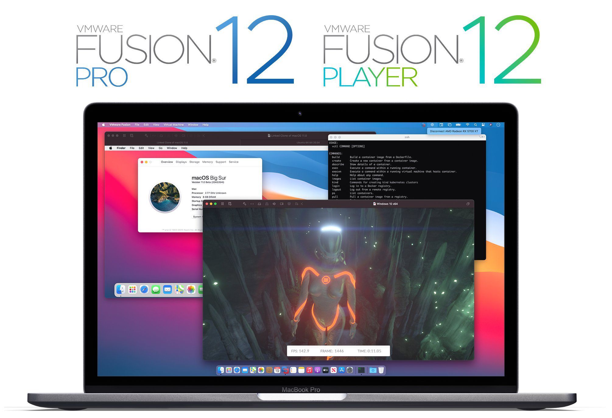
In any case, yes I'm running the beta. As for the UI changes, I was sceptical at first before I got it installed, having been a long-time Mac user and loving the classic Mac style; I was never quite happy with what happened after Yosemite honestly, preferring the more skeuomorphic look of the Leopard era.
But I mostly love the look of Big Sur - I have some smaller things here and there I wish were different, but mostly, it's great. - One of my most worried components, the menu bar; I really love. It reminds me of when Steve Jobs called Aqua finger-licking good or "so good you want to lick it" or something like that.
I also very much like the messages icon with the depth under the bubble and wish more of the iconography had more of that depth. Everything being a square icon-wise I'm still not sold on, but I do like the overall feel of the icons aside from the shape-monotonicity. - Some say it feels "touch-centric" or more touch-oriented. I disagree; It still feels like macOS; A pointer-based OS.
I dislike the look of Control Centre sort of, but you can take all the menus from Control Centre and choose to just have them in the menu bar. It kinda works a little like Bartender honestly, as if it's made sort of to hide rarely accessed elements into one menu bar item. But I never touch it since I just extract everything I need to the actual menu bar.
Notification Centre is nicer than before, but I still kinda think they should just make it 2-columns, so the widgets and notifications are both there at the same time in their own space - The UI for adding new widgets almost feels a bit futuristic honestly - Maybe not entirely congruent with the feel of the rest of the UI, but not out of place either - Nice looking but ever so slightly jarring. But also in that Aqua vibe of "so good you could lick it".
It feels just as good on my 27" iMac as on my 15" MacBook Pro, so it seems to scale well with screen size and resolution as well, and not just huge touch tiles or something. Again, still feels like a cursor-oriented interface.
Oh and as for bugs that need to be fixed before release; You still can't change the clock in the menu bar to 12-hour instead of 24-hour. So if you prefer an AM/PM clock, you're out of luck. Such a basic small thing hasn't worked since beta 1 and still doesn't. It's not getting released until that's fixed.


