Become a MacRumors Supporter for $50/year with no ads, ability to filter front page stories, and private forums.

Do these Pictures Accurately Represent What You Think the New iMac Will Look Like?

  • Totally

    Votes: 5 2.0%
  • Mostly

    Votes: 3 1.2%
  • Somewhat

    Votes: 6 2.4%
  • Not Really

    Votes: 21 8.5%
  • Not At All

    Votes: 211 85.8%

  • Total voters
    246
Status
Not open for further replies.

LeviG

macrumors 65816
Nov 6, 2006
1,277
3
Norfolk, UK
I do think my comment about laying the design horizontal still stands though. A better way of getting around that is to have something split screen so that the lower screen becomes a virtual keyboard/gesture interface when you work whilst you look up at the upper screen. Something along the lines of a larger Nintendo DS, but with the two screens borderless at the hinge, so by turning the unit on it's side and flattening it out, they become one large panel you can use to watch a film.

Kind of like mine then :)
 

GodBless

macrumors 65816
Original poster
Jan 22, 2005
1,004
0
Just because you spent hours upon hours designing this wedge doesn't automatically mean its a good idea or a good design, it just means that you spent hours upon hours on it.

If you're not really concerned about what others think of your design then why post three threads on it in a public forum? If it was more important for you yourself to be satisfied with it then why ask for feedback that you obviously didn't follow?
Simple--because I took the good feedback and it helped me to make a better design. I am not concerned about taking people's suggestions that will make my design worse. I took all of the best ideas and put them into my design. I almost see no flaws with the current design--especially if I added one more feature (that I'm not going to mention yet because I don't want people to misinterpret it) then it would be even better and you wouldn't have to pickup the whole computer to switch the positions.
 

LeviG

macrumors 65816
Nov 6, 2006
1,277
3
Norfolk, UK
Simple--because I took the good feedback and it helped me to make a better design. I am not concerned about taking people's suggestions that will make my design worse. I took all of the best ideas and put them into my design. I almost see no flaws with the current design--especially if I added one more feature (that I'm not going to mention yet because I don't want people to misinterpret it) then it would be even better and you wouldn't have to pickup the whole computer to switch the positions.

ooh ooh is it hydraulic rams which make it pivot on the rounded front of the wedge :rolleyes:
 

vniow

macrumors G4
Jul 18, 2002
10,266
1
I accidentally my whole location.
I almost see no flaws with the current design...


:rolleyes:


Its ugly, bulky and impractical for any sort of use besides using it Jeff Han style which is exactly what so many other posters have been telling you for the past three threads. Over and over and over again. If you only took the good feedback and modified your design appropriately then I can see why it changed little. There simply wasn't enough good feedback to warrant enough change.

You would think that after two threads of it you would get the points that people are trying to make. Yes some have been more outright bashing but some have been genuinely constructive criticism. And yet you ignore everyone.

Did I mention its ugly?
 

Queso

Suspended
Mar 4, 2006
11,821
8
No--but in this post I will respond to your post where you talked about your views in detail.
It was only a joke, but thanks for taking the time.
Apple laptops have ports on the side. If I put the ports on the back then it wouldn't be able to have its upright position.
But you would still have to disconnect everything in order to turn it around. In one position the ports are all on the right, in the other they're all on the left. The one thing I know about cables is that however tidily you put two of them together, they will quickly turn into a bird's nest with the slightest agitation. Without having the cables centrally on the back, it's going to look very messy very quickly, something that desktop Mac users aren't used to.
I considered something like that but I realized that it would work better for accessing the ports and for switching the positions with the way I have it designed now.

If you were aware of my side views then you would have noticed that I have a USB port on the front right side for both the Easy Touch position and also for the upright position.
OK, I missed the USB port so you've got that one covered, but really the rest of them should be recessed and out of view. How often do you connect/disconnect your Power/Ethernet and FireWire cables? Hardly ever. But putting those ports on the side means you'll have to do it every time you flip your iMac. It won't work.
I don't know. That wouldn't be good for the neck or the wrists. Having it at the angle of a keyboard (like my design) seems best for multiple reasons as I have mentioned at least 3 other times.
It's a valid argument for the vertical position. Where it falls down is when the unit is horizontal, when it simply does not work as a display unit, only as an input device.
That's not a simplistic or intuitive design so it is un-Apple. Plus it isn't an efficient design and would be costly and would only add to the deadly and environmentally hazardous e-waste.
Maybe for an iMac, but I could see a future MBP taking that sort of shape. I would expect Apple to come up with a far more elegant solution though.
 

GodBless

macrumors 65816
Original poster
Jan 22, 2005
1,004
0
As to GodBless spending hours on his design, christ I wouldn't have taken more than about 20 mins to knock that up, even if you take all the logical positions etc maybe 25 mins :).
OK--let's see it then. I bet you couldn't match it with-in 24 hours. I made everything from scratch (including the ports) besides the screenshot, the iSight camera and the Apple logo (which I digitally traced). I can go into detail about my purposeful design of all the features if you want me to--but I have a feeling that I will just be wasting my time to people who aren't willing to understand good design.

And as I have said that would have been thrown out before it even got to an initial concept stage, the design is not apple and its has not been design with the user in mind.
If you think so then be specific on where I went wrong. The screen angle is perfect for a comfortable angle for hours, a keyboard can be put in front and typing back and forth on the screen and the keyboard will be seamless. Drawing with a stylus is perfect since the screen is tilted like a drawing board. The ports that will have long cords hanging out are all on one side so the position can be switched easily. The design has both sharp and rounded edges like other Apple designs. It is white like other iMacs. My ports are lined up. The headphone port is in the middle of the side in both positions for easy access. I can go on and on about my design intention but has anyone here tried to understand? A few people (who I am grateful for)--but not many.
 

LeviG

macrumors 65816
Nov 6, 2006
1,277
3
Norfolk, UK
OK--let's see it then. I bet you couldn't match it with-in 24 hours. I made everything from scratch (including the ports) besides the screenshot, the iSight camera and the Apple logo (which I digitally traced). I can go into detail about my purposeful design of all the features if you want me to--but I have a feeling that I will just be wasting my time to people who aren't willing to understand good design.

So what are your qualifications in design again :rolleyes:

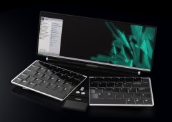
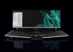
As to design the one below took about 5 hours to knock up from scratch including the physical design, admittedly not an imac but I think it will cover me on that area. Originally modelled in solidworks and then rendered in 3DS Max. Please note that the copyright of my images remain mine etc etc etc

Oh and dont forget the quicky curve design I did earlier

If you think so then be specific on where I went wrong. The screen angle is perfect for a comfortable angle for hours, a keyboard can be put in front and typing back and forth on the screen and the keyboard will be seamless. Drawing with a stylus is perfect since the screen is tilted like a drawing board. The ports that will have long cords hanging out are all on one side so the position can be switched easily. The design has both sharp and rounded edges like other Apple designs. It is white like other iMacs. My ports are lined up. The headphone port is in the middle of the side in both positions for easy access. I can go on and on about my design intention but has anyone here tried to understand? A few people (who I am grateful for)--but not many.

Ok here you go then
  • angle of display requires head to be looking down when typing, causes unnecessary neck strain
  • need to pick up the device to change position
  • ports which need unplugging when lifting up, they go from the left (iirc) to the right when flipped up into vertical from horizontal.
  • Too bulky, apple is going for sleek designs.
  • Your interpretation of sharp and rounded is incorrect in relation to current apple computer designs, you may just get away with it on an ipod.
  • wires will just become messy when all plugged in.
  • webcam position would give lovely up the nose view when horizontal.
  • vertical position would more than likely cause arm ache
  • The 2" lip at the front would mean the arms would be in a position to encourage rsi due to additional strain on the arms and wrist.
  • the assumption that the next imac is going to be white
  • your design has been taken from the keyboard which itself is rather poorly designed in terms of ergonomics and user friendliness
  • you keep going on about it as a drawing board/keyboard when it should be a computer not just another tool for a designer.
There you go that should start you off in the right direction

EDIT: oh yeah did I mention I'm a fully qualified product designer:rolleyes:
 

Attachments

  • open raised.jpg
    open raised.jpg
    180.1 KB · Views: 128
  • open hand outlines.jpg
    open hand outlines.jpg
    135.6 KB · Views: 123
  • closed.jpg
    closed.jpg
    6.6 KB · Views: 104
  • open frontal.jpg
    open frontal.jpg
    140.6 KB · Views: 125

7on

macrumors 601
Nov 9, 2003
4,939
0
Dress Rosa
I think the iMac will just get slimmer. Maybe (maybe) lose the stand and incorporate a "hanging on wall" standard (I already know the current one is Vesa compatible, maybe a stand would be seperate and a Vesa mount would come standard). Slimmer and more "flush" with a wall and a "dock" that would move all the cords to the floor to eliminate visible clutter.
 

GodBless

macrumors 65816
Original poster
Jan 22, 2005
1,004
0
It was only a joke, but thanks for taking the time.

But you would still have to disconnect everything in order to turn it around. In one position the ports are all on the right, in the other they're all on the left. The one thing I know about cables is that however tidily you put two of them together, they will quickly turn into a bird's nest with the slightest agitation. Without having the cables centrally on the back, it's going to look very messy very quickly, something that desktop Mac users aren't used to.

OK, I missed the USB port so you've got that one covered, but really the rest of them should be recessed and out of view. How often do you connect/disconnect your Power/Ethernet and FireWire cables? Hardly ever. But putting those ports on the side means you'll have to do it every time you flip your iMac. It won't work.

It's a valid argument for the vertical position. Where it falls down is when the unit is horizontal, when it simply does not work as a display unit, only as an input device.

Maybe for an iMac, but I could see a future MBP taking that sort of shape. I would expect Apple to come up with a far more elegant solution though.
I agree with your basic argument (which is the flipping and cord position problem--probably the worst problem with my current design) and I have corrected it in my next design (that I haven't started to design yet with software and is only in my head at this time). It will not be wedge design.

I think the iMac will just get slimmer. Maybe (maybe) lose the stand and incorporate a "hanging on wall" standard (I already know the current one is Vesa compatible, maybe a stand would be seperate and a Vesa mount would come standard). Slimmer and more "flush" with a wall and a "dock" that would move all the cords to the floor to eliminate visible clutter.
How would hanging it on the wall work as a multi-touch computer? It would cause way to much arm strain.
 

decksnap

macrumors 68040
Apr 11, 2003
3,075
84
I wasn't going to get too negative until I read your comments on someone else's design, at which point I realized you are insane.

Your wedge is %^# horrible.

As I said on the first page of this thread, it has what is called a fundamental flaw. Meaning, it's a total no-go. If you have to drag all of your cords from one side when it's lying down to the other side when it's standing up, it is a product that should never be made.
 

LeviG

macrumors 65816
Nov 6, 2006
1,277
3
Norfolk, UK
GodBless - I take it youre not talking to me now :confused:

You reply to the person above my post and below my post but not mine that makes me very sad :( :rolleyes:
 

GodBless

macrumors 65816
Original poster
Jan 22, 2005
1,004
0
So what are your qualifications in design again :rolleyes:

As to design the one below took about 5 hours to knock up from scratch including the physical design, admittedly not an imac but I think it will cover me on that area. Originally modelled in solidworks and then rendered in 3DS Max. Please note that the copyright of my images remain mine etc etc etc

Oh and dont forget the quicky curve design I did earlier:

EDIT: oh yeah did I mention I'm a fully qualified product designer:rolleyes:
Well even if you are a qualified designer it takes more than a few hours to make a quality and thoughtful design--that's where the hours are spent. I made my design as thoughtful as possible by Apple standards, a good 3D visual design, with ports properly dimensioned and shaped, etc. Your design doesn't have ports showing and isn't a revolutionary design. Of course it wouldn't take more than a few hours to do that.

Ok here you go then
  • angle of display requires head to be looking down when typing, causes unnecessary neck strain
It can be down for touch screen and your hand can continue from the keyboard to the screen--it can also be upright and also at a good angle. Minimal neck strain (and even less arm and wrist strain with my design). My design is better for the neck than a flat tablet--trust me I designed the viewing and touch screen angles the absolute best possible.


  • need to pick up the device to change position
  • ports which need unplugging when lifting up, they go from the left (iirc) to the right when flipped up into vertical from horizontal.
Yes I agree that it is a problem and I have figured out a way to fix it (and I have fixed it with my new design that is in my head at this time as I have said before).

  • Too bulky, apple is going for sleek designs.
My new design will satisfy people with this too. I like normal sized computer parts and that's why I liked the wedge but my new design will be more portable and give users more options but it won't have standard desktop computer sized computer parts.

  • Your interpretation of sharp and rounded is incorrect in relation to current apple computer designs, you may just get away with it on an ipod.
No I made completely sharp and completely rounded edges in various parts. This is how Apple's current designs are on the iPod, the Mac mini, the current iMac, the MacBook and MacBook pro, the AirPort Extreme and the :apple:TV (and I wouldn't be surprised if Apple had it on more of their hardware). I have met Apple standards here--trust me. This took me quite a while to get sharp and rounded sides looking the best with my sloped design--I tried many different designs and I had to readjust the ports again and again which was time consuming. If I were to design a computer again I wouldn't do the ports until I made multiple basic designs and was sure I would stick with a certain one without a doubt.

  • wires will just become messy when all plugged in.
Yes I agree it doesn't look the best with wires coming out of the side and my new design will solve that problem.

  • webcam position would give lovely up the nose view when horizontal.
Yes I agree the iSight doesn't work perfectly in the Upright position and this too will be solved with my new design.

  • vertical position would more than likely cause arm ache
How? The screen will basically be an extended keyboard because the keyboard will be put in front of the computer (and a mouse to the side of course). The screen is at the same angle as the keyboard so your hand will not have to readjust every time it switches from the screen to the keyboard.

  • The 2" lip at the front would mean the arms would be in a position to encourage rsi due to additional strain on the arms and wrist.
The front is slightly elevated so that you can optionally put a keyboard there. I could have rested the screen on table but I wanted to make room for a keyboard because keyboards will still be used with multi-touch screens.

  • the assumption that the next imac is going to be white
Why wouldn't it be? It might also come in an additional black (and possibly red for (Product)RED) but I doubt that it won't come in white. Apple will probably still mainly advertise it in white. I could easily change my design to black in a couple of minutes but why? Would it make it more Apple-like? No.

  • your design has been taken from the keyboard which itself is rather poorly designed in terms of ergonomics and user friendliness
Well I think we do the best we can with keyboard designs and I think extending the keyboard (at the same standard angle) with a multi-touch is a fair idea. If you think it isn't a good idea then tell me an idea of yours that is better otherwise I won't think you do have a better idea. If you don't have a better idea then how can you claim that my design and other keyboard designs are bad?

  • you keep going on about it as a drawing board/keyboard when it should be a computer not just another tool for a designer.
Seriously tell me you are joking. Everybody that I know who uses a computer uses a keyboard--not just designers. As for the drawing board, I just listed an extra benefit to my posted design.

There you go that should start you off in the right direction
Thank you for your input. :)
 

deasine

macrumors member
Mar 19, 2007
75
0
I wouldn't say this is progress, but at least you made it more clear about what you are TRYING to get to.

Your exisiting posts do not differ from this one. It's still a wedge/cheese shape. The shape just disgusts me. By the way, I don't think "speculated" is the right word, more like "My iMac Multi-Touch Design" is better. If you want better comments, than you must change the design completely. Make this more flexible: all monitors from apple as well as the iMac have stands that can angle the monitor, something to keep in mind. I still don't think a touchscreen iMac will come any time soon, but for sure in the future after the 10 series OS.
 

deasine

macrumors member
Mar 19, 2007
75
0
You know actually, I forgot to add something to my last post. I actually read the entire thread before making this comment now. I can't see why you are wanting comments but also becoming VERY defensive. I can see that you put a lot of work into the design of this 'thing' but then many of us don't believe this will become an Apple product. If you are to protect yourself over and over again and yet diss other people's design when their design is believed to be better by many, people will think you are stupid. KEEP THIS IN MIND AS WELL AS MY OTHER COMMENT MADE IN THE EARLIER POST.
 

GodBless

macrumors 65816
Original poster
Jan 22, 2005
1,004
0
I wouldn't say this is progress, but at least you made it more clear about what you are TRYING to get to. Your exisiting posts do not differ from this one. It's still a wedge/cheese shape. The shape just disgusts me. By the way, I don't think "speculated" is the right word, more like "My iMac Multi-Touch Design" is better.
All I was trying to do was to make a full sized multi-touch touch screen Apple computer. I guess people don't like wedges and don't like full sized for an iMac.

If you want better comments, than you must change the design completely. Make this more flexible: all monitors from apple as well as the iMac have stands that can angle the monitor, something to keep in mind.
My new design will allow adjusting of the monitor and you won't need to flip the computer to change the monitor position from a comfortable multi-touch position to an upright position.

I still don't think a touchscreen iMac will come any time soon, but for sure in the future after the 10 series OS.
OS X makes it easy for touch screen technologies--especially with resolution independence which allows the interface to scale up and down. OS X's interface can easily be scaled up for touch screen technologies. All that Apple needs to do is to add a few multi-touch technologies to OS X and we are ready to go with a good start.

You know actually, I forgot to add something to my last post. I actually read the entire thread before making this comment now. I can't see why you are wanting comments but also becoming VERY defensive. I can see that you put a lot of work into the design of this 'thing' but then many of us don't believe this will become an Apple product. If you are to protect yourself over and over again and yet diss other people's design when their design is believed to be better by many, people will think you are stupid. KEEP THIS IN MIND AS WELL AS MY OTHER COMMENT MADE IN THE EARLIER POST.
I believe reality--not other's viewpoints. Truth rules out opinion. All I try to do is tell the truth when others are ignorant (i.e. when people are posting things out of ignorance in this case). My goal is to make the facts known. :)
 

jeffy.dee-lux

macrumors 6502a
Nov 19, 2003
721
0
montreal
First off, i gotta say that if it weren't for this thread, I wouldn't have known about the Mac version of eDrawings, which is a very handy program. Too bad I didn't know about this a few months back... I was designing a hybrid power module for a series hybrid snowmobile, but the darn thing is already up and running, so eDrawings won't be too useful now. But it will hopefully come in handy in the future. I still hope SolidWorks will just go for it and give us a native version, i'm sick of using BootCamp and windows altogether.

GodBless has definitely improved the presentation of his idea from the first thread. This is really how you shoulda shown it to us in the first place. You've worked out the details, like putting in a screen and branding and all the ports. But these are all just details, and don't really have that much of an effect on the design. Sure placement of logos and arrangement of ports and all that stuff is important, but you haven't altered your basic design at all since the beginning. Its an interesting idea, figuring out a way to have a touch screen without tiring the arms, and I gotta say a product that sorta changes function when you change its orientation is a very Apple idea. But the overall execution is not very practical and isn't very attractive, which is not at all Apple.


Don't turn this into a competition with people who I must say are obviously much more experienced in the field of product design. Its great that you're having fun with this stuff, but you gotta recognize that people go to school to learn how to develop products like this, and its a very complicated topic. And its on a very different level from trying to figure out where the ports go. That shouldn't be an afterthought, but it shouldn't be the bulk of what you've accomplished either. You should try taking a step back and building something completely new, and see where that takes you, especially with everything you've learned.

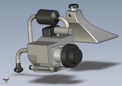
I get the feeling that you just got your hands on SolidWorks and are having fun learning how to use it. Its a great program, and its come in very handy for me too. I really like all the add ons they've incorporated for stress analysis and fluid dynamics, not very useful for computer design. Here's a picture of what I designed and built for that snowmobile, courtesy of eDrawings. Notice: function over form, we had very tight constraints and hardly a thought was given to building something attractive. Even less thought was given to making attractive drawings. PM me if you wanna know more about this thing:

PS godbless, does your eDrawings export images with backwards extensions? For example, when i export a jpeg, it names the file "filename. GPJ", or a png will be "filename. GNP".
Does anybody have any idea what's going on there?
Again, thanks for the sweet program.
 

Attachments

  • Full Assembly.jpg
    Full Assembly.jpg
    55.1 KB · Views: 106

GodBless

macrumors 65816
Original poster
Jan 22, 2005
1,004
0
PS godbless, does your eDrawings export images with backwards extensions? For example, when i export a jpeg, it names the file "filename. GPJ", or a png will be "filename. GNP".
Does anybody have any idea what's going on there?
Again, thanks for the sweet program.
I don't know but I'd recommend taking a screenshot of a design instead of saving images of a design through eDrawings. If your are on a Mac just press cmd+shift+4 and select the area that you want to print the screen and then you will get a .png file of the image.
 

GodBless

macrumors 65816
Original poster
Jan 22, 2005
1,004
0
First off, i gotta say that if it weren't for this thread, I wouldn't have known about the Mac version of eDrawings, which is a very handy program.
Yeah it's nice.

[SolidWorks is] a great program, and its come in very handy for me too. I really like all the add ons they've incorporated for stress analysis and fluid dynamics, not very useful for computer design. Here's a picture of what I designed and built for that snowmobile, courtesy of eDrawings. Notice: function over form, we had very tight constraints and hardly a thought was given to building something attractive. Even less thought was given to making attractive drawings. PM me if you wanna know more about this thing:
Yes--I hope that SolidWorks comes natively to the Mac too. You can tell me (and the rest of the thread readers) about the basics of your design in this thread if you want to--just as long as it doesn't last for more than a few posts and as long as it stays relevant to the thread topic (which deals with design anyway).
 

janey

macrumors 603
Dec 20, 2002
5,316
0
sunny los angeles
Your wedge is not comfortable - have it flat and make it usable solely in regards to the touchscreen aspect, or have it standing up where it's more comfortable but have the touchscreen aspect completely ruined? Nevermind that this computer would have to weigh a significant amount in order to not move while a user feels like touching the screen while it's standing up.
How would hanging it on the wall work as a multi-touch computer? It would cause way to much arm strain.
Your design causes too much eye and neck strain depending on how the user's workstation is set up (particularly standing straight up), while a wall mounted display/computer that is movable is much more comfortable. And I'm not talking about hanging the display on the wall like a framed picture (which I'm sure the person you were commenting to wasn't talking about either...) I'm talking about mounts like http://www.ergotron.com/ProfessionalProducts/WallMounts/tabid/157/language/en-US/Default.aspx
Apple laptops have ports on the side. If I put the ports on the back then it wouldn't be able to have its upright position.
Which is why the display and the computer shouldn't be squashed together into one box if you want users to have such flexibility.
I don't know. That wouldn't be good for the neck or the wrists. Having it at the angle of a keyboard (like my design) seems best for multiple reasons as I have mentioned at least 3 other times.
Anyone who has any iota of ergonomic sense knows that keyboards with a slight negative slope is the most comfortable to use. Try it yourself. Tilt your keyboard 45 degrees and see if you can still type comfortably. Then tilt it -15 degrees or so, and try again, ensuring that you don't have to raise your arms/hands/wrists funnily typing in such a way. A world of difference.
It also would work well for drawing on with a stylus.)...How will my design strain a person's neck? It is better than looking straight down at papers on a table.
This is all your BS. My tablet is best used flat on the table or in my lap all the time. And having the display straight in front of me is the most comfortable position for reading. If you want to make your design better, make it closer to the Wacom Cintiq (http://www.wacom.com/cintiq/index.cfm), which lets you adjust the angle (in every possible way) of the display, and even lets you take it off the stand to use, say, in your lap. Instead of having two fixed angles, period.
I personally am opposed to it having laptop components because it is a desktop computer...
I have great fears about your mockup's potential cooling and space issues if it won't have laptop-sized components.


Thankfully you won't even come near suggesting your crap to the people at Apple whose jobs it is to design such products.
 

GodBless

macrumors 65816
Original poster
Jan 22, 2005
1,004
0
Your wedge is not comfortable - have it flat and make it usable solely in regards to the touchscreen aspect, or have it standing up where it's more comfortable but have the touchscreen aspect completely ruined? Nevermind that this computer would have to weigh a significant amount in order to not move while a user feels like touching the screen while it's standing up.

Your design causes too much eye and neck strain depending on how the user's workstation is set up (particularly standing straight up), while a wall mounted display/computer that is movable is much more comfortable. And I'm not talking about hanging the display on the wall like a framed picture (which I'm sure the person you were commenting to wasn't talking about either...) I'm talking about mounts like http://www.ergotron.com/ProfessionalProducts/WallMounts/tabid/157/language/en-US/Default.aspx

Which is why the display and the computer shouldn't be squashed together into one box if you want users to have such flexibility.

Anyone who has any iota of ergonomic sense knows that keyboards with a slight negative slope is the most comfortable to use. Try it yourself. Tilt your keyboard 45 degrees and see if you can still type comfortably. Then tilt it -15 degrees or so, and try again, ensuring that you don't have to raise your arms/hands/wrists funnily typing in such a way. A world of difference.

This is all your BS. My tablet is best used flat on the table or in my lap all the time. And having the display straight in front of me is the most comfortable position for reading. If you want to make your design better, make it closer to the Wacom Cintiq (http://www.wacom.com/cintiq/index.cfm), which lets you adjust the angle (in every possible way) of the display, and even lets you take it off the stand to use, say, in your lap. Instead of having two fixed angles, period.

I have great fears about your mockup's potential cooling and space issues if it won't have laptop-sized components.


Thankfully you won't even come near suggesting your crap to the people at Apple whose jobs it is to design such products.
I won't suggest my crap to people at Apple but I will probably suggest other things to people at Apple in the future. ;)

You made some good points especially the negative keyboard angle. That would only work though if the keyboard was resting on a low surface otherwise a flat or positive slope would work best. All of the wedge haters will probably like my new design that is somewhat similar to Wacom's design.

Perhaps I can make bigger vents on a better mock-up of my wedge design.

Wall mounts are not a good idea because they would leave the touch screen in a position where it would be hard to use and it would move around too easily. Even if it were very carefully designed I still see it having too many problems to be something that Apple would even consider to develop.
 

janey

macrumors 603
Dec 20, 2002
5,316
0
sunny los angeles
You made some good points especially the negative keyboard angle. That would only work though if the keyboard was resting on a low surface otherwise a flat or positive slope would work best. All of the wedge haters will probably like my new design that is somewhat similar to Wacom's design.
Hence my suggestion of negative slope being useless if you're having to raise your arms to use it in such a way. But a flat keyboard is infintely better than a positive slope, like I said, go tilt your keyboard 45 degrees and use it. It's an ergonomic nightmare. There are keyboards, stands and other such devices that tilt keyboards at a slight and very comfortable negative slope, I suggest you try them out. The next best thing to a negatively sloped keyboard is one that feels more natural, like some of the Kinesis keyboards (http://www.kinesis-ergo.com/freestyle.htm). I'm tempted myself to see if it's possible to get a wireless split keyboard to mount on my chair arms (a la jwz), but nobody makes such a thing iirc.
Perhaps I can make bigger vents on a better mock-up of my wedge design.
You can have all the vents you want, but a vent or ten makes not a cooling system.
Wall mounts are not a good idea because they would leave the touch screen in a position where it would be hard to use and it would move around too easily. Even if it were very carefully designed I still see it having too many problems to be something that Apple would even consider to develop.
Lastly, wall mounts are infeasible for Apple to do because of all the assembly required (except build their displays and computers to be compatible with said mounts, which they already are). Unless you're gonna be stupid and mount it like to the ceiling of your bedroom (well...some people have their reasons...), there is nothing wrong with a wall mount that can adjust in every way..up, down..back closer to the wall, fowards, tilt...Miles better than the ridiculous mockup you've come up with, anyway. My point was that it wouldn't increase arm strain like your design would because some mounts are extremely flexible.
 

jeffy.dee-lux

macrumors 6502a
Nov 19, 2003
721
0
montreal
I don't know but I'd recommend taking a screenshot of a design instead of saving images of a design through eDrawings. If your are on a Mac just press cmd+shift+4 and select the area that you want to print the screen and then you will get a .png file of the image.

oh believe me, i'm a skilled practitioner in the art of the screen shot, in all its ways and forms on both Windows and OS X. So often the easiest solution....

But the beauty of this eDrawings program is that it is just as quick, if not quicker than screenshots, and less clumsy to just save as JPEG or BMP or whatever format you want. The only problem is that you have to manually change the extension name from GPJ to JPG, which is a pretty weird bug if you ask me. Still better than screenshots, in my opinion.

The design I mentioned doesn't really have much to offer for this kind of discussion. I just wanted to post what I've been up to with the SolidWorks program. Its pretty ugly if you ask me actually, but it works the way it's suppose to so I'm happy.
 
Status
Not open for further replies.
Register on MacRumors! This sidebar will go away, and you'll see fewer ads.