Become a MacRumors Supporter for $50/year with no ads, ability to filter front page stories, and private forums.

Michael Goff

Suspended
Jul 5, 2012
13,329
7,422
Ability to Hide or Remove Apps
-Compass
-Tips
-Stocks (Help people to invest etc)
-Game Center (Should be System Level)
-Podcasts (Unless you buy podcasts)
-Videos (Until you install movies)
-Voice memos

Music App Redesign
-Remove Connect

Groups Rather Than Favorites in phone app

Combine FaceTime App with Phone

Combine App and iTunes Store

Notes
-Voice Memos
-Shared Notes
-Draw on Photos

iCloud Drive
-Needs to be like Dropbox
-More starting storage

Remove Carrier

Be able to change iCloud email to match current apple id

Remove @ me email option (force others to change to @ iCloud)

Photo Stream Vs iCloud Photo Library
-Optimize photo storage settings confusing

Pixelmator built into photos app

Third party keyboards
-lock screen support
-siri dictation support

Swipe built into iOS keyboard

Siri API

Siri needs to be more contextual

Lower minimum screen brightness

Emoji needs faves section vs recents

Health be more useful / intuitive to the user (logging food easier etc.)

You can already use .iCloud, don't take .me away from people who like it.
 
  • Like
Reactions: hojx

audirs5

macrumors 6502
Oct 20, 2014
346
84
Just ****ing fix what they have started and then start adding ****... I don't know anyone that uses the flashy animations when you switch between apps, or the bouncing of the messages when you reach the end.. It's crap like that we DONT need VS the crap we DO which is a more stable system

Just open it up so we can use google maps.. FIX CARPLAY.. Actually, START OVER with carplay.

LISTEN to your customers.
 

breezeblocks

macrumors newbie
Sep 24, 2014
20
10
Not sure if it's been mentioned but I'd like to see them update the proactive screen (to the left of the home screen) to something with useful info like Google now. Maybe even merging the today tab into it.
 

jonobin

macrumors 6502
Sep 3, 2014
373
98
The only thing I really want is them to fix Metal (both on iOs and OS X) for not draining battery with blurs. I can bet that an improved management of transparency can bring us to almost 1h more of usage.
 
Last edited:
  • Like
Reactions: 3568358

PipSeg

Suspended
May 12, 2016
76
70
maxresdefault.jpg

THIS IS ALL I WANT!
 

Angel Gabriel

macrumors newbie
Dec 29, 2015
8
8
Apple needs to do something big this year to keep me. I've had iPhones since 2009 and I've become such a fanboy over the years. Now though I'm utterly bored of iOS and it's huge limitations compared to Android. I want to customise control centre and how my phone looks. I want to default whatever app I choose for mail or Twitter. I want a better display with slimmer bezels. I want to have the freedom to make my own choices, not be shackled by what Apple thinks I should do.

I'm giving them until the fall to deliver an operating system that gives me most of this or I'm gone, and that pains me.
 

Sartoria

macrumors member
Jun 4, 2015
32
20
Seoul, South Korea
I just want an overhaul of the photos app, the way my photos appear in iOS after I synced it with my computer is very different from how I have organized it originally in the Mac OSX Photos app.

- Albums within albums. It's possible on Mac, why not iOS? (For instance, one mega album just for traveling containing many photo albums)
- After having carefully chosen a cover photo for each of my albums on Mac OSX, why does this not sync to iOS?
- Having categories for selfies / videos / slowmo / etc etc is great, but it clutters up greatly. I'd like to see these combined in just one 'sub-categories' album or something like that.
- Show more data of photos, like the image size and other meta data.
- I really really miss the option in iPhoto to view all your photos on a world map based on where they were taken. As a traveler this was a great way to keep track of all the places I've been, I'd absolutely love to see a return of this feature.

Showing photos of travels to family members on my iPad Pro 12,9'' is so great, yet I really wish the experience was improved to make it even better.


Other than that, improve the multitasking features for iPads, more optimization, improved Siri, a dedicated Homekit app, and other small tidbits and improvements would be welcome.
 

Siilver777

macrumors member
Dec 1, 2013
32
13
Paris, France
I just want an overhaul of the photos app, the way my photos appear in iOS after I synced it with my computer is very different from how I have organized it originally in the Mac OSX Photos app.

- Albums within albums. It's possible on Mac, why not iOS? (For instance, one mega album just for traveling containing many photo albums)
- After having carefully chosen a cover photo for each of my albums on Mac OSX, why does this not sync to iOS?
- Having categories for selfies / videos / slowmo / etc etc is great, but it clutters up greatly. I'd like to see these combined in just one 'sub-categories' album or something like that.
- Show more data of photos, like the image size and other meta data.
- I really really miss the option in iPhoto to view all your photos on a world map based on where they were taken. As a traveler this was a great way to keep track of all the places I've been, I'd absolutely love to see a return of this feature.

Showing photos of travels to family members on my iPad Pro 12,9'' is so great, yet I really wish the experience was improved to make it even better.


Other than that, improve the multitasking features for iPads, more optimization, improved Siri, a dedicated Homekit app, and other small tidbits and improvements would be welcome.

I recently discovered that we can, actually. Hold the + button in the Albums tab :)
 
  • Like
Reactions: 3568358

Sartoria

macrumors member
Jun 4, 2015
32
20
Seoul, South Korea
I recently discovered that we can, actually. Hold the + button in the Albums tab :)

As far as I can tell, it is possible to create a new folder, but I can not actually add pre-existing photo albums to a newly created folder (or am I doing it wrong?)

Regardless, I don't see why after having organised everything in the Photos app on my Mac, it wouldn't sync it in the same manner on iOS.
 

2457248

Suspended
Apr 4, 2016
548
673
some minor things i'd like:
- confirm to delete notes (like with everything else)
- swipe to mark as read on messages (like in every other app)
- a way to go to spotlight from within an app, instead of needing to get first to the home screen.
- a way to delete or reduce app data while keeping the app (why does dropbox, twitter, instagram, etc. each use 100+mb of data to store documents and there's no way to know what it actually is and how to shrink it?)
 
  • Like
Reactions: 3568358

3568358

macrumors 6502
Jun 11, 2015
274
106
United States
From Above ^ some minor things I'd like:

- Confirm to delete notes (like with everything else)
Notes get moved to recently deleted so I dont think this is a GREAT idea but eh. I think I'd get annoyed because it's an extra step which takes longer for something thats not really necessary.
- Swipe to mark as read on messages (like in every other app)
Loooove it!!
- A way to go to spotlight from within an app, instead of needing to get first to the home screen.
Love the idea!
 

2457248

Suspended
Apr 4, 2016
548
673
- A way to go to spotlight from within an app, instead of needing to get first to the home screen.
Love the idea!

could be easily put on the drop down notification menu, which i barely use anyway, but i know i'm not such a power user like many others.
i rarely have tons of notifications to scroll through, either i check them from lock screen or, for "spammy" apps like twitter and such, i disable them completely.

the confirm to delete is just to bring consistency with other apps behavior, i don't want to prove my point here, but for example, photos go to the recently delete folder too, but there's a lower popup appearing each time you try to delete one.
 
  • Like
Reactions: 3568358

mileslong

macrumors 6502
Apr 29, 2005
491
4
Newport Beach, CA
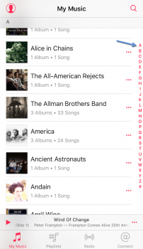
I haven't read all 25 pages but there is one thing i use everyday that bugs the hell out of me and would be so simple to fix. In the itunes app, why can't they make the stupid shortcut letters on the right side larger when scrolling through your artists?

I have never been able to hit the letter correctly the first time so i usually just scroll all the way down. Only a child's fingers can hit those tiny letters, no reason to have them that small, they are unusable. I can't imagine that one of the chubby fingered developers haven't had this same problem...
 

Attachments

  • IMG_3205.PNG
    IMG_3205.PNG
    289.2 KB · Views: 141
  • Like
Reactions: Type4O and yep-sure
Register on MacRumors! This sidebar will go away, and you'll see fewer ads.