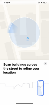
I’d like to ask some opinions on a possible Feedback report I might send in to Apple. Dark Mode for Maps. Do you think it’s too difficult to differentiate anything? I’m thinking of making a suggestion to maybe make the colors a little more “obvious”. It’s not an actual issue for me, but I think there could be a benefit for some people to make those colors pop more in Dark Mode.
Any opinions of yours could be added to my feedback report, hence why I’m asking. Basically what I’m thinking is do you think Dark Mode is a little TOO dark on Maps?
I've sort of gotten used to the new dark mode, although I did much prefer the hues of blue from the night mode in iOS 12. The current dark mode I think looks a bit better with the new maps data. But if you live in a region of the world that doesn't have the new maps data yet, then the dark mode could be a bit bland and boring.


