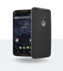
I'm not a fan of the new design. The camera/flash module and M logo circle on the back are much more clunky than on the old X. The speaker/mic grilles stick out way too much too. And on this one I actually don't dig the addition of the metal band at all, it just disturbs what already was a very slick shape. They "fixed" what wasn't broken, IMO.
I agree with you ... they've taken for me one of the best ergonomically designed phones of 2013/14 (depending on the continent) and utterly bastardised it to have the things some focus group has told them a phone needs in 2014, despite the empirical evidence being that the Moto G (which was moto's biggest selling smartphone ever despite a 4.5" screen) - and the the Moto X (not far behind it despite a 4.7" screen - garnered some of the best critical acclaim despite its specifications) .. But sod our sales figures, we need a bigger screen and metal round the sides - just because ............


