Become a MacRumors Supporter for $50/year with no ads, ability to filter front page stories, and private forums.

RobbyIdol

macrumors regular
Mar 20, 2012
248
185
I hope everyone is sending their feedback to Apple about all of these regressions in Music.

I've been sending it since iOS 7. Apple will do what they want.
[doublepost=1473569170][/doublepost]
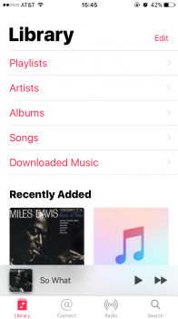
Furthermore, the Downloaded Music category doesn't really address my complaint. If I've not indicated I want the music stored on my phone, surely this would imply I do not want to listen to it. Why is the phone showing me music I don't want to listen to?

This is a reason I will not be updating to 10. I don't want to hear "Just use the Downloaded section of the Music app." That's not the point. Until now, Apple has always allowed users who don't want to view Cloud or Store purchases to hide them from their app library. They already made it annoying enough by stamping a header bar that says "Show All Music" or whatever in iOS 9 if you try and hide purchases. If 10 disables that ability entirely, then that is complete ********.
 

Shirasaki

macrumors P6
May 16, 2015
16,263
11,764
"Downloaded Music" is only a partial and unsatisfactory solution to those who want to use it a local music player. There are many ways in which the app jumps context again and starts showing stuff in your previous purchases or that you haven't purchased at all - "You might also like" etc.

It's like having a constant nagging salesman on your back when all you're trying to do is navigate and listen to your own music.
And in previous beta, Apple will silently turn "show Apple Music" back on if you turn it off. I have experienced this more than once.

I now keep Marvis and stock music app and use Marvis for rating while stock one for playlist and heart.

If this trend follow, iOS 10 is the last major version I will use on my device. But next year iPhone will load iOS 11. Ugh. :(
 

bilibug

macrumors 6502
Aug 27, 2008
361
260
Stockton NJ
I commented on this with Beta 1 and got blasted for criticizing a "work in progress". Now that we have the GM...

I would prefer that they reverted the song listings and album track view to the 2 line layout as in IOS 9. Not only did it include artist (not album artist) and track length, but also provided enough room for the track title to allow differentiation between different versions and remixes, unlike the truncated mess in the current IOS 10 "improved" layout.
 
  • Like
Reactions: Jantelagen and Loge

Frankied22

macrumors 68000
Nov 24, 2010
1,787
594
I commented on this with Beta 1 and got blasted for criticizing a "work in progress". Now that we have the GM...

I would prefer that they reverted the song listings and album track view to the 2 line layout as in IOS 9. Not only did it include artist (not album artist) and track length, but also provided enough room for the track title to allow differentiation between different versions and remixes, unlike the truncated mess in the current IOS 10 "improved" layout.
I love when someone criticizes a beta and someone replies with "don't worry it'll change before release, it's a work in progress". Anyone who thought any major design changes were going to happen during beta were out of their mind.
 

Iceage

macrumors 6502
Apr 17, 2010
303
71
I commented on this with Beta 1 and got blasted for criticizing a "work in progress". Now that we have the GM...

I would prefer that they reverted the song listings and album track view to the 2 line layout as in IOS 9. Not only did it include artist (not album artist) and track length, but also provided enough room for the track title to allow differentiation between different versions and remixes, unlike the truncated mess in the current IOS 10 "improved" layout.

On the "now playing" screen, they should get rid of the album name on the second line and only have the artist name. The album name is usually indicated on the album art cover. This would stop the annoying scrolling.

Here is the now playing screen on the Sonos app. Now, that's looks good and very informative. I like the "playing next" info.

952908cfbe32ae03529fe82fa83a7092.jpg
 
  • Like
Reactions: tonyr6

Paco II

macrumors 68020
Sep 13, 2009
2,288
706
Not sure if missed it in this thread, but in iOS 10 Music app, how does one delete an iCloud Music folder? In iOS 9 easy swipe/delete. Can't seem to figure it out in iOS 10 Music app.
 

mkaen

macrumors regular
Jun 7, 2011
149
61
No way to remove the "Connect" button at the bottom?

That plus the removal of the ability to edit star ratings...I don't even.
 

Sukach

macrumors regular
Oct 9, 2011
210
36
I second (and third and fourth) the complaints about the removal of star ratings. Like others, I have an extensive library of rated music that drives nearly all my playlists. It's been so hard for me to move from the "owning" music model to the "cloud" model (like Spotify/Apple Music) for so long because of the investment I have been in my ratings and playlists. Guess I'm being slowly forced down that road.
 

ipedro

macrumors 603
Nov 30, 2004
6,329
8,852
Toronto, ON
Apple Music in iOS 10 is organized in a far more intuitive way. Showing the upcoming songs right there in the playback card makes a lot of sense. "Play Next" and "Play Later" are easier to understand and I find myself using them all the time now.

It's also far easier to find suggested playlists and new music. I love the daily suggestions. It's really figured out my musical tastes and I discover new music all the time.

I installed iOS 10 first on my iPad and ended up running to my iPad to play music and couldn't wait to install it on my iPhone.

The white space and bold fonts actually served to make the app less complex. It was too cluttered and dense which made it harder to focus on finding what you were looking for.
 
  • Like
Reactions: Lappen71

Paco II

macrumors 68020
Sep 13, 2009
2,288
706
Bump on my own question. Did Apple remove this functionality from the Music app?

Not sure if missed it in this thread, but in iOS 10 Music app, how does one delete an iCloud Music folder? In iOS 9 easy swipe/delete. Can't seem to figure it out in iOS 10 Music app.
 

Paco II

macrumors 68020
Sep 13, 2009
2,288
706
In iTunes, one can create Folders that contain Playlists. These folders sync to iOS devices via iCloud Music Library. In iOS 9 Music app these folders can be deleted on device. In iOS 10 Music I can't seem to find a way to delete them. Trying to get confirmation if I am overlooking a way, or if Apple removed the functionality?

What do you even mean by "iCloud music folder"?
 

lagwagon

Suspended
Oct 12, 2014
3,899
2,759
Calgary, Alberta, Canada
There absolutely is. On mine it's one of the four "tabs" at the bottom of the Music app: Library, Connect, Radio, Search.

Perhaps you should look at what sub forum this is and read the title of the thread. This is in the iOS 10 forum and talking about the new iOS 10 redesigned Music app. There is no connect button/tab in iOS 10.
 

mkaen

macrumors regular
Jun 7, 2011
149
61
Perhaps you should look at what sub forum this is and read the title of the thread. This is in the iOS 10 forum and talking about the new iOS 10 redesigned Music app.
No need to be condescending. We are talking about the same app.
There is no connect button/tab in iOS 10.
Actually, here it is:
 

Attachments

  • IMG_6007.PNG
    IMG_6007.PNG
    307.9 KB · Views: 174

AgentElliot007

macrumors 6502a
Mar 22, 2010
579
363
Albums within an artist (tapping into an artist from the artis view) used to be sorted newest releases to oldest. Now, since iOS 10 dev beta 1 they have just been in a seemingly random order.

Sort Songs & Albums setting has no effect on it.

Little late, but exactly. If you have an artist with a lot of albums, good luck. If you have an artist with lots of bootlegs, get ready to be really, really frustrated.

What irritates me is that I spent a great deal of time ensuring all my music metadata in iTunes was impeccable, and it is impeccable on iTunes on the Mac. But on iOS? Total disaster. I don't understand how they make absolutely no use of so much of the metadata available. It's ridiculous.
 
  • Like
Reactions: IronWaffle

crashoverride77

macrumors 65816
Jan 27, 2014
1,234
213
Why is this still an issue? I guess smooth scrolling is something we will never see again in that part of Apple music. Not only stutters but looks "jumpy". Why not buffer everything FIRST, then load the screen. Id gladly wait 2-3 seconds for my albums to load if it meant no more epileptic scrolling.

Apple is actually starting to do this with iOS 10, they talk about it in one of their WWDC developer videos (Whats new in UICollectionViews)
If you use the video app of photo app there is now zero lag/stutter on first scroll, even if the app was fully closed. For some reason it doesnt quite work on the music app.
 

John6Plus

macrumors 6502
Sep 19, 2014
365
41
Holland, MI
I'm still waiting for iOS 10 to drop.

No star ratings? I've depended on that since my first Apple product, the original iPod Nano. It's how I organize and categorize songs when I'm listening to them. I just. What!?

Also nearly despondent over reports that the metadata is a catastrophe (even more than before, which is saying something). Music is literally why I've stuck with Apple devices, but it's been getting worse and worse since iOS 7.

I really thought they'd fix it this time.
 
  • Like
Reactions: IronWaffle
Register on MacRumors! This sidebar will go away, and you'll see fewer ads.