Become a MacRumors Supporter for $50/year with no ads, ability to filter front page stories, and private forums.

edubfromktown

macrumors 6502a
Sep 14, 2010
844
712
East Coast, USA
The S24+ is night and day compared to the Pixel when it comes to choppiness. Play store, Google news feed, Reddit to name a few. Scrolling is very choppy on the Pixel, not an issue on the Galaxy.
Yup- even S23+ was ahead of Pixel on navigation, app performance, charging, ...

(essentially everything other than point & shoot camera/app performance and less "unexpected" results, though there were some in my 2 week poking at it hehe). Pure Android or not, Pixel 8 Pro was lacking for my daily purposes.
 

psp123

macrumors regular
Mar 10, 2015
160
255
The S24+ is night and day compared to the Pixel when it comes to choppiness. Play store, Google news feed, Reddit to name a few. Scrolling is very choppy on the Pixel, not an issue on the Galaxy.
This is the main reason I'm replacing my 8 Pro with the S24U. I really like the Pixel otherwise but the stutter is so annoying and unpleasant.
 

Tig Bitties

macrumors 603
Sep 6, 2012
5,517
5,692
I'm a diehard Nexus Pixel guy, but even I have noticed weird stutter or choppiness on my Pixel 8 Pro when sometimes unlocking the phone to the homescreen, or clicking the weather app and it opens a bit slow or janky. I was always under the impression the Pixel UI was supposed to be the #1 smoothest buttery UI, but I have to say, sometimes it's not.

I am debating getting the S24U, but haven't had a Samsung since the S8+
 

Harthag

macrumors 68020
Jun 20, 2009
2,015
2,567
U.S.
I'm a diehard Nexus Pixel guy, but even I have noticed weird stutter or choppiness on my Pixel 8 Pro when sometimes unlocking the phone to the homescreen, or clicking the weather app and it opens a bit slow or janky. I was always under the impression the Pixel UI was supposed to be the #1 smoothest buttery UI, but I have to say, sometimes it's not.

I am debating getting the S24U, but haven't had a Samsung since the S8+
It is a shame, I really wanted to keep the Pixel as I enjoy the straightforward UI and Pixel launcher. Just had too many little issues I mentioned in the Pixel thread that when combined made the experience unpleasant. The last Pixel I used as a daily was the Pixel 6. I don't recall ever seeing any stutter with that phone, maybe there was and I didn't notice. I had the Pixel 7 but didn't use it enough to notice any issues. With the Pixel 8 it is jarring and disruptive. I tried the latest public beta that just released and choppiness remained but was a little improved I felt.

I am having a bit of S24U envy, really like the squared off screen and the new glass coating. But I'd never use the S-pen and it would just be dead weight. Maybe next year the new glass will trickle down to the S25+.
 
  • Like
Reactions: edubfromktown

ios3

macrumors regular
Jun 14, 2022
135
160
When I was deciding between the Pixel 8 and S23, I really wanted the Pixel for stock Android, updates, and the better camera system. However, I read about the stuttering and re-used hardware that potentially had issues on the Pixel 8 and decided against it.

I'm hoping the upcoming updates continue to resolve issues, especially with the hardware's drivers, but many should've been addressed before release IMO. With the price bump too, users should expect better. Hopefully this is all greatly improved with the 9 series
 

Aneres11

macrumors 601
Oct 2, 2011
4,353
9,551
I'm a diehard Nexus Pixel guy,


I was always under the impression the Pixel UI was supposed to be the #1 smoothest buttery UI, but I have to say, sometimes it's not.
pffft. Call yourself diehard and then say you thought pixel UI was the smoothest?! Hell, even I know the Pixel lags behind other top Androids because the tensor chip literally is a step behind.
But that’s partly why the phone is hundreds of pounds cheaper.

I for one will be watching with great interest if you do decide to get an S24 U. :D
🍿
 

psp123

macrumors regular
Mar 10, 2015
160
255
I'm a diehard Nexus Pixel guy, but even I have noticed weird stutter or choppiness on my Pixel 8 Pro when sometimes unlocking the phone to the homescreen, or clicking the weather app and it opens a bit slow or janky. I was always under the impression the Pixel UI was supposed to be the #1 smoothest buttery UI, but I have to say, sometimes it's not.

I am debating getting the S24U, but haven't had a Samsung since the S8+
The S24U isn't perfect either. iPhone is still smoother when scrolling. But it's a lot better than the Pixel.
 

Tig Bitties

macrumors 603
Sep 6, 2012
5,517
5,692
The S24U isn't perfect either. iPhone is still smoother when scrolling. But it's a lot better than the Pixel.

I've toyed around with the iPhone 15PM at Best Buy and Target over the months, and I am always surprised how smooth and fluid iOS is, just so SMOOOTH, and it's a very good looking device for sure. But iOS just isn't my cup of tea, unless it gets a pretty big makeover / overhaul, which sounds like iOS 18 is supposed to be a radical update. We shall see...
 
  • Like
Reactions: aggie99 and psp123

Aneres11

macrumors 601
Oct 2, 2011
4,353
9,551
I've toyed around with the iPhone 15PM at Best Buy and Target over the months, and I am always surprised how smooth and fluid iOS is, just so SMOOOTH, and it's a very good looking device for sure. But iOS just isn't my cup of tea, unless it gets a pretty big makeover / overhaul, which sounds like iOS 18 is supposed to be a radical update. We shall see...
The 15 PM is literally the best iPhone ever made IMO.
However they still don't have the camera as good as it could be. I know I'm picky with camera but I saw this on twitter earlier. The telephoto lens on the S24 U vs the one in the 15 PM. S24 much better to my eyes.

S24 U
IMG_4342.jpeg


iPhone 15 PM

IMG_4343.jpeg


Pretty big difference.
 
Last edited:

Aneres11

macrumors 601
Oct 2, 2011
4,353
9,551
Between the S24U and 15PM which would you take as a year long keeper?
Me?! You're asking the wrong person. 😁.
But FWIW, iPhone every day of the week. I just don't love the samsung software. The hardware looks top notch and the S24 I had briefly was lovely. Lightning fast, amazing screen. But haptics, camera and the look of the UI were far behind a Pixel IMO so I'll take that stuttery mess (😏) and run!
 

jamezr

macrumors P6
Aug 7, 2011
16,079
19,070
US
The 15 PM is literally the best iPhone ever made IMO.
However they still don't have the camera as good as it could be. I know I'm picky with camera but I saw this on twitter earlier. The telephoto lens on the S24 U vs the one in the 15 PM. S24 much better to my eyes.

S24 U


iPhone 15 PM


Pretty big difference.
I agree..the 15PM is the best iPhone ever. but as we all know here. Every phone has its drawbacks and limitations.
No matter what phone you have or like...there is a another phone that does SOME things better.

I love my s24U...but I also know there are things the P8P and 15PM do better...and vice versa.
 

Tig Bitties

macrumors 603
Sep 6, 2012
5,517
5,692
Me?! You're asking the wrong person. 😁.
But FWIW, iPhone every day of the week. I just don't love the samsung software. The hardware looks top notch and the S24 I had briefly was lovely. Lightning fast, amazing screen. But haptics, camera and the look of the UI were far behind a Pixel IMO so I'll take that stuttery mess (😏) and run!

I don't want to derail this thread, I'm sorry, but would be open to an iPhone again, but just certain things I don't like with iOS, compared to my Pixel phones.

-Google News feed on the left screen, I love that news feed and look at it multiple times a day
-T9 Dialer, when you start typing a number it starts to show the contact person
-No app drawer
-I like when swiping down on the homescreen it drags the notification shade down, but on the iPhone when you swipe down, some odd strange search thing comes up and the keyboard automatically pops up, WTF is that for? I don't need or ever want a search bar there, I want to drag down my notifications to reply or access them easier and faster.
-Notifications are just handled better overall on Android IMO.

But some things are great on the iPhone, extra settings for font size per app, I like that. Safari I will say is a very nice browser. The overall smoothness of the iPhone UI is amazing, and the rounded more comfortable shape of the iPhone, and the new lockscreen widgets seem cool.
 

Tig Bitties

macrumors 603
Sep 6, 2012
5,517
5,692
I agree..the 15PM is the best iPhone ever. but as we all know here. Every phone has its drawbacks and limitations.
No matter what phone you have or like...there is a another phone that does SOME things better.

I love my s24U...but I also know there are things the P8P and 15PM do better...and vice versa.


Yeah...great point.

I guess if I'm willing to get a S24U but I will still keep my P8P, wonder if I should instead dual world something totally different to really feel the change and get the iPhone 15PM?

What would feel better, having a Pixel 8 Pro and a Galaxy S24 Ultra? or the Pixel 8 pro and a iPhone 15 Pro Max? Only issue being the e-SIM in the iPhone.
 

Aneres11

macrumors 601
Oct 2, 2011
4,353
9,551
I don't want to derail this thread, I'm sorry, but would be open to an iPhone again, but just certain things I don't like with iOS, compared to my Pixel phones.

-Google News feed on the left screen, I love that news feed and look at it multiple times a day
-T9 Dialer, when you start typing a number it starts to show the contact person
-No app drawer
-I like when swiping down on the homescreen it drags the notification shade down, but on the iPhone when you swipe down, some odd strange search thing comes up and the keyboard automatically pops up, WTF is that for? I don't need or ever want a search bar there, I want to drag down my notifications to reply or access them easier and faster.
-Notifications are just handled better overall on Android IMO.

But some things are great on the iPhone, extra settings for font size per app, I like that. Safari I will say is a very nice browser. The overall smoothness of the iPhone UI is amazing, and the rounded more comfortable shape of the iPhone, and the new lockscreen widgets seem cool.
Agree re derailing, however one thing I will say is don’t underestimate the swipe down to search. I find it extremely handy. Any app I need it doesn’t matter where it is, just swipe down, start typing and boom, it’s there. Same with swiping down and searching for contacts or photos… all works really well!

But yes, notifications have always been better on android. You just have to swipe down from the top left of the screen to get notifications on iPhone as like you say, swiping from anywhere else brings the search up.
 

Harthag

macrumors 68020
Jun 20, 2009
2,015
2,567
U.S.
I agree..the 15PM is the best iPhone ever. but as we all know here. Every phone has its drawbacks and limitations.
No matter what phone you have or like...there is a another phone that does SOME things better.

I love my s24U...but I also know there are things the P8P and 15PM do better...and vice versa.
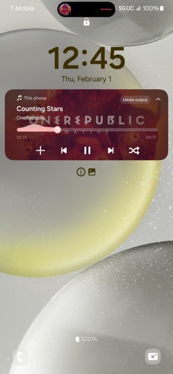
It is very amusing to me that Android does the DI better than Apple does the DI. Best of both worlds re: superior Android notifications and useful DI style notifications. You can set all apps to take advantage of the "DI".

Screenshot_20240201_124418_One UI Home.jpg Screenshot_20240201_124504_One UI Home.jpg
 

Harthag

macrumors 68020
Jun 20, 2009
2,015
2,567
U.S.
The DI in the picture covers an icon in the status bar, which is an eye sore, and even if seeing that particular icon is probably useless, does it actually do it better? lol
The DI here 1) fades completely away when not in use unlike the iPhone and 2) you can adjust the size of the DI to be smaller, I just haven't tinkered with it yet. It's convenient when I get a call or message or email, it pops up DI style same as iPhone which I really like.
 
  • Like
Reactions: Tig Bitties

Harthag

macrumors 68020
Jun 20, 2009
2,015
2,567
U.S.
The DI in the picture covers an icon in the status bar, which is an eye sore, and even if seeing that particular icon is probably useless, does it actually do it better? lol

Not sure about that... Isn't it covering one of your your icons?! 😳

Here you go, lol, shrunk it and moved lower to show it can be moved and resized.

As I said, I like DI for when notifications pop up so I can quickly see what the app is, press once, and it opens. Quicker sometimes than just pulling down the notification shade.

Screenshot_20240201_130152_One UI Home.jpg
 

Djones96

macrumors 65816
Dec 13, 2022
1,093
2,007
Here you go, lol.

As I said, I like DI for when notifications pop up so I can quickly see what the app is, press once, and it opens. Quicker sometimes than just pulling down the notification shade.

View attachment 2344005
Now it's just not center with the cutout of the phone, another eye sore IMO. But if you like it, and it works best for you, go for it!
 
  • Haha
Reactions: Harthag

Harthag

macrumors 68020
Jun 20, 2009
2,015
2,567
U.S.
Now it's just not center with the cutout of the phone, another eye sore IMO. But if you like it, and it works best for you, go for it!
I don't leave it like that 😂 it is hideous. Was just showing it can be completely moved, re-shaped, re-sized. I leave it centered closer to my 1st photo.
 
  • Like
Reactions: Tig Bitties
Register on MacRumors! This sidebar will go away, and you'll see fewer ads.