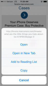
The app switcher; if Phone is one of the apps, on the keypad, at the top it displays a number you dialled ages ago. When you select the app it's there for a second then fades. Never the last number dialled, an old number. If anyone knows how to get rid of this it'd be appreciated. I don't like the cut & paste icons on the keyboard either.....
Got a tip for us?
Let us know
Become a MacRumors Supporter for $50/year with no ads, ability to filter front page stories, and private forums.
What are the "little things" you hate about iOS 9?
- Thread starter iolinux333
- Start date
- Sort by reaction score
You are using an out of date browser. It may not display this or other websites correctly.
You should upgrade or use an alternative browser.
You should upgrade or use an alternative browser.
Annoyances:
-lack of performance improvements on certain devices (rMini 2 slow animations and lag)
-no options to hide something from Proactive/Splitview
-new App Switcher style
Artificial restrictions:
-Pip/Splitview/Trackpad iPad only (PIP would be so useful on a 6/S Plus, especially for Sports)
-Content Blocker only for 64bit devices (5C says hello)
Despite those things it works reasonably well, especially on my 5S.
Last edited:
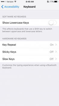
Thank you, thank you.Settings > General > Accessibility > Keyboard.
Attachments
Also do not like the new app switcher. Just do not like the look of it at all.I hate the new App Switcher...it flips to fast when you flick side to side and half the time when I swipe up to close an app, it just opens that app instead. Many of the changes are change "for the sake of change" rather than improvements to truly improve the user experience.
Also, still tired of all the stark white with thin fonts and colorless app icons that started in iOS 7.
- You can turn off Predictive in Settings > General > Keyboard to get rid of the predictive bar.-The app switcher. What was wrong with the old one from iOS 8?
-Sometimes when I go from the home screen to Safari the clock and icons at the top won't change from white to black as fast as they used to you don't see anything for a few seconds except the battery when it's green.
-The new system font. It looks really weird bolded.
-I don't like that I can't swipe down to not use the auto complete bar for the keyboard. I have an iPhone 5 and would prefer to have more screen space
-The taller menus that pop up from the bottom. Again, 4" screen real estate.
-The fact that they moved battery usage in settings and I have to scroll to open it.
-In News I want to be able to select the news sources. As it stands it has little advantage over the apps I've downloaded and the news pages I follow on Facebook and Twitter.
- What are the taller menus?
- Isn't scrolling a tiny bit to open battery usage than doing multiple clicks on different screens to get to it (which was how it worked before)?
- Spotlight search is still available when swiping down on any home screen (just like before).- Getting 3 hours less usage with iOS9 compared to 8.4. (6h instead of 9h)
- Separate page for spotlight search. Swiping down for spotlight would've been much better implementation.
- Searching in mail app doesn't show the results from newest to oldest.
- iCloud drive app is very limited and useless. Not comparable to Dropbox.
- Limited availablility of News app.
Because of the way you're enunciating. Your final s in the word times is absorbed in the beginning s in the word six. Just make it clearer and it'll work.Man, then why didn't it work for me? Two phones, one on 8.3 and the other on 9.... 9 didn't understand me saying "what is 6 times 6" while 8 understood.
I know. What I ment was that the extra page for spotlight is useless since you can just swipe down on any page.- Spotlight search is still available when swiping down on any home screen (just like before).
The app switcher; if Phone is one of the apps, on the keypad, at the top it displays a number you dialled ages ago. When you select the app it's there for a second then fades. Never the last number dialled, an old number. If anyone knows how to get rid of this it'd be appreciated. I don't like the cut & paste icons on the keyboard either.....
That not only happens there. It happens with Safari as well, sometimes even when you peek at other tabs it shows a website you haven't visited in a long time. Sometimes even months ago. It's annoying but I believe it has something to do with the limited RAM the system has to work with.
- What are the taller menus?
These types of menus. There is more white space that is just unnecessary on the 4" screen.
Attachments
None of the proactive items are in the swipe down quick search.I know. What I ment was that the extra page for spotlight is useless since you can just swipe down on any page.
Oh yeah, that is kinda annoying. They obviously wanted to make it in line with the default shortcut for Spotlight on the Mac (I wish you could change the shortcut bindings like you can on a Mac).The only frustration I've found is that when using an external keyboard, Cmd-Space now throws you out of the current app instead of switching keyboard layouts. I haven't found a way to stop that yet.
Incidentally you can use Ctrl+Space bar to change the language. Though this brings up another annoyance: You can only change the language while a text field is selected. This bugs me because I'm used to changing it back after I've inputed some text.
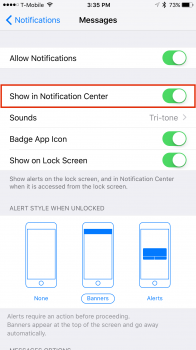
One of the biggest annoyances I've found is that you can't limit the number of Notifications that show in the Notification Center like you could in previous versions. For example, if you get push notifications from ESPN, you could easily see 20-30 per day. Previously, you could limit the Notification Center to only show 5 at a time. For some reason in iOS 9, there is no limit so your Notification Center is one long scrolling list! Did I miss something where this can be done?

Attachments
Interesting; on the Mac, with multiple keyboard layouts, Cmd-Space still switches keyboards and Ctrl-Space triggers Spotlight. It seems that Apple considered this issue on the Mac but forgot to apply the same tweak to iOS.Oh yeah, that is kinda annoying. They obviously wanted to make it in line with the default shortcut for Spotlight on the Mac (I wish you could change the shortcut bindings like you can on a Mac).
Incidentally you can use Ctrl+Space bar to change the language. Though this brings up another annoyance: You can only change the language while a text field is selected. This bugs me because I'm used to changing it back after I've inputed some text.
I did actually know about Ctrl-Space to switch keyboards but I have years of muscle memory for Cmd-Space...
Huh, My Mac defaulted to Cmd+Space when I got it, with the language toggle being completely unassigned. I switched it around to what I was used to on my iPad at the time.Interesting; on the Mac, with multiple keyboard layouts, Cmd-Space still switches keyboards and Ctrl-Space triggers Spotlight. It seems that Apple considered this issue on the Mac but forgot to apply the same tweak to iOS.
I did actually know about Ctrl-Space to switch keyboards but I have years of muscle memory for Cmd-Space...
These types of menus. There is more white space that is just unnecessary on the 4" screen.
Does that really matter how big the menu is? If you're opening a menu, your focus is on that anyways and not what's underneath it. Like quite a few of the things mentioned in this thread. That's just hating something for the sake of hating, or for the sake of not liking change.
Now that IS interesting. I just did a fresh install of 10.10.5 a few days ago and it definitely defaulted to Cmd-Space for language and Ctrl-Space for Spotlight.Huh, My Mac defaulted to Cmd+Space when I got it, with the language toggle being completely unassigned. I switched it around to what I was used to on my iPad at the time.
I guess it's a regional thing. One which the iOS team forgot to take into consideration.Now that IS interesting. I just did a fresh install of 10.10.5 a few days ago and it definitely defaulted to Cmd-Space for language and Ctrl-Space for Spotlight.
Okay, I really don't like the crash I just got. The screen went blank and none of the buttons responded. Had to do a hard reset.
Apple Music still sucks (everything)
- icon
- UI is way too cluttered
- Connect is an absolute waste of space
- Can't add music from radio to my music with one button (Spotify has a simple check if you like, auto added to my music)
- Can't easily search for songs when working out (Spotify has a dedicated activity page)
- Playlists aren't updated as frequently as Spotify
- Recommendations has been spotty, some good, a lot of bad
For some reason videos pause while AirPlay'ing them in the background if the video stops and starts, like for ads. Then sometimes they won't start again with scrubbing the video a little bit. Problems is you can't adjust the time marker for an ad so you have to close the video and reopen it!
No PIP or iPad apps for the 6+.
Also no landscape view for the music app.
Also no landscape view for the music app.
Apple Music still sucks (everything)
- icon
- UI is way too cluttered
- Connect is an absolute waste of space
- Can't add music from radio to my music with one button (Spotify has a simple check if you like, auto added to my music)
- Can't easily search for songs when working out (Spotify has a dedicated activity page)
- Playlists aren't updated as frequently as Spotify
- Recommendations has been spotty, some good, a lot of bad
How do you know a playlist is updated?
Presumably by checking to see if it has updated on another device.How do you know a playlist is updated?
Register on MacRumors! This sidebar will go away, and you'll see fewer ads.


