What I’ve done with a PowerPC Mac today is a thing I first tried on a C2D MBP running Snow Leopard: make iTunes 10 dark using
this old hack (by way of DeviantArt) and the OnyX “high contrast mode” toggle.
The PowerPC to take on this experiment, intended for Lion 10.7 running iTunes 10: the SL-PPC box running the last known stable build of iTunes on Build 10A96 (10.4.1), obviously. It’s tough to pass up a new way to break things.

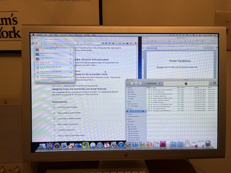
The results [
Figure 1] were basically identical to what I was seeing on 10.6.8 running iTunes 10.6.3 [
Figure 2]. Amazingly, it didn’t crash, despite its inherent delicateness in this oddball environment.
Figure 1. iTunes 10.4.1 on Build 10A96 of a Clouded Leopard, tweaked with Silent Night for iTunes 10 and OnyX “high-contrast”
Figure 2. iTunes 10.6.3 on Mac OS X !0.6.8, on a MacBook Pro 17, tweaked with the same two things.
The most apparent of those results is the low contrast inside the play details area, as the un-altered text is unchanged from the default grey. This doesn’t do well against a darker grey beneath.
The other annoyances which the above linked post didn’t bring up (but not things I care for) are UI elements which were changed to “Lionize” (well, “Marbleize”) it: tiny traffic light buttons (which stay dark grey on mouseOver, ugh and ugh); removal of the round, skeuromorphic volume slider; list sliders being ultra-skinny and hard to grab; and, frankly, play control buttons and the search window being squared off.
The OnyX thing I‘ve never liked feels more obvious here: the lack of alternating shading between each media line. But I guess this counts as working successfully on a temporal, pre-10.5.8 build of OS X running a not-final version of iTunes 10.
If there was a way to improve the play window contrast, to tweak (without owning the CD-ROM-mail-order-only USD$256 Resourcerer, last updated in 2005) those Marbleized elements back to Aqua-compliant elements (whilst preserving the all-dark effect), and a high-contrast dark mode which has contrasting bars between media items, then I could live with this (and it would be especially handy in low light settings).
I mean, it’s OK, but I’m not sure I’d think of it as very elegant (it really isn’t, but A- for the DeviantArt tweaker for giving it the good, game try). But at least both tweaks function together in even the most uncommon of unsupported (or, unsupported²) PowerPC circumstances. Who knew?
And so this, uh, concludes my 3,000th betch-kvetch-a-fest here on the MR forums.


