Ah, yes, IMHO the last of the mostly bug-free and reliable Mac operating systems: Snow Leopard. [I never did transfer an early Mac mini away from Snow Leopard because it was so reliable for what I was doing -- unfortunately the hardware (HDD) died.] Wouldn't it be nice to have an LTS version of the macOS, sort of like the Ubuntu LTS versions: no new features, just bug/security fixes for the next five years? I'd like this, but I'm certain I'm in the minority here -- just an antediluvian troglodyte wishing for the old times.I'd like to see a modern version of Snow Leopard. I'd like there to be a "MacOS PRO" with feature updates and gimmicks every 3 years at most. Only stability and bug fixes. Let the consumers have a new OS every year with iOS like Eyecandy or make iOS more like MacOS, merge them, for people who do media consumption etc. But we pros need reliability and thats what I want.
Got a tip for us?
Let us know
Become a MacRumors Supporter for $50/year with no ads, ability to filter front page stories, and private forums.
What would you like to see in the next macOS release?
- Thread starter Andrew73875
- Start date
-
- Tags
- feature requests macos
- Sort by reaction score
You are using an out of date browser. It may not display this or other websites correctly.
You should upgrade or use an alternative browser.
You should upgrade or use an alternative browser.
Absolutely nothing. Please do a “snow leopard” release and just fix/optimize everything 🙏🙏🙏
Let us change the lock screen wallpaper.
1. The death of the Zoom Button (in 16 years, I haven't been able to understand it)
2. Much, much better window management
3. App parity between iOS and macOS
4. Bug-free iCloud
2. Much, much better window management
3. App parity between iOS and macOS
4. Bug-free iCloud
There's already a password manager pane in System Preferences in Monterey.Password manager app
Native Music app
Make the Safari Team a priority
Since Monterey 12.3, the Music App is now native (I also wanted that very badly).
On the blog on www.webkit.org the Safari Team committed to bringing more web standards to Safari and it shows in the tech previews. The gap with other browsers will be filled very quickly.
Bugfix/polishing, good ethernet support with offload, system wide ocr to make slim pdf from scanner with ocr (like adobe acrobat clearscan), more choice on what the os is installing (some game/utilities/font aren't useful for everyone) and, why not, to take a good look at why people are installing mos, vlc, little snitch, betterdummy, onyx, bettersnaptool and so on.
All your requests definitely need focus. We need UI fixes for stuff they broke over the Ive design years.
I hate the Music app, iTunes in the old days was so much better
I hate the Music app, iTunes in the old days was so much better
The new look implemented too much white colour across the OS. This in turn made it too bright and people asked for dark mode.
Ideally, there's no need for dark mode if UI is balanced. If it implements all kinds of colours.
I've been trying to figure out why I became obsessed with Mac dark mode a few years ago after having had no issue with the default look since the beginning of OS X. I think you've answered that for me. I assume this is another thing Ive brought when he took over software design - and is therefore yet another precedent Apple is going to have to think its way out of now.
Fix as many bugs as possible. The Mojave, Catalina kernel panics were a real drag. The wicked high strung Intel chips added their own layer of instability. Unsatisfactory, particularly for a company that prides itself on products that "just work."
Big Sur's first patch killed the KPs for a lot of users, but I still see kernel panic threads.
Big Sur's first patch killed the KPs for a lot of users, but I still see kernel panic threads.
you're describing your own experiences, not everyone's. and what's a 'wicked high strung Intel chip'? 🤷♂️Fix as many bugs as possible. The Mojave, Catalina kernel panics were a real drag. The wicked high strung Intel chips added their own layer of instability. Unsatisfactory, particularly for a company that prides itself on products that "just work."
Big Sur's first patch killed the KPs for a lot of users, but I still see kernel panic threads.
there will always be bugs, it's the nature of software, and the reason we get incremental updates.
you're describing your own experiences, not everyone's. and what's a 'wicked high strung Intel chip'? 🤷♂️
there will always be bugs, it's the nature of software, and the reason we get incremental updates.
A 14nm ++++++++ CPU cranked to the bleeding edge in pursuit of a number.
KP threads used to be more common. New forum members signing up just to complain about their $2000 computer that crashes frequently.
"It just works" relies on a stable product to uphold the reputation. ASi, Big Sur were several leaps in the right direction.
HobeSoundDarryl
macrumors G5
Absolutely nothing. Please do a “snow leopard” release and just fix/optimize everything 🙏🙏🙏
AMEN! times 100!
I am the owner of a new Mac Studio Ultra and can't keep a USB external drive reliably connected to it. That drive worked fine for several years on the Intel iMac this Ultra replaced and still remains connected to that old iMac if I take it and the same cable and hook them back together.
I've tried ALL of the possible solutions offered online, including the more extreme ones like the sudo command in terminal to switch drive sleep from 10 to the maximum. Nothing works.
I've tried both ports, 3 different cables, not letting the Studio sleep, not letting the drive sleep, etc.
Having methodically worked through every possibility I can find by others suffering the same issue (since apparently Big Sur), I'm down to only 2 more things I can try:
- USB-C to USB-B cable arriving tomorrow. This will test if maybe this issue is only with the USB-A ports on the Studio.
- Reformat the drive with Monterey. It's already APFS and First Aid shows no issues, so I'm doubting a completely fresh formatting run will make any difference... but it's the last thing I can try.
I'm 110% for a Snow Leopard-type year or two to fix, fix, fix instead of add, add, add. I miss "just works," especially in something as seemingly rudimentary as keeping an external drive connected to a USB port.
Followup: That USB-C to USB-B cable arrived. Hooked them up and same result. So both USB-A and USB-C/TB4 jacks on a brand new Studio can't maintain a stable connection to a 2018 dual drive RAID box that works just fine with Intel Macs. Very frustrating!
Last edited:
Two things:
Removing and consolidating the old clutter
Apple needs to consolidate some of the apps in the other folder with some of its house apps, such as merging stickies with notes, keychain access with cloud keychain, system information with system preferences.
Bringing more features to their apps
This can be done by updating apple's apps using the app store, but I do not see this happening anytime soon. I want apps to be updated to be on par with their competitor's counterparts.
Mail needs an update with new features to compete with outlook and Gmail with the smart folders, need profile pictures for all email accounts that are downloaded from the email server.
Calander needs to add new features to be on par with fantastical. It lacks many small but useful features.
Contacts need an overhaul on both macOS and iOS.
Photos need to add robust editing tools. If Apple can eventually get to the level of Photoshop, that would be nice but add some features that the pixel already has, such as removing the background or removing a defect in the photo, etc.
My Probably will not happen features I would like to see is:
launchpad with app library
dock overhaul
menu ba system overflow tray
snap layouts (Steal the feature directly from windows 11)
I could talk about very tiny features that Mac needs that windows already has all day. ex: my computer instead of the home user, file tree, cut paste, etc.
Last edited:
I've been trying to figure out why I became obsessed with Mac dark mode a few years ago after having had no issue with the default look since the beginning of OS X.
Yeah. And sometimes this white coloured UI becomes intrusive and obstructive. For example "Sound off" sign changed its colour to white and became non-transparent. Same thing with brightness and keyboard backlight.
Mountain Lion:

Catalina:

Last edited:
Something I did not mention in my original post because it will probably not get seen there is the unification of their software ecosystem. We sort of seeing this when apple brings the old ios icons to the works apps on macOS but it would be nice if apple brought their app icons from macOS to iPads and iOS and unified them so that it is easier for our memory muscles to remember. Either bring the MacOS icons to iPads and iOS or bring the iOS and ipadOS icons to the mac. and do the same for the volume indicators keep it consistent throughout your operating stems.
Needs to go BYE BYE. We need unification and consistency between all apple operating systems if one has it they all should have it.Yeah. And sometimes this white coloured UI becomes intrusive and obstructive. For example "Sound off" sign changed its colour to white and became non-transparent. Same thing with brightness and keyboard backlight.
Mountain Lion:

Catalina:

You said it perfectly. Just need to also prioritize bug fixes, consolidate older apps in the other folder into one app and remove what's not needed.What do you mean by that exactly? What did you like more with the old look and feel?
My list:
- Password manager app
- Cycling routes in Germany/Europe
- Native Music app
- Bring back Aperture
- Fix all the bugs
- Make the Safari Team a priority (and allow other browser engines on iOS)
I don't have the feeling that anyone here expects that Apple does anything we discuss here. I think almost everyone here knows that macOS would not be perfect if he or she would design/develop it. This thread is not here to make suggestions to Apple. It is here to think about what could be and see what other individual people wish for. Why? Because it's fun, it doesn't "make sense".the problem with this kind-of thread is.... everyone has a wish list (for example, 'flac' in the music app... which, if it hasn't happened by now, isn't going to happen).
if apple let the OS be designed by it's users, it would look like homer simpson's car design (look it up).
again, am not saying there's a problem in discussing things. but mocking up a 'better look', and then finding the next OS doesn't reflect that... will only lead to disappointment (and more threads like this). and round & round we go...
If every other wish makes you think, "Oh man that's totally unrealistic, what's the point?" then maybe this thread isn't for you.
i've said (twice before, and now a third time) that there's nothing wrong with discussing this. perhaps read my posts before commenting on my comments.I don't have the feeling that anyone here expects that Apple does anything we discuss here. I think almost everyone here knows that macOS would not be perfect if he or she would design/develop it. This thread is not here to make suggestions to Apple. It is here to think about what could be and see what other individual people wish for. Why? Because it's fun, it doesn't "make sense".
If every other wish makes you think, "Oh man that's totally unrealistic, what's the point?" then maybe this thread isn't for you.
any thread anyone wants to participate in... is ok for them to participate in. that's how this works.
Yes! The way I see it, the only way to do this right now is if as the first thing when you set up a new Mac you set a standard view.
- Ability to set a default viewing option and it apply to ALL folders unless specified otherwise. I like having all of my folders organized by kind and then file name. I find I have to do this with each and every folder instead of it applying to all folders.
What I’d like to see is an easy way to delete/uninstall default applications that I never ever use. Stocks. Chess. Home.
Also, come + X to cut. That would be nice.
Better window management. Like, for example, build the Magnet app right into the OS. And for iOS, window management in general.
Additionally, minimizing in macOS has always felt cumbersome compared to every modern version of Windows. It still works the exact some way it did in Mac OS 10.0 (which wasn’t great).
Additionally, minimizing in macOS has always felt cumbersome compared to every modern version of Windows. It still works the exact some way it did in Mac OS 10.0 (which wasn’t great).
What’s wrong with dragging them to trash?What I’d like to see is an easy way to delete/uninstall default applications that I never ever use. Stocks. Chess. Home.
🙂 No need to get angry. I just felt that your statement was inconsistent with your actions, because you always try to give a reality check to the wishes people express here, even though that's not really the point.i've said (twice before, and now a third time) that there's nothing wrong with discussing this. perhaps read my posts before commenting on my comments.
any thread anyone wants to participate in... is ok for them to participate in. that's how this works.
I'm even with you for example on the Flac thing. When I heard first about Flac I was still in school. I would say there is no way Apple even remotely considers bringen Flac support to its music app.
Ok, I get it now. But I'm not really with you on that. I like the clean and very bright look of the current macOS. I think for people who like a dark UI going back to a "more balanced" UI would be a bad compromise. The people I know who use dark mode (not many) do that because they like it dark. Mountain Lion was not dark it was more colourful. I actually think that the macOS UI is in a good state right now. Apple brought back more shadows to the "flat" design. For me the bright UI with almost no dividing lines and nuanced use of shadows feels very light and clear.The new look implemented too much white colour across the OS. This in turn made it too bright and people asked for dark mode.
Ideally, there's no need for dark mode if UI is balanced. If it implements all kinds of colours.
Examples:
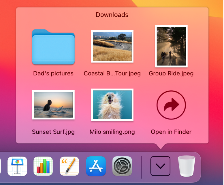
1. Stacks layout was black up until Yosemite.

It was changed into white.

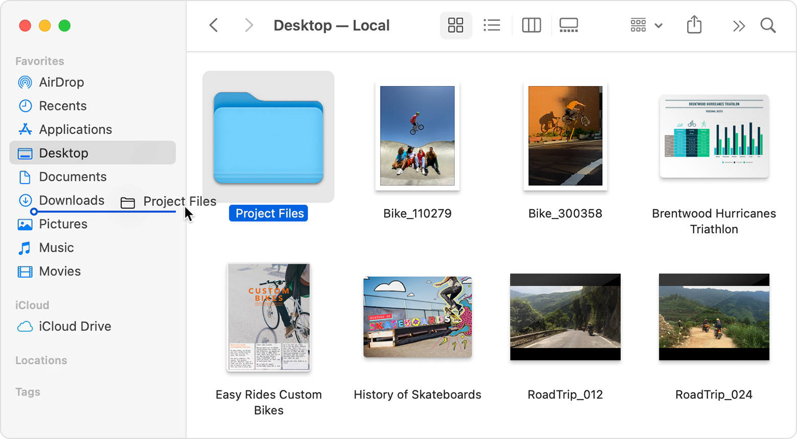
Same goes with Finder. Too much white, too bight.

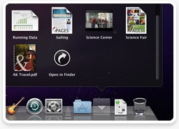
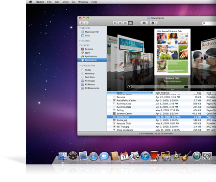
OS X Snow Leopard for comparison. It has grey header, light blue toolbar, almost no bright white colour. It's easier on the eyes and there's no need for dark mode.

Same goes with iMessage
Monterey:

Mountain Lion:

I would say the main wish I have is for Apple to do some house cleaning. As a software developer myself I know that Software can't stay good if you never take the time to clean up after yourself. Apple should know that they have to do this from time to time. And I suppose it gets more complicated with alle these variations of operating systems but that makes it even more dangerous to have bugs piling up.
Register on MacRumors! This sidebar will go away, and you'll see fewer ads.

