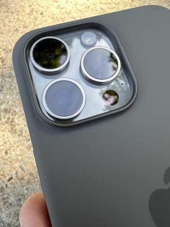
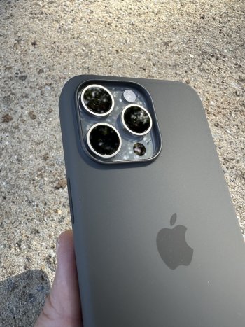
Dang, and we've still gotta wait til September 27 to order it off the Pitaka site? I really want one!Seems like Pitaka is selling their MagEZ 4 case in Apple stores in china.
Just saw these in instagram
Got a tip for us?
Let us know
Become a MacRumors Supporter for $50/year with no ads, ability to filter front page stories, and private forums.
Which Case Did You Get or Recommend For Your New iPhone 15 /Plus /Pro /Pro Max?
- Thread starter Sal09
- WikiPost WikiPost
- Start date
- Sort by reaction score
You are using an out of date browser. It may not display this or other websites correctly.
You should upgrade or use an alternative browser.
You should upgrade or use an alternative browser.
- Status
- The first post of this thread is a WikiPost and can be edited by anyone with the appropiate permissions. Your edits will be public.
Dang, and we've still gotta wait til September 27 to order it off the Pitaka site? I really want one!
I ordered one from Amazon.
I am using the aramid version and haven't found any rattling.For those of you who got the mous limitless case, do the buttons still rattle when you shake the case?
I weighed mine last night to compare with my 13PM leather case. 13PM leather was 32g exactly, 15PM silicone is 32.33g. Nearly identical.Anyone know how heavy the apple silicone case for pro max is?
Caudabe Synthesis is going back. The fit is extremely tight to the point where putting the phone in or taking it out feels like you’re doing damage. I guess I’ll try the Sheath.
Caudabe Synthesis is going back. The fit is extremely tight to the point where putting the phone in or taking it out feels like you’re doing damage. I guess I’ll try the Sheath.
Perfect fit on mine. Tight is good. But easy to take on and off.
Alright, reporting back with my cases. My final choice was actually quite suprising.
My shortlist was:
- Nomad Leather Horween
- Nomad Rugged (just to check their improved lip)
- Otterbox Defender XT
I have a black titanium pro max, attached some pictures.
Nomad Leather Horween


Nomad Rugged (with improved lip)


Otterbox Defender XT


Conclusion
And this was quite a surprise for me. My first choice before trying them all on, was the Nomad Leather. It looks great, feels good. Nice grip and the buttons work great. Especially the action button feels very clicky. However my main concern was the lip, which is almost non existent. Yes there might be a 0,1 mm edge, so technically it does not touch the surface when face down. But I feel that even a small bit of sand, could ruin this.
The Nomad Rugged dropped of my shortlist, because it had the same problem as the leather, but their site showed an almost 0,5 mm extra lip, compared to the iPhone 14 case, which peaked my interest again, so I ordered it. My second doubt was that the rim/edge on the back would make it impossible to place it on my charging dock, but since the Pro Max is bigger, this was no problem. However my biggest issue with this case was it is really slippery in hand, yes on the table it has a nice lip and same goes for the back, so it won't slide anywhere, but it just felt very slippery in hand. Also for some odd reason the action button feels almost non-existent when clicking it. Very odd, since I assume it should work the same as the leather case.
Last case I tried was the Otterbox Defender XT, and immediately when puttig it in the rubber casing (before installing the rim), it felt like a great fit. Installing the rim is a lot easier than those YouTubers make it out to be, or Otterbox might have improved that design(?), anyway, it took me less than a minute to make it align properly. Once installed the grip was amazing, even though it added a bit more bulk. This case isn't going anywhere. It has a lip, which funnily enough feels (and looks?) smaller than that of the Nomad Rugged, but should suffice. The rim also gives a nice "slope" which makes swiping feel good. My biggest "problem" with this case is that it only has 1 lanyard attachment, versus the two attachment points the Nomad cases have, so I will have to find a solution for my neck strap, how to best attach it. Also a bit worried that this big case will make future game controllers difficult to attach, but since this case was also my cheapest one at 40 bucks. I won't mind upgrading to another case once those start being released.
So winner: Otterbox Defender XT!
PS:
I've the Spigen Spigen GlasTr EZfit on the phone.
Hope this write up helps people!
Edit after several hours of using the Otterbox:
The Otterbox Defender XT is going back. The moment I attached a lanyard and held my phone with it, the rim came lose. So my second best choice for now is the Nomad Rugged.
My shortlist was:
- Nomad Leather Horween
- Nomad Rugged (just to check their improved lip)
- Otterbox Defender XT
I have a black titanium pro max, attached some pictures.
Nomad Leather Horween
Nomad Rugged (with improved lip)
Otterbox Defender XT
Conclusion
And this was quite a surprise for me. My first choice before trying them all on, was the Nomad Leather. It looks great, feels good. Nice grip and the buttons work great. Especially the action button feels very clicky. However my main concern was the lip, which is almost non existent. Yes there might be a 0,1 mm edge, so technically it does not touch the surface when face down. But I feel that even a small bit of sand, could ruin this.
The Nomad Rugged dropped of my shortlist, because it had the same problem as the leather, but their site showed an almost 0,5 mm extra lip, compared to the iPhone 14 case, which peaked my interest again, so I ordered it. My second doubt was that the rim/edge on the back would make it impossible to place it on my charging dock, but since the Pro Max is bigger, this was no problem. However my biggest issue with this case was it is really slippery in hand, yes on the table it has a nice lip and same goes for the back, so it won't slide anywhere, but it just felt very slippery in hand. Also for some odd reason the action button feels almost non-existent when clicking it. Very odd, since I assume it should work the same as the leather case.
Last case I tried was the Otterbox Defender XT, and immediately when puttig it in the rubber casing (before installing the rim), it felt like a great fit. Installing the rim is a lot easier than those YouTubers make it out to be, or Otterbox might have improved that design(?), anyway, it took me less than a minute to make it align properly. Once installed the grip was amazing, even though it added a bit more bulk. This case isn't going anywhere. It has a lip, which funnily enough feels (and looks?) smaller than that of the Nomad Rugged, but should suffice. The rim also gives a nice "slope" which makes swiping feel good. My biggest "problem" with this case is that it only has 1 lanyard attachment, versus the two attachment points the Nomad cases have, so I will have to find a solution for my neck strap, how to best attach it. Also a bit worried that this big case will make future game controllers difficult to attach, but since this case was also my cheapest one at 40 bucks. I won't mind upgrading to another case once those start being released.
So winner: Otterbox Defender XT!
PS:
I've the Spigen Spigen GlasTr EZfit on the phone.
Hope this write up helps people!
Edit after several hours of using the Otterbox:
The Otterbox Defender XT is going back. The moment I attached a lanyard and held my phone with it, the rim came lose. So my second best choice for now is the Nomad Rugged.
Last edited:
Amazon has them. Not every colorway but most of them.Dang, and we've still gotta wait til September 27 to order it off the Pitaka site? I really want one!
An update on mine, they finally shipped it on 10/22 (five days after order). Still haven't replied to any of my emails thought the last one at least got an auto-reply from their support bot. It feels like my original order and emails fell off their radar somehow. ¯\_(ツ)_/¯I have been highly impressed with their shipping and delivery times. I have also had great customer service with them.
Apple clear case… 🤣Does anyone have a recommendation for a case that doesn't have a bottom lip? I only know of Pitaka MagEz which I might skip out on this year.
Hook us up with a couple pics… I always look forward to your photos because you do a great job capturing what it looks like in real life!First case on my new phone Otterbox Symmetry in black, one of my favorites.
Waiting on my RealTree version to come in so I can get my traffic cone orange buttons
just to report backP
I don’t see many fingerprints on my Benks case but I’ve heard some people have, it wouldn’t bother me personally if I did.
The Caudabe case won’t show fingerprints, and it has a textured finish and depending on the person some people like it, some people don’t. I think the texture feels good and adds to grip.
Honestly I would say if you want good grip go with the Caudabe, it has an amazing fit and grip.
I got my Benks ArmorPro few days ago and I like the touch sensation of the back and so far I have not seen any fingerprint!
however, the metal buttons seems and the camera module protector seem abit loose
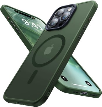
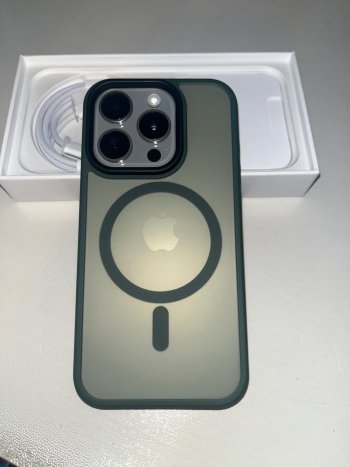
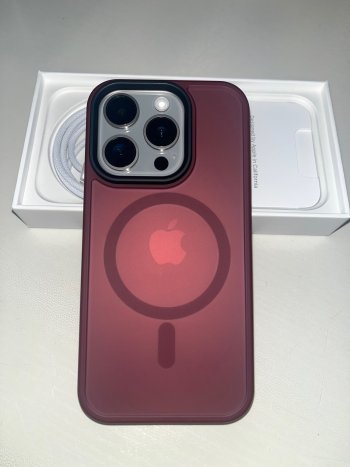
Has anyone gotten one of the frosty back/magsafe ring visible hybrid style cases with a Pro where the Apple logo is centered inside the ring? I got 3 from 3 sellers; overall really like them - but all are off (logo is a lot higher in the circle) Yes this is ridiculous to care about but I know you all get it 
Pic below is this one stock (even) and real (too high):
Also got red from this seller, same thing:

And Jtech, again same thing:

Pic below is this one stock (even) and real (too high):
Also got red from this seller, same thing:

Meifigno Magic Mag Series Designed for iPhone 15 Pro Case, [Military Grade Protection & MagSafe Compatible], Translucent Matte Back with Aluminum Alloy Keys Designed for iPhone 15 Pro 6.1", Burgundy
Case designed for iPhone 15 Pro 6.1inch 2023
www.amazon.com
And Jtech, again same thing:

JETech Magnetic Case for iPhone 15 Pro 6.1-Inch Compatible with MagSafe, Translucent Matte Back Slim Shockproof Phone Cover (Dark Green)
JETech Magnetic Case Compatible with MagSafe, Translucent Matte Back Slim Shockproof Phone Cover
www.amazon.com
Attachments
As an Amazon Associate, MacRumors earns a commission from qualifying purchases made through links in this post.
I was specifically talking about the two special color "StarPeak" cases - there's "Milky Way Galaxy" and "Over the Horizon". That picture is of the Milky Way color, and on their website it says the StarPeak cases won't ship until Sep 27.I ordered one from Amazon.
Just got the email that my phone has been shipped! Should have it a few days before the quoted 9/29! LFG
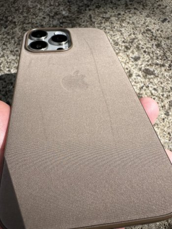
The FineWoven fits really well, and is thinner than the silicone. But you can see the marks left by light pressure, so it’s definitely going back. Next time they go on sale I may pick one up only because of the fit, but I don’t think they’re worth $60.
Meanwhile the Clay silicone case looks amazing and will do for now. Mujjo leather coming on Monday.
Meanwhile the Clay silicone case looks amazing and will do for now. Mujjo leather coming on Monday.
Attachments
oooh I quite like the look of the Ghost there.Here is another video showing a dbrand Ghost but with one of their skins applied on the iPhone
I got this case in gray:Has anyone gotten one of the frosty back/magsafe ring visible hybrid style cases with a Pro where the Apple logo is centered inside the ring? I got 3 from 3 sellers; overall really like them - but all are off (logo is a lot higher in the circle) Yes this is ridiculous to care about but I know you all get it
Pic below is this one stock (even) and real (too high):
Also got red from this seller, same thing:

Meifigno Magic Mag Series Designed for iPhone 15 Pro Case, [Military Grade Protection & MagSafe Compatible], Translucent Matte Back with Aluminum Alloy Keys Designed for iPhone 15 Pro 6.1", Burgundy
Case designed for iPhone 15 Pro 6.1inch 2023www.amazon.com
And Jtech, again same thing:

JETech Magnetic Case for iPhone 15 Pro 6.1-Inch Compatible with MagSafe, Translucent Matte Back Slim Shockproof Phone Cover (Dark Green)
JETech Magnetic Case Compatible with MagSafe, Translucent Matte Back Slim Shockproof Phone Coverwww.amazon.com

Aulofe Strong Magnetic for iPhone 15 Pro Max Case, [Compatible with MagSafe] [Military-Grade Drop Tested] Shockproof Protective Slim Translucent Matte Cover for iPhone 15 Pro Max Phone Case, Gray
Only for iPhone 15 Pro Max 6.7inch
www.amazon.com
My 15PM's Apple logo is centerered on the Magsafe ring. The back is a frosted / matte transparent.
As an Amazon Associate, MacRumors earns a commission from qualifying purchases made through links in this post.
Yeah I think it's just not centered on the proI got this case in gray:

Aulofe Strong Magnetic for iPhone 15 Pro Max Case, [Compatible with MagSafe] [Military-Grade Drop Tested] Shockproof Protective Slim Translucent Matte Cover for iPhone 15 Pro Max Phone Case, Gray
Only for iPhone 15 Pro Max 6.7inchwww.amazon.com
My 15PM's Apple logo is centerered on the Magsafe ring. The back is a frosted / matte transparent.
As an Amazon Associate, MacRumors earns a commission from qualifying purchases made through links in this post.
Given that titanium models seem to be more fragile, the case choice is more important this year, but the clear Dbrand case is a little ugly. The purpose of the clear case is, um, clear, I want to see my phone, not the thick black lines all over the case.Here is another video showing a dbrand Ghost but with one of their skins applied on the iPhone
When I got this batch of cases, I didn't even think to check if the Apple logo is centered in that Magsafe ring that's visible in many of the cases. Don't worry about it this little cosmetic thing.Yeah I think it's just not centered on the proAfter 3 of 3 were off, I think it just may be how it is. I tried 8 cases and liked these the best so far - just wish they were a LITTLE more grippy on the sides.
These first iPhone 15 Pro Max Caudabe Sheath lots missed the mark this year.
The speaker cutouts are off.
I’ll obviously get the free replacement case with the action button but disappointed with this initial one.
That's weird. I have two Sheaths on me right now (one on my wife's phone) and the speaker cutouts are fine on both. iPhone speakers sound great. I wonder if you just got a dud? Mine is pretty much perfect in all other aspects too. High quality from Caudabe as usual.
Any pics of the sheath?That's weird. I have two Sheaths on me right now (one on my wife's phone) and the speaker cutouts are fine on both. iPhone speakers sound great. I wonder if you just got a dud? Mine is pretty much perfect in all other aspects too. High quality from Caudabe as usual.
I noticed the same thing. I will definitely keep using the case and request the replacement when it’s ready to be sent out.
That's funny because I had the same thought. I have the Caudabe Sheath on mine with the cutout and I have no issues at all. I'll still probably request the action button one when it's available just to compare, but I'm totally fine with this. The way they designed the cutout makes the button access easy.
Register on MacRumors! This sidebar will go away, and you'll see fewer ads.


