Become a MacRumors Supporter for $50/year with no ads, ability to filter front page stories, and private forums.
iPad Pro Why I Went for the 13" M4 iPad Pro vs the 11" M4 iPad Pro
- Thread starter Kahnforever
- Start date
- Sort by reaction score
You are using an out of date browser. It may not display this or other websites correctly.
You should upgrade or use an alternative browser.
You should upgrade or use an alternative browser.
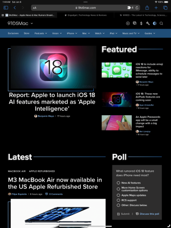
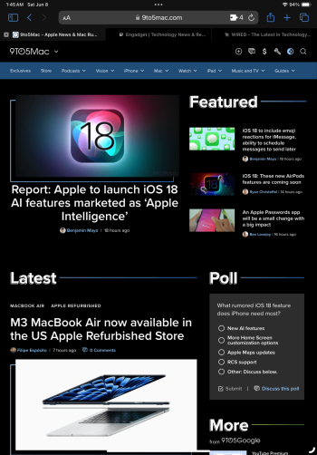
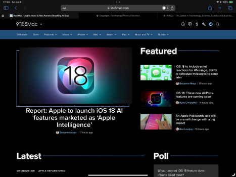
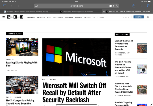
No doubt the bigger iPad provides more readable web content, but the 11" isn't bad and as was mentioned, on most sites, at 85% zoom on the 11", it's basically the same amount of content, just smaller. Attached are some screenshots from an 11" (M1) and 12.9" (M1). If you don't want to look at the filenames to figure it out, the 11" has 94% battery life and the 12.9 has 100% lol.
Edit: Not suggesting that the bigger screen doesn’t offer a better browsing experience, just that the 11” can still work well if you are willing to zoom out a bit.

Edit: Not suggesting that the bigger screen doesn’t offer a better browsing experience, just that the 11” can still work well if you are willing to zoom out a bit.
Attachments
Last edited:
How about on 100% zoom? I feel like that's actually more relevant, since most users will want to use it on 100% zoom. Of course the 11" will show more content when zoomed out. But then again, the 13" will also show more content when you set it to 85% zoom as well.No doubt the bigger iPad provides more readable web content, but the 11" isn't bad and as was mentioned, on most sites, at 85% zoom on the 11", it's basically the same amount of content, just smaller. Attached are some screenshots from an 11" (M1) and 12.9" (M1). If you don't want to look at the filenames to figure it out, the 11" has 94% battery life and the 12.9 has 100% lol.
View attachment 2386181
I'm still considering the switch from 12.9" to 11". But I 'tested' the 11" since with a stage manager window on the 12.9", and while it's fine, I do notice that quite a lot of websites render in their mobile view, especially when held handheld. The downside to that is that content is suddenly ridiculously large as it's being stretched as if it's a phone screen. On quite a few websites with news articles for instance, on the 12.9" it just shows as a desktop site, often with 3 rows of 3 articles. Whereas on the 11" (in stage manager) it just shows as a scrolling list and often only fits 2 and a half articles on the screen, vertically. So that's 2 and a half articles on 11" vs 9 in columns on the iPad Pro 12.9". That's quite a large difference!
How about on 100% zoom? I feel like that's actually more relevant, since most users will want to use it on 100% zoom. Of course the 11" will show more content when zoomed out. But then again, the 13" will also show more content when you set it to 85% zoom as well.
I'm still considering the switch from 12.9" to 11". But I 'tested' the 11" since with a stage manager window on the 12.9", and while it's fine, I do notice that quite a lot of websites render in their mobile view, especially when held handheld. The downside to that is that content is suddenly ridiculously large as it's being stretched as if it's a phone screen. On quite a few websites with news articles for instance, on the 12.9" it just shows as a desktop site, often with 3 rows of 3 articles. Whereas on the 11" (in stage manager) it just shows as a scrolling list and often only fits 2 and a half articles on the screen, vertically. So that's 2 and a half articles on 11" vs 9 in columns on the iPad Pro 12.9". That's quite a large difference!
As in your testing, at 100% zoom many websites do provide a mobile experience that isn’t ideal on a tablet sized screen. This is more common in portrait mode. I wasn’t suggesting that the larger screen isn’t better for browsing, just that one can still gave a good web browsing experience on the 11” If they are willing to zoom out a bit.
Not that it matters, but this is the fault of web developers who seem to have forgotten that tablets exist. In 2024 everything is mobile first, then desktop, and then tablet if they happen to have some spare time lol. As such, phones, laptops, and laptop-sized tablets are the best way to browse the web these days.
Thanks for this. I tried the 11 several times and making things smaller doesn’t work for me. Things just end up too small for my liking. I get it may work for some others and I’m not saying the 11” is bad.No doubt the bigger iPad provides more readable web content, but the 11" isn't bad and as was mentioned, on most sites, at 85% zoom on the 11", it's basically the same amount of content, just smaller. Attached are some screenshots from an 11" (M1) and 12.9" (M1). If you don't want to look at the filenames to figure it out, the 11" has 94% battery life and the 12.9 has 100% lol.
Edit: Not suggesting that the bigger screen doesn’t offer a better browsing experience, just that the 11” can still work well if you are willing to zoom out a bit.
View attachment 2386181
My experience as well.How about on 100% zoom? I feel like that's actually more relevant, since most users will want to use it on 100% zoom. Of course the 11" will show more content when zoomed out. But then again, the 13" will also show more content when you set it to 85% zoom as well.
I'm still considering the switch from 12.9" to 11". But I 'tested' the 11" since with a stage manager window on the 12.9", and while it's fine, I do notice that quite a lot of websites render in their mobile view, especially when held handheld. The downside to that is that content is suddenly ridiculously large as it's being stretched as if it's a phone screen. On quite a few websites with news articles for instance, on the 12.9" it just shows as a desktop site, often with 3 rows of 3 articles. Whereas on the 11" (in stage manager) it just shows as a scrolling list and often only fits 2 and a half articles on the screen, vertically. So that's 2 and a half articles on 11" vs 9 in columns on the iPad Pro 12.9". That's quite a large difference!
Thanks for sharing your findings! I think this is very useful informations for people who are considering a switch, or on the fence about the size. For some people using 85% zoom might be a good workaround.As in your testing, at 100% zoom many websites do provide a mobile experience that isn’t ideal on a tablet sized screen. This is more common in portrait mode. I wasn’t suggesting that the larger screen isn’t better for browsing, just that one can still gave a good web browsing experience on the 11” If they are willing to zoom out a bit.
Not that it matters, but this is the fault of web developers who seem to have forgotten that tablets exist. In 2024 everything is mobile first, then desktop, and then tablet if they happen to have some spare time lol. As such, phones, laptops, and laptop-sized tablets are the best way to browse the web these days.
So you’re saying if you use 85% zoom for certain websites it’ll switch to the desktop layout, instead of being stuck on the mobile one?
I do feel like my 12.9” is a wonderful size for browsing websites. The extra space is definitely very nice for browsing. For actually reading long form articles though, it’s a bit large. The 13” might be better for that with the reduced thickness and weight. But the 11” will probably always be better for actual reading.
Yes. It works for me, but I can definitely see the concern about small text. I guess if one wants to see the same amount of content on a smaller screen it’s all there is. I wouldn’t anticipate web development budgets to include proper tablet support again.So you’re saying if you use 85% zoom for certain websites it’ll switch to the desktop layout, instead of being stuck on the mobile one?
I ended up with both sizes from the M1 generation because I couldn’t decide which one to return. A few years later and I can’t say I’m any closer to making that decision lol.
The two main deciding factors for me in choosing the 13” were how thin and light the 13” has become and how content looks on the 13” vs 11”.Yes. It works for me, but I can definitely see the concern about small text. I guess if one wants to see the same amount of content on a smaller screen it’s all there is. I wouldn’t anticipate web development budgets to include proper tablet support again.
I ended up with both sizes from the M1 generation because I couldn’t decide which one to return. A few years later and I can’t say I’m any closer to making that decision lol.
Let me stress that I really like the 11”. I wish my iPad was 11” in certain situations like laying in bed or using it in tablet mode in varying conditions. The 13” is big so using it as a tablet can be awkward at times.
Aside from the form factor, the 11” compromises on the content. Sure, things look good, but in many scenarios it’s compromised. Like Stage Manager… everything is scaled down small and trying to multi-task like that on something as small as the 11” isn’t great. It works, and does it well, but not like the 13”. Same with content on the web. I don’t want to have to fiddle with text size settings and other settings which just makes everything smaller.
I tried the More Space setting in iPadOS on the 11” and hated it. Everything just scales down too small.
Ultimately the 13” won out but I can see an option of some people having both a 13” and an 11”.
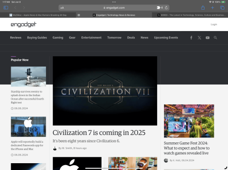
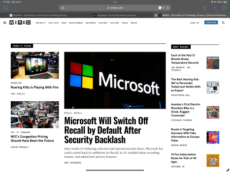
You’re not actually comparing the two. Quite often, for example with Verge, there’s fewer ads on the 11” because of the responsive web design. No one is mentioning ads at all!It seems a lot of people haven’t used the 11. Try nytimes, Behance, MacDailyNews, 9to5Mac, Adobe, The Verge, Engadget, state of california, microsoft, dell, variety, rolling stone, and wired.
Compare each on the 11 vs the 13. Doesn’t matter that it may not always be full mobile on the 11. The 13 is pretty much always full desktop and the 11 has content adjust to more mobile views. I find it annoying.
you’re not getting a mobile version of the site. It’s simply shifting stuff around, mostly stuff that isn’t important such as side tiles.
I don’t have an issue with ads because I have applications that block them.You’re not actually comparing the two. Quite often, for example with Verge, there’s fewer ads on the 11” because of the responsive web design. No one is mentioning ads at all!
you’re not getting a mobile version of the site. It’s simply shifting stuff around, mostly stuff that isn’t important such as side tiles.
Yes, they are mobile versions. I mentioned already not always the smartphone breakpoint but a mobile version that is a tablet breakpoint. I much prefer the full desktop versions which is what the 13” serves.
It's way too expensive to have both the 13" and 11" M4. Maybe if one can get the 11" M1 on the cheap.The two main deciding factors for me in choosing the 13” were how thin and light the 13” has become and how content looks on the 13” vs 11”.
Let me stress that I really like the 11”. I wish my iPad was 11” in certain situations like laying in bed or using it in tablet mode in varying conditions. The 13” is big so using it as a tablet can be awkward at times.
Aside from the form factor, the 11” compromises on the content. Sure, things look good, but in many scenarios it’s compromised. Like Stage Manager… everything is scaled down small and trying to multi-task like that on something as small as the 11” isn’t great. It works, and does it well, but not like the 13”. Same with content on the web. I don’t want to have to fiddle with text size settings and other settings which just makes everything smaller.
I tried the More Space setting in iPadOS on the 11” and hated it. Everything just scales down too small.
Ultimately the 13” won out but I can see an option of some people having both a 13” and an 11”.
I think it’s kind of insane to own both. I would much rather have one. I was going to sell them both and get a single M4 iPad, but got stuck again trying to figure out which to buy.
In general, web developers and app developers don’t care much about tablets because they represent a small percentage of users. Somehow tablets end up being too big and too small at the same time. 🤷♂️
In general, web developers and app developers don’t care much about tablets because they represent a small percentage of users. Somehow tablets end up being too big and too small at the same time. 🤷♂️
I just tried every single website you listed on my 11" iPad Pro and compared it to my MBP, and they look exactly the same....all desktop version.It seems a lot of people haven’t used the 11. Try nytimes, Behance, MacDailyNews, 9to5Mac, Adobe, The Verge, Engadget, state of california, microsoft, dell, variety, rolling stone, and wired.
Compare each on the 11 vs the 13. Doesn’t matter that it may not always be full mobile on the 11. The 13 is pretty much always full desktop and the 11 has content adjust to more mobile views. I find it annoying.
I see where you're coming from but saying "mobile versions" seems antiquated. Let's clear up some stuff: 1) Both the 11" and 13" iPads serve up the full desktop versions of websites; 2) Almost all websites display content layout dynamically based on browser window size. That is, the layout will change in real-time as you resize a window or even turn a tablet from landscape to portrait. Whether on a 16" MacBook or a 13" iPP or an 11" iPP, the content will display exactly the same as you resize the browser window. The user can also change layout by using their browser's zoom control.I don’t have an issue with ads because I have applications that block them.
Yes, they are mobile versions. I mentioned already not always the smartphone breakpoint but a mobile version that is a tablet breakpoint. I much prefer the full desktop versions which is what the 13” serves.
I get it though - there are users who take what's served up as the default/definitive and don't want to bother with resizing their screen or changing their zoom. For others, it's necessary - on my 16" MacBook or even 24" monitor, I never run my browser full-screen to get the "desktop version".
That's a little disingenuous, websites absolutely do not always show the same information on devices of every size, let alone 11" vs 13" iPad.I see where you're coming from but saying "mobile versions" seems antiquated. Let's clear up some stuff: 1) Both the 11" and 13" iPads serve up the full desktop versions of websites; 2) Almost all websites display content layout dynamically based on browser window size. That is, the layout will change in real-time as you resize a window or even turn a tablet from landscape to portrait. Whether on a 16" MacBook or a 13" iPP or an 11" iPP, the content will display exactly the same as you resize the browser window. The user can also change layout by using their browser's zoom control.
I get it though - there are users who take what's served up as the default/definitive and don't want to bother with resizing their screen or changing their zoom. For others, it's necessary - on my 16" MacBook or even 24" monitor, I never run my browser full-screen to get the "desktop version".
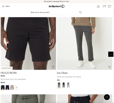
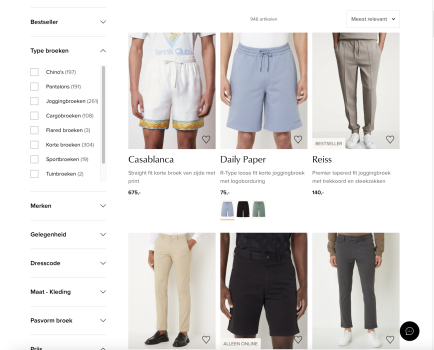
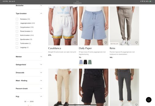
Here's an example of a dutch clothing store, where on the 11" it goes to a mobile-optimised view which only shows two pieces of clothing, compared to a 13" view which shows up to 6 pieces of clothing AND a side bar for filtering on the side.
Note: these screenshots are simulated on my Mac in Safari, but I know this is how the website looks on an 11" and 13" iPad respectively, because I tested it in the store myself. This is approximately how they compare. On this specific website.
Tested in portrait mode, the results might be different in landscape, but I'm not sure about that. Either way I always browse the web in portrait, so landscape results would be irrelevant for me personally.
For those with 11/13" iPads that want to test it for themselves, this is the site: https://www.debijenkorf.nl/herenmode/broeken
Attachments
Here's a screenshot from my 11" Pro.That's a little disingenuous, websites absolutely do not always show the same information on devices of every size, let alone 11" vs 13" iPad.
Here's an example of a dutch clothing store, where on the 11" it goes to a mobile-optimised view which only shows two pieces of clothing, compared to a 13" view which shows up to 6 pieces of clothing AND a side bar for filtering on the side.
Note: these screenshots are simulated on my Mac in Safari, but I know this is how the website looks on an 11" and 13" iPad respectively, because I tested it in the store myself. This is approximately how they compare. On this specific website.
Tested in portrait mode, the results might be different in landscape, but I'm not sure about that. Either way I always browse the web in portrait, so landscape results would be irrelevant for me personally.
For those with 11/13" iPads that want to test it for themselves, this is the site: https://www.debijenkorf.nl/herenmode/broeken
Attachments
Solution to this is use more spaceSome Websites including this one on 115% moves side to side with your finger on the 13” , have to change back to 100% to stop it, and is too small, not happening on the 11”.
I‘ts annoying.
This is what I said earlier. I prefer the 11” for the larger preview tiles on shopping / clothing websites.That's a little disingenuous, websites absolutely do not always show the same information on devices of every size, let alone 11" vs 13" iPad.
Here's an example of a dutch clothing store, where on the 11" it goes to a mobile-optimised view which only shows two pieces of clothing, compared to a 13" view which shows up to 6 pieces of clothing AND a side bar for filtering on the side.
Note: these screenshots are simulated on my Mac in Safari, but I know this is how the website looks on an 11" and 13" iPad respectively, because I tested it in the store myself. This is approximately how they compare. On this specific website.
Tested in portrait mode, the results might be different in landscape, but I'm not sure about that. Either way I always browse the web in portrait, so landscape results would be irrelevant for me personally.
For those with 11/13" iPads that want to test it for themselves, this is the site: https://www.debijenkorf.nl/herenmode/broeken
Call me mad but I prefer browsing down the previews and seeing bigger images on the 11”. I’d have to constantly zoom in on the 13”.
Hmm, disingenuous how? Your website perfectly demonstrates what I posted. On the 11”, in portrait view, change Safari’s zoom level and you get the same view you describe on the 13”. View this same site on an iMac and narrow the window and it will switch to the two-product view.That's a little disingenuous, websites absolutely do not always show the same information on devices of every size, let alone 11" vs 13" iPad.
Here's an example of a dutch clothing store, where on the 11" it goes to a mobile-optimised view which only shows two pieces of clothing, compared to a 13" view which shows up to 6 pieces of clothing AND a side bar for filtering on the side.
Note: these screenshots are simulated on my Mac in Safari, but I know this is how the website looks on an 11" and 13" iPad respectively, because I tested it in the store myself. This is approximately how they compare. On this specific website.
Tested in portrait mode, the results might be different in landscape, but I'm not sure about that. Either way I always browse the web in portrait, so landscape results would be irrelevant for me personally.
For those with 11/13" iPads that want to test it for themselves, this is the site: https://www.debijenkorf.nl/herenmode/broeken
Did you have both M4 or previous have 12.9”?This is what I said earlier. I prefer the 11” for the larger preview tiles on shopping / clothing websites.
Call me mad but I prefer browsing down the previews and seeing bigger images on the 11”. I’d have to constantly zoom in on the 13”.
Register on MacRumors! This sidebar will go away, and you'll see fewer ads.


