Become a MacRumors Supporter for $50/year with no ads, ability to filter front page stories, and private forums.
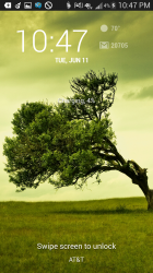
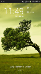
IMO, the Google lock screen is better. Observe the contrasts that make for easy readability.

I wouldn't think that trying to read thin, white colors on a light blue background in the sun would be a pleasant experience.

I disagree, the Samsung screen has a lot of issues:

-the text is in all capitals for no reason in the Google version, that's harder to read.
-the text is too small, again, harder to read.
-the 12 is in bold for little purpose, there's a reason most clocks aren't like this in real life.
-there's not enough white space in the black bar around objects, why scrunch them so tight.
-the clock appears twice, duplicating info, which is pointless.
-they shorten the name of the day when they could easily fit in the whole word, what for???
-the signal indicator is difficult to read.
-the battery is vertically placed when it makes more sense for it to be horizontal given the real estate in the black bar.
-the bluetooth icon is not really necessary.
-the natural location for the eye to first hit is the top left hand corner, where there is conveniently no information at all.
-the background graphic is uglier.
-the number spacing isn't attractive.

etc etc
 
I don't think anyone would give a rip about who is copying who is Apple wasn't so ridiculous with their lawsuits in recents months/years. So they realized people actually want and use some of the great features Android has to offer. I think iOS users are better off for it. I could care less that Android did it first.
 
Sure, look at this.


Now maybe there are some similarities, but, honestly, which looks better? Which do you end up gravitating towards at the end of the day? Apple's implementation is superior. Better use of fonts, color, composition, you name it.

I think Google are really second rate at this sort of thing, even Microsoft is better than them tbh.


Ah, you're just making a parody of a blind fanboy (of any company, all of them are equal)

----------

And regarding the thread, no, I don't think Apple is copying Android
 
Sure, look at this.

Image

Now maybe there are some similarities, but, honestly, which looks better? Which do you end up gravitating towards at the end of the day? Apple's implementation is superior. Better use of fonts, color, composition, you name it.

I think Google are really second rate at this sort of thing, even Microsoft is better than them tbh.

The iphone lock screen looks like a condom rolled down over the iphone. Why does it have to be so white and slightly opaque?
 
Sure, look at this.

Image

Now maybe there are some similarities, but, honestly, which looks better? Which do you end up gravitating towards at the end of the day? Apple's implementation is superior. Better use of fonts, color, composition, you name it.

I think Google are really second rate at this sort of thing, even Microsoft is better than them tbh.

Apple switching to balls should be a hoot.

"This sucks...I only have one ball"
 
I don't think Apple is copying Android. I think they are copying My Little Pony theme though. And since you can't change the icons at all, this is what you are stuck with. Like a guy driving a soccer mom's minivan. Sad.

As someone living on the East coast, I can safely say that all the rainbow colors are indicative of someone designing from the Left ... err Happy... err West... Coast.

You sure wouldn't see this namby-pamby stuff come out of a design bureau in Brooklyn. Fugetaboutit !

:D
 
Everybody steals from each other. I honestly don't care one bit. The consumer wins in the end.

It's amazing how much these new stock icons are bothering people commenting online. It's such a minor thing if you think about it. It's a damn icon.

IMO most of the changes in iOS 7 are great changes.

I also think the default wallpaper was a mistake. It's a minor mistake but the icons look much better with a darker wallpaper.

Apple will change the icons roughly every 5 years. They need to. It was overdue and a visual refresh is good for everybody.
 

Attachments

  • 9012383735_c91c38c0a6_b.jpg
    9012383735_c91c38c0a6_b.jpg
    173.3 KB · Views: 119
Sure, look at this.

Image

Now maybe there are some similarities, but, honestly, which looks better? Which do you end up gravitating towards at the end of the day? Apple's implementation is superior. Better use of fonts, color, composition, you name it.

I think Google are really second rate at this sort of thing, even Microsoft is better than them tbh.

The only thing that jumps out at me is the contrast. The Android lock screen has better contrast. Other than that, they are pretty much the same to me.
 
Not a huge iOS fan but what's funny is that most people complain that iOS is dated and not as mature as android (like myself) but now that they're catching up, you get a thread like this.

Who cares that they're copying, just be grateful that they're finally bringing iOS up to snuff where it's supposed to be.

So it seems to me that the majority of those supporting Apple and iOS7 now find it acceptable to "steal" the look and feel of another OS, because Apple is the one doing the blatant ripoff. Yet, when another company does the exact same sort of thing, they are scum and should be sued.
I don't care if Apple steals ideas and implements their copy into iOS, because it is beneficial to all consumers. It's the double standard of the extreme Apple fan and Apple itself, that smells like pure bullsh#+.

----------

Sure, look at this.

Image

Now maybe there are some similarities, but, honestly, which looks better? Which do you end up gravitating towards at the end of the day? Apple's implementation is superior. Better use of fonts, color, composition, you name it.

I think Google are really second rate at this sort of thing, even Microsoft is better than them tbh.

I don't agree with your sentiment, as the Apple version is to washed out and very feminine in appearance. However, it should be known that the Android lock screen shown in that image is not stock. That is a cyanogen mod lock screen. Looks more like Apple stole from CM 10.1, than Google in this case, so no foul on Apple's part here. CM10 is free open code.
 
A copied B, C copied D, B copied D, C copied A, etc.


Get over it. At the end of the day I wish my Super Phone have...

Android's Customization
Replaceable Battery & microSD Support
hTc's One Design & Built
Apple's iTunes & Apps
BlackBerry's BB10, Swipe & Keyboard


Window's...I don't know I want from them. LOL

I really don't get why one is so invested to ONE company...fanboy!
 
If Apple didn't sue everyone else with its ridiculous design lawsuits (i.e. lock screen, rectangle shape, search, icon shape), then iOS7 may be more acceptable. Apple is such an arrogant hypocrite (and a bully) as it stands. So it is very OKAY to arrogantly say that Apple is a thief.

Apple should be very ashamed for copying the Android/Holo/WP metro UI design. We shouldn't forget this or let Apple off the hook that easily for copying. The bigger the backlash the better and send a message to Apple to think twice before suing others based on ridiculous design patents. I think iOS fans should feel ashamed too if they say iOS7 didnt have any elements that were a blatant copy from others.
 
They copy and call it innovation. iOS looks nice, but I couldn't help bit laugh when they introduce features that have been available with the little robot for years.

Seriously, what did Apple introduce yesterday that Android has had for years? I've had a number of different Android devices over the past year, and I can tell you, the Android OS isn't nearly as fluid as iOS. Only vanilla Android comes close, and as of this writing, it is only available on the Nexus 4.
 
Seriously, what did Apple introduce yesterday that Android has had for years? I've had a number of different Android devices over the past year, and I can tell you, the Android OS isn't nearly as fluid as iOS. Only vanilla Android comes close, and as of this writing, it is only available on the Nexus 4.

How many "years"?

Honeycomb has had app preview multitasking since it was released. Same with a control center type of control. Same with a live wallpaper that moves with the gyroscopes.

Btw vanilla Android is available on the N7 and N10. The N10 is very fluid.

Granted most of what I mentioned was on tablets but it was still "On Android for years".
 
Sure, look at this.

Image

Now maybe there are some similarities, but, honestly, which looks better? Which do you end up gravitating towards at the end of the day? Apple's implementation is superior. Better use of fonts, color, composition, you name it.

I think Google are really second rate at this sort of thing, even Microsoft is better than them tbh.

All I see is pastel colors. Can barely see the font.

With the android, if the font is what you like on iOS, just make use of that font on the Android.
 

Attachments

  • Screenshot_2013-06-11-22-47-12.png
    Screenshot_2013-06-11-22-47-12.png
    2.9 MB · Views: 184
Last edited:
I disagree, the Samsung screen has a lot of issues:

-the text is in all capitals for no reason in the Google version, that's harder to read.
-the text is too small, again, harder to read.
-the 12 is in bold for little purpose, there's a reason most clocks aren't like this in real life.
-there's not enough white space in the black bar around objects, why scrunch them so tight.
-the clock appears twice, duplicating info, which is pointless.
-they shorten the name of the day when they could easily fit in the whole word, what for???
-the signal indicator is difficult to read.
-the battery is vertically placed when it makes more sense for it to be horizontal given the real estate in the black bar.
-the bluetooth icon is not really necessary.
-the natural location for the eye to first hit is the top left hand corner, where there is conveniently no information at all.
-the background graphic is uglier.
-the number spacing isn't attractive.

etc etc

I guess you're not familiar with Android.:(

Everything you stated can be changed to look however you'd like.
 
If Apple didn't sue everyone else with its ridiculous design lawsuits (i.e. lock screen, rectangle shape, search, icon shape), then iOS7 may be more acceptable. Apple is such an arrogant hypocrite (and a bully) as it stands. So it is very OKAY to arrogantly say that Apple is a thief.

Yup.

The classic apple double standard.
 
Last edited:
How many "years"?

Honeycomb has had app preview multitasking since it was released. Same with a control center type of control. Same with a live wallpaper that moves with the gyroscopes.

Btw vanilla Android is available on the N7 and N10. The N10 is very fluid.

Granted most of what I mentioned was on tablets but it was still "On Android for years".

The tablet experience is way different than the phone experience. I'm not saying Android hasn't innovated in many areas. However it would be unfair to say that Apple copied everything in iOS 7 from Android. Competition makes both companies better innovators, and in the end we all benefit.
 
Can I get a couple more icons in that top bar?

It's not busy enough for my needs.

:)

Those are my notifications that I haven't looked at. Once you open it and swipe them away, they are gone. I have setup my homescreen so that notification pane i gone completely.
 

Attachments

  • Screenshot_2013-06-11-23-49-24.png
    Screenshot_2013-06-11-23-49-24.png
    2.9 MB · Views: 145
  • Screenshot_2013-06-11-23-54-07.png
    Screenshot_2013-06-11-23-54-07.png
    1.5 MB · Views: 143
You're point is that both have the date/time and a "unlock" option on the home screen?

Oh ya, and that similar wallpaper - man Apple, what a copycat......

Jesus, these threads are going to drive me off MRs.....

As usual you completely miss the point. If Apple had done this first they would have sued whoever was "inspired" by them.

Samsung got their arse handed to them because Apple seems to think they invented the rectangle.

The problem people have with Apple is not that they are copying or they are inspired by another's design - the outrage stems from the fact that they are complete and utter hypocrites.

----------

Only vanilla Android comes close, and as of this writing, it is only available on the Nexus 4.

What a total fail.

----------

However, it should be known that the Android lock screen shown in that image is not stock. That is a cyanogen mod lock screen. Looks more like Apple stole from CM 10.1, than Google in this case, so no foul on Apple's part here. CM10 is free open code.

1. Android AOSP code on which CM10 is based is the license which applies.

2. Just because something is open source doesn't mean design elements don't have restrictions on re-use. It's only the code (i.e. that particular implementation) which is open. Google has and does patent design elements of Android even though the source is open.

I would suggest that Google has been very relaxed with regards to Apple's blatant copying in the last few releases of iOS but if they keep it up, they will awaken a sleeping giant and find themselves in legal battle with a company who will be in an extremely strong position in terms of litigation. It almost feels like Google is giving Apple enough rope to hang themselves with.
 
As usual you completely miss the point. If Apple had done this first they would have sued whoever was "inspired" by them.

Samsung got their arse handed to them because Apple seems to think they invented the rectangle.

The problem people have with Apple is not that they are copying or they are inspired by another's design - the outrage stems from the fact that they are complete and utter hypocrites.

----------


What a total fail.

----------


1. Android AOSP code on which CM10 is based is the license which applies.

2. Just because something is open source doesn't mean design elements don't have restrictions on re-use. It's only the code (i.e. that particular implementation) which is open. Google has and does patent design elements of Android even though the source is open.

I would suggest that Google has been very relaxed with regards to Apple's blatant copying in the last few releases of iOS but if they keep it up, they will awaken a sleeping giant and find themselves in legal battle with a company who will be in an extremely strong position in terms of litigation. It almost feels like Google is giving Apple enough rope to hang themselves with.

Maybe.

But it does seem like Google genuinely doesn't care to sue. They're chill like that. Or you could be right. What do I know.

If the tables were turned however it'd be far easier to predict would apple would do.
 
I would suggest that Google has been very relaxed with regards to Apple's blatant copying in the last few releases of iOS but if they keep it up, they will awaken a sleeping giant and find themselves in legal battle with a company who will be in an extremely strong position in terms of litigation. It almost feels like Google is giving Apple enough rope to hang themselves with.

Google makes way too much money from iOS devices to do that. If they took Apple on like that themselves, say hello to Bing as the default iOS search engine.
 
I would suggest that Google has been very relaxed with regards to Apple's blatant copying in the last few releases of iOS but if they keep it up, they will awaken a sleeping giant and find themselves in legal battle with a company who will be in an extremely strong position in terms of litigation. It almost feels like Google is giving Apple enough rope to hang themselves with.

To an extent I agree. But the knock-out punch for Google will be Notification Center, assuming the USPTO ever decides to give it approval. It's only been 5 years since Google applied for that patent. :rolleyes: Makes you wonder why it is taking so long, yet Apple gets rounded corners patented in 45 days? *exaggerated for effect*
The kicker is, Apple stole it for iOS5, and not only used it for iOS, but also OSX. And it is very obvious that they ripped it off from Google's patent application. Can you imagine the damage amount, Google could sue for? Hundreds of millions of iPhones, iPads, iPods and Macs using a stolen patent and have gotten away with it, because the USPTO is stalling on Google's patent.

----------

Google makes way too much money from iOS devices to do that. If they took Apple on like that themselves, say hello to Bing as the default iOS search engine.

Apparently, you missed the latest Key Note.

WWDC '13: Apple quietly highlights Bing (not Google) in iOS 7 update

http://www.zdnet.com/wwdc-13-apple-quietly-highlights-bing-not-google-in-ios-7-update-7000016617/
 
Last edited:
Register on MacRumors! This sidebar will go away, and you'll see fewer ads.