Become a MacRumors Supporter for $50/year with no ads, ability to filter front page stories, and private forums.

zbarvian

macrumors 68010
Jul 23, 2011
2,004
2
By nothing we haven't seen before, do you mean "exist in some form on Android or another platform?"

My response is, so what? I'm not concerned about what an Android has. I'm concerned about my iPhone has. I'd prefer to utilize things within iOS versus Android. Not an apples to apples comparison for me.

As for the design - ok, I get you feel that way. I don't feel the same way. Apple's going to piss people off no matter what. All the cries of stale and boring before, now they change it and some people hate it.

Oh well. As I've said, there are plenty of good options out there. HTC One and Sense 5 really are superb.

EDIT: Actually I wanna go into this a little bit more......so you're telling me that none of the below make you happy or excited?

(1) Intelligent multitasking - apps learning your patterns and updating based on when you use them. Not to mention multitasking opened up to all apps and with no hit to the battery (claimed - one that given Apple's bent on efficiency I'd tend to believe).

(2) Control Center - quick toggles, flashlight, available from anywhere?

(3) AirDrop

(4) REALLY shared photo streams

(5) Additional sharing options

(6) more organized settings app

(7) Spotlight available from any home screen (frees up that left swipe from the main home screen for something else perhaps?)

(8) Siri improvements - better voice, control over system functions, more responsive

(9) APIs for all these things for devs - maps, gestures, gaming, Siri, sharing etc...

(10) Infinitely better weather

Those are the things I could think of from the WWDC announcement.....which is only a fraction of the actual features in iOS 7.

I find it hilarious that people are ignoring all of this because of some ugly (subjective) app icons. I actually like the transparency and I think it makes for some neat effects (like the Parallax and also a more dynamic themeing). I'm not saying I need all these things - I don't, but I'm certainly not going to bash Apple for implementing them and some of them I'll highly praise them for.

Yes, these features are great. But whereas I see Google as forward-thinking and innovative, none of these features really strike me the same way. I don't know, Siri and Notification Center seem like a poor attempt at Google Now, the new design screams amateur, the UI is now becoming MORE complex when it could become simpler, and I guess I'm just flummoxed by Apple now. This is not at all what I was expecting or hoping for, and in my eyes it's several steps forward, several steps backward. I get a terrible sense of déjà vu when I look at iOS 7. Apple, to me, is supposed to specialize in design and execution, and they've failed. I'm nowhere near able to switch platforms, so I don't have a choice but to wait for the GM and pray for major polishing. But I'm growing less and less optimistic about Apple's future for the time being.
 

jrswizzle

macrumors 603
Aug 23, 2012
6,107
129
McKinney, TX
Yes, these features are great. But whereas I see Google as forward-thinking and innovative, none of these features really strike me the same way. I don't know, Siri and Notification Center seem like a poor attempt at Google Now, the new design screams amateur, the UI is now becoming MORE complex when it could become simpler, and I guess I'm just flummoxed by Apple now. This is not at all what I was expecting or hoping for, and in my eyes it's several steps forward, several steps backward. I get a terrible sense of déjà vu when I look at iOS 7. Apple, to me, is supposed to specialize in design and execution, and they've failed. I'm nowhere near able to switch platforms, so I don't have a choice but to wait for the GM and pray for major polishing. But I'm growing less and less optimistic about Apple's future for the time being.

What's Google done lately that's forward thinking? Play Games? All-Access? Adding reminders and alarms to Google Now?

And how is the UI more complex? Granted they've added some gestures, but I think thats way forward anyway. Gestures will hopefully replace buttons of any kind.....much like the iPad.

----------

Hm. Boy this sounds awfully familiar. Oh yes, I said the same thing about Samsung. I wonder, where this level of acceptance was for Samsung when they implemented a plethora of things you didn't find useful?

So, if the competition comes up with things that aren't immediately useful or useful to you, they're not really doing anything special. But if Apple comes up with things that you just admitted isn't useful to you, hey, you're not going to bash them for it -- why would anyone do that?! :rolleyes:

I'm certainly not bashing Apple for it. But I don't bash Samsung either.

Ok. Sure. I don't like Samsung and it doesn't have to do with the features they implement.

And I'm not trying to deny there isn't some form of double standard. Though I think the focus here is different. Whereas when we talk about Samsung and the focus is "X number of features, wow Samsung's awesome", for me and iOS, the features really are secondary, hence why I can say "Meh these features aren't necessary but I applaud Apple for implementing them."

I also never said I didn't find them useful. Useful and necessary are not the same. I can get by and do everything I need to do in iOS 6. iOS 7 simply adds other features that add usefulness, but to me aren't exactly necessary. I feel this way because the OS, ecosystem and hardware as a package are what I'm looking at, not a laundry list of features, whereas for Samsung, its all about a long checklist of features that may or may not add to the overall experience.

Two different philosophies at work here leading to two different views. You can call it a double standard if you want, but they don't go about things the same and as such really can't be seen in a direct comparison.
 

TheHateMachine

macrumors 6502a
Sep 18, 2012
846
1,354
I'd beg to differ..

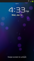
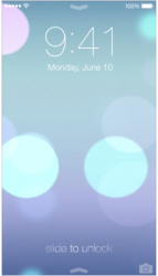
I would say it looks closer to aping Touchwiz than stock. Hell if I had the S4 it would even have the transparent notification bar that the latest Touchwiz released with. Samsung must have planted spies deep within Apple HQ!
 

Attachments

  • Screenshot_2013-06-12-16-33-47.png
    Screenshot_2013-06-12-16-33-47.png
    253.2 KB · Views: 109
  • ape.png
    ape.png
    92.8 KB · Views: 128
Last edited:

onthecouchagain

macrumors 604
Mar 29, 2011
7,382
2
Sure, for all 5 people out there who actually use lock screen orientation and Do Not Disturb. And what the heck is that thing next to the battery.

It's busy, but you're trying hard to make it so. Steve Jobs hated having an icon on the top bar for everything for this very reason, they're unnecessary clutter. The Android ones are far uglier though.

Unnecessary clutter in the status bar? You mean like how the iPhone tells me I'm on Tmobile? As if I need to be reminded of that constantly?

Or how it tells me it's an "ipad" that I'm using when I use my iPad. Very necessary. ;)
 

Irishman

macrumors 68040
Nov 2, 2006
3,449
859
And the design isn't an acquired taste, it's plain horrid.

To you.

----------

Unnecessary clutter in the status bar? You mean like how the iPhone tells me I'm on Tmobile? As if I need to be reminded of that constantly?

Or how it tells me it's an "ipad" that I'm using when I use my iPad. Very necessary. ;)

Well, surely you know why contract phones have the carrier name splashed on the status bar.
 

JoeG4

macrumors 68030
Jan 11, 2002
2,873
539
Actually, they don't. None of my android phones ever showed the carrier in the title bar.

+1 for the touchwiz ripoff. I like iOS 7, but the UI is not new. it doesn't HAVE to be new, I mean, yea.. whatever.
 

Dolorian

macrumors 65816
Apr 25, 2007
1,086
0
So far this doesn't seem to be Google's style, but who knows!

Yeah, I think that Google would not sue Apple over this even if their notification center patent gets approved today. It is really not their style.
 

Irishman

macrumors 68040
Nov 2, 2006
3,449
859
Actually, they don't. None of my android phones ever showed the carrier in the title bar.

+1 for the touchwiz ripoff. I like iOS 7, but the UI is not new. it doesn't HAVE to be new, I mean, yea.. whatever.
How about on the lock screen?
 

mib1800

Suspended
Sep 16, 2012
2,859
1,250
Laughable. And even so - 2013 announcements have shown "copying" on both sides. Google comes up with Play Games (Game Center) - has Apple sued? No. Google adds reminder and alarm functionality to Google Now, which Siri has had. Is Apple suing? No. Google adds developer tools and APIs to compete with the iOS developer environment. Has Apple sued? No.

So forgive me if I think you guys are being a little childish when you complain that Apple is "copying Android's lock screen".

To be quite honest, what has Apple done to you? You don't approve of their legal actions, but as far as I've seen none of these trials have resulted in any vast negative effects for any of the companies involved (Samsung's loss has been re-looked at and they've got a lot of it back). So you don't like Apple, don't buy their stuff.....

There's no reason you have to come here and tell those of us who either don't care or think they're right that we can't like their stuff.

Do you tell people to ignore (and let it be) companies that dump toxic waste because it doesnt affect them? Apple is just a pesky company that make use of the flawed patent system to stifle its competitions (thru lawsuits) while at the same time steal from others. Are you telling people to condone this kind of despicable acts just because they dont affect them directly?

When others don't freely sue Apple doesnt mean that Apple is in the right (or they dont have a case against Apple). Not many companies have the money/resources to be bogged down in legal system. They rather spend those money in something more productive like R&D. Apple spend very little on R&D and they most probably think it is cheaper and easier to steal ideas from others than to invent them. Instead Apple has its multi-billion legal teams sniffing out legal loopholes in justice/patent system to be used against the competitions.

Apple has INITIATED more legal lawsuits than any other companies in the world. So yeah, everyone should stand up and denounce such underhand tactics of Apple.
 

JoeG4

macrumors 68030
Jan 11, 2002
2,873
539
How about on the lock screen?

I'm pretty sure every single possible variant of locking and unlocking with a touchscreen has already been done on Android. It's one of those hot topics that people are always trying to 1-up on. Lol I'm not defending apple here, just telling it like it is.

Now then, if they keep suing other companies for copying them, they're just being moronic hypocrites.
 

Sensamic

macrumors 68040
Mar 26, 2010
3,072
689
The today panel in notification center seems killer a respond to Google now, which shows information for the day. Both show weather, calendar appointments, traffic info, etc.

It's copying but I like having that on iOS too if I ever go back.
 

Oletros

macrumors 603
Jul 27, 2009
6,002
60
Premià de Mar
Two different philosophies at work here leading to two different views. You can call it a double standard if you want, but they don't go about things the same and as such really can't be seen in a direct comparison.

Two different philosophies because you view them as different because your double standard
 

hackjo

macrumors member
Sep 16, 2012
74
0

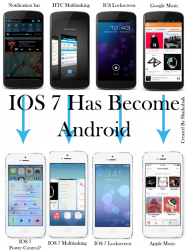
Although there is truth in this, it worries me that someone spent valuable minutes of their life making this collage to prove a point on a forum.

And did Apple describe any of these features as "innovative"? I don't remember them doing that.

----------

Unnecessary clutter in the status bar? You mean like how the iPhone tells me I'm on Tmobile? As if I need to be reminded of that constantly?

Or how it tells me it's an "ipad" that I'm using when I use my iPad. Very necessary. ;)

Indeed! Although I guess it's a little branding touch.
 

daveathall

macrumors 68020
Aug 6, 2010
2,379
1,410
North Yorkshire
How about on the lock screen?

It may be region or carrier specific, I cant remember if my SGS3 showed carrier details in the notification bar. My Galaxy S4 doesn't, however if I have powered down, when restarting the phone it does show a large O2 (My carrier) page on startup, this disappears once the lock screen kicks in. :)


Screenshot_2013-06-13-07-58-55_zps56fb9389.png
 

Irishman

macrumors 68040
Nov 2, 2006
3,449
859
It may be region or carrier specific, I cant remember if my SGS3 showed carrier details in the notification bar. My Galaxy S4 doesn't, however if I have powered down, when restarting the phone it does show a large O2 (My carrier) page on startup, this disappears once the lock screen kicks in. :)


Image

My point was not so much that it's always and only on the menu bar, but that carrier agreements are the reason they get mentioned up front. (whether on the lockscreen that disappears when you swipe it away, or in the menu bar.

It's not Apple that decides you get to see T-Mobile, or whoever your carrier is, plastered on the menu bar or lock screen.

----------

The only point you made was that you hold a double standard. For Android, excessive information in the status bar is ugly clutter. For Apple... : throw hands in the air : hey, it's just carrier agreements (they don't make these agreements with Android, I guess).

"iPad" -- good thing that's there to remind me that I'm using an iPad. :rolleyes: At least the "clutter" of Android's status bar shows pertinent information.

I don't know with whom you're arguing here, but it's not me. I never said that on Android, whatever's in the menu bar is clutter. That was Drunken Master who said that menu bar clutter was far worse on Android.

I was addressing your comment that suggested that Apple alone controls the placement of "T-Mobile" on your iPhone. It's not. It's due to carrier agreements on ALL carrier phones.
 
Last edited:

onthecouchagain

macrumors 604
Mar 29, 2011
7,382
2
My point was not so much that it's always and only on the menu bar, but that carrier agreements are the reason they get mentioned up front. (whether on the lockscreen that disappears when you swipe it away, or in the menu bar.

It's not Apple that decides you get to see T-Mobile, or whoever your carrier is, plastered on the menu bar or lock screen.

----------


I don't know with whom you're arguing here, but it's not me. I never said that on Android, whatever's in the menu bar is clutter. That was Drunken Master who said that menu bar clutter was far worse on Android.

I was addressing your comment that suggested that Apple alone controls the placement of "T-Mobile" on your iPhone. It's not. It's due to carrier agreements on ALL carrier phones.

You're correct. My mistake. I mistook you for having said that because you quoted my original response to Drunken Master. Sorry.
 

Lukkee24

macrumors 6502a
Sep 20, 2011
669
355
London
I'd beg to differ..

The only thing similar is the wallpaper, I don't get your point here? Any user can choose their own wallpaper. If an Android user chooses a wallpaper similar to mine on my iPhone, I wouldn't say 'Android are copying Apple'.
 

cynics

macrumors G4
Jan 8, 2012
11,959
2,156
My point was it's due to carrier agreements.

I'm sure your right. Also keep in mind some Android phones have the carrier printed on the phone itself. Verizon is terrible for this.

I still think "iPad" on an iPad is pretty dumb. Gaudy Apple logo on the back is bad enough. I use cases to cover that.

There is a none jailbreak way to remove carrier logo. I couldn't get it to work though.
 

Irishman

macrumors 68040
Nov 2, 2006
3,449
859
You're correct. My mistake. I mistook you for having said that because you quoted my original response to Drunken Master. Sorry.

No worries. I think the shoe has been on the other foot in the past. :)

----------

I'm sure your right. Also keep in mind some Android phones have the carrier printed on the phone itself. Verizon is terrible for this.

I still think "iPad" on an iPad is pretty dumb. Gaudy Apple logo on the back is bad enough. I use cases to cover that.

There is a none jailbreak way to remove carrier logo. I couldn't get it to work though.

You haven't SEEN a gaudy Apple log til you've seen the old style rainbow colored logos from right about the time Steve came back!
 
Register on MacRumors! This sidebar will go away, and you'll see fewer ads.