Become a MacRumors Supporter for $50/year with no ads, ability to filter front page stories, and private forums.

nickdalzell1

macrumors 68030
Dec 8, 2019
2,787
1,670
I hated the cluttered ribbon. What? Was a menu bar too much for them? It took forever to figure out how to 'select all' from that thing. Now I just click a file, go to three dots, select all.

Windows 10 was just frustration city. It never got fixed. They never figured out that people HATED METRO. I sure did. Also, they never fixed Vista's wifi bug in 10 either. You still had issues with 'unidentified network local access only' which made zero sense. The only solution to that was either live without internet or reinstall the wifi driver only for it to repeat in a couple weeks.

Windows 8 sucked majorly. Windows 10 was trying to be Windows 8 and something else at the same time, to cater to the 6 people who loved Windows 8 and also cater to those who hated it and failed at both. I would have rather they kept 7 forever, but 11 is close for now. I hope it gets better. Windows 10 was bad in 2015 and got no better.

I still can't grasp why people actually prefer 10's start menu over 11's. Heaven forbid they don't bring that mess to 11. I hated live tiles in 8. I hated Windows 10 trying to push 8's tiles interface with Win95's mess of a start menu.
 

exoticSpice

Suspended
Jan 9, 2022
1,242
1,952
I still can't grasp why people actually prefer 10's start menu over 11's. Heaven forbid they don't bring that mess to 11. I hated live tiles in 8. I hated Windows 10 trying to push 8's tiles interface with Win95's mess of a start menu.
You got bigger worries to worry about, MS tested ads in file explorer in Windows 11.


Can we just go back to Windows 7. Even Win 11 is a mess with control panel and settings.

Everything was unified in Windows 7.
 

Bubble99

macrumors 65816
Mar 15, 2015
1,100
304
You got bigger worries to worry about, MS tested ads in file explorer in Windows 11.


Can we just go back to Windows 7. Even Win 11 is a mess with control panel and settings.

Everything was unified in Windows 7.
Not sure what you mean by windows 11 settings and control panel is mess?

Microsoft is slowing moving the control panel over to settings.
 
  • Like
Reactions: TechRunner

Bubble99

macrumors 65816
Mar 15, 2015
1,100
304
I hated the cluttered ribbon. What? Was a menu bar too much for them? It took forever to figure out how to 'select all' from that thing. Now I just click a file, go to three dots, select all.

Windows 10 was just frustration city. It never got fixed. They never figured out that people HATED METRO. I sure did. Also, they never fixed Vista's wifi bug in 10 either. You still had issues with 'unidentified network local access only' which made zero sense. The only solution to that was either live without internet or reinstall the wifi driver only for it to repeat in a couple weeks.

Windows 8 sucked majorly. Windows 10 was trying to be Windows 8 and something else at the same time, to cater to the 6 people who loved Windows 8 and also cater to those who hated it and failed at both. I would have rather they kept 7 forever, but 11 is close for now. I hope it gets better. Windows 10 was bad in 2015 and got no better.

I still can't grasp why people actually prefer 10's start menu over 11's. Heaven forbid they don't bring that mess to 11. I hated live tiles in 8. I hated Windows 10 trying to push 8's tiles interface with Win95's mess of a start menu.


You mean the large ribbon in Microsoft office.

Office-Student-Tools.jpg


I think Microsoft made it really big for touch user friendly as why else would be so big.
 

exoticSpice

Suspended
Jan 9, 2022
1,242
1,952
Not sure what you mean by windows 11 settings and control panel is mess?

Microsoft is slowing moving the control panel over to settings.
Why have 2 configuration apps?

As far I know only Windows has this problem. macOS, Linux, Android and iOS don't have it.

Settings was a thing since Windows 8. The fact they still have not merged Control Panel into Settings in Windows 11 is telling how MS takes a LONG time.
 

nickdalzell1

macrumors 68030
Dec 8, 2019
2,787
1,670
Cause it defaults to the centre. the start menu was always to the left. oh and you can't even move the taskbar to the right or left or top.

Talk about unfinished.
I personally am glad for the inability to move or resize the taskbar. No telling how often my parents or grandmother calls me over because the taskbar got moved to the side or grew about 10x its original size! I'm no longer having to drive 20 miles to fix it over and over again! I always hated how Ubuntu had its taskbar always to the left. I have always been used to it being on the bottom much like 90% of users. Perhaps the issue my parents/grandparents faced is why they changed it? I also noticed you can't make the desktop icons 10x their size either. My God! How my grandmother's PC had like 5 of them giant sized because she's as blind as a bat. I wish desktop icons would just vanish, as everyone loves cluttered desktops full of 100s of them. I can't imagine how they find anything. I just pin them to start or pin to taskbar.

Settings was a thing since Windows 8. The fact they still have not merged Control Panel into Settings in Windows 11 is telling how MS takes a LONG time.

It's better in 11, you don't really need control panel nearly as much (unless you want to dig into say power options and/or graphics settings).

I don't know why they stopped caring about Windows 7 either. IIRC, they were the ones pushing Windows 8 which pushed everyone else (including Apple) into the flat design bandwagon. If Windows 7 remained up until now, we'd probably be using holographic tech.

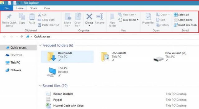
Windows 10's file explorer also used MS Office's cluttered ribbon, although in the last feature update, they have a setting to toggle 'new ribbon' and replace it with the Win11 one. Also has this in Outlook desktop. The cluttered one was a total mess. They tried and failed to amalgamate the menu bar stuff into the ribbon so finding the view controls, for example was frustration.

File-Explorer-with-Ribbon-800x438.jpg
 
Last edited:

exoticSpice

Suspended
Jan 9, 2022
1,242
1,952
No telling how often my parents or grandmother calls me over because the taskbar got moved to the side or grew about 10x its original size! I'm no longer having to drive 20 miles to fix it over and over again!
You can lock the taskbar so it does not do that. It's as simple as right click on taskbar and click on "Lock takbar".
 

nickdalzell1

macrumors 68030
Dec 8, 2019
2,787
1,670
Oh they figure out how to inadvertantly change the lock setting as well. You'd be surprised what enough mis-clicks and mouse-overs can do with older people. Next to that issue was the zoom settings in any web browser getting buggered to where everything ends up being comic sans font with 48pt text.

Never, ever underestimate the possible issues between older people and technology. I can only hope I never get that bad.
 

exoticSpice

Suspended
Jan 9, 2022
1,242
1,952
Oh they figure out how to inadvertantly change the lock setting as well. You'd be surprised what enough mis-clicks and mouse-overs can do with older people. Next to that issue was the zoom settings in any web browser getting buggered to where everything ends up being comic sans font with 48pt text.

Never, ever underestimate the possible issues between older people and technology. I can only hope I never get that bad.
I think thats why iPads are popular with older folks as it simple and not to complicated.
 

Bubble99

macrumors 65816
Mar 15, 2015
1,100
304
I personally am glad for the inability to move or resize the taskbar. No telling how often my parents or grandmother calls me over because the taskbar got moved to the side or grew about 10x its original size! I'm no longer having to drive 20 miles to fix it over and over again! I always hated how Ubuntu had its taskbar always to the left. I have always been used to it being on the bottom much like 90% of users. Perhaps the issue my parents/grandparents faced is why they changed it? I also noticed you can't make the desktop icons 10x their size either. My God! How my grandmother's PC had like 5 of them giant sized because she's as blind as a bat. I wish desktop icons would just vanish, as everyone loves cluttered desktops full of 100s of them. I can't imagine how they find anything. I just pin them to start or pin to taskbar.


It's better in 11, you don't really need control panel nearly as much (unless you want to dig into say power options and/or graphics settings).

I don't know why they stopped caring about Windows 7 either. IIRC, they were the ones pushing Windows 8 which pushed everyone else (including Apple) into the flat design bandwagon. If Windows 7 remained up until now, we'd probably be using holographic tech.

Windows 10's file explorer also used MS Office's cluttered ribbon, although in the last feature update, they have a setting to toggle 'new ribbon' and replace it with the Win11 one. Also has this in Outlook desktop. The cluttered one was a total mess. They tried and failed to amalgamate the menu bar stuff into the ribbon so finding the view controls, for example was frustration.

View attachment 2005422

Well it seems windows 11 is moving away from the ribbon interface. I understand Microsoft thinking that big ribbon interface every where would be easier for touch user friendly.
 

nickdalzell1

macrumors 68030
Dec 8, 2019
2,787
1,670
I'm glad they're moving away from it. I'd rather they have real menus again, though. When dealing with Windows 10's file explorer, I had hopes that hitting the ALT key would override the need for the ribbon by bringing access to the file, edit, view menus but all clicking on them ever did was make the ribbon change to those settings. Still ended up being a frustrating cluttered mess. Didn't help then at the time that the touchpad would often click instead of hover so I'd end up moving files I didn't want to move or select things I didn't or even delete stuff I didn't intend to.

iPhones and iPads were great back during iOS 6-under days. My grandmother had an old iPhone 4. She could easily figure out that old 'slide to unlock' thing. Then it got iOS 7 and she couldn't see the slider anymore and couldn't figure it out. Now she neither uses a cell phone or laptop. They just alienated her out. My mother is the one who often resized her taskbar or changed the font somehow. Since getting an HP Envy with Windows 11, that's no longer an issue.

If you're going to change UI, at least make it feel like the future. None of this regressing to the flat UI past that was the 1980s. If Windows 8 made flat UI become trendy, here's hoping Windows 11 does the opposite and brings back skeuomorphic UI back. I've been waiting forever for it to hopefully return and bring the fun and whimsy back. If I wanted a flat UI I'd go back to a Nokia 5185i.
 

Bubble99

macrumors 65816
Mar 15, 2015
1,100
304
I think thats why iPads are popular with older folks as it simple and not to complicated.
One of biggest problems with iPad and MacOS today is young people today will have very different view on what is a computer than a boomers from 90s and 2000s.

Back in 90s with Windows 98 themes and plus theme CDs getting all extra theme packs with different mouse icon pointers, sound effects, icons, screen savers, and UI themes so on. The young people today looking at will seems very alien like to them.

Even Windows is locking down more but still way more customizable than iPadOS and MacOS. And before you say well what about Linux that me tell you when all boomers die of using Linux the millennials will be too lost and it be way to alien like for them.

The act of power users and tinkering is going out the window well a computer is more fashion device today.
 

exoticSpice

Suspended
Jan 9, 2022
1,242
1,952
The act of power users and tinkering is going out the window well a computer is more fashion device today.
Not really. This is macOS 12 right now on my Mac. That is a video wallpaper and widgets on my Mac right now.
all extra theme packs with different mouse icon pointers, sound effects, icons, screen savers, and UI themes so on.
You can still do that on Windows and Mac.

My Mac Desktop:


Please don't say macOS and iPadOS have the same amount of customizabllity. No way.
iPadOS is the most locked OS in terms of customizabllity. Third party and first party customizabllity is nill on iPadOS.
 

Bubble99

macrumors 65816
Mar 15, 2015
1,100
304
I'm glad they're moving away from it. I'd rather they have real menus again, though. When dealing with Windows 10's file explorer, I had hopes that hitting the ALT key would override the need for the ribbon by bringing access to the file, edit, view menus but all clicking on them ever did was make the ribbon change to those settings. Still ended up being a frustrating cluttered mess. Didn't help then at the time that the touchpad would often click instead of hover so I'd end up moving files I didn't want to move or select things I didn't or even delete stuff I didn't intend to.

iPhones and iPads were great back during iOS 6-under days. My grandmother had an old iPhone 4. She could easily figure out that old 'slide to unlock' thing. Then it got iOS 7 and she couldn't see the slider anymore and couldn't figure it out. Now she neither uses a cell phone or laptop. They just alienated her out. My mother is the one who often resized her taskbar or changed the font somehow. Since getting an HP Envy with Windows 11, that's no longer an issue.

If you're going to change UI, at least make it feel like the future. None of this regressing to the flat UI past that was the 1980s. If Windows 8 made flat UI become trendy, here's hoping Windows 11 does the opposite and brings back skeuomorphic UI back. I've been waiting forever for it to hopefully return and bring the fun and whimsy back. If I wanted a flat UI I'd go back to a Nokia 5185i.
Well part of problem is mindset and also millennials are not immune to it but older people very much is problem because of how the brain works.

From ages one to to 18 the brain does a better at learning new things and you not afraid that is why they say learning other languages like say Spanish and Greek and so on is best for kids and teens than Adults.

As studies say kids and teens brain are more prone to learning and are not afraid.

When people spend 10 years using MacOS they have hard time learning windows and likewise people that spend 10 years using windows have hard time using MacOS. And these are younger people. Older people need UI that does not change.

And I see all to often on the Linux forms reading comments of new users getting frustrated because Linux is not Windows. Even Linux mint that get close to windows look in feel is still not any where close to copy. I see all to many Linux experts tell new users to use Linux mint saying look and feel be less alien like than say Ubuntu but still many new users struggle.

This is why learning must be at young age and people growing up using different UI.

The reason Linux Distro hoppers do better than new Linux users is not that they are more knowledgeable but they don’t look for similarities. Example if you use to say Ubuntu and switch to say Linux mint you not going to be looking for same steps. Same thing going from windows 7 to say windows 8.

And changing taskbar from bottom to top or to say a centrist start menu or moving a shortcut icon from left to right is enough to confuse many older people. Older people get use to step process and when it gets broken they get frustrated snd confused.

There are people that never learn how to use file manager and save every thing on the desktop.
 

nickdalzell1

macrumors 68030
Dec 8, 2019
2,787
1,670
Oh believe me the younger folks have it a lot easier than I ever did. I started with CP/M, then PC DOS 3.3, then MS DOS 6, then Windows 3.x, and I was perfectly happy in Windows 3.1, and the program manger was the best layout ever made. I had every program group tiled so every app I ever needed was a click away, and when starting the system the program manger would minimize itself on launch so I had my wallpaper showing. If I wanted to launch an app, I double-clicked the minimized program manager and double-clicked the app I wanted. It was proto-start but now Windows 11 brings that back. I've been missing that ease of use since 1995.

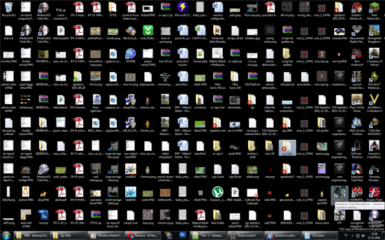
Also, I still can't stand cluttered desktops with literally hundreds of icons. The boss's PC at work has over a hundred icons spread across two monitors, and she only uses IE. She hates any browser other than Internet Explorer (she's used to it). She also has tons of malware on the darned thing. It's one reason I bought a cheap Windows 11 laptop to use in my shop as I cannot stand Windows 10 or THAT PC. Ever try to do even a web search on IE in 2022?

28e02d0b-70c9-4daf-8cb1-edf4c082a910.png
 

Bubble99

macrumors 65816
Mar 15, 2015
1,100
304
Not really. This is macOS 12 right now on my Mac. That is a video wallpaper and widgets on my Mac right now.

You can still do that on Windows and Mac.

My Mac Desktop:
View attachment 2005441

Please don't say macOS and iPadOS have the same amount of customizabllity. No way.
iPadOS is the most locked OS in terms of customizabllity. Third party and first party customizabllity is nill on iPadOS.

MacOS does not have themes like windows. And over years Microsoft as tone down themes unlike 90s like windows 95 and windows 98 and windows ME.

You cannot change the icon themes in windows through windows settings.

The act of screensaver is still there in windows 10 but is hidden and tone down because burn in was more problem for CRT monitors.:eek:

Most people that do any theming in windows now are more hacks and work arounds but the company is not supporting it.

I have seen people down load themes to get the start menu to the left and windows 10 start menu look and feel. But this is not supported by Microsoft.
 
Last edited:

nickdalzell1

macrumors 68030
Dec 8, 2019
2,787
1,670
There are tons of theme options if you don't depend on app stores. There's Stardock WindowBlinds, Rainmeter, and so on. You can make it look like Windows XP or Vista or heck, Star Trek LCARS if you like.
 

Bubble99

macrumors 65816
Mar 15, 2015
1,100
304
Oh believe me the younger folks have it a lot easier than I ever did. I started with CP/M, then PC DOS 3.3, then MS DOS 6, then Windows 3.x, and I was perfectly happy in Windows 3.1, and the program manger was the best layout ever made. I had every program group tiled so every app I ever needed was a click away, and when starting the system the program manger would minimize itself on launch so I had my wallpaper showing. If I wanted to launch an app, I double-clicked the minimized program manager and double-clicked the app I wanted. It was proto-start but now Windows 11 brings that back. I've been missing that ease of use since 1995.

Also, I still can't stand cluttered desktops with literally hundreds of icons. The boss's PC at work has over a hundred icons spread across two monitors, and she only uses IE. She hates any browser other than Internet Explorer (she's used to it). She also has tons of malware on the darned thing. It's one reason I bought a cheap Windows 11 laptop to use in my shop as I cannot stand Windows 10 or THAT PC. Ever try to do even a web search on IE in 2022?

View attachment 2005445

I think in some ways the way computer where back than taught people what computer is and how to use it. Learning command line teaches you about file directory. No GUI to boot to.

Messing with system BIOS and jumpers teaches you about computers. Not having plug and play and messing with guts of computer teaches you more about troubleshooting and parts of the computer.

You the user have to update the system the OS will not update but you the user must update the system and every software on the computer well teaches you what software you have on the computer.

Messing with Fdisk, formatting and partitioning at command line teaches you about computers.

Back in the 90s just about every store had a computer book learning guts of the computer.

Well now days you the user are not allowed to touch it being done for you by the company.

A person using iOS, iPadOS and MacOS today will be very lost.
 

exoticSpice

Suspended
Jan 9, 2022
1,242
1,952
I think in some ways the way computer where back than taught people what computer is and how to use it. Learning command line teaches you about file directory. No GUI to boot to.

Messing with system BIOS and jumpers teaches you about computers. Not having plug and play and messing with guts of computer teaches you more about troubleshooting and parts of the computer.

You the user have to update the system the OS will not update but you the user must update the system and every software on the computer well teaches you what software you have on the computer.

Messing with Fdisk, formatting and partitioning at command line teaches you about computers.

Back in the 90s just about every store had a computer book learning guts of the computer.

Well now days you the user are not allowed to touch it being done for you by the company.

A person using iOS, iPadOS and MacOS today will be very lost.
99% of users don't care about how the computer functions. For them it's a tool, just like a oven or stove.

Apple does allow to remove all the security restrictions on macOS. Go into recovery mode and into terminal and you can disable SiP. In fact Macs also allow third party kernels even on M1 and is supported by Apple.

Mac's in the Apple ecosysystem were open. iOS devices was built so that the computer illertiate can use them.
 

grmlin

macrumors 65816
Feb 16, 2015
1,110
777
I still can't grasp why people actually prefer 10's start menu over 11's. Heaven forbid they don't bring that mess to 11. I hated live tiles in 8. I hated Windows 10 trying to push 8's tiles interface with Win95's mess of a start menu.
I use an Ultrawide monitor. The fact that I have to use this tiny fixed start menu, with a fixed size grid, is absolutely infuriating. Also this absolute useless "recommended" section means so much space wasted.
It's also a buggy mess, the search is slow, laggy or doesn't find stuff at all. The taskbar STILL isn't fixed, especially when auto hiding. It breaks all the time, resets itself, stays open without telling you why, or even worse refuses to hide again even though all apps are without updates. I HATE IT.

The live tiles might have been ugly and a reminder of the failure Windows 8 was, but at least I had the possibility to customize the start menu and use my screen.

Not sure what you mean by windows 11 settings and control panel is mess?

Microsoft is slowing moving the control panel over to settings.
Why have 2 configuration apps?

As far I know only Windows has this problem. macOS, Linux, Android and iOS don't have it.

Settings was a thing since Windows 8. The fact they still have not merged Control Panel into Settings in Windows 11 is telling how MS takes a LONG time.
"slow" is the key. They never finish anything but add more on top of the old crap. We still have to use the control panel they basically introduced with XP in Windows 11 because they still didn't finish the migration after all these years. It has been almost 10 years since 8 released. TEN!


The act of screensaver is still there in windows 10 but is hidden and tone down because burn in was more problem for CRT monitors.:eek:
The real crime is that it's buried so deep inside the old control panel. With so many OLED panels used in Windows PCs it's absolutely needed imo.
 

Ethosik

Contributor
Oct 21, 2009
8,144
7,120
Oh they figure out how to inadvertantly change the lock setting as well. You'd be surprised what enough mis-clicks and mouse-overs can do with older people. Next to that issue was the zoom settings in any web browser getting buggered to where everything ends up being comic sans font with 48pt text.

Never, ever underestimate the possible issues between older people and technology. I can only hope I never get that bad.
Yeah I agree with this. I once got an after hours call from a client that moved their task bar and thought it was worthy to wake me up to address.
 
Register on MacRumors! This sidebar will go away, and you'll see fewer ads.