May I ask, when others are saying they have yellow tint/warmth issues, is this solely noticeable when they compare next to another device (like myself), or it is actually YELLOW YELLOW - like someone spilt concentrated food colouring onto the screen yellow? Or just a warmer display than say last years phones?Yeah I was thinking the same thing about hardware because not every unit is affected it’s a bummer just don’t understand what the hell happened with production this year
Got a tip for us?
Let us know
Become a MacRumors Supporter for $50/year with no ads, ability to filter front page stories, and private forums.
iPhone 12 Pro Yellow Screen/Tint? Display seem "Warm"? Check here first!
- Thread starter kre62
- Start date
- Sort by reaction score
You are using an out of date browser. It may not display this or other websites correctly.
You should upgrade or use an alternative browser.
You should upgrade or use an alternative browser.
I immediately recognized it without comparing or knowing that there is an issue with displays. Especially if you are coming from a older iPhone model.May I ask, when others are saying they have yellow tint/warmth issues, is this solely noticeable when they compare next to another device (like myself), or it is actually YELLOW YELLOW - like someone spilt concentrated food colouring onto the screen yellow? Or just a warmer display than say last years phones?
It's overall warmer and yellowish. Text that was white before, looks yellow. Greys looking yellowish. Whites looking yellow....
Yep, imagine it's frustrating when you lay out such a huge amount for a device. Only reason I posted was to give some perspective that it's not all screens which, in it self, points more towards it being a hardware issue?
Any hopes of some picture comparing the white balance with an 11 / XS / X? Thank you.
I’ve attached some images. The first is with the 12PM on 100% brightness, which is higher than what the monitor can deliver. On the second I’ll try to match them. Seems that the monitor is more yellow than the 12PM.
Thank you! Yes I see what you mean. I think on the second one the photo on your phone looks the best.
I was trying to get a real blue colour on the mini, but it just never gets blue. There’s always that green cast covering it. So I only get different tints of sea-green/blue-green. I just can’t get any colour the same as on my monitor or on my iPad and 7.
I’m going to wait for a few weeks, maybe Apple comes with a statement regarding this issue (yesterday Apple support said they were aware and looking into this issue some users experience with the green tint). And otherwise I’m returning the mini and then I’m buying again next year.
May I ask, when others are saying they have yellow tint/warmth issues, is this solely noticeable when they compare next to another device (like myself), or it is actually YELLOW YELLOW - like someone spilt concentrated food colouring onto the screen yellow? Or just a warmer display than say last years phones?
Seems to be a variety of different levels of yellows on the whole 12 series more like a warmer leaning towards white I think I compared my old 11 pro max that my daughter has now with whites and my 12 pro max is whiter and brighter in our eyes so I don’t seem to have the yellow issue but unfortunately I have the flickering and gray issues undoubtedly the quality control this year was on COVID-19 break because way to many faulty issues going on for such an expensive piece of hardware
For me it’s inbetween with TT off, but (existing) photos definitely look too warm overall, and in dark mode small text looks like a very yellow white, and the grays don’t look neutral. Maybe not warmer than LCDs are cold, but not neutral either.May I ask, when others are saying they have yellow tint/warmth issues, is this solely noticeable when they compare next to another device (like myself), or it is actually YELLOW YELLOW - like someone spilt concentrated food colouring onto the screen yellow? Or just a warmer display than say last years phones?
Last edited:
This is super interesting.Just sharing some photos. Compared my 12 to several phones at a nearby store and my old S9.
View attachment 1673621
S9 and 12 (Taken with manual white balance 6500K)
View attachment 1673623
12 and 12 Mini
View attachment 1673624
12 and 12 Pro
View attachment 1673625
12 and 11
I know the accessibility tint setting is frowned upon because it’s likely to make your display less accurate, and people have also claimed it can reduce brightness and contrast, but I’ve achieved some pretty spectacular results using it.
I sat down last night and started playing with it, mainly to get rid of green tint, not just to make my screen cooler. First I tried the tint slider all the way to the left under the red pencil, and that made the screen a bit more red and got rid of the green tint, but it made the screen too warm. Then I tried moving the tint slider under the dark blue pencil, and that made the screen a lot cooler, but didn’t do anything to fix the green tint. Finally I tried moving the slider to the dark purple pencil, which added a bit more red to the blue, and that neutralized the green tint. Then I started comparing photos, websites, and color charts to my 2019 iMac, and I was able to really dial in the color tint slider to where my 12 Pro Max matches my iMac screen almost perfectly. Seriously, it’s almost indistinguishable. I’ve never had a phone that matched my computer screen so closely before. Here’s that setting. The intensity slider is set all the way to the left. I turned my screen this way and scrolled to make it easier to see where the tint slider is in relation to the pencils.

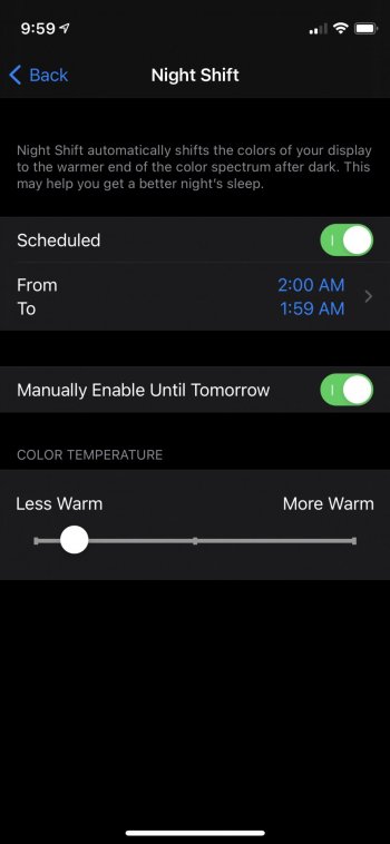
Now, while my Pro Max matched my iMac screen, I suspect my iMac screen has a color temperature in the 6800-7000K range, which can look a bit harsh at night, so then I wondered how it would look if I turned on Night Shift and adjusted it to match my really good iPhone X display, which is a bit warmer and probably around 6700K. Well, to my surprise, just leaving the accessibility tint settings how I had them to match my iMac and turning on Night Shift to a low level made my 12 Pro Max look almost identical to my X! Seriously, it’s so close. I watched a bunch of videos side by side and viewed pictures and webpages side by side for a while, and surprisingly, the colors of everything are pretty much indistinguishable. And contrast and brightness are still excellent too. My Pro Max still gets at least as bright as my X, if not brighter. Here’s the night shift setting I used to match my X:

I wish Apple would just provide the ability to create calibration profiles for iOS devices using colorimeters, and I still may request a couple replacements and see if I can’t get a screen that doesn’t need tweaking to look good, but I’m at least happy to know that I can make my current Pro Max screen look very good. By the way, I also ran a bunch of CPU and GPU benchmarks because I was concerned that the tint setting might add extra processing and slow something down, but it doesn’t.
I sat down last night and started playing with it, mainly to get rid of green tint, not just to make my screen cooler. First I tried the tint slider all the way to the left under the red pencil, and that made the screen a bit more red and got rid of the green tint, but it made the screen too warm. Then I tried moving the tint slider under the dark blue pencil, and that made the screen a lot cooler, but didn’t do anything to fix the green tint. Finally I tried moving the slider to the dark purple pencil, which added a bit more red to the blue, and that neutralized the green tint. Then I started comparing photos, websites, and color charts to my 2019 iMac, and I was able to really dial in the color tint slider to where my 12 Pro Max matches my iMac screen almost perfectly. Seriously, it’s almost indistinguishable. I’ve never had a phone that matched my computer screen so closely before. Here’s that setting. The intensity slider is set all the way to the left. I turned my screen this way and scrolled to make it easier to see where the tint slider is in relation to the pencils.
Now, while my Pro Max matched my iMac screen, I suspect my iMac screen has a color temperature in the 6800-7000K range, which can look a bit harsh at night, so then I wondered how it would look if I turned on Night Shift and adjusted it to match my really good iPhone X display, which is a bit warmer and probably around 6700K. Well, to my surprise, just leaving the accessibility tint settings how I had them to match my iMac and turning on Night Shift to a low level made my 12 Pro Max look almost identical to my X! Seriously, it’s so close. I watched a bunch of videos side by side and viewed pictures and webpages side by side for a while, and surprisingly, the colors of everything are pretty much indistinguishable. And contrast and brightness are still excellent too. My Pro Max still gets at least as bright as my X, if not brighter. Here’s the night shift setting I used to match my X:
I wish Apple would just provide the ability to create calibration profiles for iOS devices using colorimeters, and I still may request a couple replacements and see if I can’t get a screen that doesn’t need tweaking to look good, but I’m at least happy to know that I can make my current Pro Max screen look very good. By the way, I also ran a bunch of CPU and GPU benchmarks because I was concerned that the tint setting might add extra processing and slow something down, but it doesn’t.
Last edited:
Hi can you please post the entire screenshot of your calibration settings please? Thanks!I know the accessibility tint setting is frowned upon because it’s likely to make your display less accurate, and people have also claimed it can reduce brightness and contrast, but I’ve achieved some pretty spectacular results using it.
I sat down last night and started playing with it, mainly to get rid of green tint, not just to make my screen cooler. First I tried the tint slider all the way to the left under the red pencil, and that made the screen a bit more red and got rid of the green tint, but it made the screen too warm. Then I tried moving the tint slider under the dark blue pencil, and that made the screen a lot cooler, but didn’t do anything to fix the green tint. Finally I tried moving the slider to the dark purple pencil, which added a bit more red to the blue, and that neutralized the green tint. Then I started comparing photos, websites, and color charts to my 2019 iMac, and I was able to really dial in the color tint slider to where my 12 Pro Max matches my iMac screen almost perfectly. Seriously, it’s almost indistinguishable. I’ve never had a phone that matched my computer screen so closely before. Here’s that setting. The intensity slider is set all the way to the left. I turned my screen this way and scrolled to make it easier to see where the tint slider is in relation to the pencils.
View attachment 1673622
Now, while my Pro Max matched my iMac screen, I suspect my iMac screen has a color temperature in the 6800-7000K range, which can look a bit harsh at night, so then I wondered how it would look if I turned on Night Shift and adjusted it to match my really good iPhone X display, which is a bit warmer and probably around 6700K. Well, to my surprise, just leaving the accessibility tint settings how I had them to match my iMac and turning on Night Shift to a low level made my 12 Pro Max look almost identical to my X! Seriously, it’s so close. I watched a bunch of videos side by side and viewed pictures and webpages side by side for a while, and surprisingly, the colors of everything are pretty much indistinguishable. And contrast and brightness are still excellent too. My Pro Max still gets at least as bright as my X, if not brighter. Here’s the night shift setting I used to match my X:
View attachment 1673652
I wish Apple would just provide the ability to create calibration profiles for iOS devices using colorimeters, and I still may request a couple replacements and see if I can’t get a screen that doesn’t need tweaking to look good, but I’m at least happy to know that I can make my current Pro Max screen look very good. By the way, I also ran a bunch of CPU and GPU benchmarks because I was concerned that the tint setting might add extra processing and slow something down, but it doesn’t.
I was told by support that the engineers say this yellow tint is "proper performance". The best they can do is have me go into an Apple store for physical inspection.
This config gets me the best result too, actually pretty close to my calibrated Eizo IPS Monitor. But we shouldn't have to do this, and yes you DO lose some brightness, even if it's not much.I know the accessibility tint setting is frowned upon because it’s likely to make your display less accurate, and people have also claimed it can reduce brightness and contrast, but I’ve achieved some pretty spectacular results using it.
I sat down last night and started playing with it, mainly to get rid of green tint, not just to make my screen cooler. First I tried the tint slider all the way to the left under the red pencil, and that made the screen a bit more red and got rid of the green tint, but it made the screen too warm. Then I tried moving the tint slider under the dark blue pencil, and that made the screen a lot cooler, but didn’t do anything to fix the green tint. Finally I tried moving the slider to the dark purple pencil, which added a bit more red to the blue, and that neutralized the green tint. Then I started comparing photos, websites, and color charts to my 2019 iMac, and I was able to really dial in the color tint slider to where my 12 Pro Max matches my iMac screen almost perfectly. Seriously, it’s almost indistinguishable. I’ve never had a phone that matched my computer screen so closely before. Here’s that setting. The intensity slider is set all the way to the left. I turned my screen this way and scrolled to make it easier to see where the tint slider is in relation to the pencils.
View attachment 1673622
Now, while my Pro Max matched my iMac screen, I suspect my iMac screen has a color temperature in the 6800-7000K range, which can look a bit harsh at night, so then I wondered how it would look if I turned on Night Shift and adjusted it to match my really good iPhone X display, which is a bit warmer and probably around 6700K. Well, to my surprise, just leaving the accessibility tint settings how I had them to match my iMac and turning on Night Shift to a low level made my 12 Pro Max look almost identical to my X! Seriously, it’s so close. I watched a bunch of videos side by side and viewed pictures and webpages side by side for a while, and surprisingly, the colors of everything are pretty much indistinguishable. And contrast and brightness are still excellent too. My Pro Max still gets at least as bright as my X, if not brighter. Here’s the night shift setting I used to match my X:
View attachment 1673652
I wish Apple would just provide the ability to create calibration profiles for iOS devices using colorimeters, and I still may request a couple replacements and see if I can’t get a screen that doesn’t need tweaking to look good, but I’m at least happy to know that I can make my current Pro Max screen look very good. By the way, I also ran a bunch of CPU and GPU benchmarks because I was concerned that the tint setting might add extra processing and slow something down, but it doesn’t.
I know the accessibility tint setting is frowned upon because it’s likely to make your display less accurate, and people have also claimed it can reduce brightness and contrast, but I’ve achieved some pretty spectacular results using it.
I sat down last night and started playing with it, mainly to get rid of green tint, not just to make my screen cooler. First I tried the tint slider all the way to the left under the red pencil, and that made the screen a bit more red and got rid of the green tint, but it made the screen too warm. Then I tried moving the tint slider under the dark blue pencil, and that made the screen a lot cooler, but didn’t do anything to fix the green tint. Finally I tried moving the slider to the dark purple pencil, which added a bit more red to the blue, and that neutralized the green tint. Then I started comparing photos, websites, and color charts to my 2019 iMac, and I was able to really dial in the color tint slider to where my 12 Pro Max matches my iMac screen almost perfectly. Seriously, it’s almost indistinguishable. I’ve never had a phone that matched my computer screen so closely before. Here’s that setting. The intensity slider is set all the way to the left. I turned my screen this way and scrolled to make it easier to see where the tint slider is in relation to the pencils.
View attachment 1673622
Now, while my Pro Max matched my iMac screen, I suspect my iMac screen has a color temperature in the 6800-7000K range, which can look a bit harsh at night, so then I wondered how it would look if I turned on Night Shift and adjusted it to match my really good iPhone X display, which is a bit warmer and probably around 6700K. Well, to my surprise, just leaving the accessibility tint settings how I had them to match my iMac and turning on Night Shift to a low level made my 12 Pro Max look almost identical to my X! Seriously, it’s so close. I watched a bunch of videos side by side and viewed pictures and webpages side by side for a while, and surprisingly, the colors of everything are pretty much indistinguishable. And contrast and brightness are still excellent too. My Pro Max still gets at least as bright as my X, if not brighter. Here’s the night shift setting I used to match my X:
View attachment 1673652
I wish Apple would just provide the ability to create calibration profiles for iOS devices using colorimeters, and I still may request a couple replacements and see if I can’t get a screen that doesn’t need tweaking to look good, but I’m at least happy to know that I can make my current Pro Max screen look very good. By the way, I also ran a bunch of CPU and GPU benchmarks because I was concerned that the tint setting might add extra processing and slow something down, but it doesn’t.
Thanks for sharing this! I already messed with the color tint and got close results. However, it seems that turning Night Shift on a little bit makes it even better! I do not think it can get closer.
For those wondering, you can keep Night Shift on permanently by using the following settings.
Attachments
again, looking back at the new pics for the last 5 pages, I dont see a single unacceptable panel.
turn off True Tone.
it does appear, based on the biased sampling of screens posted here that the panels this year with
- true tone
- white point
are on the slightly warmer side. But I honestly can't see a panel posted in the last 10 pages or so that is egregious that it warrants a return
really this doesn't look egregious to you? my screen looks like I am 50% brightness compared to other phones. reduce white point is off and true tone is off... This is absolutely unacceptable imo.... and mind you the picture doesn't do it justice, this looks slightly worse in person.

Hi, im having same issue, comparing my old iPhone 6s plus (with aliexpress screen changed by myself LOL) and my new iPhone 12 pro MAX screen, the 12 PM screen is like yellow tinted, like if you compare the teeths of someones who smoke with the teeths of someones who doesnt. I dont know if this is normal, but isnt correct for my logic, like, when i take a photo, i dont want to see it like yellowish. There i put some report of the i4.cn app, in concrect the panel of the screen of my iPhone 12 PM starts with the serial G9Q... It would be interesting if more users check this report and put their panel serial number start prefix.

Hi can you please post the entire screenshot of your calibration settings please? Thanks!
I posted it in landscape because I thought it would be easier to replicate, but I realize now that the tint slider seems to line up with the pencils a little differently in portrait mode, and since non-Max phones can't do landscape, here ya go.
Why should I have to jump through so many hoops to get a proper color calibration? I don't think we should have to play mental gymnastics to justify our purchases.I know the accessibility tint setting is frowned upon because it’s likely to make your display less accurate, and people have also claimed it can reduce brightness and contrast, but I’ve achieved some pretty spectacular results using it.
I sat down last night and started playing with it, mainly to get rid of green tint, not just to make my screen cooler. First I tried the tint slider all the way to the left under the red pencil, and that made the screen a bit more red and got rid of the green tint, but it made the screen too warm. Then I tried moving the tint slider under the dark blue pencil, and that made the screen a lot cooler, but didn’t do anything to fix the green tint. Finally I tried moving the slider to the dark purple pencil, which added a bit more red to the blue, and that neutralized the green tint. Then I started comparing photos, websites, and color charts to my 2019 iMac, and I was able to really dial in the color tint slider to where my 12 Pro Max matches my iMac screen almost perfectly. Seriously, it’s almost indistinguishable. I’ve never had a phone that matched my computer screen so closely before. Here’s that setting. The intensity slider is set all the way to the left. I turned my screen this way and scrolled to make it easier to see where the tint slider is in relation to the pencils.
View attachment 1673622
Now, while my Pro Max matched my iMac screen, I suspect my iMac screen has a color temperature in the 6800-7000K range, which can look a bit harsh at night, so then I wondered how it would look if I turned on Night Shift and adjusted it to match my really good iPhone X display, which is a bit warmer and probably around 6700K. Well, to my surprise, just leaving the accessibility tint settings how I had them to match my iMac and turning on Night Shift to a low level made my 12 Pro Max look almost identical to my X! Seriously, it’s so close. I watched a bunch of videos side by side and viewed pictures and webpages side by side for a while, and surprisingly, the colors of everything are pretty much indistinguishable. And contrast and brightness are still excellent too. My Pro Max still gets at least as bright as my X, if not brighter. Here’s the night shift setting I used to match my X:
View attachment 1673652
I wish Apple would just provide the ability to create calibration profiles for iOS devices using colorimeters, and I still may request a couple replacements and see if I can’t get a screen that doesn’t need tweaking to look good, but I’m at least happy to know that I can make my current Pro Max screen look very good. By the way, I also ran a bunch of CPU and GPU benchmarks because I was concerned that the tint setting might add extra processing and slow something down, but it doesn’t.
Have the same settings and the green tint is gone. However the green flickering when viewing dark images is still there so I still hope for some sort of response from Apple.I posted it in landscape because I thought it would be easier to replicate, but I realize now that the tint slider seems to line up with the pencils a little differently in portrait mode, and since non-Max phones can't do landscape, here ya go.
View attachment 1673733
My Pro Max with serial starting with F2L has a G9Q panel as well. I suppose that means we have Samsung panels.Hi, im having same issue, comparing my old iPhone 6s plus (with aliexpress screen changed by myself LOL) and my new iPhone 12 pro MAX screen, the 12 PM screen is like yellow tinted, like if you compare the teeths of someones who smoke with the teeths of someones who doesnt. I dont know if this is normal, but isnt correct for my logic, like, when i take a photo, i dont want to see it like yellowish. There i put some report of the i4.cn app, in concrect the panel of the screen of my iPhone 12 PM starts with the serial G9Q... It would be interesting if more users check this report and put their panel serial number start prefix.
View attachment 1673731
edit: G9Q and G9P are the "poor" grade Samsung panels.
 Doesn't surprise me though as mine has somewhat of a green tint.
Last edited:
How do you find out which panels you have? I thought all Pro models came with Samsung screens this year - otherwise DisplayMate will need to run more tests on each screen manufacturer to get an accurate view.My Pro Max with serial starting with F2L has a G9Q panel as well. I suppose that means we have Samsung panels.
Never said you have to, and I don't think we should have to. If you read all of my post, you'll know that I still plan on exchanging mine. But until then, I found something that makes the current screen I have look good.Why should I have to jump through so many hoops to get a proper color calibration? I don't think we should have to play mental gymnastics to justify our purchases.
How do you find out which panels you have? I thought all Pro models came with Samsung screens this year - otherwise DisplayMate will need to run more tests on each screen manufacturer to get an accurate view.
With the i4.cn app. It’s unfortunately only in Chinese. I’ve posted a YouTube link on previous page. There is a Translation for the tool in the Video
This video shows you how to figure out. No one knows for sure whether all Pro screens have Samsung panels this year. I know that was true back in the X days because Samsung was the only OLED supplier for iPhone then, but now we know LG is making some panels, but Apple never says whether LG panels are only being used in non-Pro models.How do you find out which panels you have? I thought all Pro models came with Samsung screens this year - otherwise DisplayMate will need to run more tests on each screen manufacturer to get an accurate view.
This app seems real sketch.This video shows you how to figure out. No one knows for sure whether all Pro screens have Samsung panels this year. I know that was true back in the X days because Samsung was the only OLED supplier for iPhone then, but now we know LG is making some panels, but Apple never says whether LG panels are only being used in non-Pro models.
Register on MacRumors! This sidebar will go away, and you'll see fewer ads.