Become a MacRumors Supporter for $50/year with no ads, ability to filter front page stories, and private forums.
Status
Not open for further replies.

grahamperrin

macrumors 601
Jun 8, 2007
4,942
648
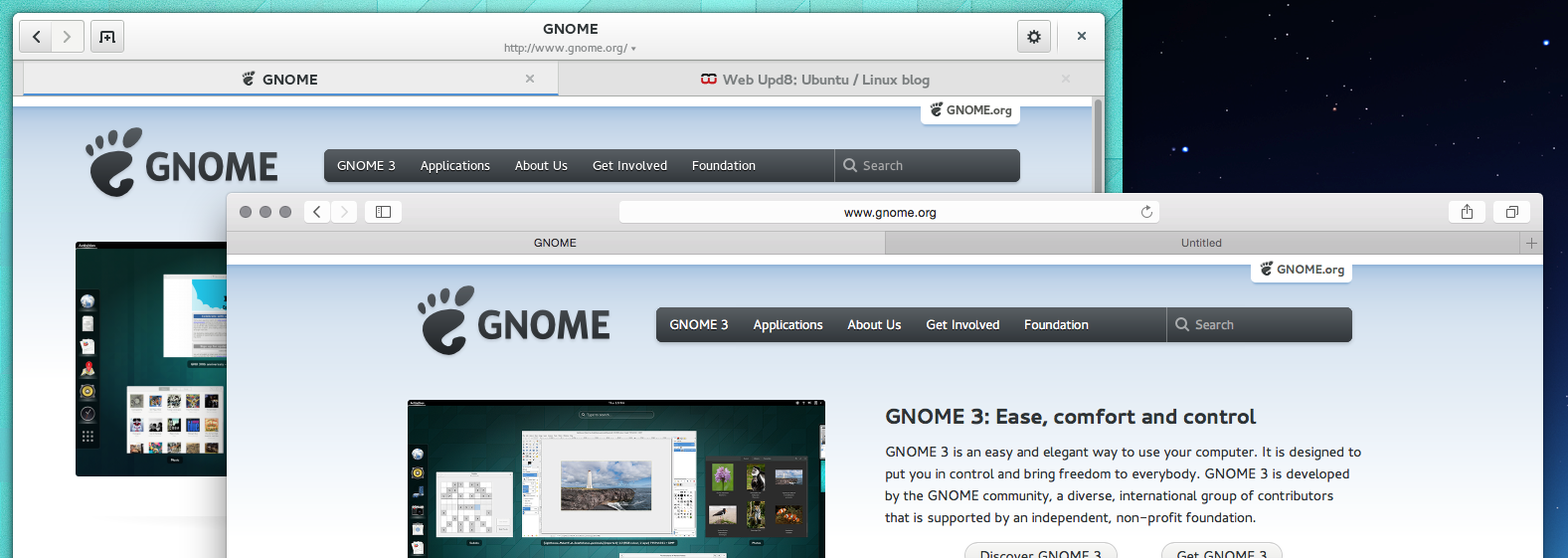
Spot the difference … at a glance, most people can not

The beauty of Compiz has escaped you? …

The beauty of many things escapes many people – Lachhh, check your private messages :)

attachment.php


… The interface layout is pretty much identical. Web is only different in the sense of having extremely large interface elements compared to Safari. Claiming otherwise is just nonsense as demonstrated by the screen shot …

Something fundamental to Safari 7 is not normally present in Safari 8.

When the same thing was not present following a redesign of Web, it was recognised – albeit, not immediately – as a critical bug, and given high priority.

The fix is visible in your screenshot. It may be more obvious if you perform a comparison against the other image that I provided …
 

F1Mac

macrumors 65816
Feb 26, 2014
1,283
1,604
The issue you're having with the lacking titlebar is a non-issue for me. Sorry.

as it is for me too, what's the big deal about the titlebar?
 

Attachments

  • Screen Shot 2014-10-27 at 4.55.03 PM.png
    Screen Shot 2014-10-27 at 4.55.03 PM.png
    83.5 KB · Views: 846

grahamperrin

macrumors 601
Jun 8, 2007
4,942
648
Thanks and thanks

n-evo, no need to apologise; but thanks. It's an expected difference (probably of learnt behaviour – saccades and so on). The more often I find that people whose approaches to orientation (example) are the opposite from what I have learnt, lifelong, the more I wonder whether Apple designed and tested with due consideration for people who habitually read from top to bottom.

(This is likely to get way off-topic from the beauty of Yosemite – sorry folks. I'll continue elsewhere.)

----

Lachhh, PM noted; thank you.
 

grahamperrin

macrumors 601
Jun 8, 2007
4,942
648
Please, RobFog, tread carefully when criticising a person's writing style. It rarely has the desired outcome. If my style can not match the level of yours, and/or if my quotes of other people's contributions are valueless (or less in number than yours), then it should be easier and politer to use the ignore feature.
 

iWaldo

macrumors member
Sep 6, 2008
87
7
Finally upgraded, after Mavericks went one kernel panic too far.

The change was a bit jarring, but Yosemite is growing on me fast. It feels clean and modern, but at the same time very reminiscent of Ye Olde Classic Mac OSes.

Only thing I really can't stand is the new Finder icon, but I'll fix that once I find a good icon for the job...
 

smoking monkey

macrumors 68020
Mar 5, 2008
2,363
1,508
I HUNGER
Removing something fundamental is no small deal.

Perhaps you should include qualifiers like "I believe" or "I think" when discussing such subjective things about the OS. Otherwise others may feel you are trying to tell them how they should think... and we all know that is Apple's job!

But seriously,

It seems your fundamental problem is the missing titles at the top of Safari??? Personally, I feel like this belongs in a thread of its own as it doesn't really pertain to the "Beauty" of Yosemite. BUT, it is still a valid discussion. If I have erroneously attributed the incorrect design issue to your fundamental problem then I shall delete this part of the post.

As for myself, I find Yosemite and the layering to be a work in progress and an exciting addition to the OS that brings a distinct beauty to it. In a familiar way it reminds me of Sushi and Sashimi - contrasting colours in harmony within various layers.
 

RobFog

macrumors regular
Nov 29, 2012
116
34
Please, RobFog, tread carefully when criticising a person's writing style. It rarely has the desired outcome.
If your current writing style is the undesired outcome of past criticisms, I fear the worst, yes.

If my style can not match the level of yours, and/or if my quotes of other people's contributions are valueless (or less in number than yours), then it should be easier and politer to use the ignore feature.
This is not about quoting anybody else but yourself. I think I stated that quite clearly.

Look, I’ve seen posts of yours which have been of a very helpful to others.

Most of your posts however – at least in recent times – are about your crusade against Safari’s titlebar in Yosemite which is a bit tiresome in itself. Though what I really find impolite is endless self-quoting. Honestly, I haven’t ever seen anything like that post in any forum I have visited since the end of 1990s.
 

Attachments

  • TheArtOfSelfquoting.png
    TheArtOfSelfquoting.png
    1.7 MB · Views: 201
Last edited:

F1Mac

macrumors 65816
Feb 26, 2014
1,283
1,604
Removing something fundamental is no small deal.

Not for me because the address bar takes care of that now, look at my previous image again. Since they moved it up it now has the same function as a title bar (which is why the whole address is not shown by the way, you have to click on it to see it) and it would be a redundant and useless waste of space to have a title bar above the address bar.
 
Last edited by a moderator:

HaruAoki

macrumors member
Oct 14, 2014
87
4
Australia
I love the new look of Mac OS X, I've been waiting for this update for sometime and love the new simple and flat UI to it. It looks even better on the new 5k iMac!

There nothing I hate about it at first I did not like the folder icons but the grow on me. There are some kinder big bugs I've found in the 10.10 like finder windows not working. other then that I'm loving this update and can't wait to see where apple goes from here.
 

grahamperrin

macrumors 601
Jun 8, 2007
4,942
648
… I feel like this belongs in a thread of its own … BUT, it is still a valid discussion. …

smoking monkey: thanks.

----

For any reader with true interest in the pros and cons of that subject: the relevant topic began three months ago – The value of addresses/locations/paths/URLs in Safari, and of title bars in general – and I occasionally link to that, instead of quoting from it.

----

What might be the most concise alternative to a quote? Linking seems reasonable. Sadly, some time ago I found a few people complaining … about the presence of links. Links to relevant content. Mildly baffling. It's simply too difficult to please such people.

Incidentally, for the post pictured above by RobFog, I wrote a few words that might help to explain its extraordinary length – those words, posted a few hours before RobFog chose to continue with off-topic criticisms of an unnecessarily personal nature.

True: the post pictured was long. I could have blogged (one-sided) but instead, I chose to take that result of many hours' work to somewhere public where the somewhat difficult to fathom patent application might be discussed in a reasonable fashion.

In fairness to RobFog, I saw some nice posts from him – including kindness from him, to someone other than me, in response to a private message – but those things don't excuse his occasional readiness to publicly criticise other people's style without first considering that his own style might be distasteful.

----

… easier and politer to use the ignore feature.

To RobFog …


… to you, these two words: no longer.

----

To other readers: apologies for the off-topic parts of this post. For me, that's an end to those parts.

Please, let's return to discussion of Yosemite, in relevant topics. Thanks.
 

Thomas Veil

macrumors 68030
Feb 14, 2004
2,636
8,862
Much greener pastures
I've given Yosemite a week or so to grow on me, and it's just not happening. It is, at best, a mixed bag.

The translucent windows look fine. The Helvetica Neue font is a welcome improvement. I might even be able to get used to the flat gray color of the Finder toolbar.

On the other hand, the rest has gone too far past "simplified" to just plain simple. The traffic light buttons are downright cartoony. The line drawings on the Finder and Safari toolbars are so thin they look like doodles.

I think part of the problem is that the flat design philosophy that looks acceptable on the iPhone becomes terrible when blown up to fill a 20" iMac. The overall effect is My Little Pony meets Mac OS 8.

And then there's the little matter of functionality. I was getting really pissed off at iTunes because I couldn't find a way to delete an audiobook. I was sure there was some newfangled trick I was missing. I wasn't. I downloaded the iTunes update, and suddenly there it was -- delete -- in the contextual menu where it was supposed to be. (*Sigh.*)

I dunno. I give this look between one and two years before Apple starts changing back.
 

grahamperrin

macrumors 601
Jun 8, 2007
4,942
648
… OS X Yosemite on six Macs of friends so far and everyone said pretty much the same thing: "I like it. Looks fresh."

Today a work colleague (in IT support) asked about Yosemite. I showed him some information, online. At glance, he thought it looked nice.

He uses and primarily supports Microsoft Windows desktops and notebooks. He has an iPhone and is happy to support iPads and other lightweight devices.

So far the ratings on the App Store …

Average star rating for the current version (OS X 10.10) in the App Store for the US:

4.5​

Average star rating for all versions (presumably Lion, Mountain Lion, Mavericks and Yosemite):

4.5​

In the stores for Canada, France, Italy and the UK, the operating systems are less highly rated. Both measurements are four-star.

I showed my colleague some previously selected and more recent random tweets about Yosemite, some of which are too rude for App Store. From a Twitter use perspective, the perceived ugliness of Yosemite is far greater, and far more scathing, than Mavericks.

He found it amusing, and didn't question the validity of people's criticisms.
 

n-evo

macrumors 68000
Aug 9, 2013
1,909
1,731
Amsterdam
Average star rating for all versions (presumably Lion, Mountain Lion, Mavericks and Yosemite):

4.5​
No, it only encompasses all versions of OS X Yosemite: v10.10.0, v10.10.1, v10.10.2, etc. Which currently translates to just one: v10.10. Hence they're the same.
 
Last edited:

grahamperrin

macrumors 601
Jun 8, 2007
4,942
648
From five star to four star

Ah, thanks.

It may be that OS X in general gains a higher rating from voters in the US than from voters here.

UK
  • four stars for all versions of Mavericks
  • four stars for OS X 10.9.5
  • four stars for OS X 10.10.
Yosemite was highly rated around one day after release, then lost its lost its five-star rating.
 

n-evo

macrumors 68000
Aug 9, 2013
1,909
1,731
Amsterdam
A 4-4,5 star rating (depending on the country) still indicates the majority of people are largely satisfied with the new OS X. The anti-OS X Yosemite camp likes to pretend they're the vast majority, which definitely isn't the case.
 

Partron22

macrumors 68030
Apr 13, 2011
2,655
808
Yes
A 4-4.5 star rating on Amazon would mean "don't buy from this vendor ever." Besides, these star ratings aren't science, they're a self selecting poll. I've never voted on an OS, and likely never will. I suspect I'm in the majority on that.
 

n-evo

macrumors 68000
Aug 9, 2013
1,909
1,731
Amsterdam
It's my experience that people who're unsatisfied tend to be the ones that vote and post the most. Don't really know how to respond to your Amazon comparison. I've heard about the website, but my knowledge pretty much ends there.
 

Partron22

macrumors 68030
Apr 13, 2011
2,655
808
Yes
It's my experience that people who're unsatisfied tend to be the ones that vote and post the most.
Posts, sure. The yosemite looks terrible thread has 7 times the posts, and 4 times the views of this one. You only get to vote once though, if you bother with it. I look at 4.5 out of 5 as a 90% approval rating among those who care to vote.
 

n-evo

macrumors 68000
Aug 9, 2013
1,909
1,731
Amsterdam
Posts, sure. The yosemite looks terrible thread has 7 times the posts, and 4 times the views of this one. You only get to vote once though, if you bother with it. I look at 4.5 out of 5 as a 90% approval rating among those who care to vote.
Actually with the App Store you can modify your vote as much as you like and get to vote again with every new version that's released. :p

----------

Which post(s), in particular, imply that majority?
I'm positive the search engine works just as well on your side as it does on mine. Or are you perhaps suffering from those Wi-Fi connection issues? I thought I'd just hand you another stick. Saves you from having to go out and look for a new one. Although I'm pretty sure you have enough to help a small town through a Siberian winter already.
 
Status
Not open for further replies.
Register on MacRumors! This sidebar will go away, and you'll see fewer ads.