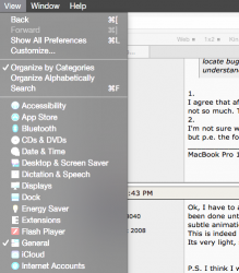
Ok, I have to admit that I was skeptical when the DP1 came out. But literally an hour ago I decided to look at what has been done until now, and now I am completely
blown away. The improvements up to DP4 are
amazing. All these little subtle animations, the shades, the beautiful fonts, the icons (which have
massively improved from their ugly DP1 state). This is indeed the most beautiful and consistent UI I have ever seen. There is nothing 'flat' about it. I would call it 'aery'. Its very light, subtle, unobtrusive and visually pleasant. Its an amazing job, Apple.
P.S. I think I will actually run it as my main OS starting next week. The improvements to Mail and Safari alone make it very tempting.
----------
The venerable master Jobs (amituofo!) would never approve of Yosemite. He would consider it a regression to the 1990s, reintroducing terribly ugly jagged fonts and horribly disturbing colors for folders and stuff.
This post is very puzzling for me, because I really cannot comprehend what you are saying. The fonts are extremely clear for me and while I am not the biggest fan of the light blue folders (hope it will get tuned down), most other things are top notch. Maybe its really the retina display thing? Let me guess you are not using one?
As I read this and similar posts, I wonder if there is a good reason for the flat design. When I was a programmer, we had to keep rewriting our code inorder to get it down to as few bytes as possible. As computers become more and more powerful, this became less of a concern. But more efficient code still increases performance. We enjoy stunning icons and animation, but there is a price to pay in terms of the performance of the actual application. Just an opinion.
Actually, the UI in Yosemite uses more computational resources than say, Mavericks. It has more animation and more translucency, which requires computationally expensive shaders. I believe that the reason for the 'flat design' is the visual efficiency rather than computational one.


