Become a MacRumors Supporter for $50/year with no ads, ability to filter front page stories, and private forums.
Status
Not open for further replies.

alankeny

macrumors newbie
Apr 27, 2015
2
7
I've been following this thread for quite a while looking for changes or hacks that might make Yosemite usable for me. I haven't seen anything to fix my biggest problem yet, so I reinstalled Mavericks after around two months on Yosemite.

At one point I changed the Yosemite system font back to Lucida Grande and that helped some. I don't run my 13" Retina MBP at its optimal resolution, because I want a little more screen space. Most of the time it's connected to at least one external display any way. These aren't retina capable displays, so I'm not going to see whatever Apple's designers thought they were aiming for with Helvetica Neue.

The biggest problem that I couldn't overcome was the translucency. The idea that menu text or lists of folders should appear on a mostly translucent background is just crazy. The readability of text should not be determined by what's behind the current window or menu.

I tried the "reduce transparency" option in the accessibility options, and everything that was translucent became white. There was hardly any color left in the interface. I still had the System Preferences > General > Appearance set to Blue, but most of the interface that was blue with translucency enabled turned light gray instead.

I contacted Apple Support, after I couldn't find a workable configuration for Yosemite. When that didn't get me anywhere, I contacted Apple's Executive Relations. It took over an hour and a half on the phone, but I walked them through a few of the interface elements I thought had serious usability issues in Yosemite.

I tried to make it clear that I didn't think OS X was like iOS, because OS X users use a lot of third-party hardware that Apple doesn't control. I also tried to make it clear that, in my opinion, flat doesn't mean mostly white with a little light gray sprinkled around the screen. I paid for a color display, and I expected OS X to use it. Just because I don't want text on a mostly translucent background, doesn't mean I want even more white and light gray on an already washed out and low contrast interface.

Without an option to bring back some color and contrast to the interface, I'm staying put on Mavericks.
 

mjm718

macrumors newbie
Apr 28, 2015
4
0
I installed Yosemite yesterday and I hate it. The system fonts are way too small for me, and even when I boost the font in Safari, etc it looks blurry to me. I've tried unchecking font smoothing and reducing transparency to no avail. I am coming from Snow Leopard, which I found to be visually crisp. Yosemite is a big step back for me (visually).

What will I gain by changing to Mavericks (visually) and where I can buy/download it? Any downsides? I don't care about iOS integration...

Thanks very much for any thoughts you may have on the issues I note above.

Mike
 

WorkerBee2015

macrumors member
Jan 23, 2015
41
4
Somebody else mentioned this, but if you're going to experiment with OSes do it on an external drive first. You may not like Mavericks that much either if you were used to Snow Leopard, although it's much closer to Snow Leopard than Yosemite is.

There seem to be lots of significant bugs in Yosemite, too.
 

redheeler

macrumors G3
Oct 17, 2014
8,640
9,288
Colorado, USA
If I'm not mistaken, all of the following browsers have the title at the top of the window in either a title bar or a toolbar:
  1. Avant Browser
  2. iCab 5.5
  3. K-Meleon
  4. Konqueror
  5. Lunascape
  6. Midori
  7. OmniWeb, including 6.0 test (v625 r219164) on Mavericks; I assume that yesterday's test build r232234 shows the title bar by default on Yosemite (when I last tested on Yosemite, the bar was shown)
  8. QupZilla
  9. rekonq
  10. Safari 6.2.5
  11. Safari 7.1.5
  12. Web
  13. WebKit nightly Safari r183352 on Mavericks.
Beyond simply naming (and linking) I'll refrain from reviews or recommendations of those browsers; some of those are not (or not yet) for OS X.

Key point: whilst Google, Microsoft, Apple and some other developers have chosen to demote and/or abbreviate the title, there are plenty of other browsers that respect a tradition of showing, by default or as an option:
  • the title at the top.

Ok, you got me with some more obscure browsers based on older designs from the days when most browsers still had a title bar by default, which I kind of assumed would happen. Although you also, quite hilariously, included versions of Safari which do not qualify as the current form of the browser.

I admit the option to add a title bar should be present, but Apple hasn't been willing to offer an option to revert back to previous behavior (I still wish they would add a single setting to System Preferences > General to change the default behavior of the green button). There are always other browsers if a title bar is a must have.

Removing the title from the title bar typically means failure to show the HTML title in every new window of Safari 8.x; and the tab bar is not a substitute for the title bar.

Adding the tab bar to a non-tabbed Safari window, to show the title somewhere other than the title bar, does not mean more space.

Hovering over a tab to show the full title in Safari does the job for me. I can do this with any tab without having to click on it and look at title bar.

I do wish tabs in Safari would show site favicons, as that would help when there are many tabs open. As far as I know Safari has never showed favicons on tabs.
 

Etan1000

macrumors regular
May 18, 2008
174
34
…(I still wish they would add a single setting to System Preferences > General to change the default behavior of the green button).…

XtraFinder, one of the gazillion kludges I added to Yosemite to try to make the medicine go down, includes an option to restore the prior behavior of the green button, along with numerous other welcome options.

Etan
 

neversink

macrumors regular
Jan 16, 2008
162
16
"I am coming from Snow Leopard, which I found to be visually crisp. Yosemite is a big step back for me (visually).

What will I gain by changing to Mavericks (visually) and where I can buy/download it? Any downsides?"

I have been using Maverivks on three different MBP's for about six months. I love it. Everything runs smoothly and faster including my heavy- duty graphic presentations and my wife's number crunching medical science programs. Mavericks is much better than Snow Leopard, Lion and Mtn Lion. Good Luck.

Due to all the problems with Yosemite I have not yet tried it . Happy with Mavericks!
 
Last edited:

mjm718

macrumors newbie
Apr 28, 2015
4
0
Somebody else mentioned this, but if you're going to experiment with OSes do it on an external drive first. You may not like Mavericks that much either if you were used to Snow Leopard, although it's much closer to Snow Leopard than Yosemite is.

There seem to be lots of significant bugs in Yosemite, too.

Will do. How is Mavericks different visually? Are the system fonts bigger? Beyond that are they clearer? I see other threads on Yosemite being blurry for some people with non-retina displays and wonder if this is any better with Mavericks? Thanks.
 

mjm718

macrumors newbie
Apr 28, 2015
4
0
"I am coming from Snow Leopard, which I found to be visually crisp. Yosemite is a big step back for me (visually).

What will I gain by changing to Mavericks (visually) and where I can buy/download it? Any downsides?"

I have been using Maverivks on three different MBP's for about six months. I love it. Everything runs smoothly and faster including my heavy- duty graphic presentations and my wife's number crunching medical science programs. Mavericks is much better than Snow Leopard, Lion and Mtn Lion. Good Luck.

Good to hear! How is Mavericks different visually? Are the system fonts bigger or clearer? It seems I am not the only one who finds the Yosemite fonts to appear blurry. Thanks.

Due to all the problems with Yosemite I have not yet tried it . Happy with Mavericks!
 

OldGuyTom

macrumors regular
Original poster
Sep 6, 2013
156
33
US
Will do. How is Mavericks different visually? Are the system fonts bigger? Beyond that are they clearer? I see other threads on Yosemite being blurry for some people with non-retina displays and wonder if this is any better with Mavericks? Thanks.

Mavericks looks like Lion and Mountain Lion. Snow Leopard had scrolling controls and everything was in color. With Lion, Mountain Lion, and Mavericks the scrolling controls are narrower, the stop light buttons in the upper left corner of the display are a little smaller, and for some reason color icons in things like Mail and the sidebar of a Finder window are now all monochrome. Other than that it looks pretty much identical to Snow Leopard.

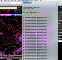
A Yosemite experiment in ugliness:

  1. Go to the weather underground site.
  2. Find their configurable maps
  3. Set for Model Data, which is a black map with very bright markings in it.
  4. Bring down the Bookmarks menu.

What happens is that the translucent bookmarks menu bleeds through the high contrast colors against the black background. It looks incredibly stupid and distracting.

I should get a screen shot of it and post it, but that would mean booting into Yosemite, which I really don't want to do.
 

joedec

macrumors 6502
Jul 25, 2014
443
51
Cupertino
Mavericks looks like Lion and Mountain Lion. Snow Leopard had scrolling controls and everything was in color. With Lion, Mountain Lion, and Mavericks the scrolling controls are narrower, the stop light buttons in the upper left corner of the display are a little smaller, and for some reason color icons in things like Mail and the sidebar of a Finder window are now all monochrome. Other than that it looks pretty much identical to Snow Leopard.

A Yosemite experiment in ugliness:

  1. Go to the weather underground site.
  2. Find their configurable maps
  3. Set for Model Data, which is a black map with very bright markings in it.
  4. Bring down the Bookmarks menu.

What happens is that the translucent bookmarks menu bleeds through the high contrast colors against the black background. It looks incredibly stupid and distracting.

I should get a screen shot of it and post it, but that would mean booting into Yosemite, which I really don't want to do.

Even easier ...

1. Open http://www.yelp.com
2. Scroll down a little.
3. Your Safari toolbar background is PINK!

Now that's ugly.

I like to leave the demo machines in the Apple store like this when I'm done playing with it!
 

mjm718

macrumors newbie
Apr 28, 2015
4
0
Mavericks looks like Lion and Mountain Lion. Snow Leopard had scrolling controls and everything was in color. With Lion, Mountain Lion, and Mavericks the scrolling controls are narrower, the stop light buttons in the upper left corner of the display are a little smaller, and for some reason color icons in things like Mail and the sidebar of a Finder window are now all monochrome. Other than that it looks pretty much identical to Snow Leopard.

A Yosemite experiment in ugliness:

  1. Go to the weather underground site.
  2. Find their configurable maps
  3. Set for Model Data, which is a black map with very bright markings in it.
  4. Bring down the Bookmarks menu.

What happens is that the translucent bookmarks menu bleeds through the high contrast colors against the black background. It looks incredibly stupid and distracting.

I should get a screen shot of it and post it, but that would mean booting into Yosemite, which I really don't want to do.

Thanks, OGT. This gives me an idea of what to expect with Mavericks. I experienced the bleeding you describe with Yosemite for this first time this morning. More than that I just don't like the washed out look and the small/slightly blurry text.
 

HeyMarley

macrumors newbie
Apr 12, 2009
5
0
I desperately need to recalibrate Yosemite, but the default calibration tool is not good enough. Any suggestions, help or advice on what I can use? I'm trying to use Supercal, but it crashes when I try to purchase.

My black level is too dark. I can only differentiate between the bottom row

http://www.lagom.nl/lcd-test/black.php

everything after that is pure black. This makes watching films a terrible experience.
 

OldGuyTom

macrumors regular
Original poster
Sep 6, 2013
156
33
US
Even easier ...

1. Open http://www.yelp.com
2. Scroll down a little.
3. Your Safari toolbar background is PINK!

Now that's ugly.

I like to leave the demo machines in the Apple store like this when I'm done playing with it!


I actually did it and got the screen shots, but was surprised that even MacRumors could be made to look ugly under Yosemite, so I included that too:
 

Attachments

  • BeautyOfTransucency1.jpg
    BeautyOfTransucency1.jpg
    21.6 KB · Views: 125
  • BeautyOfTransucency3.jpg
    BeautyOfTransucency3.jpg
    132 KB · Views: 145

OldGuyTom

macrumors regular
Original poster
Sep 6, 2013
156
33
US
That's not too distracting now, is it?

I was actually thinking about making up a joke about some hippies on acid attending an Iron Butterfly concert to see the 17 min rendition of Inna Gadda Da Vida to one of their light shows, but then I thought I'd just let the results speak for themselves.
 

BigxMac

macrumors member
Mar 15, 2015
35
13
I have installed Yosemite and went back to Mavericks 3 times but I always end up back on Yosemite. This is for a number of reasons. Here are the top ones (1 = biggest reason, 2 = less important etc)

1. Apple dropped Mavericks support in the middle of Xcode 6!
I am an iOS Developer and I need to have Xcode 6.3 for the WWDC student scholarship project and to write the latest Swift code. This update will only run on Yosemite :(

2. OS X Mavericks does need "some" simplification
OS X Mavericks was in need of a design refresh in some areas. You could tell some things were just getting dated, but Apple went about it the wrong way. Yosemite looks terrible in many aspects.

3. Inconsistency between my iPhone 6 and my Mac
While the iOS 7 redesign (and iOS8) is not perfect it does look better than iOS 6. With that said when I would go on my iPhone and then hop on my Mac on Mavericks I felt like my Mac was outdated somehow.

I am hoping that in OS X 10.11 announced in about month things will be cleaned up and perfected.
 

redheeler

macrumors G3
Oct 17, 2014
8,640
9,288
Colorado, USA
I actually did it and got the screen shots, but was surprised that even MacRumors could be made to look ugly under Yosemite, so I included that too:

It doesn't look all that ugly to me, but if it bothers you simply turn off transparency with System Preferences > Accessibility > Reduce transparency.
 

ZVH

macrumors 6502
Apr 14, 2012
381
51
It doesn't look all that ugly to me, but if it bothers you simply turn off transparency with System Preferences > Accessibility > Reduce transparency.


It seems to me there's a lot of (obvious) advice in this thread from Yosemite "advocates" telling everyone how to circumvent Yosemite's appearance. Has it not occurred to you yet that the mere fact that you're suggesting circumventing the way an OS looks should be telling you there's something wrong with its appearance?

FYI, reducing transparency makes it look even worse, as the doc turns into an ugly gray blurb.
 

redheeler

macrumors G3
Oct 17, 2014
8,640
9,288
Colorado, USA
It seems to me there's a lot of (obvious) advice in this thread from Yosemite "advocates" telling everyone how to circumvent Yosemite's appearance. Has it not occurred to you yet that the mere fact that you're suggesting circumventing the way an OS looks should be telling you there's something wrong with its appearance?

You can't please everyone with the way an OS looks, which is why they included the setting for disabling transparency. I have transparency enabled on all my Yosemite Macs and its appearance doesn't bother me at all.

FYI, reducing transparency makes it look even worse, as the doc turns into an ugly gray blurb.

Try System Preferences > General > Use dark menu bar and Dock, or cDock to customize the Dock even further :)
 

vista980622

macrumors 6502
Aug 2, 2012
369
178
I have installed Yosemite and went back to Mavericks 3 times but I always end up back on Yosemite. This is for a number of reasons. Here are the top ones (1 = biggest reason, 2 = less important etc)

1. Apple dropped Mavericks support in the middle of Xcode 6!
I am an iOS Developer and I need to have Xcode 6.3 for the WWDC student scholarship project and to write the latest Swift code. This update will only run on Yosemite :(

2. OS X Mavericks does need "some" simplification
OS X Mavericks was in need of a design refresh in some areas. You could tell some things were just getting dated, but Apple went about it the wrong way. Yosemite looks terrible in many aspects.

3. Inconsistency between my iPhone 6 and my Mac
While the iOS 7 redesign (and iOS8) is not perfect it does look better than iOS 6. With that said when I would go on my iPhone and then hop on my Mac on Mavericks I felt like my Mac was outdated somehow.

I am hoping that in OS X 10.11 announced in about month things will be cleaned up and perfected.

The first problem is solvable, because a genius developer has back-ported Xcode 6.3 and released his solution on Github:

https://github.com/landonf/XcodePostFacto/
 

hamis92

macrumors 6502
Apr 4, 2007
475
87
Finland
You can't please everyone with the way an OS looks, which is why they included the setting for disabling transparency. I have transparency enabled on all my Yosemite Macs and its appearance doesn't bother me at all.

While it's true that you can't please everyone, it seems like the previous releases of Mac OS X pleased a larger percentage of users than Yosemite does. I have no scientific data on this, but it just feels that way because of how much people complain.
 

ZVH

macrumors 6502
Apr 14, 2012
381
51
You can't please everyone with the way an OS looks, which is why they included the setting for disabling transparency. I have transparency enabled on all my Yosemite Macs and its appearance doesn't bother me at all.


Try System Preferences > General > Use dark menu bar and Dock, or cDock to customize the Dock even further :)

You've completely missed my primary point. Why do people need to massage and adjust the OS so it doesn't look like garbage? Change this, change that, where does it end?

I think the word to describe Yosemite in it's current state is "kludge."
 

Paulk

macrumors 6502
Feb 10, 2008
307
38
Sweden
I have installed Yosemite and went back to Mavericks 3 times but I always end up back on Yosemite. This is for a number of reasons. Here are the top ones (1 = biggest reason, 2 = less important etc)

1. Apple dropped Mavericks support in the middle of Xcode 6!
I am an iOS Developer and I need to have Xcode 6.3 for the WWDC student scholarship project and to write the latest Swift code. This update will only run on Yosemite :(

2. OS X Mavericks does need "some" simplification
OS X Mavericks was in need of a design refresh in some areas. You could tell some things were just getting dated, but Apple went about it the wrong way. Yosemite looks terrible in many aspects.

3. Inconsistency between my iPhone 6 and my Mac
While the iOS 7 redesign (and iOS8) is not perfect it does look better than iOS 6. With that said when I would go on my iPhone and then hop on my Mac on Mavericks I felt like my Mac was outdated somehow.

I am hoping that in OS X 10.11 announced in about month things will be cleaned up and perfected.
Well, I will wait for 10.11, and perhaps after I've checked these forums I may, just may, try it.
 

grahamperrin

macrumors 601
Jun 8, 2007
4,942
648
… Mavericks … where I can buy/download it? …

Please see https://forums.macrumors.com/showthread.php?p=20984899#post20984899 under OS X Mavericks not available is App store (I had two chats with AppleCare support).

While it's true that you can't please everyone, it seems like the previous releases of Mac OS X pleased a larger percentage of users than Yosemite does. I have no scientific data on this, but it just feels that way because of how much people complain.

I began polls about Mavericks and Yosemite – both remain open (readers can find the topics, if they wish) – the results of the polls should not be viewed as scientific, but they do indicate that fewer people are likely to recommend Yosemite.

… I admit the option to add a title bar should be present …

+1

However I no longer hope for a third party fix.

… some more obscure browsers …

As before: I'll refrain from reviews or recommendations of those browsers. I refrain in this topic, because it's about OS X, but I would like to continue to exchange thoughts about the presentation of titles. If I quote you in a relevant topic, can you join me there? Thanks.

… hilariously, included versions of Safari which do not qualify as the current form of the browser.

They're current.
 

RedOctober

macrumors regular
Mar 14, 2015
192
523
West side of Oz
Yosemite..no thanks

I've been running Mavericks 10.9.5 since I inherited a mid 2012 MBP non-retina a few months ago (after cranking it up to a Samsung 512Gb EVO SSD and 16Gb RAM) and had have been reading up on the issues with Yosemite.

Had some free time yesterday so I thought I'd have a play with it so I installed it onto an external SSD and ran it via USB3 -by golly, the icons were shocking and everything looked it's been bleached white.

I think I'll stick to 10.9.5 for now.
 

albusseverus

macrumors 6502a
Nov 28, 2007
744
154
Well, I will wait for 10.11, and perhaps after I've checked these forums I may, just may, try it.

I'm looking forward to 10.11, wonder if they can -minimalise- it even more, like iOS 8. I do miss buttons in iOS 8, something Apple spent years ridiculing Windows for—clicking on text to perform an action.

Yosemite pretty much caught up to the clean look of http://elementary.io
Wonder if they can surpass it in 10.11

I've grown quite fond of the clean look of Yosemite. After struggling with Win8 at work all day, it's such a relief to come home to the clean look and feel of Yosemite on my iMac every night. AirDrop & Continuity are worth the price of admission "alone".

Haven't been able to bring myself to open Photos. Just can't get my head around storing photos in iCloud. Yes to iCloud for syncing, but I want my photo library on my Mac only. Pity, because I used iPhoto from time to time—slideshows and the odd book, so I have no idea what I'm going to do about the slides and books I had in iPhoto. Haven't had the need under Yosemite. Maybe Apple will have a solution I can use by the time I do.

Mavericks was OK, but I like Yosemite better than Mavericks… except Photos and…

Sadly, Yosemite rendered my 2010 2GB RAM 11" Air pretty useless—now only netbook capabilities, whereas under Mavericks, I could do reasonably complex image editing in Pixelmator. No more. It used to crash a lot under pre-release Yosemite betas, but at least it's been stable with the release and subsequent betas—just not very functional. Can't even edit complex Word documents with Libre Office anymore.

Bring on 10.11

I wonder if there will ever be a time when the OS has only 1 new feature - now twice as fast as previous OS! If only that were a bullet point.
 
Status
Not open for further replies.
Register on MacRumors! This sidebar will go away, and you'll see fewer ads.