Become a MacRumors Supporter for $50/year with no ads, ability to filter front page stories, and private forums.
Status
Not open for further replies.

leman

macrumors Core
Oct 14, 2008
19,525
19,691
Nobody starts an open source project for any purpose other than the betterment of an entire community. That's the whole point of open source, and is a very core point of its ethos.

This is not true. I am sure that there are some people that like to think that way about themselves though. Usually, open source projects are started either to get more people to contribute to your ideas or because it does not make much sense to keep the software closed-source. I open source my software simply because I can't sell it — most of stuff I do is part of my work in academia. Nobody is going to pay for it, no matter how great it is. My revenues from it are indirect, because I get invited to various universities to teach classes on how to use my tools.
 

dsemf

macrumors 6502
Jul 26, 2014
442
116
I agree here, I never use LaunchPad. IMO, its quite pointless. Spotlight is much more convenient for launching applications.

I, on the other hand, use LaunchPad extensively on my Air. Lower left hot corner: swipe down, swipe up, touch. I do use Spotlight at times. It depends on where my hands are at the moment and the application I want to launch. BTW, I take a very minimalist approach to the Dock: Finder, Downloads and Trash. To each their own methods. Its great.

DS
 

grahamperrin

macrumors 601
Jun 8, 2007
4,942
648
The great value of guidelines that maximise understanding at a glance

With apologies for some repetition: now, at last, I think I can explain a key point in a way that will be understandable to a broader range of readers.

… if your desktop is a cluttered mess with dozens of partially overlapping windows, then you need to start scanning trough the title bars. But at that point you should be using Mission Control/Dock/CMD+Tab. …

For now, please let's ignore the screenshot that presented a cascade. That cascade was too exaggerated.

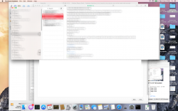
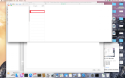
Instead: take a broader, non-cropped view of my earlier (14A283o) example. With either blur or redaction, take your pick:


A natural cascade, only three deep.

Six windows, two of which (bottom right) were irrelevant at the moment of the problem. Particular attention to the window in front, and the one immediately behind.

Towards a deeper understanding of the type of problem that Yosemite introduces to the user experience (UX), I suggest ignoring the two windows that were irrelevant. You could treat that entire desktop as having an essence of four windows, or take the extreme view that there were six. No-one will convince me that I had created clutter.

Neither was there any mess created by me. Between fifteen and eighteen icons on the spacious desktop, automatically arranged – strictly orderly. Order is extremely important to me. Most things are strictly alphabetical but my desktop icons, at any Mac, are always strictly chronological. No-one will convince me that things were messed up by me.

at that point you should be using Mission Control/Dock/CMD+Tab. …

No. And this may be the key point that drove me, more than any other point, to reject Apple's experiments.

First impressions given by the operating system were essentially wrong. The first split-second of scanning what was on screen. Where there were truly four windows, the OS appeared to present the wrong number:


Whenever Yosemite is likely to misrepresent the number of units of organisation (the number of windows), at such a basic level, I suspect that – amongst other things – the OS causes the human eye to perform scanning movements/patterns that both:
  • confuse the context; and
  • make it difficult gain focus on the required content.
----

The difficulty may be so subtle, and the moments so brief, that the end user is not consciously aware (at each moment) of the difficulty. But the cumulative effect of such moments is repellent to me.

----

From Mavericks, and from earlier releases of Apple operating systems, I am accustomed to using the best tools:
  • my eyes
  • my brain's perception of what is seen at any particular moment
– nothing less. Nothing more.

Not a glance followed by a command that results from movement of the hand or hands. Not a glance followed by a command that results from recognition of speech. A glance, pure and simple. Tremendously effective.

Decades of outstandingly good designs by Apple allowed me to interpret, to understand what is important to me – at a glance. Sometimes within a split-second. With extremely high confidence that the human interface of the OS will successfully convey what is required in almost all situations.

The flaws in Yosemite's human interface are destructive to that confidence.

I found – repeatedly – that Yosemite is far less likely, than Mavericks, to successfully convey what is required – when required.
 

Attachments

  • 2014-07-12 07-35-26 screenshot, some blur.png
    2014-07-12 07-35-26 screenshot, some blur.png
    1.6 MB · Views: 1,255
  • 2014-07-12 07-35-26 screenshot, some redaction.png
    2014-07-12 07-35-26 screenshot, some redaction.png
    952.7 KB · Views: 1,216
Last edited:

roadbloc

macrumors G3
Aug 24, 2009
8,784
215
UK
Are Apple still planning on sticking that fisher price theme onto OS X? :( Shame. I'd have thought they'd have backtracked by now. Or hoped at least.
 

Miguel Cunha

macrumors 6502
Sep 14, 2012
389
102
Braga, Portugal
Am I the only guy who always thought iOS 7 looked fresh and cool?

Never said you were.
It was my perception of people's reaction in general.

I think that Yosemite looks way more modern than Mavericks. It's unifying the design language that was naturally evolved into and it adds some awesome features too.

Indeed.
That's why I started my post with "features aside". ;)

By the way if you guys have questions about how stuff looks or works in Yosemite, I'd be glad to help. I'm out from around 09:00-16:00 EST this week but outside of those hours I'm happy to help.

Thank you for your readiness.
Always good to have someone to unveil what's behind the magic. :)
 

Padmini

macrumors 6502a
Aug 9, 2014
545
2
The look is not going to change, that's final except for some mini changes.

Performance wise, I don't know how you installed Yosemite, but even in a beta state, for me it performs better than Mavericks, same battery life, love how Safari performs, so this can only get better.

It was an upgrade. I'm planning on doing a clean install soon but i don't believe it will fix the performance issues.

Safari is sluggish. Scrolling is not as smooth as Mavericks, opening a new tab takes almost a second after a click.
 

jolux

macrumors regular
Aug 9, 2014
171
1
This is not true. I am sure that there are some people that like to think that way about themselves though. Usually, open source projects are started either to get more people to contribute to your ideas or because it does not make much sense to keep the software closed-source. I open source my software simply because I can't sell it — most of stuff I do is part of my work in academia. Nobody is going to pay for it, no matter how great it is. My revenues from it are indirect, because I get invited to various universities to teach classes on how to use my tools.

That's not starting an open source project though. I urge you to find an OSP that doesn't mention "making a better ________ through the power of OSS" or something along those lines.
 

leo.andres.21

macrumors regular
Oct 14, 2008
227
32
Centre of the Attention
With apologies for some repetition: now, at last, I think I can explain a key point in a way that will be understandable to a broader range of readers.

For now, please let's ignore the screenshot that presented a cascade. That cascade was too exaggerated.

Instead: take a broader, non-cropped view of my earlier (14A283o) example. With either blur or redaction, take your pick:

A natural cascade, only three deep.

Six windows, two of which (bottom right) were irrelevant at the moment of the problem. Particular attention to the window in front, and the one immediately behind.

Towards a deeper understanding of the type of problem that Yosemite introduces to the user experience (UX), I suggest ignoring the two windows that were irrelevant. You could treat that entire desktop as having an essence of four windows, or take the extreme view that there were six. No-one will convince me that I had created clutter.

Neither was there any mess created by me. Between fifteen and eighteen icons on the spacious desktop, automatically arranged – strictly orderly. Order is extremely important to me. Most things are strictly alphabetical but my desktop icons, at any Mac, are always strictly chronological. No-one will convince me that things were messed up by me.


No. And this may be the key point that drove me, more than any other point, to reject Apple's experiments.

First impressions given by the operating system were essentially wrong. The first split-second of scanning what was on screen. Where there were truly four windows, the OS appeared to present the wrong number:

Whenever Yosemite is likely to misrepresent the number of units of organisation (the number of windows), at such a basic level, I suspect that – amongst other things – the OS causes the human eye to perform scanning movements/patterns that both:
  • confuse the context; and
  • make it difficult gain focus on the required content.
----

The difficulty may be so subtle, and the moments so brief, that the end user is not consciously aware (at each moment) of the difficulty. But the cumulative effect of such moments is repellent to me.

----

From Mavericks, and from earlier releases of Apple operating systems, I am accustomed to using the best tools:
  • my eyes
  • my brain's perception of what is seen at any particular moment
– nothing less. Nothing more.

Not a glance followed by a command that results from movement of the hand or hands. Not a glance followed by a command that results from recognition of speech. A glance, pure and simple. Tremendously effective.

Decades of outstandingly good designs by Apple allowed me to interpret, to understand what is important to me – at a glance. Sometimes within a split-second. With extremely high confidence that the human interface of the OS will successfully convey what is required in almost all situations.

The flaws in Yosemite's human interface are destructive to that confidence.

I found – repeatedly – that Yosemite is far less likely, than Mavericks, to successfully convey what is required – when required.

I actually agree with you regarding the scanning for opened windows. I was on Yosemite DP2 and it was such a pain to look for opened apps at a glance. I had to move windows so that they overlap each other, with status bars at different height level, sticking out just enough so i know that they're there. It's a massive waste of space and make any interface clunky to look at.
 

MacRobert10

macrumors 6502
Nov 24, 2012
287
46
I do hope all you people are sending Apple your feedback. Although it may be nice to get on here and "vent" so to speak it doesn't necessarily do any good. I'm sure some people from Apple frequent this site at least once in a while but there's no guarantee they'll even see this thread.

Once again, if you don't have developer previews or beta versions but remain unimpressed with what you've seen, complaints can be filed at the following:

FYI, if you want to complain about the GUI you can visit the following site and provide feedback about Yosemite:

https://www.apple.com/feedback/macosx.html

If you would prefer to write a complaint, here's the address for that too:

Apple, Inc.
1 Infinite Loop
Cupertino, CA 95014

Those with the beta version of developers preview can and should use the feedback assistant to complain.


My own personal guess is that they heard so much negative stuff after the iOS 7 release that they opened OS X up for public beta to avoid the negative feedback. It would be a smart thing to do, especially when literally fooling with what was one of the most respected OSes in the world.
 

Miguel Cunha

macrumors 6502
Sep 14, 2012
389
102
Braga, Portugal
There should be no question that Mavericks along with previous versions of OS X are beautiful. However, their beauty is static. Its about the lines, icons, embossed UI elements.

Yosemite opens a new dimension, which is dynamic beauty. When I first time saw the screenshots of Yosemite, I was quite unimpressed. It looked, well, flat. But when I started using it, I realized that they were doing something quite different. The OS has an incredible amount of depth which is conveyed through the dynamic feedback such as animations and translucency.

Well observed! I love what they're doing with translucency and animation, although we'd already seen some implementation of the latter in Mavericks.
Still, I prefer Mavericks' icons.
I just fail to understand the reason for deprecating something good, instead of having the best of both approches.
Flat, remindes me of Windows… and a flat tyre. :)

It achieves much more then Mavericks with its static design, and it does it much more elegantly (IMO of course). Its all about the subtle UI animations and interplay of content, UI and backgrounds. You can't convey it through a screenshot. You need to actually use the system to appreciate its beauty.

I've been testing the public beta since its release and I understand you mean.
It's slick and very comfortable to operate, but the static takes probably most of the usage (mine, at least) and is very agressive, too rough and sharp for my taste. :eek:

BTW, I always thought that iOS 7 was much more beautiful and most of all, functional than any other iOS (the control center is one of the best designs I have ever experienced on a electronic device).

Far from my intentions to question the functionality and the features, as I stated.
Airdrop will be available with having a Finder window opened - a must have feature since day 0, in Lion - it was obvious and logical, for me.
I love Dark Mode. I don't know if they'll extend, for instance, to a page of text, allowing us to invert the color and have white letters on a black or gray page, like in Xcode.
My eyes would really appreciate it. :cool:

What most people disliked about iOS 7 were the application icons. I got used to them in the meantime, but I still think they are ugly.

I might get used to them, but that's very different from enjoying.
They make want to vomit! :mad:
 

MagnusVonMagnum

macrumors 603
Jun 18, 2007
5,196
1,452
I do hope all you people are sending Apple your feedback. Although it may be nice to get on here and "vent" so to speak it doesn't necessarily do any good. I'm sure some people from Apple frequent this site at least once in a while but there's no guarantee they'll even see this thread.

Once again, if you don't have developer previews or beta versions but remain unimpressed with what you've seen, complaints can be filed at the following:

FYI, if you want to complain about the GUI you can visit the following site and provide feedback about Yosemite:

https://www.apple.com/feedback/macosx.html

And how, pray tell, do I select "Yosemite" as the operating system I'm commenting on when 10.9.4 is the highest one to select? The thing is I AM running 10.9.4. I don't want to put a beta version of OS X on my server. But feedback is not set up for GUI feedback for beta operating systems and yet NOW is the time to tell them before they lock everything in stone and nothing can be changed. It's really up to the beta testers here to provide feedback since that is who they are asking for feedback from.

In any case, I submitted feedback anyway and told them I'd rather see poor GUI choices made optional through THEMING instead and that I think they should have concentrated on functional changes like improvements to Finder similar to "XtraFinder" and the latest OpenGL standards instead of trying SO HARD to make OS X look like iOS7.
 
Last edited:

Miguel Cunha

macrumors 6502
Sep 14, 2012
389
102
Braga, Portugal
Yosemite, as a whole, appears to force a trend in a way that is not acceptable to me. I totally understand that the OS is nowhere near release quality, but I used it for long enough to realise that some exquisite touches alone are not enough; the overall appearance is repellent to me. Add to that appearance: some loss of functionality, the result is alienation of a customer.

Mavericks continues to attract me.

The fervour around Yosemite, I can understand and accept. But beneath the recent fervour, there is a rationale that is demonstrably incomplete. If Apple imagines that all users will fail to notice the flaws in the logic – the incompleteness – Apple is wrong.

Trends that do not make complete sense, bulldozed through … this is not Apple producing the best. It's popularity, at a cost, but it's not the best.

I couldn't agree with you more.
Nicely put.

(Off-topic: years ago a friend recommend Blink. It's on my reading list.)

Thanks for the book recomendation. Seems very interesting.

It wasn't love at first sight with Yosemite, so I immediately gave feedback.

Let's hope they-:apple: (will be willing to) take you under consideration.
May I give that kind of feedback, even not being a developer? If so, I will drop them a line or two.

Things were puzzling, but I kept the puzzles pretty much to myself. As 'no questions asked' could not apply, instead I suspended judgement. I gave it time. Maybe it would be love at second, third or fourth developer preview.

DP 4 reinforced my perception of Yosemite as a like it or lump it approach to customers. Love, at first sight? No. Like, after a few weeks? No.

I lumped it, and jumped ship to the things that will make most sense for a gradual departure from OS X.

Very insightful post.
Thanks for sharing your points of view.
 

Miguel Cunha

macrumors 6502
Sep 14, 2012
389
102
Braga, Portugal
I do hope all you people are sending Apple your feedback. Although it may be nice to get on here and "vent" so to speak it doesn't necessarily do any good. I'm sure some people from Apple frequent this site at least once in a while but there's no guarantee they'll even see this thread.

Once again, if you don't have developer previews or beta versions but remain unimpressed with what you've seen, complaints can be filed at the following:

FYI, if you want to complain about the GUI you can visit the following site and provide feedback about Yosemite:

https://www.apple.com/feedback/macosx.html

If you would prefer to write a complaint, here's the address for that too:

Apple, Inc.
1 Infinite Loop
Cupertino, CA 95014

Those with the beta version of developers preview can and should use the feedback assistant to complain.


My own personal guess is that they heard so much negative stuff after the iOS 7 release that they opened OS X up for public beta to avoid the negative feedback. It would be a smart thing to do, especially when literally fooling with what was one of the most respected OSes in the world.

Thanks for the tip.
 

shanson27

macrumors 68020
Nov 27, 2011
2,228
21,188
Get info redesign, from terrible Yosemite, to beautiful Yosemite:D
What do you think

Bildschirmfoto%202014-08-15%20um%2002.49.29.png


more to see here, click
 

smartalic34

macrumors 6502a
May 16, 2006
977
61
USA
My own personal guess is that they heard so much negative stuff after the iOS 7 release that they opened OS X up for public beta to avoid the negative feedback. It would be a smart thing to do, especially when literally fooling with what was one of the most respected OSes in the world.

I seem to remember the general consensus of the redesign that was iOS 7 was quite positive. Sure, it was a big change, but well-received. A couple threads in MacRumors with some vocal posters pales in comparison to not only the positive reviews on the big tech sites and general public consensus, but all the MR members happy with the design who didn't bother posting. After all, people are more likely to post if they have a complaint or problem. I think the beta is more for bug-squashing.

How will progress ever occur if things always stay the same?
 

maflynn

macrumors Haswell
May 3, 2009
73,682
43,740
Get info redesign, from terrible Yosemite, to beautiful Yosemite:D
What do you think

Image

more to see here, click

I'm liking the UI a lot more then I originally did but I think this example shows the what doesn't work imo. I think the lack of contrast works against the design. The older version is better imo because its easier on the eyes and easier to read imo
 

matrix07

macrumors G3
Jun 24, 2010
8,226
4,895
I'm liking the UI a lot more then I originally did but I think this example shows the what doesn't work imo. I think the lack of contrast works against the design. The older version is better imo because its easier on the eyes and easier to read imo

Yeah.. it's pretty but it REALLY hard to read.
 

grahamperrin

macrumors 601
Jun 8, 2007
4,942
648
The look is not going to change, that's final except for some mini changes. …

When developer preview 4 was seeded, I had much the same assumption.

I do hope all you people are sending Apple your feedback.

Yes and no.

The DP 5 introduction of a preference to show addresses in Safari was fairly predictable.

The harsher regressions – those that affect the system as a whole – appear to be presented, by Apple, as core features (with no hint of a way to avoid troubles that that may arise from enforcement of those features). Those things were presented with pride by Apple and so for Apple to relax, or somehow backtrack, could seriously hurt the pride of some people there.

A snippet from my unenrolment e-mail to Apple, 24th July:

"… I hoped that with Yosemite, Developer Preview 4 would allow users to enjoy some basics such as titles and addresses. Sadly not. I feel that Apple is bulldozing these changes without an appreciation of all possible long term consequences. Also, without blaming any presenter at WWDC, I believe that it was wrong to announce, in that context, some of the most contentious changes. …"​

(When writing that e-mail, I had not yet realised that the true nature of Safari 8 was partially misrepresented at WWDC. Had I realised, I would have voiced my concerns.)

Although it may be nice to get on here and "vent" so to speak it doesn't necessarily do any good.

The diversity of venting – the discussion – helped me to get closer to the cores of the more nebulous problems. That deepened understanding is a good thing. And hand-on-heart, that understanding would not have come if I had continued testing in the established way. The leap away from establishment proved to be a really good breathing space. A very personal thing.

Please note, I do not encourage other testers to step away. The more feedback to Apple – with confidentiality – the better.

… My own personal guess is that they heard so much negative stuff after the iOS 7 release that they opened OS X up for public beta to avoid the negative feedback. It would be a smart thing to do, especially when literally fooling with what was one of the most respected OSes in the world.

I enjoy a refurbished and almost perfect first generation iPhone (iOS 3.1.3) so I can't make significant comments on the transition from 6 to 7, but from what I saw of both operating systems (on other people's devices): both 6 and 7 were usable and fit for purpose.

Let's not lose sight of the essential nature of OS X: it is for Mac hardware.

If refinements to OS X lead to greater ease of use of other operating systems: that's fine. But the usability of OS X should not be reduced.

… What do you think

Bildschirmfoto%202014-08-15%20um%2002.49.29.png

Just some of my views on that type of thing: overall, the Yosemite appearance is less legible and less informative. It's novel, colourful and experimental, but it's ultimately a wash-out.

more to see here, click

Thanks, I'll look later. I might reply under Post all of your OS X Yosemite screenshots here! but I should discourage publication of screenshots so if I don't comment, please don't be offended.

… How will progress ever occur if things always stay the same?

Apple's changes before Yosemite were nearly always progressive. I welcomed all of that progress.

Some of the appearance of Yosemite is, for some customers, regressive. I can not welcome changes of that nature.

… Amongst the qualities that have made using Macs an outstandingly good experience, over the years: constancy and refinement. …

Refinements. Additions, complements. Broadening of support. Standards-oriented work. More choices for end users. Improvements to the blend of simplicity plus power. And so on.

All of those things involve change; not one can be classed as always staying the same.

Constancy

With emphasis added by me:

The quality of being faithful and dependable;
  • the quality of being enduring and unchanging: the trade winds are noted for constancy in speed and direction.
– expect reasonable degrees of change in direction, and lulls in speed, but the general direction can be relied upon.

So, for example, faith in the general direction of a trade wind allows the traveller to progress – without fear of persons or possessions being stranded or going overboard.

To me, the changes to Yosemite are indicative of Apple losing some direction with its much-loved operating system for much-loved Mac hardware. I'd like to expand upon that, but not in this topic – it could be a long and difficult discussion, one that will touch some nerves.

… DP 4 reinforced my perception of Yosemite as a like it or lump it approach to customers. …

That perception remains true, for its time, but I'm less inclined to believe that Apple knowingly took a like it or lump it attitude.

It has taken weeks for me to begin describing a problem in a way is more understandable. A majority of people will continue to disagree with my perceptions – disagreement is natural – but I feel that there's less of a brick wall.

So, it's possible that Apple did not foresee people having such difficulties with the first five pre-releases. Maybe reactions such as mine did not surface – or were inexplicable – during internal testing by Apple.
 

Intelligent

macrumors 6502a
Aug 7, 2013
922
2
Note pixelation.. very difficult to read.

I was expecting the "Dark Mode" to be as beautiful and clear as say the Pixelmatr app. If you've ever used that, you'll know what I mean.


The Pixelmator look is based off of Apples HUD Windows which are in Xcode. Dark mode is not even done yet.
 

ZVH

macrumors 6502
Apr 14, 2012
381
51
Apple's changes before Yosemite were nearly always progressive. I welcomed all of that progress.

Some of the appearance of Yosemite is, for some customers, regressive. I can not welcome changes of that nature.

Agreed. Progress means improvement. The shear number of posts and views of this thread tell me people generally don't like Yosemite, and likewise with iOS7.

As long as there are Fanboy magazines/publications like MacWorld, who dare not say anything bad about the company they, as pilot fish, have attached themselves to to make a living off of, and as long as Apple is dictating to users that what they are producing is wonderful, you really can't get a feel for how well stuff is received.

iOS 7 is a perfect example. A users survey in CNET which was simply users rating the product gave iOS 7 a 1.5 out of 5 stars. The media, on the other hand (including CNET) rated it between 4 and 5. They dare not say anything bad about an advertising sugar-daddy. Like someone else posted, iPad sales are falling since iOS 7's release. Unlike iPhones, that are tied to contracts, iPad's usually aren't.

I considered getting an iPad when iOS6 was around. I didn't need it. I just toyed with the idea. When iOS7 came out with it's stupid translucency, simple minded icons, and glaring white everywhere the "consider an iPad" option changed to "want nothing to do with an iPad." I will never own an iPad and the next time I look at smartphones Apple will be given no other priority other than that of another manufacturer to consider...when it used to be the only brand to consider.

If the objective of their new design is to irritate a considerable number of customers, I guess I should salute them with a "job well done." They can hide behind fast talking marketing types and self published statistics indicating overall success, but they won't be able to hide from a loss of customers.
 

Dozer_Zaibatsu

macrumors 6502
Oct 10, 2006
344
381
North America
Always hate being late to the gang bang, but...

I'm an old Mac user. My first Macs were beige with Black and White screens. I was using MacOS professionally when the OS9/OSX transition happened. I was a believer big time in where they were going with it, and the dock and the developments of things like Exposé were brilliant GUI innovations, I thought.

I'm running Yosemite beta, and I'm not convinced. To me, the colors look wrong, and the icons don't look right. The "flat" look doesn't make it easier for me to see where to go.

I'm running iOS7 too, and saw some upsides to it. I didn't think there was much "broken" with iOS6, though. A year on, I can still take or leave iOS7. It never "grew" on me. It looks like something that will seem so obviously dated in a few years. Like what flared polyester pants in the early 70s, if people had the presence of mind to think about it for a second.

I didn't care much for the color palette of "Easter Candy." Sadly, it looks worse, in my opinion, on my 27" iMac screen.

Hey, I'm glad that others find that they "love" this. To each their own. I support a bunch of Windows machines, too. And I have learned to work with Windows 8 through gritted teeth. I'm not a fan that Windows out of the box is almost unusable until you install Revo, Classic Start Shell, and a Better Desktop Tool. But with them installed, Windows 8.1 is a usable OS. But I have to say, Yosemite isn't making me feel enthusiastic about signing on to MacOS being "better" than Windows as a choice for OS.

I only wish that Linux were as usable as Windows and MacOS for a lot of routine use. Because I can really appreciate now how much choice there is for Linux desktop distros.
 

MagnusVonMagnum

macrumors 603
Jun 18, 2007
5,196
1,452
Get info redesign, from terrible Yosemite, to beautiful Yosemite:D
What do you think

I think they took out 3x the functionality/information from Yosemite and further dumbed down OS X. Visually, I don't like the new traffic light buttons at all. Otherwise, I see little difference worth getting excited about from just that snapshot other than the fact that Yosemite there looks like it came off some kid's iPod Touch rather than a professional level computer. ;)
 

jolux

macrumors regular
Aug 9, 2014
171
1
I think they took out 3x the functionality/information from Yosemite and further dumbed down OS X. Visually, I don't like the new traffic light buttons at all. Otherwise, I see little difference worth getting excited about from just that snapshot other than the fact that Yosemite there looks like it came off some kid's iPod Touch rather than a professional level computer. ;)

I'm still grappling with the idea that you can remove functionality with a visual update. I classify myself as what most people would call a power user, and I love Yosemite. All of the new features are positively priceless, (literally, the update is free :D) and I like the unified design elements. I'm using it as my daily driver right now, about to make a full switch. My 64GB Cruzer Extreme arrives Monday.:cool:

Could you give me a simplified rundown of the issues you're having with it?
 

MagnusVonMagnum

macrumors 603
Jun 18, 2007
5,196
1,452
I'm still grappling with the idea that you can remove functionality with a visual update.

Removing like half the information from "Get Info" reports defeats functionality. I don't think that's very hard to understand. :rolleyes:

Frankly, I wouldn't be shocked if they make the Shell inaccessible at some point (since it "confuses" some people) like they did by hiding the /Library folders (which you need to access to adjust some programs parameters and log files ,etc.). Let's face it, Apple has been kiddifying OS X for some time now. They just assume their average user is a non-computer person and try to design some fashion parade that control with a two-button remote (like Apple TV and let me say that two-buttons plus a ring is woefully inadequate sometimes there).
 
Last edited by a moderator:

charlituna

macrumors G3
Jun 11, 2008
9,636
816
Los Angeles, CA
Why is it that some of the people arguing on behalf of Yosemite come across as a bunch of salesmen trying to sell people something they don't want.

If people don't like it, they don't like it.

my issue is with folks that can't get the simple truth that it is their opinion and not some factual statement. And it might not be a shared opinion.

I happen to like Yosemite, and iOS 8 and I liked iOS 7. That I liked them doesn't make me stupid, a fanboi etc. It just means that my opinion is not yours. That you can't see that is your issue not mine. Get over your issue or do me a favor and put me on your ignore list.

Just like my needs for something like an iPad are not yours. Sorry if YOU can't create on an iPad but I can. Sorry that you feel that the iPad is a toy, I disagree. If you don't like it, don't buy one. But don't tell me that I'm wrong, stupid etc.

and yet I see those kinds of attitudes and comments here way way too much
 
Status
Not open for further replies.
Register on MacRumors! This sidebar will go away, and you'll see fewer ads.