Become a MacRumors Supporter for $50/year with no ads, ability to filter front page stories, and private forums.
Status
Not open for further replies.

grahamperrin

macrumors 601
Jun 8, 2007
4,942
648
… Can the novel appearance be applied consistently to all types of windowed app? …

…Of course it can.

See below.

… Bottomline: its OK for windows to look differently. … Consistency means unambiguity in context: that a stimulus A in a context B always has an interpretation C (which is intuitively expected). …

Yosemite encourages a range of different appearances.

A dictionary definition of consistency:

conformity in the application of something, typically that which is necessary for the sake of logic, accuracy, or fairness: the grading system is to be streamlined to ensure greater consistency.​

– and amongst the definitions of conformity:

similarity in form or type; agreement in character: these changes are intended to ensure conformity between all schemes.​

– that's closest to what I meant.

Tried, tested and established:

Every document and app window and panel has, at a minimum:
  • A title bar. …

– and so, in Mavericks, all such windows and panels have that similarity.

As that primary guideline for windows is trashed by Yosemite, we're left with just one bare minimum:
  • A close button, so that users have a consistent way to dismiss the window.

So. All the different types of window, including the variety that will be added by third party developers, on screen. I can visualise it.

Can the consistency of a small red button cause me to treat all windows and panels as having a consistent appearance? Absolutely not.

In plain english: more difference. Less consistency.
 

FrtzPeter

macrumors member
Aug 11, 2014
77
3
For anyone attempting to "prove" that Yosemite is going to be a big success based on iPhone sales and contracts is using flawed logic. Most iPhone sales are tied to a contract, and the terms and the price of the contract may dictate who buys which device, not whether or not they "love" iOS 7. Some people using an iPhone under such a contract may likely never use it for anything other than a phone.

There is, however, a more independent measure of iOS 7, and that would be iPad sales. Most iPads aren't tied to contracts. The following link indicates their sales have been sagging.....since the release of iOS 7:

http://www.thestreet.com/story/1284...eclining-pad-sales-with-ibm-and-biz-apps.html

I also wouldn't use "data" from the manufacturer of a product to "prove" a point. That logic is like letting a pedophile run a day care center.

iPad sales and the effect of the radical changed brought to it by iOS 7 should be studied as a possible source for the decline in sales. Apple should then learn from that lesson and apply it to Yosemite before they start killing off their own computer base as well.

Change for the sake of change is a very, very, very stupid idea.
 

grahamperrin

macrumors 601
Jun 8, 2007
4,942
648
Edges of windows …

Plus you won't be able to distinguish between windows because there's no shadow anymore.

+1

The resulting collages had a very grating effect.

… and those edges when windows are maximised above the Dock

I just spent fifteen minutes seeking a screenshot that shows both the Dock and a maximised window.

With Google I found nothing. Curious.

… Change for the sake of change is a very, very, very stupid idea.

+1

I can take into consideration all the suggested reasonings behind the appearance of Yosemite. All of it. But the acid test is to simply look. Every time I look, I think: change for the sake of change.
 

MagnusVonMagnum

macrumors 603
Jun 18, 2007
5,196
1,452
Plus you won't be able to distinguish between windows because there's no shadow anymore.

I wonder who will make a load of money with a program that restores a bunch of the features they're removing (like drop shadows). Some features aren't just eye candy. They have actual purpose like making it easier to see window edges. I know XtraFinder makes Finder 1000% more friendly than Apple's own Finder, especially for moving files around with dual-pane mode. Apple could/should have worked on things like the Finder that would make the functionality so much better than putting so much effort on some "Crayola Crayon" look.
 

grahamperrin

macrumors 601
Jun 8, 2007
4,942
648
… theme managers etc. — the reason why OS X does not have one is because window themes do not work. They never have. …

Years ago I thoroughly enjoyed some of the third party approaches to variation from Apple's interface.

Over the years, progressively, Apple made great refinements. I no longer wished to stray. Mavericks is great. Refined.

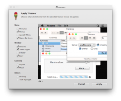
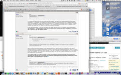
Yesterday as an experiment I began adding, to Mavericks, the things that I most like about Yosemite. The trio of coloured buttons, and so on. I found a theme that's not too dissimilar from Apple's Yosemite then applied only the things that either (a) work for me or (b) grate:

attachment.php


Allowing some of the grating stuff. Excluding things that I know will be intolerable. To see how I felt about something more tolerable than Yosemite; Mavericks with a twist.

Here's the screenshot that I promised yesterday:

attachment.php


I always prefer a menu bar that is bright and consistently opaque, so the appearance there was a puzzle.

Transparent menus were the first thing that I wanted to change.

I could have spent a few minutes, and maybe a little money, editing the appearance to suit my tastes. It would have worked, but there was no great desire to do so. No wish to stray. I reverted to 'Aqua'. It's great. Refined.

Postscript

Please note, I was editing the appearance of a third party theme for Mavericks.

(Not attempting to theme Yosemite.)
 

Attachments

  • mash.png
    mash.png
    503.7 KB · Views: 784
  • 2014-08-11 18-52-40 screenshot.png
    2014-08-11 18-52-40 screenshot.png
    160 KB · Views: 750
Last edited:

Xcallibur

macrumors 6502a
Jul 24, 2011
520
9
Manchester
I wonder who will make a load of money with a program that restores a bunch of the features they're removing (like drop shadows).

There is a slight drop shadowing surrounding the windows, so its not gone completely.

...
I could have spent a few minutes, and maybe a little money, editing the appearance to suit my tastes. It would have worked, but there was no great desire to do so. No wish to stray. I reverted to 'Aqua'. It's great. Refined.

I'm trying to customise Yosemite, not 100% happy yet. I refined Mavericks so it was perfect, just not there yet with Yosemite, might take time.
 

leman

macrumors Core
Oct 14, 2008
19,525
19,688
Unfortunately not.

...

I get it that you seem to be very fond of the notion of 'windows'. But Safari is not using windows as unit of content organisation — it uses tabs; and has been doing so since Leopard. If you are criticising a tool, at least you should be using it as intended by its creator. The chaos of windows in your screenshot is extremely contra-productive, no matter whether we are talking about Mavericks or Yosemite. If your workflow requires a browser which is designed around windows, then please use one. Safari is not the only browser on the market.

Finally, about productivity. I have over 20 different web pages open right now in my Yosemite Safari and somehow I have absolutely no trouble navigating though them, because they are uniquely and quickly identifiable by the tab title. Not to mention the new tab navigation feature.
 

leman

macrumors Core
Oct 14, 2008
19,525
19,688
Every document and app window and panel has, at a minimum:
  • A title bar. …

...

Can the consistency of a small red button cause me to treat all windows and panels as having a consistent appearance? Absolutely not.

Having a title bar that says 'Calendar' on the calendar app is just a waste of space and conformity for the sake of pointless conformity. A minimal requirement for a window is something that identifies it as a window, which is is exactly that red button that you dismiss so easily. How does 'a rect with a red button on the top left and a text in the middle top' is any more 'consistent' than a 'rect with a red button on the top left'? You are not about consistency, you are simply talking about what you are used to.

Its not about change for the sake of change, its change for the sake of improving something. Removing redundant information that does not play any functional role whatsoever (except apparently giving people like grahamperrin some ease of mind) is a big improvement in my book ;)

----------

Allowing some of the grating stuff. Excluding things that I know will be intolerable. To see how I felt about something more tolerable than Yosemite; Mavericks with a twist.

Its kind of a Yosemite theme which completely takes all the depth away from the Yosemite design. That is really flat and uninspiring.
 

Fuchal

macrumors 68030
Sep 30, 2003
2,614
1,137
Edges of windows …


+1

The resulting collages had a very grating effect.

… and those edges when windows are maximised above the Dock

I just spent fifteen minutes seeking a screenshot that shows both the Dock and a maximised window.

With Google I found nothing. Curious.


+1

I can take into consideration all the suggested reasonings behind the appearance of Yosemite. All of it. But the acid test is to simply look. Every time I look, I think: change for the sake of change.

I don't understand - I've read this multiple times but I see shadows behind all my windows in Yosemite. What am I missing? Where is this no-shadow UI?
 

grahamperrin

macrumors 601
Jun 8, 2007
4,942
648
… Safari is not using windows as unit of content organisation …

Is it just me, or is some software becoming a little weird?

Is there an Apple assumption that no-one ever views a page without also opening a tab to something else?

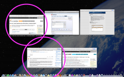
At the moment with Safari 7.x in Mavericks I have six windows, neatly arranged:
  • four with tabs
  • two without tabs.
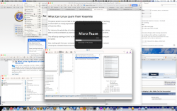
Here's a Mission Control view of the six, with highlights around the two:

attachment.php


Can Apple not, or no longer, recognise each of those two highlighted windows as a unit of content?

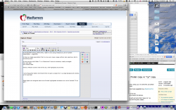
I very frequently Option-Command-Click to open a single link in a new background window, so for example:

attachment.php


I bring that seventh window to the front. Here, no tab:

attachment.php


I can see the title of the window behind.

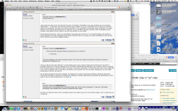
If I am to blind myself to the title bar and seek the title elsewhere – some people suggest, in a tab – then Apple would logically need to have the tops of some new windows much lower by default. A rough example (I simply dragged the window down, without shrinking it):

attachment.php


Result: less space for the body content of the page.

----

Incidentally, I'm not averse to weird. Like, The Purple Armchair is from the outside an uninvitingly weird book. But a surprisingly good read, from what I recall. Man.
 

Attachments

  • 2014-08-12 21-49-59 screenshot.png
    2014-08-12 21-49-59 screenshot.png
    930.5 KB · Views: 762
  • 2014-08-12 21-50-57 screenshot.png
    2014-08-12 21-50-57 screenshot.png
    977.7 KB · Views: 790
  • 2014-08-12 21-51-12 screenshot.png
    2014-08-12 21-51-12 screenshot.png
    1,023.7 KB · Views: 757
  • 2014-08-12 21-44-43 screenshot.png
    2014-08-12 21-44-43 screenshot.png
    1.8 MB · Views: 808

grahamperrin

macrumors 601
Jun 8, 2007
4,942
648
… information that does not play any functional role …

Things like that may be said, countless times, to …users of the information.

The sayings may be well-intended, but they fail to address a problem.

… You are not about consistency, you are simply talking about what you are used to. …

No. That's a misinterpretation of what I tried to say.

Plus, it is not a simple discussion. There's a problem. I don't expect everyone to understand but please, don't dismiss this as simplistic or blinkered.

----------

… Where is this no-shadow UI?

From what I recall, the shadows are terribly lacking in depth compared to Mavericks. It's fair to say, almost worthless wherever part of a window is borderless. Really flat and uninspiring …

YMMV
 

grahamperrin

macrumors 601
Jun 8, 2007
4,942
648
… If your workflow requires a browser which is designed around windows, then please use one. …

I do use one: Safari. In Mavericks.

Some windows with tabs. Some without. And I can take those windows fullscreen, and so on.

To the best of my recollection, Safari has never presented a web page without the context of a window.

Yes, Safari in Mavericks has excellent support for tabbed browsing. But in plain english: there are windows, and from the perspective of an end user, nothing has ever given me the impression that Safari is designed without due consideration given to use of windows.
 

jolux

macrumors regular
Aug 9, 2014
171
1
Edges of windows …


+1

The resulting collages had a very grating effect.

… and those edges when windows are maximised above the Dock

I just spent fifteen minutes seeking a screenshot that shows both the Dock and a maximised window.

With Google I found nothing. Curious.

+1

I can take into consideration all the suggested reasonings behind the appearance of Yosemite. All of it. But the acid test is to simply look. Every time I look, I think: change for the sake of change.

There you go, dock and maximized window. There's no edge. I don't normally make the dock that big, this is for emphasis. God, the icons look so lickable on this Retina display.

Furthermore, you can say change for the sake of change as much as you want, but design is design. If you think the new design is worse, and not worth all of the new UI improvements, then fine. A lot of us like the new look, it's not necessarily better, but it's different. It feels very fresh to me, and I like the consistency of the Dock icons. Every once in a while, a platform needs freshening up. The UI had been previously almost unchanged since Leopard, with some elements going back as far as Panther. It was starting to look pretty old, and the remnant skeuomorphs had to be killed off. The web and by proxy the computer world as a whole has been flattening, the scrolljacking web design trend that Apple popularized with the iPhone 5s and 5c pages last September has gone viral, now Google is using it and it's currently the trendiest way to design a web page. The old Aqua was an interface not consistent with the trends of the future.

Personally I think Yosemite is great. Handoff and Continuity are seamless and awesome, all of the new icons look fantastic, (though the Messages badge is starting to bug me) and Spotlight has replaced Alfred for me.
 

Attachments

  • Screen Shot 2014-08-12 at 6.00.32 PM.png
    Screen Shot 2014-08-12 at 6.00.32 PM.png
    928.8 KB · Views: 145

dsemf

macrumors 6502
Jul 26, 2014
442
116


Is it just me, or is some software becoming a little weird?

Is there an Apple assumption that no-one ever views a page without also opening a tab to something else?

At the moment with Safari 7.x in Mavericks I have six windows, neatly arranged:
  • four with tabs
  • two without tabs.
Here's a Mission Control view of the six, with highlights around the two:

Image

Can Apple not, or no longer, recognise each of those two highlighted windows as a unit of content?

I very frequently Option-Command-Click to open a single link in a new background window, so for example:

Image

I bring that seventh window to the front. Here, no tab:

Image

I can see the title of the window behind.

If I am to blind myself to the title bar and seek the title elsewhere – some people suggest, in a tab – then Apple would logically need to have the tops of some new windows much lower by default. A rough example (I simply dragged the window down, without shrinking it):

Image

Result: less space for the body content of the page.

----

Incidentally, I'm not averse to weird. Like, The Purple Armchair is from the outside an uninvitingly weird book. But a surprisingly good read, from what I recall. Man.

You have highlighted something interesting.

Every person has their own usage patterns and based on these patterns, they respond differently to changes.

I use a 13" MacBook Air, on my lap, in the recliner, 8+ hours a day (yes, weird). My normal mode of operation is 2 desktop spaces, 3 Safari spaces (2 dedicated to their own URLs and 1 with tabs) and at least 1 Terminal space, sometimes 3.

This means that I NEVER see the Safari or Terminal title bars. The app windows in the desktops come and go depending on what project I am working on.

Sometimes I have to create additional Safari or Desktop spaces if I get too many things going on at once.

Between command-tab for applications, 3 finger swipe for spaces and control-tab for Safari tabs, navigation is no problem.

Based on my usage pattern, I did not realize that the Safari title bar was gone in Yosemite until I started following this thread.

DS
 

MagnusVonMagnum

macrumors 603
Jun 18, 2007
5,196
1,452
I get it that you seem to be very fond of the notion of 'windows'. But Safari is not using windows as unit of content organisation — it uses tabs; and has been doing so since Leopard. If you are criticising a tool, at least you should be using it as intended by its creator.

That's a strange notion, IMO. I think browsers (and programs in general) should serve people, not the other way around. If you prefer windows, use windows. I personally despise the "Chromification" of browsers. I had to install a few items to make Firefox look like it did before, but it's now the way I want it, not the way some developer prefers it. Their taste is not my taste and in the case of Firefox, the browser is not just one author's work that they control and they should keep that in mind or they will lose users even faster. I don't know about Safari. I almost never use it. I haven't liked its interface for quite some time and it has far less customization options than Firefox ever had.

People should always have at least some customization options in a good program. Not everyone likes the same things nor should they. Life would be pretty boring if everyone was exactly the same.
 

jolux

macrumors regular
Aug 9, 2014
171
1
People should always have at least some customization options in a good program. Not everyone likes the same things nor should they. Life would be pretty boring if everyone was exactly the same.

This is funny, because there was a video by the Firefox lead on Hacker News the other day about how if they were to make Firefox again from the start, they would remove all of the settings and customization options. Among other things, but that struck me as the most drastic.
 

MagnusVonMagnum

macrumors 603
Jun 18, 2007
5,196
1,452
This is funny, because there was a video by the Firefox lead on Hacker News the other day about how if they were to make Firefox again from the start, they would remove all of the settings and customization options. Among other things, but that struck me as the most drastic.

Well, that should tell you the difference between the people running the company today and the original team (even if some are the same, it appears their views of choice have changed). The original team espoused customization and freedom. The current team seems to worship totalitarianism and Communist-like behavioral patterns. Of course, when YOU are the one making the choices for everyone else, you don't have the same viewpoint as the person that is having those changes forced upon them because YOU still have your freedom of choice as the developer. Thus, it's that lack of empathy that may have changed in some cases.

I can't say I'm too fond of Firefox in that regard anymore. The problem is that Chrome is even worse. Apple actually added add-ons because they were so popular in Firefox. Now it's like Firefox is saying they wish they had been more like Safari. Oh boy! All that would do is open the door for yet another browser based off the base source code of Mozilla or WebKit. I'm not sure what the drive is push conformity among the population and make everyone exactly the same, but I'm thinking it's EVIL. :eek:

Having a title bar that says 'Calendar' on the calendar app is just a waste of space and conformity for the sake of pointless conformity.

It identifies the window's function and thus is a function of the GUI itself. I've seen plenty of programs override the GUI and do their own thing over the years It rarely works as well. Imagine twenty windows open of similar "looking" content (all the more likely in a "conformity" atmosphere) and trying to figure out which one is the one you're looking for. You'd have to start looking through the content of the item instead of just looking at its name. Now if you put Tabs at the top, at least you could see what content was available and it would be fairly obvious it's the browser. But that wouldn't fit all programs other than browsers too well. Maybe a calendar looks like a calendar, but plenty of applications have menus of options and aren't instantly recognizable, particularly when new to the user.

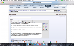
For example, the top of this window right now says "MacRumors Forums - Reply to Topic" and so if I had multiple browser windows open for some reason, I could quickly identify it at a glance. Windows task bars identify things quickly if you don't have too many open. You have to click and hold on the browser icon to get a list of window names in OS X, though. There's a simple solution to window title bars. Make it an OPTION. Then title bar haters like yourself can get rid of it and those of us that like it for its intended purpose can keep on using it.

I simply don't comprehend the resistance of people to OPTIONS. I can only assume that whatever "force" drives Apple to not include them somehow permeates the fanatical droves and makes them think the same exact way.
 

leman

macrumors Core
Oct 14, 2008
19,525
19,688
I bring that seventh window to the front. Here, no tab:

Image

I can see the title of the window behind.

Great example. And now, when you switch to the background window, it will complete hide the foreground one, leaving you no obvious way of switching back. Unless you use Mission Control or the Window menu. Or move around your windows like crazy. Had you used tabs, you would have had all the different content directly at your fingertips, with no need to mess around with arranging windows that get occluded all the time you focus another one.

To reiterate: any application becomes a mess if you have more then 3-4 windows open. No matter whether its Yosemite, Mavericks or Panther. If you have to use lots of windows at the same time, it is always easier to use the Window menu or Mission Control to navigate them, simply because the screen is not big enough. Your problem is not the lack of title bars, your problem is that you are using a suboptimal window configuration.

I can relate to that last issue myself, because its a bad habit I have when working with TextMate. I would often have more then 10 different windows open, which is a huge mess and impossible to navigate. Despite very obvious title bars ;) I should really learn to use tabs more consistently...
 

leman

macrumors Core
Oct 14, 2008
19,525
19,688
That's a strange notion, IMO. I think browsers (and programs in general) should serve people, not the other way around.

Its not about who serves whom. Its about best practices and convenient computing. Having too many windows open is always a mess (see my above post). Freedom in computing is good when its functional. And funnily enough, this is where OS X is unparalleled, which its strong Unix underpinning, system-wide scriptability and pluggability (which has ben MASSIVELY improved in Yosemite btw.) and automated actions.

I agree with you that its very important to have customisation options, but sometimes too many of these options lead to substandard software. And that is btw why I stopped using Firefox long time ago — it was ugly and did not match the visual theme of the OS. The Safari 8.0 is an amazing browser, because it only has 5 UI elements in its toolbar — and it does not need more. BTW, the toolbar is fully customisable if you need to change something.

It identifies the window's function and thus is a function of the GUI itself. I've seen plenty of programs override the GUI and do their own thing over the years It rarely works as well. Imagine twenty windows open of similar "looking" content (all the more likely in a "conformity" atmosphere) and trying to figure out which one is the one you're looking for.

Let me disclose you a horrible secret — you are not identifying the window based on its title, you are doing it based on its overall appearance. Its just how the brain works. Sure, if your desktop is a cluttered mess with dozens of partially overlapping windows, then you need to start scanning trough the title bars. But at that point you should be using Mission Control/Dock/CMD+Tab. This is why your example of twenty windows of similar content is silly. Its not like having a title for every of those windows makes it easier for you to navigate them. Most of the windows will be entirely occluded in the first place. Not to mention that if you have windows like that, then they are most likely to have title bar (because in all likelihood, those will be 20 different documents opened in an editor or whatever). For apps like Calendar or Calculator you don't need anything like that because they are easily identifiable due to their visual style and arrangement of elements.

In practice, I have been using Yosemite for a number of days now and I have never run into a situation where I can't find a window or identify an application. And right now I have exactly 21 windows open, with 26 tabs in Safari. Why doesn't lack of title bars bother me?
 

Miguel Cunha

macrumors 6502
Sep 14, 2012
389
102
Braga, Portugal
Features aside, focusing on GUI, Yosemite is by far, ths ugliest Mac OS ever.
Thin lines hard to see, striking colors, trying to start up some sort of pop short life fashion.
My first thought was that we need a Mac OS 11.

I remember the suspense before the announcement of iOS 7. The first leaked image to be shown here caused quite a shock and perplexity to most users… because it was so, so ugly.
A few hours later, after the WWDC keynote, users started to change their minds, in the sense that maybe it was not that bad.
Strange…

The same happens nowadays with Yosemite, with only one difference: people already suspected such a shift, similar in so many ways to the shift from iOS 6 to iOS 7.
Not so strange…

As if some wanted others to believe in something.
The magic is people believing spontaneously - love at first sight, no questions asked.

I have to say that all iOS's until 7 were really beautiful in such an empathic way, because of the extremely carfully designed GUI. The same for Mac OS's until Yosemite. Skeumorphisms (what does this really mean and what made people to despise it after years loving it?) and other jargon never really cared to me.
It was beautiful and it worked. And it also worked because it was beautiful, gorgeous - one of the features that made everyone crave about the devices themselves and wish "I want one of those"

I miss that.

I'm on the market and honestly, for the first time in my not so short life I'm puzzled. For the first time ever, I pondering on buying an non Mac PC.

I'm aware that my money isn't that important to Apple, nor it should be.
The most important would be to question why is this happening, and what to make of it, technicalities aside.
If Yosemite and iOS 7/8 are that marvelous, why are we throwing ideas in this thread? There is where the real profit lies.

"Design is what works", certainly, but it has to work for the eye, the brain, the empathy with the person who buys the machine, otherwise it won't work at all, in any way, neither for the computer maker, nor for the person.
Although design has more than meets the eye, it still really has to meet the eye.
Design has to meet and work with people, otherwise people won't work with the correspondent devices. Ultimatly desgin is working to much and looking to little. People don't drop jaws anymore, they just stare for a moment, they don't even drool.

Looks don't count, but we look at the whole package.

I want an OS designed not to kill ideas and concepts, to oppose unpopular people.
I want the old "think different" but to keep the link with users, people who buy and use machines, or the newer "think out of the box", but not as far as to loose contact with what's really important, what really works: people.

Things did change quite a bit, didn't they?
Frankly, I never gave it much though until very recently.

Anyway, this is just my extremely and deep humble opinion and wish. Not the truth, not the facts, not a prophecy or anything else you might imagine, other than, my extremely and deep humble opinion and wish.

Thank you for the patience, and for reading.
 
Last edited:

jolux

macrumors regular
Aug 9, 2014
171
1
Well, that should tell you the difference between the people running the company today and the original team (even if some are the same, it appears their views of choice have changed). The original team espoused customization and freedom. The current team seems to worship totalitarianism and Communist-like behavioral patterns. Of course, when YOU are the one making the choices for everyone else, you don't have the same viewpoint as the person that is having those changes forced upon them because YOU still have your freedom of choice as the developer. Thus, it's that lack of empathy that may have changed in some cases.

I can't say I'm too fond of Firefox in that regard anymore. The problem is that Chrome is even worse. Apple actually added add-ons because they were so popular in Firefox. Now it's like Firefox is saying they wish they had been more like Safari. Oh boy! All that would do is open the door for yet another browser based off the base source code of Mozilla or WebKit. I'm not sure what the drive is push conformity among the population and make everyone exactly the same, but I'm thinking it's EVIL. :eek:

Don't bash communism. Nearly every open source project is communist, everyone working for a common goal with the compensation for labor being the joy of completing work that you love. Communism espouses ultimate freedom as its anarchist ideal, however getting there is the hard part. :p

Their point about customization is that it's getting to a point where all the add-ons and settings are a cacophony. All the settings would be set to sensible ideals, and the browser would be smart enough to figure out the user's usage.

https://blog.mozilla.org/verdi/463/lightspeed-a-browser-experiment/

Watch it, it's quite interesting.
 

jolux

macrumors regular
Aug 9, 2014
171
1

Am I the only guy who always thought iOS 7 looked fresh and cool?

I think that Yosemite looks way more modern than Mavericks. It's unifying the design language that was naturally evolved into and it adds some awesome features too.

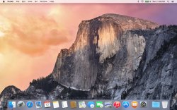
More desktop porn, though I guess this looks like a stock photo. I'm not using my Yosemite partition for much.

By the way if you guys have questions about how stuff looks or works in Yosemite, I'd be glad to help. I'm out from around 09:00-16:00 EST this week but outside of those hours I'm happy to help.
 

Attachments

  • Screen Shot 2014-08-12 at 11.29.49 PM.jpg
    Screen Shot 2014-08-12 at 11.29.49 PM.jpg
    451.9 KB · Views: 127

leman

macrumors Core
Oct 14, 2008
19,525
19,688
I have to say that all iOS's until 7 were really beautiful in such an empathic way, because of the extrenely carfully designed GUI. The same for Mac OS's until Yosemite.

I miss that.

There should be no question that Mavericks along with previous versions of OS X are beautiful. However, their beauty is static. Its about the lines, icons, embossed UI elements.

Yosemite opens a new dimension, which is dynamic beauty. When I first time saw the screenshots of Yosemite, I was quite unimpressed. It looked, well, flat. But when I started using it, I realized that they were doing something quite different. The OS has an incredible amount of depth which is conveyed through the dynamic feedback such as animations and translucency. It achieves much more then Mavericks with its static design, and it does it much more elegantly (IMO of course). Its all about the subtle UI animations and interplay of content, UI and backgrounds. You can't convey it through a screenshot. You need to actually use the system to appreciate its beauty.

BTW, I always thought that iOS 7 was much more beautiful and most of all, functional than any other iOS (the control center is one of the best designs I have ever experienced on a electronic device). What most people disliked about iOS 7 were the application icons. I got used to them in the meantime, but I still think they are ugly.
 

grahamperrin

macrumors 601
Jun 8, 2007
4,942
648
I'm on the market and honestly, for the first time in my not so short life I'm puzzled. For the first time ever, I pondering on buying an non Mac PC. …

"Design is what works", certainly, but it has to work for the eye, the brain, the empathy with the person who buys the machine …

… Design has to meet and work with people …

… we look at the whole package. …

Thank you for the patience, and for reading.

Likewise, thank you for those things.

… no obvious way of switching back. Unless you use Mission Control or the Window menu.

I do so (in Mavericks) – frequently, and very happily. Typically with keystrokes for Mission Control. Plus Command-F12 for Launchpad then find-as-you-type, and Spotlight to launch or switch to an app, and more than anything: application switching with Command-Tab and other key combinations. The application switcher is a particularly useful complement when I switch to single application mode for the Dock. Plus fullscreen without hesitation, whenever that's beneficial. The ways in which those features of the operating system work together – coherently and predictably – exemplify Apple at, or close to, its best.

Add to those things: hopping between Windows, Linux and OS X in both physical machines and VirtualBoxVM apps, knowing to add (or refrain from) certain keystrokes to work with the peculiarities of the latter. Plus Outlook 2007 in CrossOver, knowing to not accidentally use MS Windows keystrokes despite the Windows appearance of things. I try to be very good at adapting to change – when that change is good.

Yes, Mission Control is both beautiful and functional. However, to remind people about such things is to lose sight of what was, to me, genuinely and frequently troublesome:
  • the state of windows in their natural state, when I simply observed the screen.
(Apologies for the reiteration and use of red, but I must re-emphasise the first bullet point from an earlier reply to you.)


Also worth repeating, from https://forums.macrumors.com/showthread.php?p=19457949#post19457949 :

Wouldn't the Window Menu be far more helpful in that case if you were interested in finding an open window by its title. …

I do often use, and enjoy using:
  • the Window menu
  • the Dock menu of windows of Safari (Control-Click)
  • Mission Control application windows
However: no combination of those things can be a substitute for titles that are already present – present without additional key strokes, additional clicks, additional mouse movements or additional gestures.

Or move around your windows like crazy.

Or take a normal approach to movement of windows. With no sense of craziness.

… The Safari 8.0 is an amazing browser, because it only has 5 UI elements in its toolbar — and it does not need more.

You do not need more. I do need more.

My use case is no less valid than your use case, and my appreciation of the value of titles is not unique.

Let me disclose you a horrible secret — you are …

It was neither secret nor horrible. I know how I work. I work in the way that you describe, but not only that way. I also have other ways of working. Please, do not imagine – from a few words and pictures – that you know me better than I know myself.

your example of twenty windows of similar content is silly.

It was exaggerated. Primarily to emphasise that the amount of space occupied by each title bar is small. And so if someone wishes to cascade two windows, or three or four or twenty, or more, the cascade can be both tidy and functional.

It certainly was not twenty of similar content. To me, there were differences. Also please know that some of the windows had tabs. I use tabs frequently and very happily.

… have title bar (because in all likelihood, those will be 20 different documents opened in an editor or whatever).

Is a document in Safari not a document?

Please consider three of these four windows:

attachment.php


Is what's in front not a window-based view of edition of a document?

… Why doesn't lack of title bars bother me?

Between your ways of working and my ways of working, differences are natural. People are different.

I can easily accept, easily believe that some of the ways of other people will be not suitable for me. If I am unable to fully understand why a person behaves in a way that's different from my way, then I simply accept the difference.

I do not expect all people to understand that titles, at tops of windows, can have value. I ask only that people accept use of titles as one way of working with windows.

There you go, dock and maximized window. …

A lot of us like the new look, it's not necessarily better

… trends of the future. …

Trends are natural, some are good, some not so good. No trend can be perfect for every user of an operating system. I have used Macs for more than a quarter of a decade – long enough to observe and enjoy trends whilst recognising and accepting things that are, to me, imperfect. A quarter of a decade of open mindedness by me and of improvements by Apple. It is extremely rare for something trendy to be forced in a way that makes an app more difficult for me to use.

Yosemite, as a whole, appears to force a trend in a way that is not acceptable to me. I totally understand that the OS is nowhere near release quality, but I used it for long enough to realise that some exquisite touches alone are not enough; the overall appearance is repellent to me. Add to that appearance: some loss of functionality, the result is alienation of a customer.

Mavericks continues to attract me.

The fervour around Yosemite, I can understand and accept. But beneath the recent fervour, there is a rationale that is demonstrably incomplete. If Apple imagines that all users will fail to notice the flaws in the logic – the incompleteness – Apple is wrong.

Trends that do not make complete sense, bulldozed through … this is not Apple producing the best. It's popularity, at a cost, but it's not the best.

You have highlighted something interesting.

Every person has their own usage patterns and based on these patterns, they respond differently to changes. … Based on my usage pattern, I did not realize that the Safari title bar was gone in Yosemite until I started following this thread.

Differences. Responses. Realisations. Yes, yes, yes.

… Their taste is not my taste … People should always have at least some customization options in a good program. Not everyone likes the same things nor should they. Life would be pretty boring if everyone was exactly the same.

Differences. Options. Appreciation. Yes, yes, yes.

… The magic is people believing spontaneously - love at first sight, no questions asked.…

Yes, there can be magic in that.

(Off-topic: years ago a friend recommend Blink. It's on my reading list.)

It wasn't love at first sight with Yosemite, so I immediately gave feedback.

Things were puzzling, but I kept the puzzles pretty much to myself. As 'no questions asked' could not apply, instead I suspended judgement. I gave it time. Maybe it would be love at second, third or fourth developer preview.

DP 4 reinforced my perception of Yosemite as a like it or lump it approach to customers. Love, at first sight? No. Like, after a few weeks? No.

I lumped it, and jumped ship to the things that will make most sense for a gradual departure from OS X.
 

Attachments

  • 2014-08-13 05-13-04 screenshot.png
    2014-08-13 05-13-04 screenshot.png
    183.8 KB · Views: 1,418
Last edited:

leman

macrumors Core
Oct 14, 2008
19,525
19,688
However: no combination of those things can be a substitute for titles that are already present – present without additional key strokes, additional clicks, additional mouse movements or additional gestures.

Now you genuinely confuse me. What other purpose do title bar have then being able to select the correct window quickly? And here we come to the point I have been making all along — if you have few windows, you don't need the title bar because it should be obvious what is in the window. If you have a lot of windows, title bars won't help you because there are either too many to quickly disambiguate them or the might be overlapped. Its either you see the window you need immediately and can click on it — or you don't see it, in which case you have to look for it. In the later, the existing tools (Mission Control etc.) are the most efficient way to do this. Its not like those tools are substitutes for title bars. They are simply making title bars redundant for many applications.


It was neither secret nor horrible. I know how I work. I work in the way that you describe, but not only that way. I also have other ways of working. Please, do not imagine – from a few words and pictures – that you know me better than I know myself.

I would never be as arrogant to do that, I was simply point out a basic observation I know from research on cognitive psychology.


Is a document in Safari not a document?

Please consider three of these four windows:

Image

Is what's in front not a window-based view of edition of a document?

Fair enough, good point ;)

Still, your picture shows very well whats wrong with cascading (its not by chance that OS X does not offer a window cascading option) or with having your pages split into different windows like that. Focus the top window — and all the other windows disappear behind it. Cascading only works if you are never changing the active window in the first place. I respect the fact that you have your own workflows and habits, but it does not mean that they are efficient.

You do not need more. I do need more.

My use case is no less valid than your use case, and my appreciation of the value of titles is not unique.

With all due respect, OS X not about making everyone happy. Its about providing reasonable productivity tools. I do not see any utility in having mandatory window title bars and your examples do not convince me because they all show scenarios which have either inherent problems of other kind or only apply to some very specific usage patterns (see P.S. for the note on Safari).

At any rate, I have the feeling that we are going around in circles here. To reiterate my point: I understand where you come from, but I believe that all the issues you are pointing out can be easily bypassed by adopting existing navigation tools or more efficient working habits. As far as I see it, this boils down to personal preferences and taste. And as they say, one can't argue about taste.

P.S. I do king of see your point with Safari and I agree that it would make sense for Apple to provide an option of a title bar for a Safari window.
 
Status
Not open for further replies.
Register on MacRumors! This sidebar will go away, and you'll see fewer ads.