Become a MacRumors Supporter for $50/year with no ads, ability to filter front page stories, and private forums.
Status
Not open for further replies.

jolux

macrumors regular
Aug 9, 2014
171
1
Sadly, I'm afraid this post is indicative of today's younger generation that seem to think the whole world revolves around their opinions (a dangerous thing as they grow older and take over positions of government, etc., but then we already see that in today's ever more polarized society that cannot tolerate opinions different from one's own). :(

----------


Removing like half the information from "Get Info" reports defeats functionality. I don't think that's very hard to understand. :rolleyes:

Frankly, I wouldn't be shocked if they make the Shell inaccessible at some point (since it "confuses" some people) like they did by hiding the /Library folders (which you need to access to adjust some programs parameters and log files ,etc.). Let's face it, Apple has been kiddifying OS X for some time now. They just assume their average user is a non-computer person and try to design some fashion parade that control with a two-button remote (like Apple TV and let me say that two-buttons plus a ring is woefully inadequate sometimes there).
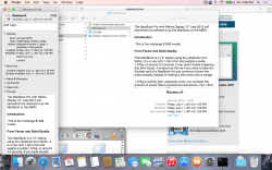
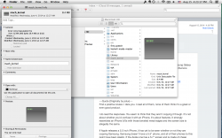
I call ********. The "Get Infos" are identical.

The shell is already not exposed to most regular users, hidden away in Utilities. They can't get rid of the shell, then they wouldn't be UNIX compliant. How has Apple been kiddifying it? I see power user features added all the time, like Finder tags and the new Spotlight and app extensions, etc.
 

Attachments

  • Screen Shot 2014-08-15 at 4.26.57 PM.png
    Screen Shot 2014-08-15 at 4.26.57 PM.png
    1.1 MB · Views: 241
  • Screen Shot 2014-08-15 at 4.23.17 PM.png
    Screen Shot 2014-08-15 at 4.23.17 PM.png
    867.5 KB · Views: 162

Menel

Suspended
Aug 4, 2011
6,351
1,356
Always hate being late to the gang bang, but...


I'm an old Mac user. My first Macs were beige with Black and White screens. I was using MacOS professionally when the OS9/OSX transition happened. I was a believer big time in where they were going with it, and the dock and the developments of things like Exposé were brilliant GUI innovations, I thought.


I'm running Yosemite beta, and I'm not convinced. To me, the colors look wrong, and the icons don't look right. The "flat" look doesn't make it easier for me to see where to go.


I'm running iOS7 too, and saw some upsides to it. I didn't think there was much "broken" with iOS6, though. A year on, I can still take or leave iOS7. It never "grew" on me. It looks like something that will seem so obviously dated in a few years. Like what flared polyester pants in the early 70s, if people had the presence of mind to think about it for a second.


I didn't care much for the color palette of "Easter Candy." Sadly, it looks worse, in my opinion, on my 27" iMac screen.


Hey, I'm glad that others find that they "love" this. To each their own. I support a bunch of Windows machines, too. And I have learned to work with Windows 8 through gritted teeth. I'm not a fan that Windows out of the box is almost unusable until you install Revo, Classic Start Shell, and a Better Desktop Tool. But with them installed, Windows 8.1 is a usable OS. But I have to say, Yosemite isn't making me feel enthusiastic about signing on to MacOS being "better" than Windows as a choice for OS.


I only wish that Linux were as usable as Windows and MacOS for a lot of routine use. Because I can really appreciate now how much choice there is for Linux desktop distros.


You want to see easter candy colors? Look at Android L.
 

Dozer_Zaibatsu

macrumors 6502
Oct 10, 2006
344
381
North America
You want to see easter candy colors? Look at Android L.

Well, obviously, I'd rather not look at Android.

I'm not complaining with un-moderated Nerd Rage. I'm willing to give this new scheme a try. I will be fair. But I admit, I'm a little taken aback. The reason for going this route with this design isn't clear to me. I have seen design ideas in some Linux distros that I like, such as those in Elementary, Ubuntu, even SUSE. But almost all Linux cannot handle pixel smoothing and High DPI, anyway, so that's just what they are -- mere ideas.

Although, to be honest, if I had to choose what the interface fonts look like me – at this point I would say it kind of looks like Linux Mint. Kind of underwhelming for MacOS.

And I'm developing some tools on MacOS for MacOS. So I dread leaving Mac for something else. But I'm not feeling optimistic about this latest turn.

I'll compliment the new nice things, like Spotlight, and I find them to be well done. But my other complaints are first impressions.

Also, my Logitech T-651 isn't working correctly, either. I can't hold that against Apple, probably.
 

0000111

macrumors member
Jul 24, 2014
97
18
[...]
Ability to change the + windows size from fullscreen to maximize without needing to option click.
[...]
Add option to Show/hide Spotlight icon in menu bar.

Add option to Show/hide Notifications icon in menu bar.

Allow native resolution for Retina Macbook Pros and future devices to have retina displays. [...]​

The free app betterTouchTool can change the green button's behavior, and I do believe there's also an option to switch it back in System Preferences, though I'm only 60% sure. Can't back myself up on the latter, since I forgot where I read it.

Also, re: hiding icons from the menu bar – I totally agree, and have the same gripe. The non-free app Bartender allows you to hide items from the menu bar, I use it myself and highly recommend it, though it's a little frustrating at $15. It's well worth it if you also have other apps in the menu bar, such as iStat Menus.

Interestingly, the font seems to 'change' a bit when translucency of the menubar is turned off. In fact in Dark Mode, the fonts return to being readable. When translucency is turned on, they get difficult to read again. Non-retina MBP.

But with translucency turned off, it gets a bit tacky in other places. For example, the volume bar on the menubar.

That's a good catch! Have you reported it?
 

Lolito

macrumors 6502
Mar 20, 2013
397
34
here
two things:

a) who ever decided to make the battery icon in the menu bar GREEN, well, that apple employ smoked too much of something and went over the top. All apps finally decided to give the option of BW icons, and now apples makes a ******* green icon... Seriously apple, seriously??

b) no matter how you look at it. these fonts suck big time in no retina or no imac high dpi screens. Face it. this is the sad true, no matter how you look at it. choseen font looks amazing in retina screens. but in current non retina macbooks, it sucks big time, and it's so extremely obvious that saying the contrary is quite sad too.
 

nikicampos

macrumors 6502a
Jul 23, 2011
818
330
two things:

a) who ever decided to make the battery icon in the menu bar GREEN, well, that apple employ smoked too much of something and went over the top. All apps finally decided to give the option of BW icons, and now apples makes a ******* green icon... Seriously apple, seriously??

b) no matter how you look at it. these fonts suck big time in no retina or no imac high dpi screens. Face it. this is the sad true, no matter how you look at it. choseen font looks amazing in retina screens. but in current non retina macbooks, it sucks big time, and it's so extremely obvious that saying the contrary is quite sad too.

a) I'm guessing you don't have an iPhone.

b) I love the new fonts, specially in Safari's Favorites Bar.
 

jolux

macrumors regular
Aug 9, 2014
171
1
The Logitech drivers on Mavericks work fine. The T-651 works almost identically to the Magic Trackpad.

I had an Anywhere Mouse MX. I bricked the connector by taking it out and plugging it back in. Bought another one, turns out the same thing happened with it again. There's a 30 page thread in the Logitech support forums on the subject and they still haven't done anything about it. Let's hope it's fixed for Yosemite. LabVIEW is a real pain in the ass without a mouse.
 

matrix07

macrumors G3
Jun 24, 2010
8,226
4,895
two things:

a) who ever decided to make the battery icon in the menu bar GREEN, well, that apple employ smoked too much of something and went over the top. All apps finally decided to give the option of BW icons, and now apples makes a ******* green icon... Seriously apple, seriously??

I swear people sometimes just complain for the sake of complaining and didn't think much about it. The green battery is the indication that, like iOS counterpart, your Mac is charging. It's so obvious you only take a quick glance to know. I really hate iOS 7 look and still hate it today but this is the only new function in iOS 7 that I find making sense and improving my experience.
 

MagnusVonMagnum

macrumors 603
Jun 18, 2007
5,196
1,452
two things:

a) who ever decided to make the battery icon in the menu bar GREEN, well, that apple employ smoked too much of something and went over the top. All apps finally decided to give the option of BW icons, and now apples makes a ******* green icon... Seriously apple, seriously??

Green...apple? :D

Well, we went from a Turtleneck black sweater kind of Apple that liked stark aluminum, chrome, glass and jet black to the current post-Jobs Apple that seems to like lots of colors, especially the Easter Egg "pastel" variety. I personally didn't want OS X to look look like a Cinco de Mayo carnival year round and that's the impression I'm starting to get with these screenshots of pink, green Crayola cartoon looks.

Between Final Cut Pro X and the new Mac Pro and the announcement of a dark mode, I was hoping OS X would go more professional and sleek and sexy like a Porsche Cayman. But the screenshots I'm seeing are more Fiat 500 POP than Porsche Cayman. I'm sure a lot of people like the Fiat 500 POP look, but it's just not my thing. But that seems to be the direction Apple is heading. I suppose we did have the gumdrop iMacs when Steve first came over and the "cheese grater" look of the Mac Pro didn't do much for me (the Grey PowerMac Digital Audio I still have sitting here struck me as the right contrast and I don't think anything except possibly the G4 Cube ever looked any better.
 

leman

macrumors Core
Oct 14, 2008
19,525
19,691
Frankly, I wouldn't be shocked if they make the Shell inaccessible at some point (since it "confuses" some people) like they did by hiding the /Library folders (which you need to access to adjust some programs parameters and log files ,etc.). Let's face it, Apple has been kiddifying OS X for some time now. They just assume their average user is a non-computer person and try to design some fashion parade that control with a two-button remote (like Apple TV and let me say that two-buttons plus a ring is woefully inadequate sometimes there).

Statements like this make me a little bit upset, because they don't have anything to do with reality (but might mislead a less educated reader).

With every version of OS X, Apple extends system-wide scriptability and introduces new options for power-users to control and tweak their computer — and many of 10.10 enhancements are exactly in that area. There is absolutely NO indication that the system is being dumbed down or that the options are being removed. Streamlined and made more accessible, yes. Complaining about hiding the Library folder is ridiculous. Most of the major OSes employ some sort of protection agains messing with system or auxiliary file structures (Windows and Linux included).
 

grahamperrin

macrumors 601
Jun 8, 2007
4,942
648
Bildschirmfoto%202014-08-15%20um%2002.49.29.png


… The "Get Infos" are identical.

That's beyond exaggeration. To describe them as identical is untrue.

I think they took out 3x the functionality/information …

In my opinion, it's not '3x'.

When I exaggerate, it sometimes reflects a strength of feeling. Maybe a reaction to something that is not entirely reasonable.

… I see power user features added all the time, like Finder tags and the new Spotlight and app extensions, etc.

Whilst I must refrain from naming the person, it's worth knowing that one highly respected developer is deeply critical of Spotlight-related technologies.

The appearance of Spotlight in Yosemite is potentially better than in Mavericks, but the change is somewhat incomplete/incoherent. Things such as this make me wonder whether the visionaries at Apple are suitably together in their approaches to OS X … this is part of the nerve-touching stuff that I hinted at earlier.

I'd love to use tags (Leap is extraordinarily good) but for me, the implementation in Mavericks proved to be so badly bugged that tags are useless to me. I doubt that Apple has fixed, or will fix, whatever was wrong.

a) … iPhone.

We have Mac hardware. Please accept that some people's passion about the state of the operating system – for this hardware – is not primarily fuelled by use of a different operating system on very different hardware.

b) I love the new fonts, specially in Safari's Favorites Bar.

Certainly, some people will love novelty without realising a reduction in usability. (That's not a personal criticism. It's acceptance that only some use cases will suffer the detrimental effects.)

I swear people sometimes just complain for the sake of complaining

From my experience with testing Apple software: that's extremely rare.

and didn't think much about it.

That's less rare, but we should not dismiss a complaint simply because one person's thought is (in another person's opinion) incomplete.

Ask yourself why such a limited comment has been given. (Has the person lost patience after being frustrated by a period of reduced usability of software? What can you do to help the person describe the trouble with a particular difference? Read between the lines … and so on.)

The green battery is the indication that, like iOS …

iOS … yet again :-(

I preferred an appearance that suited OS X.

It's so obvious you only take a quick glance to know. …

Months ago I thought, that green is so obviously inconsistent. I sent appearance feedback to Apple.

At a glance, the green stuck out like a septic thumb.

Statements like this make me a little bit upset, because they don't have anything to do with reality (but might mislead a less educated reader).

Some of Apple's claims are unrealistic and misleading. You should be equally upset about that.

… There is absolutely NO indication that the system is being dumbed down or that the options are being removed.

Whilst respecting your perception of things, I strongly disagree. More than a few people perceive a dumbing down. Some power users might say: oversimplification.

The word dumb is probably not an incentive for Apple's developers/designers to take on board such complaints, but the word does indicate a strength of feeling. For example: when I want to use an iPad, I use one. Like most people, I have the ability to use many more things, in my daily work and home lives, than an iPad alone; and successful use of those things does not require a resemblance to iOS. The devices that give me most pleasure are the ones that are fit for purpose.

Mavericks was fit for purpose. Yosemite is less fit.

Designs must not assume that all users have difficulty using different devices; that assumption is false. Basing too much of a product on a false assumption can cause trouble.

Streamlined and made more accessible, yes.

The notion that Yosemite appears more accessible is refuted by many people. It becomes necessary for people, who are probably not power users, to make changes for accessibility. I can not believe that Apple intended Yosemite to be more accessible, out of the box, than Mavericks; if that was the intention, then Apple failed abysmally.

Continuity might contribute to streamlining, but continuity-related technologies are not at the forefront of people's complaints about the appearance of Yosemite.

If a change causes something to take longer, then that change is not streamlining.

Complaining about hiding the Library folder is ridiculous. …

I would not say ridiculous, but with so many ways to open ~/library … the complaints are tiresome.
 

azentropy

macrumors 601
Jul 19, 2002
4,138
5,665
Surprise
Image


That's beyond exaggeration. To describe them as identical is untrue.

The example you show must have some other preference set as my get info on the latest developer builds is pretty much the same on DP5 as it is on Mavericks. It looks nothing like the "info" window on the right.
 

grahamperrin

macrumors 601
Jun 8, 2007
4,942
648
Apology

The example you show must have some other preference set as my get info on the latest developer builds is pretty much the same on DP5 as it is on Mavericks. It looks nothing like the "info" window on the right.

Ah. When I first represented that image, I made clear that it was someone else's. The second representation lacked credit, sorry about that.
 

leman

macrumors Core
Oct 14, 2008
19,525
19,691
Whilst respecting your perception of things, I strongly disagree. More than a few people perceive a dumbing down. Some power users might say: oversimplification.

I was only referring to what MagnusVonMagnum wrote, that is, 'dumbing down' as in reducing the flexibility/external options/low-level control of the OS. I was not referring to changes in the design and visuals (I realise that you and others perceive them as kind of dumbing down).

However, as far as scriptability, extendability and control goes, Yosemite is the most flexible OS X ever. With introduction of JavaScript as successor of AppleScript, system-wide extensions, built-in hypervisor etc., there are lots of new options power-users can utilise. I don't see ANY indication of oversimplification whatsoever, at least in those areas.
 

grahamperrin

macrumors 601
Jun 8, 2007
4,942
648
… scriptability, extendability and control … JavaScript … system-wide extensions, built-in hypervisor etc. …

Yeah, but none of those things can correct the problems that are found with appearance.

Overall, I agree that Yosemite looks terrible. The primary appearance is so fugly that I have no desire to use the background improvements.

Off-topic from appearance

There's a long history of me taking interest in new technologies, and in improved use of established technologies.

The appearance of Yosemite cripples my interest in its technological underpinnings. There remains an interest in technical discussion (elsewhere) but honestly, there's no motivation for me to use the OS for myself or roll it out to other users.
 

grahamperrin

macrumors 601
Jun 8, 2007
4,942
648
I don't know whether the screen recording below is representative of 13A341h, but here goes …

… apple have taken design over usability and done this

safari-tab-scrolling.gif


… not as useable. … Now you have to constantly … and can't just LOOK …

Uppercase, shouting; I sense some strength of feeling about Yosemite making it more difficult to simply look at some things.

A simple look. Not a look followed by a command that results from movement of the hand or hands. Not a look followed by a command that results from recognition of speech. A look, pure and simple.

I absolutely hate how Safari handles tabs in Safari 8, and this is absolutely the reason why. It used to be you'd get a drop down button on the right hand side when you needed to look at tabs that couldn't fit. Now you're forced to scroll through individual tabs until you find the one you're looking for.

Ugh. And I don't recall getting as far as realising removal of that feature …

… that's how much I was turned off by Safari 8. An interest-killer.
 

PsykX

macrumors 68030
Sep 16, 2006
2,756
3,937
Image


That's beyond exaggeration. To describe them as identical is untrue.

Woah, where is that new Get Info window ?
I can't believe they finally modernized it, but it's not on my system...

Edit : Nevermind. It's only a mockup.... -_-
 

leman

macrumors Core
Oct 14, 2008
19,525
19,691
Ugh. And I don't recall getting as far as realising removal of that feature …

This I can absolutely agree with. The new show all tabs button is nice but it is not a proper substitute for selecting tabs. I have submitted a report and I hope that they improve the handling for scenarios with large number of tabs.
 

matrix07

macrumors G3
Jun 24, 2010
8,226
4,895
iOS … yet again :-(

I preferred an appearance that suited OS X.

Months ago I thought, that green is so obviously inconsistent. I sent appearance feedback to Apple.

At a glance, the green stuck out like a septic thumb.

Nothing wrong with being like iOS if it's efficient, and it IS efficient. It's much more noticeable than a monochrome battery icon.

Even if I hate iOS 7 I find Yosemite's quite alright. Much better than I thought it would be.
Can't wait for Continuity!

I don't care much about Title Bar (yes, I read your posts). Everyday, in Maverick, I work with Safari (which has one) side by side with Firefox (which has none) and I never notice the difference, and I'm sure once I'm using Yosemite I will not miss it.
 

jolux

macrumors regular
Aug 9, 2014
171
1
Ah. When I first represented that image, I made clear that it was someone else's. The second representation lacked credit, sorry about that.

Yeah, but none of those things can correct the problems that are found with appearance.

Overall, I agree that Yosemite looks terrible. The primary appearance is so fugly that I have no desire to use the background improvements.

Off-topic from appearance

There's a long history of me taking interest in new technologies, and in improved use of established technologies.

The appearance of Yosemite cripples my interest in its technological underpinnings. There remains an interest in technical discussion (elsewhere) but honestly, there's no motivation for me to use the OS for myself or roll it out to other users.

That image you have is a mockup or old. I have no idea where you got it from, but the Get Info window in Yosemite is now functionally identical to the one in Mavericks. Quit your bitching about it. I can't find a single feature in Yosemite that has had functionality removed from it. If you can give me an example then fine, but because you don't have the real developer preview, you're spreading misinformation. I don't know how many other things you guys hate about Yosemite that aren't actually real, but I'd love to hear some more of them.

I actually like the way Safari handles tabs now, the drop-down felt quite primitive and I never have more than 20 tabs open at a time anyway. I've gotten into a habit of efficient browsing, where I get rid of a tab I haven't looked at in a while or I bookmark it if it's interesting. At least they're trying something different instead of copying Chrome, and the performance improvements with the new FTL JIT, (I believe Safari 8 has it? Can anyone confirm?) are so massive that I can overlook some slight UI blunders, especially considering it's a beta and if it's a huge problem it will be fixed soon enough.
 

grahamperrin

macrumors 601
Jun 8, 2007
4,942
648
… It's much more noticeable than a monochrome battery icon. …

That's the problem. It's much more noticeable than others; an inconsistency. Sticks out too much. Distracting. In itself the green was garish; too much.

To SHOUT that something is working normally is quite unlike the Apple that I loved.

That image you have is a mockup or old. I have no idea where you got it from … Quit your bitching …

It seems that you and I both omitted to follow the original poster's link, where the origin is perfectly clear.

Apologies for imagining that shanson2's post presented an Apple design. From my first response: "Thanks, I'll look later. … I should discourage publication of screenshots so if I don't comment, please don't be offended". That was my excuse for not looking sooner.

What's your excuse for bitching about origins without bothering to look at the original? ;-)

I assumed that the image on the right was recent, and an Apple design, because I recalled someone complaining, less recently, about Apple's change of approach to use triangles in a representation of the path. Today I find this:

Yosemite irritation #1: File info uses arrows instead of file separators : apple (2014-08-11)

– but that's wasn't my first sight of a complaint about that aspect. I recall something earlier …

Postscript

To avoid further confusion …

… you don't have the real developer preview …

My copy of Apple's Install OS X 10.10 Developer Preview.app was properly obtained. There's nothing unreal about it.

14A314h Finder: Get Info

– the Info window of Finder in that build of Yosemite is neither visually nor functionally identical to the Mavericks implementation, but nothing in either approach is terrible.
 
Last edited:

hamis92

macrumors 6502
Apr 4, 2007
475
87
Finland
Nothing wrong with being like iOS if it's efficient, and it IS efficient. It's much more noticeable than a monochrome battery icon..

But is this really necessary? Every portable Mac comes with a charger that has an LED indicator on the connector: it's amber when it's charging and green when it's not. In fact, if the battery icon has to have colour to it, shouldn't it be following the exact same pattern as the physical indicator to be consistent?

For me the noticeability of the new battery icon is exactly the problem. It doesn't quite go with this "focus on the content" thing some people keep saying Yosemite is about. That green battery icon wants me to focus on the system, which should be completely secondary to what I'm doing with the system.
 
Status
Not open for further replies.
Register on MacRumors! This sidebar will go away, and you'll see fewer ads.