If we look around, every major OS is going flat; I am not a UI designer type but, i feel that's the future.
Windows 8 and beyond is flat
Google's new andriod is on the flat UI as well
Google's new tools like mail, calendar etc is also moving towards Flat UI
iOS is on the flat UI concept
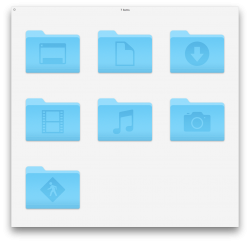
and so, the OS X is also moving towards the same concept.
I may personally not like it but i guess, that's the modern look and feel we all may end up seeing in every computing that we have..cellular, tablets, web and operating systems.
and to know that, OS X Mavericks is supported on my 7 year old iMac, i don't think i can ever complain. i would believe some of the newer phones may be more powerful than my dinosaur mac ..
Windows 8 and beyond is flat
Google's new andriod is on the flat UI as well
Google's new tools like mail, calendar etc is also moving towards Flat UI
iOS is on the flat UI concept
and so, the OS X is also moving towards the same concept.
I may personally not like it but i guess, that's the modern look and feel we all may end up seeing in every computing that we have..cellular, tablets, web and operating systems.
and to know that, OS X Mavericks is supported on my 7 year old iMac, i don't think i can ever complain. i would believe some of the newer phones may be more powerful than my dinosaur mac ..
")