Become a MacRumors Supporter for $50/year with no ads, ability to filter front page stories, and private forums.
Status
Not open for further replies.

grahamperrin

macrumors 601
Jun 8, 2007
4,942
648
Careless

… a different approach perhaps, which obviously doesn't seem to appeal to everyone, but carelessness no.

attachment.php


Designs such as that scream to me that the designers knowingly lack care for a significant proportion of users.
 

F1Mac

macrumors 65816
Feb 26, 2014
1,284
1,604
Image

Designs such as that scream to me that the designers knowingly lack care for a significant proportion of users.

Still highly subjective and again, what's the "proof" that they "knowingly lack care"? Because the menu is different than the previous one? I have no problem with it. Usability is still there, same as before. That this design doesn't please everyone doesn't mean it's faulty.
 

joedec

macrumors 6502
Jul 25, 2014
443
51
Cupertino
Still highly subjective and again, what's the "proof" that they "knowingly lack care"? Because the menu is different than the previous one? I have no problem with it. Usability is still there, same as before. That this design doesn't please everyone doesn't mean it's faulty.

I rarely disagree with my friend grahamperrin but here I must, this release was "thought out".

However, they certainly didn't target usability, its about bling, and its flashy.

The problem is that Yosemite isn't about the human interface either, and that's not subjective. In the new Human Interface Guide they rarely discuss humans, or design goals with regard to humans, it just defines the current "look".

So at the end of the day the proof is in Apple's own documentation, or lack of. Of course if they didn't take the time to complete it, maybe grahamperrin is right.
 

grahamperrin

macrumors 601
Jun 8, 2007
4,942
648
Apple's defaults for Yosemite scream of bad design

Still highly subjective

Absolutely – it screams of bad design.

Usability is still there, same as before.

A complete lack of contrast is less usable than some contrast.

That this design doesn't please everyone doesn't mean it's faulty.

It works and it pleases some users, but that does not mean that it's good design.

… not sure I see the issue here.

Lack of contrast.

For a while, I forgot that I was testing Apple's twisted idea of best. Viewing a release of the operating system as Apple intends the viewer to see it.

I'm not disabled but again, I resorted to the Accessibility pane of System Preferences to work around the bad design.

----

Yes, yes, yes, subjective; Yosemite looks terrible out of the box! Screamingly awful! What a stinking test experience, I'm so glad that I never installed it on my Mac.

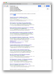
Consider search suggestions from Google for 'Yosemite looks'. Ignoring the top hit (this topic), there's so much negativity. How can this be Apple's best?


Back to Mavericks …
 

Attachments

  • Screen Shot 2014-11-21 at 16.52.07.png
    Screen Shot 2014-11-21 at 16.52.07.png
    353 KB · Views: 502

joedec

macrumors 6502
Jul 25, 2014
443
51
Cupertino
Here's a legibility example. Yes they are both "readable" but "easy" to read is the test.
 

Attachments

  • Mavericks-Stock.jpg
    Mavericks-Stock.jpg
    24 KB · Views: 386
  • Yosemite-Stock.png
    Yosemite-Stock.png
    50.2 KB · Views: 404

Omega Mac

macrumors 6502a
Aug 16, 2013
582
346
Still highly subjective and again, what's the "proof" that they "knowingly lack care"? Because the menu is different than the previous one? I have no problem with it. Usability is still there, same as before. That this design doesn't please everyone doesn't mean it's faulty.

Proof! Ha.

It's this simple.

There are visual rules of design (art) that exist and are commonly known, can be learned and have been experimented with and expressed over many thousands of years. Once you know them and then you master them it gives you the confidence to break them you can do amazing things and product astounding great works.

This is not an example of that. This is simply $hyte design.
 
Last edited:

TheBSDGuy

macrumors 6502
Jan 24, 2012
319
29
Proof! Ha.

It's this simple.

There are visual rules of design (art) that exist and are commonly known, can be learned and have been experimented with and expressed over many thousands of years. Once you know them and then you master them it gives you the confidence to break them you can do amazing things and product astounding great works.

This is not an example of that. This is simply $hyte design.

I worked with OSF in the early days of the Motif standards. Large companies such as HP, Microsoft, Apple, Sun Microsystems etc.etc were all members and contributors. They devised a common standard and set of rules for ALL guis, not just Motif. This is why in most cases, pull downs and their associated commands that make common sense like "Save As..." exist.

What the "design team" at Apple is doing is completely throwing the standards out the door. Apparently someone or some group of people at Apple either think they know better than typical GUI design standards and are now creating their own for all the rest of the world to adopt (WON'T HAPPEN - Chaos and inconsistency will not replace common sense and logic) In this case, no one is even committing to the standards, or they simply don't know what they're doing. I suspect it's the latter.

On observing the Yosemite interface you cannot easily distinguish a text field that's been filled out from a control like a button. They're both white and they both have text in them. On the new iOS releases colored text now replaces controls in some places...just hope whatever you're looking at doesn't use the same text with the same color.

Yosemite is an example of NOT thinking.
 
Last edited:

MagnusVonMagnum

macrumors 603
Jun 18, 2007
5,196
1,452
I find it somewhat ironic and funny when people complain about Yosemite's awful new contrasts...

What about Ive's quote? I don't see carelessness in those Yosemite screengrabs - a different approach perhaps, which obviously doesn't seem to appeal to everyone, but carelessness no.

I don't find Ive's UI design changes "careless". I find them stupid. The guy should be FIRED, IMO. Whatever value he had under Steve Jobs, he's gone ego-mad under Cook. Whatever Cook is good at, it's NOT getting under the hood in any kind of way (where Jobs excelled was either coming up with or at least picking out the best ideas). Honestly, I'm not sure WHAT Tim does. He even hands off most of the presentations to other people. He strikes me more of a middle manager than a CEO for some reason. Apple needs a LEADER not a quiet guy hiding in the background. Ive THINKS he's a leader, but it's clear to me he's someone that has to be reigned in to produce usable output.

Now I don't know whether things like that search box with almost identical grey upon grey contrast was Ive's doing or a design member's doing, but Ive is responsible for APPROVING it. Someone isn't doing their job. Even if I don't agree with the overall new "look" of Yosemite, it shouldn't have glaring readability and usability issues which changes like that create for the user. That SAD thing is they are simple to fix. Change the damn color! It isn't rocket science. I almost feel color blind looking at Yosemite in places.
 

435713

macrumors 6502a
May 19, 2010
834
153
I don't find Ive's UI design changes "careless". I find them stupid. The guy should be FIRED, IMO. Whatever value he had under Steve Jobs, he's gone ego-mad under Cook. Whatever Cook is good at, it's NOT getting under the hood in any kind of way (where Jobs excelled was either coming up with or at least picking out the best ideas). Honestly, I'm not sure WHAT Tim does. He even hands off most of the presentations to other people. He strikes me more of a middle manager than a CEO for some reason. Apple needs a LEADER not a quiet guy hiding in the background. Ive THINKS he's a leader, but it's clear to me he's someone that has to be reigned in to produce usable output.

Now I don't know whether things like that search box with almost identical grey upon grey contrast was Ive's doing or a design member's doing, but Ive is responsible for APPROVING it. Someone isn't doing their job. Even if I don't agree with the overall new "look" of Yosemite, it shouldn't have glaring readability and usability issues which changes like that create for the user. That SAD thing is they are simple to fix. Change the damn color! It isn't rocket science. I almost feel color blind looking at Yosemite in places.

I co-sign all of this 100%. Ive is WAY gone mentally and it obviously took Jobs who could point Ive in the right direction to make him look better than he is. I would love to switch Forstall in Ive's place to be honest. I also have no clue what Cook does. He adds nothing on stage since he presents nothing and just sounds like a rambling out of touch guy.

This sucks big time though. Probably never will get a decent looking OSX anytime soon. They probably could go with pinks and neon greens and people would eat it up and say it was beautiful. Yosemite looks like garbage. IMO of course.
 

joedec

macrumors 6502
Jul 25, 2014
443
51
Cupertino
I co-sign all of this 100%. Ive is WAY gone mentally and it obviously took Jobs who could point Ive in the right direction to make him look better than he is. I would love to switch Forstall in Ive's place to be honest. I also have no clue what Cook does. He adds nothing on stage since he presents nothing and just sounds like a rambling out of touch guy.

This sucks big time though. Probably never will get a decent looking OSX anytime soon. They probably could go with pinks and neon greens and people would eat it up and say it was beautiful. Fact is this Yosemite looks like garbage.

Tim Cook is a brilliant supply chain guy. A huge part of Apple's success is the efficiencies he has brought to the company. Apple never has greater than 10 days finished product in the pipeline, that's best in the industry by a long shot.

Problem is, the qualities a person possesses to be a great manager of processes does not make him creative. Kind of the opposite.
 

435713

macrumors 6502a
May 19, 2010
834
153
Tim Cook is a brilliant supply chain guy. A huge part of Apple's success is the efficiencies he has brought to the company. Apple never has greater than 10 days finished product in the pipeline, that's best in the industry by a long shot.

Problem is, the qualities a person possesses to be a great manager of processes does not make him creative. Kind of the opposite.

I agree with that.

Yosemite still looks like poop though, :p
 

dmj102

macrumors 6502
Oct 30, 2013
253
46
Canada
There better be a fix for some of this UI crap with the next update, especially the font. I've spent way too much time trying out different fixes to fix this UI mess. My newest beef is Yosemite's menu bar in Safari has been lightened dramatically to the point where it looks white at a glance. Now I'm looking for a fix for that....arghhh!!! I just don't get why Apple wouldn't give us more choices with OUR computer settings. This isn't an iDevice for ***sakes. What really bugs me is how Apple remains mum on all this. No, "hey, we're working on this". Nothing. How many feedback reports do I have to send in? How many times per day, week...aghhh!
 

dmj102

macrumors 6502
Oct 30, 2013
253
46
Canada
I don't find Ive's UI design changes "careless". I find them stupid. The guy should be FIRED, IMO. Whatever value he had under Steve Jobs, he's gone ego-mad under Cook. Whatever Cook is good at, it's NOT getting under the hood in any kind of way (where Jobs excelled was either coming up with or at least picking out the best ideas). Honestly, I'm not sure WHAT Tim does. He even hands off most of the presentations to other people. He strikes me more of a middle manager than a CEO for some reason. Apple needs a LEADER not a quiet guy hiding in the background. Ive THINKS he's a leader, but it's clear to me he's someone that has to be reigned in to produce usable output.

Now I don't know whether things like that search box with almost identical grey upon grey contrast was Ive's doing or a design member's doing, but Ive is responsible for APPROVING it. Someone isn't doing their job. Even if I don't agree with the overall new "look" of Yosemite, it shouldn't have glaring readability and usability issues which changes like that create for the user. That SAD thing is they are simple to fix. Change the damn color! It isn't rocket science. I almost feel color blind looking at Yosemite in places.
I can't wait until they fire Ive. Hopefully in 2015. I can't take anymore of his so called brilliant UI designs. It truly amazes me that tech reviewers sing praises with this crap. I suppose they have to roll on the right side with Apple or receive their wrath and be ostracized from the in group.
 

TheBSDGuy

macrumors 6502
Jan 24, 2012
319
29
I can't wait until they fire Ive. Hopefully in 2015. I can't take anymore of his so called brilliant UI designs. It truly amazes me that tech reviewers sing praises with this crap. I suppose they have to roll on the right side with Apple or receive their wrath and be ostracized from the in group.

We really don't know if Ive is to blame. I suspect he's a big part of the problem, but there's no real proof he's solely to blame.

Tech reviewers, especially at places like CNET and MacWorld (especially MacWorld) stand losing advertising dollars and access if they "don't behave," so to speak.
 

grahamperrin

macrumors 601
Jun 8, 2007
4,942
648
Apologies for ranting, blame it on Yosemite. A few links …

Wow. Some obstinate ranting from me above, mostly yesterday. Sorry folks. That's what happens whenever I try to use Yosemite with Apple's defaults.

The Yosemite disk is disconnected. I'm now far less likely to rant (waste space?) … ah, the pleasure of Mavericks :) :apple:

OS X 10.9.5 Mavericks - An Appreciation

… Tech reviewers … stand losing advertising dollars and access if they "don't behave," so to speak.

Oh, I found a few scathing criticisms by individuals from well-known publications. They're interspersed amongst hundreds of criticisms by Apple customers at http://tinyurl.com/1010uglystick but (again, sorry) it's no longer possible to view that list in its entirety. I wonder whether that viewing preference broke after more than one thousand bookmarks were listed …
 

n-evo

macrumors 68000
Aug 9, 2013
1,910
1,731
Amsterdam
I don't know why they wouldn't put a blinking cursor in there, but pretty much everything about Mavericks had a clearer presentation. That isn't as big a deal to a computer savvy user like you or I, but it can be off putting for novices. Plus, it can even help experienced users when working with programs that are unfamiliar.
There is in fact a blinking cursor. It disappears when typing something > clicking the x > search field looses focus. However at that point you already know it's a text field. The the blinking cursor appears again when clicking the the text field or opening the Help menu the next time.

No idea what the issue is here.
 

Attachments

  • Screen Shot 2014-11-22 at 11.02.27.png
    Screen Shot 2014-11-22 at 11.02.27.png
    14.3 KB · Views: 75

AndreSt

macrumors member
Mar 4, 2014
63
0
I don't find Ive's UI design changes "careless". I find them stupid. The guy should be FIRED, IMO.
Don't blame Ive too much. This is probably just the guy who has the honor to play the designer role in Apple's stage play. Why didn't we see Ive on the stage during the last keynote? I'm not sure if he really is part of he involved design teams.

No, the Yosemite (design and quality) mess is a clear sign of an organizational failure within Apple.
 

n-evo

macrumors 68000
Aug 9, 2013
1,910
1,731
Amsterdam
Wow. Some obstinate ranting from me above, mostly yesterday. Sorry folks. That's what happens whenever I try to use Yosemite with Apple's defaults.
Right. OS X Yosemite is the problem. Whatever you say. I kinda feel sorry for you. Obsessing and ranting like that over the color of a search field. It just seems unhealthy to me.
 
Last edited:

roadbloc

macrumors G3
Aug 24, 2009
8,784
215
UK
I kinda feel sorry for you. Obsessing and ranting like that over the color of a search field. It just seems unhealthy to me.

I guess that's why Steve Jobs died then. It wasn't the cancer, it was his obsessive compulsive behaviour to make sure Apple's software was visually perfect.
 

n-evo

macrumors 68000
Aug 9, 2013
1,910
1,731
Amsterdam
I guess that's why Steve Jobs died then. It wasn't the cancer, it was his obsessive compulsive behaviour to make sure Apple's software was visually perfect.
It's clear some have short memories and only remember the positive things. Previous Mac OS X versions were by no means perfect. By the time Mac OS X Tiger arrived things turned into an inconsistent hell of different window styles that seemed to serve no clear purpose anymore. The HIG were never updated to explain the then new Unified title / toolbar look per example. iLife introduced matte interface elements, like scroll bars, that were never adopted system-wide. I always thought Mac OS X Leopard and Snow Leopard looked awkward because they underwent this half baked iTunes / iPhoto transformation.

It's fine to say OS X Yosemite isn't your cup of tea. However, let's not give previous versions martyr status and pretent they were the pinnacle of perfection lacking any interface issues of their own.
 
Status
Not open for further replies.
Register on MacRumors! This sidebar will go away, and you'll see fewer ads.