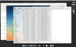
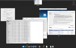
Yosemite buttons did appeared nice, but I never tested for long enough to say how they might feel after extended use. Moreover I was doing everything possible to avoid Apple's abnormal defaults, so I'm not really in a position to comment on how buttons might have looked with what Yosemite treated as a 'normal' appearance.
I'm not sure exactly what's meant by 'lighter gradient' in that context but an hour or so ago:
Yosemite's toolbars in apps such as Safari and System Preferences do have gradients like in Mavericks, but Apple dramatically lightened them to the point where they look white at a glance.
Also, I'm mixed the the title bar issue. In apps like Safari I think they are necessary. Even in Maps and contacts they couldn't hurt. In some apps like Calendar or System preferences I don't see a point in have a bar that just reads "Calendar" or "System Preferences," but that's just me.
The excessive brightness was probably one of many problems that I simply didn't bother to report. I know, that's defeatist, but honestly: so many things were wrong about the design of pre-release Yosemite, I had almost zero confidence that whoever drove those changes would respond reasonably."[/INDENT]
Yes. Feedback to Apple in July 2014:
Yosemite translucency (including reduced translucency) is truly awful
"… Examples such as this are alarming. If Apple can't get it right first time with an app – QuickTime Player – that has a long history of being user-friendly, then (I suspect) there's a great risk that third party developers will also make a mess of things.
… (HOW MANY MORE CASES AND EDGE CASES WILL THERE BE?) …"
When I review feedback and recall that I was desperately, politely trying to sound alarms within Apple – long before release – the feeling now is crushing.
Lack of forethought by Apple
I am glad you submitted this. I sent similar feedback during the beta, but I knew Apple wouldn't change. Yosemite is bright, but that only bugs me at night when i'm tired. As for the translucency, small hints are okay to me. For example, the menu bars in Mavericks were transparent. I don't care if they add some slight translucency to that and to the dock and Notification Center.
My issue was the level of transparency and sticking it where it doesn't belong. I use dark wallpapers usually. If I control-clicked an item on my desktop in Mavericks I was given a white, slightly transparent, menu with black text. In Yosemite, the entire menu was a dark, murky glass look with the black text. While I
could see it, I felt like it could cause eye strain. Additionally, in Mavericks I was able to glance and keep working where as I had to stop and look in Yosemite because I could see as easily at a glance. I think this comes back to the issue with that app you posted. In Mavericks, buttons, toolbars, menus, they were all easily seen at a glance and readily recognizable. In Yosemite they tried to make everything too uniform and apps/features lose their distinctness. I also dislike the translucency in sidebars. It wouldn't be that bad if Apple (1) toned down the transparency and/or (2) bolded the text to increase the contrast. I think Yosemite will eventually see a "bold text" option, but that comes back to the principle of needs to adjust the system. To me, it should come out of the box ready to be used and usable. Yosemite
is usable, but I think you know what I mean. Still, the most abhorrent example of translucency are in apps like Pages. In Safari you are growing and it could be argued that the translucency helps somewhat....I don't know...but in apps like Pages you are creating content. There is NO reason for those apps to have translucent menu bars. Soon, everything will be translucent! You will be able to see hints of your wallpaper and windows behind your current document as your write or behind your picture as you edit!

I exaggerate of course, but that's how I often feel.
Also, you're right; the reduce transparency does not help like it should. As long as the system is usable, I can live with ugly, but I shouldn't have to deal with ugly (granted it is subjective). Yosemite was designed around translucency and you disable that the OS looks oddly crippled to me. God forbid you use the "white/light" menubar and dock because you'll be blinded. If you use the dark theme you'll get a slightly less offensive grey blob. Apps like Finder look odd somehow because the sidebar becomes that weird grey/tan. Apple should have taken more care to optimize the interface for Retina/non-retina/translucency/no-translucency.
*Disclaimer: Due do an eye condition I have mildly severe colorblindness. I can see colors, but they don't always look as intended to me so some of my opinions may not be sound.
Lack of forethought by Apple.
I disagree. I think much thought and consideration when into the Yosemite UI, it's just a new mindset. Yosemite represents a new design language for Apple that started with iOS 7. I just hope that they retract a little or at least give users the option to customize the UI to an extent.
EDIT: A few more thoughts.
I thought it was interesting when they introduced Yosemite that Craig made a point to say that it made a "more usable" versions of OS X. I don't agree, but that shows me that Apple knew there would be concerns over it. I had hoped that that meant Apple would tweak things more than they did during the betas.
Also (speaking only about contextual menus and sidebars) Yosemite's usability to me seems to be effected too greatly by your wallpaper choice. This is unacceptable to me. For example, if you choose a light wallpaper wight he white theme then menus and sidebars take on a brighter appearance which helps with the text. If you use a dark wallpaper than you have dark text on a dark menu. No. Dark mode helps this in the menubar by enabling white text on a darker menu, but even then, wallpaper choices greatly affects this. Apple needs to expand dark mode to control-click menus and maybe even sidebars. Also, your OS experience shouldn't' be defined by your wallpaper.


