Become a MacRumors Supporter for $50/year with no ads, ability to filter front page stories, and private forums.
Status
Not open for further replies.

grahamperrin

macrumors 601
Jun 8, 2007
4,942
648
Think bubbles …

Cook and the other cooks

… I don't think Cook is to blame for OS X. … As long as OS X passed the internal design team it will be released.

Whilst I don't blame the CEO, some responsibility must be borne in that area.

Also, we must not over-focus on the design team. And there's more to leadership than the selective view of leadership that is presented for PR purposes.

Beyond the Apple PR representation of company leadership: there's a leading person in a different area, someone who was with the company before the first public beta of Mac OS X. I need to look more closely at the period of time during which Tim Cook headed the Macintosh division – see how the two profiles overlap, and so on – maybe structure my first 10.10.1 feedback item – a duplicate – accordingly.

Think bubble … Feedback Assistant can be ideal for most forms of feedback, but I struggle to imagine how I might use it to repeat (say) a problem report for Safari, when that report involves an essence of what's wrong with Yosemite. I can give reproducible steps, but that engineering-oriented approach to problem-reporting lacks the essence of what's wrong. Hmm.

(Hmm. Bubbles. What would be most valuable in a leader-to-leader discussion?)

… they removed all of the little accents that made OS X special …

I wouldn't say all.

I do say that Yosemite was the least special operating system ever tested or released by Apple. Too many of its design precedents were truly terrible. One size did not fit all – the sooner that one ill-fitting design becomes past tense: the better. Mac users expect reasonable choices to be offered by Apple.

Off-topic from the looks …

… OS X doesn't do a single thing that Windows can't do.

As this topic relates to Yosemite, so the twelve-point list offered by frgough could expand to include – at least – handoff (continuity).

However, this topic is primarily about looks (and things that affect looks, e.g. visual design). There are topics about the feature set of Yosemite, but this is not one, so I'll refrain from lengthening or discussing that list here.

----
 

AxoNeuron

macrumors 65816
Apr 22, 2012
1,251
855
The Left Coast
Personally, I think Yosemite is drop-dead gorgeous. Some people might not like it, but that's their opinion. Probably the same people that didn't like iOS 7.
 

grahamperrin

macrumors 601
Jun 8, 2007
4,942
648
OS X 10.10 is not completely Mac

… drop-dead gorgeous.

Please can you post that to the 'beautiful' topic instead? Pinned alongside this topic.

Some people might not like it … Probably the same people that didn't like iOS 7.

Many people did not, do not like it. I'm certain that some of those people are within Apple. It's unfortunate that those voices can not be made more obvious.

For me the rejection of Yosemite is entirely unrelated to any experience with iOS.

The 'Completely Mac' part of Apple's design statement is ridiculous.
 

nubizus

macrumors newbie
Oct 20, 2014
25
17
Stupid hipster kids are blind.
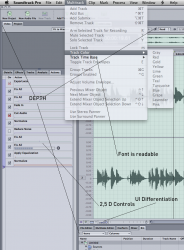
The Yousemite **** is so not usable, i cannot see ****ing buttons, for the first time i have to use color highlights to see clearly what is active and what is not.
Its not about the design no more. Its about interface that gave me years of easy usage.
Its about 2,5 D User Interface Apple morons. ****ing hipster Ive. Mother****ing Windows has at least contrast.
This is interface that Apple should take forward, not Metro stupidity. Depth is needed for god sake. Reduce rounding of buttons, and slightly remove aqua highlight and this is the usable pro interface:
 

Attachments

  • osx.png
    osx.png
    480.7 KB · Views: 236

MagnusVonMagnum

macrumors 603
Jun 18, 2007
5,196
1,452
Yep. The best way to describe using Windows is death by a thousand paper cuts. Apple seems to be adopting that philosophy, because Yosemite is quite an annoying OS to use in its own right.

People need to NOT adopt it, even if they can "stand" it. Apple has made it VERY clear over the years that adoption is the measuring stick they use for "success". They constantly shove figures in our face about how fast the community adopts iOS and certainly OS X as well in the past. They've made it "FREE" to encourage that even further.

But if people DON'T adopt Yosemite in record numbers, they might just get a different message. Tim Cook might not pay much attention to OS X, but if he sees a report that it's being adopted slower than any version of OS X in history despite the free nature and relatively compatibility with hardware (i.e. I believe even my 2008 MBP will still work with it), he might just want to know WHY. And if the feedback says because it's a PITA to use and looks ugly, well, Apple may ignore feedback, but they don't ignore sales and lack of use.

Unfortunately, the fanatic Mac base will ALL adopt it like clockwork and you've got to figure they're probably anywhere from 30-60% of the entire Mac market based on impressions here (45% would be my best guess) and that will give them a very quick 30-40% adoption and make ANYTHING Apple does look good at first. It's all the more reason the logical people need to avoid it like the plague if they can, because Apple does notice when something isn't being used. They're not used to people avoiding upgrades.
 

joedec

macrumors 6502
Jul 25, 2014
443
51
Cupertino
People need to NOT adopt it, even if they can "stand" it. Apple has made it VERY clear over the years that adoption is the measuring stick they use for "success". They constantly shove figures in our face about how fast the community adopts iOS and certainly OS X as well in the past. They've made it "FREE" to encourage that even further.

But if people DON'T adopt Yosemite in record numbers, they might just get a different message. Tim Cook might not pay much attention to OS X, but if he sees a report that it's being adopted slower than any version of OS X in history despite the free nature and relatively compatibility with hardware (i.e. I believe even my 2008 MBP will still work with it), he might just want to know WHY. And if the feedback says because it's a PITA to use and looks ugly, well, Apple may ignore feedback, but they don't ignore sales and lack of use.

Unfortunately, the fanatic Mac base will ALL adopt it like clockwork and you've got to figure they're probably anywhere from 30-60% of the entire Mac market based on impressions here (45% would be my best guess) and that will give them a very quick 30-40% adoption and make ANYTHING Apple does look good at first. It's all the more reason the logical people need to avoid it like the plague if they can, because Apple does notice when something isn't being used. They're not used to people avoiding upgrades.

Since its free to try, the adoption rate may get artificially raised. For example, I have multiple copies I've downloaded running basically as test or demo only, nothing critical, actually a second boot to try this or that hardware. There is no way I'll adopt it for production, its too buggy, and too hard on the eye. However these downloads will add a few machines to the graph that shows how well they did.

Apple also uses App Store connections to measure, but even there since these boxes are generally dual booting, I register points for both Mavericks and Yosemite, that's a wash.

So in the end myself, a "Yosemite is Terrible" commenter shows up as "Yosemite is Beautiful" input at the next Apple event.
 

martinstefan

macrumors newbie
Oct 24, 2014
3
0
I would like to know why the overworked their surface '. Was there a particular occasion, you know because maybe what.
 

grahamperrin

macrumors 601
Jun 8, 2007
4,942
648
Loyalties of voters in MacRumours: 49% NPS® for Mavericks, -17% for Yosemite

October 2013

"… Despite Apple’s rank as the #1 brand WW by Interbrand, the NPS score for the company is weak (-3% NPS score). Nearly 40% of consumers would not recommend the Apple brand. …"​

Today

Based on recent votes in MacRumors:
  • +49% NPS for OS X Mavericks
  • -17% NPS for OS X Yosemite
Recall the opening poster's comments about loyalty to Apple, about the looks of pre-release Yosemite:

… I've been a loyal fan of Apple for years …

… I would give Yosemite a rating of 0.5 out of 5 stars. …

Discussion

Apple Computer, OS X®, iOS® and the Net Promoter® Score (NPS®)
 

Omega Mac

macrumors 6502a
Aug 16, 2013
582
346
Crazy thing I never noticed before. I still run Snow Leopard. I recently installed F.lux which is just one of throat great clever apps that solve a genuine problem.

I've been reading a lot of the horror posts on Yosemite

Last night I noticed as F.Lux changed the colour temp that the drop down from the main top apple menu bar on snow leopard are in fact slightly transparent.

It's so very slight it look like 90% or higher opacity.

Now getting to the overall negative reaction to this OS X release I believe it goes far deeper than mere aesthetics. I now witness a complete betryl of a global design culture many decades in the making, one that Apple is a part of but did not foment.

The UI and UX disaster that is unfolding began with iOS7. This is not one major screw up this is a planned pipeline of screw ups from IOS to OSX.

Tim Cook is clearly not a visionary and seems like Johnny Ive's ego has lead him astray to only besmirch a perfectly good reputation.

Forstall was clearly a Maverick in a company founded by a mentor Maverick that was Steve Jobs. Harmony is great for those who want to hold power and control things but this can be asphixiating and sometimes you need edge to push beyond the comofrt zone. Jobs clearly kept everyone in some what seclusion of the whole probably to contain the maverick elements required in departments rather than letting them rip each other apart across the board room table which is not constructive since that is not their role.

That was his job. Well done Steve on that point.

Very clever compartmentalization to allow manageable synergisation of course team effort is important and maybe he could have moved a bit more in that dierction but it looks like Cook has gone to another extreme rather than strike a balance. In so doing Apple is now totally out of balance despite the rhetoric in the media. The baby has been thrown out with the bath water.

If anyone wants oto understand the bizarness of what Apple is doing. Look at the historical legacies of consumer good development and desing across the world. TV, VCR's radio, walkman, headphone, record players and so on going right up to the present day.

Now take the ubiquity of this single button

1194983927973663421io_anthony_liekens_01.svg.med.png


We all know what this button does without thinking.

It's on every electircal machine that can display it clearly as are many others we all know. What did Ive do. HE walked away from an entire visual language culture and set of symbols he should and would be totally famliar with on hardware of his industry. Ironically the Forstall approach was to recreate these globally understood symbols in software GUI.

The idea of making functional buttons looking like real world buttons because they perform the exact same function as they would on familiar electronics using symbols we all understand therefore know there funciton without thinking is not even genius it's design common sense and conforms with good industry practice without compromising your design. YOu also do not have to localise your button for different language markets!

For a Industrial Designer to stand over this is far greater travesty than anything to date. Apple has decided to ignore tried and proven and globally understood visual symbolic langague like this is very very very worrying.

GUI desinged by ego tantrum we do not need.

To concluded in great Irony forstall approach was more Industrial Design lead than IVE's as the designs and approach used, utilised while also paying homage to great classic and common functional themes and symbols that user understood out of the box!

However to my mind the buck stops with Tim Cook.

emperor.jpg


Also that I am reading criticism and rightly so of the typography approach of Apple when that was a core foundational stone of Job's legacy is also deeply worrying as it was a quality aspect. It marked personality that drove attention to detail.

I cam late to the apple party as such in 2008 and happened to stay stuck on SL because it worked so well and i never had issues or reason to update. This is what brought me over to the Apple platform and my ownership of Apples has far outweighed the amount of PC boxes I have of which many have bot been turned on for some year.

Now I find myself a bit stuck. No Mavericks to go to and Yosemite a total car crash. I'll see if I can find Mavericks and update machines for longevity but I'm under no pressure to ever move to YOX.

I also feel the approach of using user to test release stability is a cost cutting measure. Think about it, less oversight required internally before a release, get that release out sooner but oh when things go wrong... yea it's turning of the new business model under Tim Cook that is going to be the undoing of what was a great ride thus far. QA is an internal matter first and foremost. It's about deveoting the resources and commitment.

I wonder why SONY didn't use words here and plumbed for those out of date old fashioned symbols.

6a00d83451c9ec69e20120a591c683970c-800wi.jpg


I rest my case.
 
Last edited:

F1Mac

macrumors 65816
Feb 26, 2014
1,284
1,604
Apple has decided to ignore tried and proven and globally understood visual symbolic langague like this is very very very worrying.

What are you talking about?

Yosemite is more about "visual symbols" and stylization than any other version. If the symbols below are not clear I don't know what is.
 

Attachments

  • Screen Shot 2014-11-16 at 9.22.55 AM.png
    Screen Shot 2014-11-16 at 9.22.55 AM.png
    28 KB · Views: 652
  • Screen Shot 2014-11-16 at 9.23.57 AM.png
    Screen Shot 2014-11-16 at 9.23.57 AM.png
    2.4 KB · Views: 639

hamis92

macrumors 6502
Apr 4, 2007
475
87
Finland
What are you talking about?

Yosemite is more about "visual symbols" and stylization than any other version. If the symbols below are not clear I don't know what is.

Agreed. I'm having a hard time noticing any symbols that were present in earlier versions being replaced with text in Yosemite. The graphical style is certainly different, but they're still symbols – not text.

The new design in general has its shortcomings, subjectively as well as objectively speaking, but I wouldn't say this is one of them.

Could you Omega Mac present us with some screenshots from Yosemite where you find this to be an issue?
 

grahamperrin

macrumors 601
Jun 8, 2007
4,942
648
Ive, the design team and its environment, a lack of collaboration and discussion

… We're being asked to accept a very narrow and I would say one dimensional approach to UI design. …

It looks like we have the Industrial designer working on the UI …

https://forums.macrumors.com/showthread.php?p=20362245#post20362245 is long, and somewhat speculative, but hopefully worth a read if you're interested in Sir Jony and/or the environment of the design team. Also there's a thought on how to promote discussion without too much confrontation. Tags: gentle; happy; bubble …

… Now getting to the overall negative reaction to this OS X release I believe it goes far deeper than mere aesthetics. I now witness a complete betryl of a global design culture many decades in the making, one that Apple is a part of but did not foment.

The UI and UX disaster that is unfolding …

… Apple is now totally out of balance despite the rhetoric in the media. The baby has been thrown out with the bath water. …

to my mind the buck stops with Tim Cook.

… get that release out sooner but oh when things go wrong... yea it's turning of the new business model under Tim Cook that is going to be the undoing of what was a great ride thus far. QA is an internal matter first and foremost. It's about deveoting the resources and commitment. …

https://forums.macrumors.com/showthread.php?p=20361132#post20361132 "a rare public representation of voices from within Apple" but (sorry) I'll not link to that publication at this time. That, and a few other things, make me believe that the rhetoric promoted by Apple is wearing thin.

On a constructive note: the private imbalance (beneath the public rhetoric) can almost certainly be steadied, with positive effects on products, if things can be properly discussed. The sooner the better.

… things started to get a bit hand baggy at Apple HQ and people began to get fired. …

Under the Scott Forstall topic, https://forums.macrumors.com/showthread.php?p=20346210#post20346210 – there's a reason for me describing someone's mock-up as 'misleading' and 'lacking in refinement' but I will not yet disclose that reason. Incidentally, that mock-up is also hand-baggy – an attempt to ridicule the works of others – not the type of thing that I would choose to promote a personal portfolio. OTOH … it's not unknown for me to swing a bag, so I should stop there with the criticisms. Pot, kettle, black and all that :)
 

grahamperrin

macrumors 601
Jun 8, 2007
4,942
648
Yosemite, Apple and precedents

… Yosemite is more about "visual symbols" and stylization than any other version. …

Questions for anyone, concerning the button in the attached screenshot.

Can you name the build of the operating system?

What happens when you first click the button?

What happens when that first click is followed by a second click?

What happens when that second click is followed by a third?

If you had not previously used the app: would that button (in lieu of a title) allow you to know the name or nature of the app?
 

Attachments

  • 2014-11-11 00-50-36 screenshot.png
    2014-11-11 00-50-36 screenshot.png
    15.9 KB · Views: 1,312

Omega Mac

macrumors 6502a
Aug 16, 2013
582
346
What are you talking about?

Yosemite is more about "visual symbols" and stylization than any other version. If the symbols below are not clear I don't know what is.

I'm happy to accept you example above of some conformity to norms.

However I used the power symbol as an very obvious and potent example of the visual grammar that is universally accepted and how we can all recognize a symbol without thinking regardless of the product or device we use.

I didn't mean to indicate that as a specific example.

I never meant to indicate they had removed it but that the move of using words to becomes buttons visually is asking to much. It's confusing. I'm going mainly by screen shots of iOS mainly and the various threads. I've found this to be visually very confusion and creates much uncertainty at first glance especially on the iPad. Even for touch you need a bit more placement que. There is an unnerving pattern in the overall GUI approach by apple along these lines. I'm speaking from using it and also user commentary here.
 
Last edited:

ZVH

macrumors 6502
Apr 14, 2012
381
51
I've discovered that I can stand looking at Yosemite for about 30-60 minutes before the shaking of my head in disbelief gets out of hand.

Just thought I'd share!:eek:
 

Omega Mac

macrumors 6502a
Aug 16, 2013
582
346
Agreed. I'm having a hard time noticing any symbols that were present in earlier versions being replaced with text in Yosemite. The graphical style is certainly different, but they're still symbols – not text.

The new design in general has its shortcomings, subjectively as well as objectively speaking, but I wouldn't say this is one of them.

Could you Omega Mac present us with some screenshots from Yosemite where you find this to be an issue?

I'm sourcing more from screenshots of iOS.

----------

Questions for anyone, concerning the button in the attached screenshot.

Can you name the build of the operating system?

What happens when you first click the button?

What happens when that first click is followed by a second click?

What happens when that second click is followed by a third?

If you had not previously used the app: would that button (in lieu of a title) allow you to know the name or nature of the app?


What is that?
 

Omega Mac

macrumors 6502a
Aug 16, 2013
582
346
My impression and feeling of insight of what Apple are trying to do but not communicating at this point for obvious reasons is they are prepping the ground/OS for moving pan-platforms and appliancising their OS for many non traditional surfaces.

Walls, fridges, cars, windows, doors, tables, ceilings and any other surface you can think of or surface of a product/machine that has a surface.
 

MagnusVonMagnum

macrumors 603
Jun 18, 2007
5,196
1,452
I'm happy to accept you example above of some conformity to norms.

However I used the power symbol as an very obvious and potent example of the visual grammar that is universally accepted and how we can all recognize a symbol without thinking regardless of the product or device we use.

I didn't mean to indicate that as a specific example.

I think you should give examples. I personally have NO IDEA what you're talking about. I don't like Yosemite, but if you draw a giant power symbol and tell me Yosemite has abandoned worldwide standard conventions, you better back that statement up with more than an example that HASN'T changed. It makes your post look ridiculous, IMO. What abandonment are you talking about? Give us an example that HAS changed from standard to something Apple made up. If you can't give one then your whole post is bogus.
 

Omega Mac

macrumors 6502a
Aug 16, 2013
582
346
I think you should give examples. I personally have NO IDEA what you're talking about. I don't like Yosemite, but if you draw a giant power symbol and tell me Yosemite has abandoned worldwide standard conventions, you better back that statement up with more than an example that HASN'T changed. It makes your post look ridiculous, IMO. What abandonment are you talking about? Give us an example that HAS changed from standard to something Apple made up. If you can't give one then your whole post is bogus.

I was vibing off this link posted on this or another thread and similar stuff which is I think but one good example of words being used over buttons/symbols (with some other points about slider visibility) but is iOS.

http://uxcritique.tumblr.com/page/2

Sorry I realise I've been looking at a lot of iOS and conflating it with YOSX because everyone keeps likening it to iOS8 in thread in the worst possible ways.

I would classifiy moving to this flatness fetish, removing texture, and 2.5D affects moving away form broad understood convention as all walking away.

As I have also written before never have so many pixels (retina) been asked to do so little.

I won't be installing YOSX so I'm reliant on user posts and reading threads to get to grips with it's visual GUI shortcomings.

My point was IVE was walking away from his own roots going by the tenor of the "innovation" ... not!

I thought it ironic that Forstall reign showed him trying to capture the essence of great electronic machine design with classic universally understood looks via software GUI use 2D tech to look almost 3D while IVE tried to make physical things resemble a more impossible 2D form in a 3D world. It's was a perfect complementary opposed synergy that could have harmoised if board room jungle antics had not intervened.

It's an IVE versus Forstall thesis that's evolving in my mind. I probably should have posted it in a different forum. However it's important we understand the elegance of the symbolic language we all share sometimes without even realising it until some designer has a mood swing and decides to disappear it. Thus my posting the power symbol as a very strong symbolic form. Imagine removing it was my insinuation.

To conclude I feel Apple via IVE are walking away from solid symbolic practice across their various but not exactly the same operating systems. How's that?

Not trying to be misleading. Hope you understand get the point.

Something else to note. Many users hate when a new machine comes out because they loose a few ports to great dismay and some of their peripheral device become redundant if they want to upgrade.

I think we might be seeing a similar trend in the UI.

Take the merging of headphones and mic jack into one. We're now seeing same approach in the GUI. That's making the thing dam clumsy to use.

Which leads me to conclude Ive is a one trick pony.

This is also by no means Kaizen in terms of quality control.
 

grahamperrin

macrumors 601
Jun 8, 2007
4,942
648
Usability or GTFO: promising but insufficient forethought; a ridiculous Apple product

… concerning the button in the attached screenshot. …

attachment.php

… What is that?

Exactly.

Another example, the screenshot attached.

What is '130'?

attachment.php

My impression and feeling of insight of what Apple are trying to do but not communicating at this point for obvious reasons is they are prepping the ground/OS for moving pan-platforms and appliancising their OS for many non traditional surfaces.

Walls, fridges, cars, windows, doors, tables, ceilings and any other surface you can think of or surface of a product/machine that has a surface.

If that's Apple's plan, I have no objection.

However: I can not imagine using any part (or combination of parts) of a fridge, car, window, door, table or ceiling to achieve what I can achieve with Mavericks. The more I think about it, the more I agree that Yosemite is dumbing things down in the wrong way. Usability suffers as a result of careless oversimplification.
 

Attachments

  • Apple calculator mistaken for a clock.png
    Apple calculator mistaken for a clock.png
    27.7 KB · Views: 478
Last edited:

grahamperrin

macrumors 601
Jun 8, 2007
4,942
648
UX Critique

Two of the following relate to OS X Yosemite. Some of the criticisms preceded Yosemite but apply to Yosemite. I agree with all twelve criticisms.

Hint: the links below are exactly as the titles appear in a browser without a title bar.

You could be… swingin' on a star!

volume slide…

this screen f… …inds all files with moonbeams in their jars.

Quick: Is air… …plane one of the funniest movies ever, or what?

word “Trim…” doesn't begin to describe my waistline.

What’s that… noise behind the sofa, and why is the dog going crazy?

Recents scre… …ening include Star Trek: The Motion Picture!

All elements… including Sapphire and Steel have been assigned.

Camera app… …ears to show Joanna Lumley communicating telepathically with David McCallum whilst walking up a dark staircase to the nursery from where a small child has gone missing …

iOS 8 keybo…

OS X Yosemi… …te abandonment of title bars is entirely appropriate, Sapphire.

Where does… love begin, Steel?
 

AndreSt

macrumors member
Mar 4, 2014
63
0
Two of the following relate to OS X Yosemite. Some of the criticisms preceded Yosemite but apply to Yosemite.

Great post. I still hate the iOS 7 and 8 user interface design. Every time I use the keyboard I have to figure out whether the shift key is active or not. This is just abysmal user experience. I'm not going to purchase any $1000 class device with such bad experience.

For the Mac, I'll be staying with OS X Mavericks as long as possible. Therefore I'm also not going to buy more new Macs.
 

IA64

macrumors 6502a
Nov 8, 2013
552
66
Btw guys do you have a jerky animation sometimes ?

Whenever im maximizing a finder window, animation is a bit laggy. I have GTX 780M... and all is OK under Bootcamp.

Finder doesn't feel smooth at all and Yosemite is clean install with literally nothing yet installed.
 
Status
Not open for further replies.
Register on MacRumors! This sidebar will go away, and you'll see fewer ads.