Overwhelmingly
It has overwhelmingly positive reviews in the press
minority.
I usually stop reading whenever someone inappropriately plays the 'minority' card but leman, I know that you're normally thorough and suitably balanced. I respect you for
explicitly playing devil's advocate recently

Unfortunately some of the positive reviews appear to be blind to problems, blind to potential problems.
Six Colors: OS X Yosemite Review may be amongst the best. It's suitably positive. There's also suitable attention to problems with title bars ("maddeningly inconsistent") and to some of the other concerns that customers have raised in this topic. Compare
these highlights with, for example, the extended discussion about consistency and so on (see below).
start a sociological survey on this?
Simpler: there are the pleas for
better measurements of Net Promoter® scores. The effort to measure need not be great, the task should not fall upon any individual.
This thread has a little bit over 500 unique posters. Worst case scenario, around 400 of them dislike Yosemite's design. Compared to the overall activity on the Yosemite subforum forums, this number is laughable.
More than two hundred thousand views, and a few of these readers will be people who have silently followed, with interest, maybe from the beginning. 3rdGradeTchr broke his or her silence just once, after reading for more than three months, around ten days after the initial release:
I've followed this conversation since the first post.
I made my decision today
back to Mavericks and will ride its wave for the remaining life of my two beloved Macs.
My main reason for posting is in appreciation of this community
When things become heated, as they will occasionally, it's worth recalling the quiet appreciation of an unknown number of readers.
almost a 2:1 factor, and it should be given 2-stars by Apple, not 2.5.
I know what you mean.
When
the hate:great ratio is nearly 3:1 (now 274:96 in France) with not much (visually) at the three points in between it seems a little odd to have that version of a product rated midway between disliked and OK. For the current version of a product, the bar graph is disclosed by default, that's a good thing.
http://chat.stackexchange.com/transcript/message/18846795#18846795 Ian C. in Ask Different Chat explained the averaging.
Why would you want to downgrade?
Yosemite just doesn't cooperate with my eyes, and given the amount of system and app instability from Apple lately, I'm thinking an ultrabook with Windows 10 on it is probably the better choice. Of course, if I like the "all new redesigned 2015 macbook air", I'll probably get and install Windows 10 on that, if Windows runs alright on it.
It all depends on what happens this May(ish).
Yeah, six months (or however long it will be until WWDC) is the likeliest milestone date for a review.
----
Retrospective
Above and below, no personal criticisms.
The quotes below may serve as a reminder that it can take a long time for people to acknowledge a problem.
the new UI design is much more consistent than, say, Lion or Mavericks.
Some have a title bar (if the title bar can show meaningful information), some have title bar integrated into the toolbar (if there is a toolbar), some have quite clear multi-panel design where the title bar is completely absent and the window control buttons are integrated into one of the panels. Very consistent.
cutting of the excess fat. In my opinion, Yosemite is the most visually consistent OS ever
100% functional. And I couldn't care less about title bars in Safari or the recognisability of background windows.
changes are always polarising. I have been always very fond of Apple because they are crazy enough to push change despite the protests and their changes quite often (not always, but often) make perfect sense. I 'get' what they are trying to do with Yosemite.
to all of you who are complaining about theme managers etc. the reason why OS X does not have one is because window themes do not work. They never have. They lead to visual inconsistency
Apple has a clear set of UI design guidelines
For Yosemite, those were absolutely not clear! Not published until after Yosemite was released
"the Apple HIG reads more like an explanation or excuse than a logical process that led to Yosemite".
Consistency means unambiguity in context: that a stimulus A in a context B always has an interpretation C (which is intuitively expected).
You are not about consistency, you are simply talking about what you are used to.
Removing redundant information that
does not play any functional role whatsoever (except apparently giving people like grahamperrin some ease of mind) is a big improvement in my book

Yosemite encourages a range of different appearances.
A dictionary definition of
consistency:
conformity in the application of something, typically that which is necessary for the sake of logic, accuracy, or fairness: the grading system is to be streamlined to ensure greater consistency.
and amongst the definitions of
conformity:
similarity in form or type; agreement in character: these changes are intended to ensure conformity between all schemes.
that's closest to what I meant.
Tried, tested and established:
Every document and app window and panel has, at a minimum:
and so, in Mavericks, all such windows and panels have that similarity.
that primary guideline for windows is trashed by Yosemite
In plain english: more difference. Less consistency.
Jason Snell:
"
maddeningly inconsistent
"
Title bars, with or without an actual title, have always been a useful and consistent place from which to drag a window to a new position. I wouldnt call that pointless conformity.
Yosemites mess of window styles has, unfortunately, eliminated this predictable and consistent target from which to drag.
disregard for good UI design
window dragging works exactly as it always have and as one would expect it.
there is no less consistency. You can still drag any window by grabbing its upper portion.
no disadvantage
Jason Snell:
"
unfortunately, an overly cluttered title bar makes it harder to reposition windows
"
What you are criticising is primarily the usability aspect
Let me briefly demonstrate one aspect of Yosemite which IMO is a great illustration of the design guidelines: translucency.
Translucency has one particular function, which is providing the depth illusion to an app. This can be most commonly used to overlay content or underlay the content in order to make it 'float' (this is what Mail does). This gives user visual feedback about the UI hierarchy and aids the figure-ground distinction. In fact, translucent panes which 'float' over the content of the app or the desktop signal 'I am closer to you, I do stuff'
Apple uses this effect to manipulate the saliency of the UI and visually group control items. This is 100% consistent use though the entire system (menus, notification pane, pop-ups, app toolbars). As such, the semantics of translucency in OS X closely follows the principle of familiarity (proximity to the user, association with control), simplicity and discoverability.
In fact, the translucency in Yosemite plays the same role as the embossing and metal brush texture our friend Magnus likes so much. Only, translucency is less aggressive, lighter, more subtle and arguably more flexible.
I can easily accept that not everyone finds this design aesthetically pleasing.
Jason Snell:
"
it doesnt really seem to serve any useful purpose.
"
You would expect the title of the website (what the HTML tells the browser) while for Safari the title is the URL. I can understand that this impairs usability. Maybe they should show the actual HTML title
other than that, Safari's design is absolutely consistent with, say, Mavericks or Tiger or whatever. The elements are still the same and they are at exactly the same place.
The design of Safari in/on Yosemite is not absolutely consistent with Mavericks.
To sum it up, I don't really see any reason to claim that Yosemite's design violates the fundamental UI principles which have been adopted by Apple.
If an application can convey useful information in the title, it should have one.
lack of title in Safari is a usability impairment and should be fixed.
Document-based applications should obviously have a title, but nobody is arguing against this.
With Mavericks I work happily with titled content without a title bar in full screen view.
Apple has desired to obscure the actual webpage title
which can be argued as limitation of usability.
Yosemite employs clear visual cues to mark key areas tranclucenty, contrast and animations.
Some (you included) have argued that windows in Yosemite are difficult to distinguish because they lack contrast.
I understand that this is a valid concern.
'Safari 8 makes it more difficult to see the website title' (which is a regression in usability and should be probably fixed)
two main issues: a) reduced contrast between windows (I can absolutely imagine that you and many other people find this problematic), and b) changed approach to application design.
More specifically, I think what we have here is a combination of a genuine issue (window identifiability) and the old good inertia of habit
Yosemite is quite consistent within itself
Not consistent enough

and in regards to Apple's design guidelines
which, for Yosemite, Apple had not published. Neither could I find them mentioned anywhere in private.
No relevant human interface guidelines available for critique until after release. I was, still am, appalled.
Time
even if they don't have a title. There is no way to confuse the Calculator, Calendar, Messages and Contacts
Way.
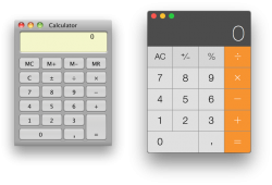
For example, some people view the calculator below, which lacks the word 'Calculator', as an alarm clock.
Wake me at 1:30
Postscripts
Not only Jason Snell (ex-Macworld). It's worth noting what
the people at Macworld someone from 9to5Mac wants to do with Safari on Yosemite
I'll seek more information.
Animations, another problem area. More on this later.


