Become a MacRumors Supporter for $50/year with no ads, ability to filter front page stories, and private forums.

fredcintra

macrumors regular
Jun 10, 2011
101
54
Sounds like you two are contradicting each other. :confused:

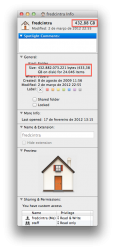
In Lion it is currently displayed like this: 55,301,914,760 bytes (55.3 GB)

It SHOULD be like this: 55.3 GB (55,301,914,760 bytes)

I mean would anyone disagree with me? It is crazy that Apple listed it the first way in Lion and not the latter like any normal person would expect! It is very annoying to me because it is not easily glance-able, you have to search or scan when you look at it just to see how big something is. It is only in Lion that they switched it weird like that too!

So can either of you confirm which way it is in Mountain Lion for sure?

Thanks :)

I dont think this is relevant when you have a BIG BOLD number right beside the file name
 

Attachments

  • Screen Shot 2012-03-06 at 00.14.04.png
    Screen Shot 2012-03-06 at 00.14.04.png
    103.8 KB · Views: 448

MacFly123

macrumors 68020
Dec 25, 2006
2,340
0
I dont think this is relevant when you have a BIG BOLD number right beside the file name

The point is it doesn't make any sense and is poor design. It was never like that until Lion and it is only annoying and illogical now.

There are a bunch of great tweaks in this thread that I am excited about. I just hope they make the refinements I have specified in my other posts in here and don't make us wait for another OS update till we get a new music app, new iTunes, Videos app, iBooks, iTunes U, etc.

Oh, and if they are changing iCal and Address Book to Calendar and Contacts can anyone confirm if they are changing System Preferences to Settings?

If they are aiming for consistency then they better do a good job haha. All the music notes are different shapes on the iTunes icon, music app icon, iTunes store icon, file thumbnails, etc. The messages app icons should either both be green or both blue on iOS and OS X. I do like the OS X Messages icon though (it is a rip off from WebOS but oh well haha). iPhoto I'm not sure how they should handle that. Do they call the Photos app on iOS iPhoto? Doesn't really make sense because iMovie and Garage Band are purchasable apps and I don't think they would want to change iPhoto on the Mac which is part of iLife to just photos. Little things like that make all the difference! :cool:
 

RoelJuun

macrumors 6502
Aug 31, 2010
450
209
Netherlands
Though I won't argue with you about the other things you say, the info-window is logical to me. First thing you see is the size of the file(s) written so that you can see instantly the rough (useful) size. Below they provide the exact size of the file(s). You claim it is the other way around…
 

MacFly123

macrumors 68020
Dec 25, 2006
2,340
0
Though I won't argue with you about the other things you say, the info-window is logical to me. First thing you see is the size of the file(s) written so that you can see instantly the rough (useful) size. Below they provide the exact size of the file(s). You claim it is the other way around…

I see your point of view. I just prefer the way it has always been till they changed it in Lion. I don't know anyone that ever wants to know how many exact bytes a file is lol!
 

DeckMan

macrumors regular
Mar 16, 2011
109
6
Actually, there *is* an iPhoto app for iOS now - it's different from Photos in that it has a lot more advanced editing tools. (Edit: And some other stuff.)

Also, I do wanna know the exact size of a file sometimes ;)
 
Last edited:

Incarna

macrumors newbie
Mar 11, 2012
21
0
Logically, to me:

Rough size (most people probably don't care about the exact # of bytes...)

More Info -> Exact Size (For people who care. Personally I'd want to know the exact size, but it just doesn't make sense to me to stick it out under the assumption that everyone wants to know the exact size.)
 

JUiCEJamie

macrumors 6502a
Mar 22, 2011
817
223
I've not seen this mentioned anywhere else but there's a new (to me) icon in the System Preferences pane called Ink that has something to do with hand writing recognition. Also, it's a 32-bit preference pane so requires a restart of System Preferences when selected.

That's been there since 10.2 I think. But it'll only appear when you have a graphics tablet currently plugged in.
 

Solowalker

macrumors regular
Feb 13, 2008
114
0
Spiffy new iCloud open pane when TextEdit first opens.

http://cl.ly/0B2A1D1l3E3V3s0p0V3b

And the whole mess about the Open dialog box and dragging and dropping is fixed. Functions as it did before, not moving files and no file renaming and stuff, though you can right click and share.

http://cl.ly/2n2p0j0R2d020y181S0x

http://cl.ly/2x1q2D1I380z2S3E0b0P

Some Finder sidebar icons tweaked:

http://cl.ly/0c333D2x2q2z3N2H1O05

Graphite interface colors back:

http://cl.ly/0D122f1D3u2L403L1o47

Messages fullscreen no longer wastes space on the sides.


Privacy section in Security pane in System Preferences revamp, including a "Who's looking at my Contacts?" section:

http://cl.ly/3L1n0f1l0M3o1m3V111X

Contact access blocking does appear to be in place already, too:

http://cl.ly/3r0E2T3G3l1H3j1q3Y0N

http://pic.twitter.com/nuvZUheu
 
Last edited:

Tmelon

macrumors 65816
Feb 26, 2011
1,150
619
I saw something about an iCloud icon in Safari? Any word on what that does? I can't update until I get home.
 

Solowalker

macrumors regular
Feb 13, 2008
114
0
I saw something about an iCloud icon in Safari? Any word on what that does? I can't update until I get home.

If there is one, I must be over looking it. There is, however, an option to exclude this machine's Safari from showing tabs on other devices. So there might be something else somewhere but I haven't found it. Let me know if you see it elsewhere.
 

Tmelon

macrumors 65816
Feb 26, 2011
1,150
619
If there is one, I must be over looking it. There is, however, an option to exclude this machine's Safari from showing tabs on other devices. So there might be something else somewhere but I haven't found it. Let me know if you see it elsewhere.

Macrumors just posted a story. Apparently it's a button in Safari now that syncs your open tabs.
 

Solowalker

macrumors regular
Feb 13, 2008
114
0
Macrumors just posted a story. Apparently it's a button in Safari now that syncs your open tabs.

Thanks, just saw that. They (and others now) also have posts on others things like the Contacts access and Graphite's return. Too bad none of them mention me. :rolleyes: j/k
 
Last edited:

imacken

macrumors 65816
Feb 28, 2010
1,250
127
It didn't work as expected in DP1 either
Parallels team published a very quick new build to get over the ML and W8 incompatibility a couple of weeks ago.
Also, PD7 does work with DP2. I got the 'incompatibiity' message, but a simple uninstall/reinstall of PD sorted that out.
 

ct2k7

macrumors G3
Aug 29, 2008
8,382
3,439
London
Parallels team published a very quick new build to get over the ML and W8 incompatibility a couple of weeks ago.
Also, PD7 does work with DP2. I got the 'incompatibiity' message, but a simple uninstall/reinstall of PD sorted that out.

Let me upgrade again
 
Register on MacRumors! This sidebar will go away, and you'll see fewer ads.