Can someone either post pictures or speak to what iCal (now Calendar) and Address Book (now Contacts) feels like under Mountain Lion?
I must say, I absolutely cannot stand the iOS-y versions found in 10.7 and hope they are looking to improve them. Particularly the print views in iCal.
Calendar feels exactly the same as iCal under 10.7, same design and features. I never used the print feature before now but I attached screenshots.
Same for Contacts, besides a few UI changes it feels the same to me. The bottom "views" bar is new, I think.
Attachments
-
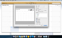 Screen Shot 2012-02-27 at 8.30.00 AM.png365.9 KB · Views: 708
 -
 Screen Shot 2012-02-27 at 8.30.08 AM.png311.5 KB · Views: 415
 -
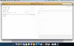 Screen Shot 2012-02-27 at 8.30.14 AM.png327.2 KB · Views: 397
 -
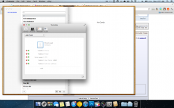 Screen Shot 2012-02-27 at 8.31.31 AM.png411.6 KB · Views: 431
 -
 Screen Shot 2012-02-27 at 8.31.44 AM.png19.4 KB · Views: 232


