How come we're no longer able to drag an app off the dock to remove it from there????? I find it extremely annoying (given the number of icons they cram in the dock by default), I'd really like to know the reason behind this stupid change
Got a tip for us?
Let us know
Become a MacRumors Supporter for $50/year with no ads, ability to filter front page stories, and private forums.
10.8 All the Little Things!
- Thread starter baryon
- Start date
- Sort by reaction score
You are using an out of date browser. It may not display this or other websites correctly.
You should upgrade or use an alternative browser.
You should upgrade or use an alternative browser.
How come we're no longer able to drag an app off the dock to remove it from there????? I find it extremely annoying (given the number of icons they cram in the dock by default), I'd really like to know the reason behind this stupid change
You can still drag icons off. You just need to wait until the "cloud" icon appears. I've found the area you need to drag the icon to seems to be about the size of the dock at it's largest. Does that make sense? Basically, you have to move slower.
You can still drag icons off. You just need to wait until the "cloud" icon appears. I've found the area you need to drag the icon to seems to be about the size of the dock at it's largest. Does that make sense? Basically, you have to move slower.
And higher up.
that's rather annoying, I'd much prefer the old behaviour 🙁
guess i'd have to try to get used to it.
guess i'd have to try to get used to it.
C'mon, how often do you remove something from the dock? That's good they changed it, because now it is so easy to accidentally drag icon off the dock. Happens to me all the time.that's rather annoying, I'd much prefer the old behaviour 🙁
guess i'd have to try to get used to it.
C'mon, how often do you remove something from the dock? That's good they changed it, because now it is so easy to accidentally drag icon off the dock. Happens to me all the time.
I agree, it happens sometimes and its really annoying. This is a welcome change, for me at least!
It might be just me, but I have some folders in my dock that I use to quickly drag files from the desktop to the folder. It happens quite often that I drag a bunch of files, the folder moves aside and suddenly there are 15 files in my dock that I need to remove manually. A undo option would be nice for me at least.
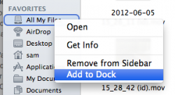
Is this option in the Finder new?
Does it create a stack if added to Dock? It will be very useful to me if it does.
Also, can you add a Smart Folder to the Dock as a Stack?
----------
This bugs or not i just upgrade to DP 4, and safari can not feed rss.
RSS has been removed from Safari/Mail in Mountain Lion, since the initial DP. And it is not coming back. :|
Also, can you add a Smart Folder to the Dock as a Stack?
Yes, apparently you can!
It does!Does it create a stack if added to Dock? It will be very useful to me if it does.
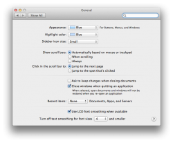
how could one turn off resume in Mountain Lion? The option doesn't seem to be there anymore. What about version and autosave, have they made those mandatory features now????
For resume, it looks like it's already disabled in your screenshot--it's the option that says "close windows...".
For resume, it looks like it's already disabled in your screenshot--it's the option that says "close windows...".
yes and no. If I manually turn off/restart the Mac, all current apps are not resumed, however, it doesn't seem to remember this setting if I schedule OS X to automatically shutdown my Mac. I just wanna confirm if this is the correct behaviour before filing a bug report 🙂
Yes, apparently you can!
It does!
Awesome. ROARR!!
That's the one that really bugs me too. Can anyone verify whether apps in Launchpad autosort and lose their position after a restart?
Yup, it's been doing that for every DP release. Should be fixed by GM.
In the meantime, try the free app Launchpad Control. Makes arranging Launchpad much easier from "System Preferences".
swingerofbirch
macrumors 68040
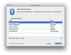
Can someone take a screenshot of the Browse device window from Bluetooth File Exchange?
It was drastically changed in Lion removing a lot of functionality and some basic functionality was added back in 10.7.4, but it still doesn't have all the functionality it did pre-Lion.
It was drastically changed in Lion removing a lot of functionality and some basic functionality was added back in 10.7.4, but it still doesn't have all the functionality it did pre-Lion.
There you go.Can someone take a screenshot of the Browse device window from Bluetooth File Exchange?
It was drastically changed in Lion removing a lot of functionality and some basic functionality was added back in 10.7.4, but it still doesn't have all the functionality it did pre-Lion.
Attachments
Last edited:
Aaron, feel free to use [img][/img] tags instead of [img][/img] for large pictures. That will help keep us with smaller screens from having to scroll sideways or ruin the flow of the sites. Thanks
EDIT: Thanks. Much better.
EDIT: Thanks. Much better.
Last edited:
swingerofbirch
macrumors 68040
There you go.
Thanks very much. I actually meant the screen once you select a device, such as a cell phone, to browse, but I really appreciate you responding. Are you using a skin of some sort? The stoplight buttons and fonts look slightly different to me than Lion, but I could be wrong.
Thanks very much. I actually meant the screen once you select a device, such as a cell phone, to browse, but I really appreciate you responding. Are you using a skin of some sort? The stoplight buttons and fonts look slightly different to me than Lion, but I could be wrong.
Click the thumbnail. It's clearly retina resolution.
Aaron, feel free to use [img][/img] tags instead of [url=]Image[/url] for large pictures. That will help keep us with smaller screens from having to scroll sideways or ruin the flow of the sites. Thanks
EDIT: Thanks. Much better.
This is off-topic, but the MacRumours staff should use CSS to set the maximum width of img tags to "100%". Hopefully a moderator will see this and pass it up.
Register on MacRumors! This sidebar will go away, and you'll see fewer ads.


