Become a MacRumors Supporter for $50/year with no ads, ability to filter front page stories, and private forums.
Every day i forward my phone to my desk phone number. I do this b/c i work in a building that you cant bring your cell phone in.

Now i notice when i forward my phone, there is a blue icon with the pic of a phone and an arrow pointing to the right to indicate that my phone is on forward.


pretty cool!


Alex
 
Additions that I didn't see but, very well could've missed.

- Unknown incoming calls show the location of the call!

- iPod album art is shown on the lock screen

- Moving applications to different screens is smoother and doesn't re-arrange apps until it is placed.

- Messages has a new icon

- Stocks has horizontal view

- You can now add 20 places to check the weather in the weather app (previous was 12 I believe)

- You can change the default search engine in settings

- You can log in and out of Youtube accounts

- "Find My iPhone" addition in MobileMe preferences

- You can now share a contact

- When adding an IM name it now says "add new instant message"

- Calendar syncs subscriptions

- App Store has a different image viewer to preview what apps look like

- Mail preview loading is much faster

The thing you said about moving apps doesn't seem to work for me, if I wiggle then move an app it just moves the other apps right away.
 
You can now select which folders to push from MS Exchange so you can have folders other than inbox synced (found by TedIsraelson)

That is AWESOME! Might be one of the better things IMO.
 
Im?

Did previous version have IM ID field in contacts? I'm synced with Google via Exchange (which is also synced to my Mac address book), and now everybody's IM screen names are showing on my iPhone.
 
Podcasts now listed in ORDER

This drove me crazy - I listen to podcasts ever day, and they were listed in a backwards order. Now they're fixed!

Huge for me.
 
When installing an app, while the phone is contacting the server/negotiating (whatever it is doing in the background) under the app it will say "waiting" as opposed to no feedback before the download bar shows up on the icon.

I don't recall seeing that before?
 
Just a few I've found:

- You’re no longer forced to use the English (US) keyboard in addition to you local keyboard. In 1.x.x and 2.x.x you could turn on an international keyboard (such as English (UK)) but you'd not be able to turn off the US keyboard as well.

- The iPod 'overlay' controls seem more responsive. Edit: and did it always have a volume slider?

- when entering text in a page in Safari, you now have 'previous', 'next' and 'AutoFill' options in addition to 'done'.

- when exiting an app, the minimise effect now has shading to make it seem more like it's disappearing into the distance.
 
I would argue this is not at all like Mail. It would be the same if Mail allowed you to delete/forward each line of an email. Useful? Not to me.

What I want is the ability to mass delete entire conversations from the main Messages list, to me that would be "just like you would in mail" and would also be very very useful.

Can't you do what you're describing my swiping right or left over the conversation you want to delete entirely (from the Messages main screen) and press the red "Delete" button to delete that entire convo, like you've been able to do forever on iPhone OS?
 
Google maps shows even more traffic

I noticed that google maps not only shows traffic on interstates/freeways/tollways, but also now shows traffic on state and us route highways
 
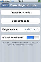
screen lock 10 failed and erase all data

as an added level of security you can if you use screen lock have the phone erase itself after ten failed attempts

m
 
Better organization of the list would be greatly appreciated.

For example, categorize the features by types, or by its significances. Many of the mentioned features are rather small tweaks, but scrolling through them is tough.
 
Great thread!

Couple things I found (99% sure they're new in 3.0):

1. If you had a WebApp bookmark on one of your homescreens, and had set it up in 2.x when that particular website didn't have a favicon, when you click on that WebApp in 3.0 and a favicon now exists for that website, the homescreen icon will auto update to the new favicon...before, you had to re-add the webapp to your homescreen.

2. This might have been mentioned before, but in "vertical" stocks, when a particular stock is selected, if you "swipe" the mini-graph left, then a more detailed stock quote will show up with Open/High/Low/Volume/PE/Mkt Cap/52w High/52w Low/Avg Volume/Yield...and if you swipe another time to the left then news for that stock comes up and the news is scrollable in the vertical direction.

3. if you click the arrow on a recent calls contact person, it will show you the duration of the last few phone calls in minutes. It's also easier to add a contact to your Favorites now.

4. You can redeem gift certificates and "beta app redemption codes" from the App store.
 
In the Mail app, when you hit "Edit" to select multiple message, the blue unread indicator dot remains visible.
 
"This accessory is not made to work with iPhone" anymore

Since upgrade to 3.0, I don't get the "This accessory is not made to work with iPhone" message when docking the iPhone anymore. Yay!

Ciao :)
 
screen lock 10 failed and erase all data

as an added level of security you can if you use screen lock have the phone erase itself after ten failed attempts

m
 

Attachments

  • IMG_0367.PNG
    IMG_0367.PNG
    41 KB · Views: 79
iCal Landscape

I'm starting to worry, that I seem to be the only one who craves a week-view in Calender.app. How can people work only with days and months?! I was hoping Apple would implement that but alas, I was shaking my iPhone when in landscape and screaming "give me a week-view!!!".
Am I missing something here? Anything hidden on that level?
 
sound fading out

I think the music of apps you close is now FADED out, not just interrupted!
 
Resized Safari Bookmarks

It appears they have resized the bookmarks list view in safari.
 
• when making a genius playlist, it has little dots instead of letters for every second letter (found by Acronym)
Actually, this happens wherever there is limited space and the index letters are too squashed vertically. I noticed it also started happening on one of the screens in my own app.
 
Better organization of the list would be greatly appreciated.

For example, categorize the features by types, or by its significances. Many of the mentioned features are rather small tweaks, but scrolling through them is tough.

i'm sorry but that's definitely not happening anytime soon. maybe when things slow down but not right now, they're just coming in too fast.
 
Not on the list & the very first things I noticed:

In Phone.app:
- New icon shows which calls were received vs. dialed out.
- In call details mode, it displays the call duration next to the time of the call. (something I've always wanted to know).
 
Register on MacRumors! This sidebar will go away, and you'll see fewer ads.