Hahahah, I think it’s an illusion. Some numerical digits fit and some digits do not fit and look weird. I think it’s a lot of work and Apple needs to work on every single number to make it look more aesthetic. Who knows. I have a feeling it will be tweaked with future software updates.I feel the percentage icon does not fit the rest of the status bar aesthetic… so that plus the fact my battery lasts me all day and I don’t miss monitoring it keeps me having that feature turned off.
Got a tip for us?
Let us know
Become a MacRumors Supporter for $50/year with no ads, ability to filter front page stories, and private forums.
Other 2022 iPhone 14/Plus/Pro/Pro Max/ US Pre-Orders, Orders, and Delivery Status Thread
- Thread starter TheYayAreaLiving 🎗️
- Start date
- Sort by reaction score
You are using an out of date browser. It may not display this or other websites correctly.
You should upgrade or use an alternative browser.
You should upgrade or use an alternative browser.
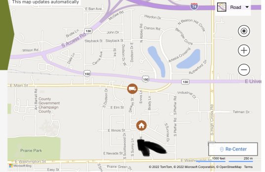
This is getting crazy. This dude left my subdivision and went to Walgreens drop box and stuck there for last 30 minutes.
No phone today, doubt they will deliver tomorrow so Monday at the earliest. What this message means is they sent it to the wrong place, entirely. Should have been to Texas, not Massachusetts. Oh well.
09/16/2022
9:24 A.M.On the Way
We’re sorry this package has experienced a sortation delay. The package has been rerouted to the correct destination.
Brockton, MA, United States
The real iPhones were the friends we met along the way.
I am with ya! 😞🙏🏽💜Thinking I’m probably the last delivery of the day 😅
When they said this thing has a bit of heft to the weight, they were pretty much right, weighs a bit more than my Pixel 6 Pro even with the case.
" data-source="post: 31486278"
class="bbCodeBlock bbCodeBlock--expandable bbCodeBlock--quote js-expandWatch">
What did she say to him? Now I’m intrigued lol
Nah, she wants to make money from Apple and Samsung together. She is in it for the money. I respect her hustle but Sorry, that’s not a true Apple fan. Definitely not an iPhone lover. Just remember she lied to Tim Cook.
Case closed!
Case closed!
What did she say to him? Now I’m intrigued lol
Yipee!
My new iPhone 14 Pro and watch just landed in Lakewood (near Denver). The UPS guy was guessing it was Apple gear. I said yup, release date for new phones and watches. He said he had been delivering a ton of them today.
FYI...even though the UPS MyChoice info didn't indicate a signature was required the driver said he needed one. I ordered a new case which was delivered last week. It needed a signature too.
Last edited:
Ugh. Missed my delivery by 3 minutes.
Ups Site didn’t say it would require signature but I guess the driver made that choice.
They will try to deliver again tomorrow. Just in case, I ordered a 256 black for pickup at an apple store about 30 minutes away for tomorrow afternoon. Just stinks their taxes come out to be $20 more than the delivery.
What mystic powers!! I'm hours into it by now. Currently syncing music 3,894 of 4976. Did get AW reengaged, so that's good.UPS delivered about 15 minutes ago and I just completed setup!
Well as I figured driver is busy to the north in the fancy, high end (300 K and higher houses, ours is old 1960’s lower. Income place but as a retired state employee what we could afford. I bet many more in the neighborhood to north got iphones and such we are alway last but it will be here soon

Well changed fast just to our north already left the fancy neighborhood so probably close
Well changed fast just to our north already left the fancy neighborhood so probably close
Attachments
@jr866gooner She lied to Tim Cook when iPhone 14 was announced. Lied about the color. Check out @MrENGLISH post below. Yesterday, Tim Cook CEO of Apple stopped by and confirmed it himselfWhat did she say to him? Now I’m intrigued lol
Personally, check it out. This is the real deal. 😂
👇👇👇
But in her iPhone review video today she admitted to lying to Tim Cook when she originally said she was going to buy the Deep Purple and instead she bought the Silver.
.
GOOD MORNING!
Fax she told me she got Deep Purple when I asked, then I checked her Pre-Order and it said Silver! A damn lie!
Goouuuuuudddd morninggggg and thank you, Mr. Cook.
There you go, guys. Heard it from the CEO of Apple himself.
Last edited:
My Purple Nurple has been delivered! Thank You All! I'll be back to track if they announce a new M2 14" MacBookPro and who knows...maybe next year for the 15 as well! Enjoy your new phones all! 


Just stopping by to say Congrats to everyone with their new phones, mine still says In Progress Arrives Oct 10 - Oct 17 so about 4 more weeks for me.
@Wxchaser if you break free from factory soon enough, you'll catch historic tailwinds.I'm happy for you! Saves hassle of driving to the big city Apple Store or cruising cellular shops. It's only a couple more days and we get to relive the tracking experience with you. Win, win!!

A 'historically powerful' storm brings seas of up to 54 feet toward Alaska, NWS says
Virtually Alaska's entire shoreline is under some form of alert. Flood and storm warnings cover the west, and craft advisories cover both the Gulf of Alaska and the coast of the North Slope.
Picking up NYC 59 ST Bad Idea
This is how it was last year at the Grove Apple Store in Los Angeles. Definitely was not in and out. Line was super long but moved fast maybe for 30 to 45 minutes.
I left work at 12:00 PM EST and went to my local Apple Store for my 1:45 pm window for pick up. The transition to esim was smooth but I got talked into doing the iCloud restore AT the apple store and it took FOREVER due to everyone in the store on the Apple wifi. But I did meet some nice people both Apple employees and others who were setting up their iCloud restore on their phones. Apparently, a few were familiar with these forums but don't post ( lurkers) ha. I am just getting home with my 14 pro max in silver though it looks white. I got the clear MagSafe case and a screen protector as well. I would take pics many have posted theirs already so y'all get the point. I was expecting the screen to be a bit bigger though on the 14 pro max coming for an 11 pro max but the screens are about the same size. Not bothered by that but from some stuff I saw online, I thought the screen would be massive lol.
Will really play around with it once the iCloud restore is done. Still very excited to have this phone and it's been a great ride with you all. I still will be around on these forums, photography thread, and in doing this tracking stuff in a month or two when I order a new apple watch going for the series 8 or Ultra.
Will really play around with it once the iCloud restore is done. Still very excited to have this phone and it's been a great ride with you all. I still will be around on these forums, photography thread, and in doing this tracking stuff in a month or two when I order a new apple watch going for the series 8 or Ultra.
We got so lucky we survived this weather and arrived to Louisville, KY early on. It’s crazy!@Wxchaser if you break free from factory soon enough, you'll catch historic tailwinds.

A 'historically powerful' storm brings seas of up to 54 feet toward Alaska, NWS says
Virtually Alaska's entire shoreline is under some form of alert. Flood and storm warnings cover the west, and craft advisories cover both the Gulf of Alaska and the coast of the North Slope.www.npr.org
First impressions, coming from an iPhone 11 Pro Max: The cameras are E N O R M O U S.
It took at least 30 minutes before mine was transferred.Of course, my eSIM isn't transferring.
Congratulations!
Small UPS CC!
Arrived at mine 1/2 hour after they opened. I was the only person there, no cars in the lot.
View attachment 2068039
Mine opened at 12, I arrived at 1:10 and no line. I asked the employee if there was a line when they opened he said not really I was kind of impressed with UPS today. Last year I reserved At the Apple Store and it was pretty crazy. Now I’m undecided for next year. lol. I have been ordering in-store pick up for the past few years.
Register on MacRumors! This sidebar will go away, and you'll see fewer ads.


 said:
said:

