Become a MacRumors Supporter for $50/year with no ads, ability to filter front page stories, and private forums.
Status
The first post of this thread is a WikiPost and can be edited by anyone with the appropiate permissions. Your edits will be public.

MozMan68

macrumors 603
Original poster
Jun 29, 2010
6,152
5,261
South Cackalacky
I miss the Yellow, blue and green major roads, everything is some form of grey now and it just looks horrid, like how did they think changing the most iconic thing about apple maps was a good idea

Because, those colors are nothing more than old representations of road types needed when people used paper maps. They actually serve little to no purpose in a digital format other than nostalgia.

The weight and designation of The road is what is more important now. One doesn’t necessarily look at the map and try to figure out the route now. Simply enter a starting point and end point and it routes for you. You can then use that information to decide your route.

In countries where the color is actually a significant part of that information, Apple does leave it in. But in the USA, color was nothing more than a helpful visual on paper maps that is no longer needed.

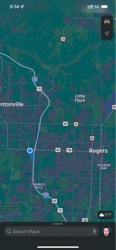
It’s pretty clear to me, even in dark mode, which roads are highways, significant main streets, or side streets here.
d8370c11a3167a9f9bbfed50007d9553.jpg
 

calmelb

macrumors member
Jul 12, 2016
66
78
In countries where the color is actually a significant part of that information, Apple does leave it in. But in the USA, color was nothing more than a helpful visual on paper maps that is no longer needed.
In the UK the colour is actually important for the road type, all maps keep it as the motorways are different to the A roads which are different than others. The Blue and Green are important to tell the Motorways and the A roads apart from the others too. All the road signs in the UK also respect those colours so they're a lot more than just a map throwback
 
  • Like
Reactions: Rivvvers

MozMan68

macrumors 603
Original poster
Jun 29, 2010
6,152
5,261
South Cackalacky
In the UK the colour is actually important for the road type, all maps keep it as the motorways are different to the A roads which are different than others. The Blue and Green are important to tell the Motorways and the A roads apart from the others too. All the road signs in the UK also respect those colours so they're a lot more than just a map throwback

Isn’t that what I said?

They are still there in the UK for that reason.

4cd1aba399f5f97e9ee4a895f1118b90.jpg
 

Rivvvers

macrumors regular
Jun 11, 2012
115
121
The Shire
The problem seems to be that the colours are completely absent on the explore map, but present on the driving map but only when zoomed far enough out, as soon as you zoom in to street level the roads turn different shades of grey. This particular aspect needs to be reverted in the uk in all honesty, or perhaps a setting option to set preference.
I’ve attached a video of what I’m talking about

CC7597C6-935C-4CA2-80D7-57A12C103D0D.png


MozMan68

macrumors 603
Original poster
Jun 29, 2010
6,152
5,261
South Cackalacky
Explore mode is about exploring poi’s…not about roads/driving. Most road details and signage is irrelevant.

Driving mode does include it, but I think Apple relented on the green and blue as a reference when looking at the map at a higher zoom level.

Again, no matter how they present it, digital maps rely less and less on older design styles.
 
Last edited:

SugarrayMax

macrumors newbie
Oct 23, 2021
2
1
In the Settings area of the phone, there's an option under Maps to turn on or off the ability for the phone to play directions over your car's radio. Maybe try that?
Where exactly is this setting. Looked in 15.0.2 can’t find. Having similar issues.
 

calmelb

macrumors member
Jul 12, 2016
66
78
Where exactly is this setting. Looked in 15.0.2 can’t find. Having similar issues.
Settings -> Maps -> Spoken Directions -> Directions on Radio. It'll play over the cars built in car bluetooth phone mode (as if you're making a phone call)
 

Dunk the Lunk

macrumors regular
Oct 27, 2007
232
74
.uk
Explore mode is about exploring poi’s…not about roads/driving. Most road details and signage is irrelevant.

Driving mode does include it, but I think Apple relented on the green and blue as a reference when looking at the map at a higher zoom level.

Again, no matter how they present it, digital maps rely less and less on older design styles.


MozMan, I have to say I disagree. I can see what you’re saying about a single colour being better in a digital age but I’m not sure cartographically this is totally true and I certainly don’t think the shade of grey is the right choice.

To quote: “The most efficient graphic constructions are those in which any question, whatever its type and level, can be answered in a single instant of perception, that is, in a single image.” Semiology of Graphic by Jacques Birten (from Justin’s website).

I just don’t think that the uniform grey (whatever slight line weight variation there is) achieves that same depth of insight.

And as Calmelb says in the UK the colour coded roads have long histories, colours are included in all signage, and most importantly some colours (motorways) have different legal status/requirements. Here’s an example of all three on the same sign:

57536DF0-93F3-459A-B5CC-F96B202F9B54.png


In Apple Maps the colours appear to be somewhat inconsistently applied. The A417 road is shown as grey, not green which it should be. The road between Stroud and Cirencester should be grey, not green. Are these just mistakes? How many others are there?

E26A20AA-1F75-4D7E-9F9A-77AB94353105.png
 
Last edited:

MozMan68

macrumors 603
Original poster
Jun 29, 2010
6,152
5,261
South Cackalacky
MozMan, I have to say I disagree. I can see what you’re saying about a single colour being better in a digital age but I’m not sure cartographically this is totally true and I certainly don’t think the shade of grey is the right choice.

To quote: “The most efficient graphic constructions are those in which any question, whatever its type and level, can be answered in a single instant of perception, that is, in a single image.” Semiology of Graphic by Jacques Birten (from Justin’s website).

I just don’t think that the uniform grey (whatever slight line weight variation there is) achieves that same depth of insight.

And as Calmelb says in the UK the colour coded roads have long histories, colours are included in all signage, and most importantly some colours (motorways) have different legal status/requirements. Here’s an example of all three on the same sign:

View attachment 1876430

In Apple Maps the colours appear to be somewhat inconsistently applied. The A417 road is shown as grey, not green which it should be. The road between Stroud and Cirencester should be grey, not green. Are these just mistakes? How many others are there?

View attachment 1876431

I would say that is an error that the one small section you have noted is grey and not green as it should be.

I still do not understand why you guys are bringing this up. I clearly stated that places like the UK and some other countries where the color is part of the navigation process and not just there to define road type on a paper map.

I agree with that in my original post.

BUT…it will become less and less relevant, even in the UK, as mapping and GPS improves to the point that one will barely need a visual reference at all. Self driving cars won’t care. Unless the roads themselves are painted blue or green and that is the only reference on where to turn, color on maps or even signs should not matter….in a perfect world.
 

Dunk the Lunk

macrumors regular
Oct 27, 2007
232
74
.uk
BUT…it will become less and less relevant, even in the UK, as mapping and GPS improves to the point that one will barely need a visual reference at all. Self driving cars won’t care. Unless the roads themselves are painted blue or green and that is the only reference on where to turn, color on maps or even signs should not matter….in a perfect world.

But in that case why have a viewable map at all?! Just tell Siri and go-I don’t need to see anything! Because while todays maps are absolutely data driven and could be used for applications such as self driving cars importantly they are also used to explore and understand a landscape. And that is where the cartographic point I was making comes in. The grey(s) just don’t give the same level of understanding at a glance.

I also think the ‘Explore’ map is also very car centric (even though IMO it’s cartographically flawed) - this map should be more agnostic. For example in comparison to the road details Apple Maps shows, the railway lines are difficult to see. Here three major London stations (Euston, St Pancras, and Kings Cross) but they are not shown until you zoom right in:
EB90BD7C-D9F2-4758-9EF7-90BCEE5ED1C0.jpeg


Ok if I zoom in further or go to the Public transport map I can see them. But why do I need to do this when a few simple changes to the cartography could tell me this information and still look beautiful.
 

MozMan68

macrumors 603
Original poster
Jun 29, 2010
6,152
5,261
South Cackalacky
But in that case why have a viewable map at all?! Just tell Siri and go-I don’t need to see anything! Because while todays maps are absolutely data driven and could be used for applications such as self driving cars importantly they are also used to explore and understand a landscape. And that is where the cartographic point I was making comes in. The grey(s) just don’t give the same level of understanding at a glance.

I also think the ‘Explore’ map is also very car centric (even though IMO it’s cartographically flawed) - this map should be more agnostic. For example in comparison to the road details Apple Maps shows, the railway lines are difficult to see. Here three major London stations (Euston, St Pancras, and Kings Cross) but they are not shown until you zoom right in:
View attachment 1876557

Ok if I zoom in further or go to the Public transport map I can see them. But why do I need to do this when a few simple changes to the cartography could tell me this information and still look beautiful.

The answer is, there is no correct answer. ;)

Apple has their way, Google has their way….dozens of others….

And it’s an evolving process….that’s the best part. They can and will change based on usage and feedback.
 

bransoj

macrumors 68000
Jul 31, 2013
1,563
739
Not sure if other UK users are seeing the same but in the past i always had the voice muted in maps but i've now got the new alerts only option enabled. However it seems on a section of the M1 motorway that i use on a regular basis whilst the icons for speed cameras are in the right place the voice alert is happening too late, in general i get the first voice alert as i'm about to go past the camera and the second on a good few hundred yards after it. Now i know where they are but seems a bit pointless to have them if they dont alert properly.

Interestingly on the main road near our house where there are two 30mph speed cameras the alert for those goes off in plenty of time, its only the quicker roads it seems to be too late.
 

calmelb

macrumors member
Jul 12, 2016
66
78
However it seems on a section of the M1 motorway that i use on a regular basis whilst the icons for speed cameras are in the right place the voice alert is happening too late, in general i get the first voice alert as i'm about to go past the camera and the second on a good few hundred yards after it. Now i know where they are but seems a bit pointless to have them if they dont alert properly.
I had that in Aus, on one of the freeways the alert is about 1-2km before the actual camera, but theres no notice closer to the camera. Seems something is amiss at times.

Also regarding the Australian rollout of new maps, looks like some things are appearing even though I don't yet have the maps fully rolled out (Eg AAMI park, a sports stadium, used to be a white space, now has the green of a stadium around it, and when navigating I get the new maps colours instead of what the maps look like normally). Interesting how some things get trialed and others don't
 

iOS Geek

macrumors 68000
Nov 7, 2017
1,658
3,443
Hoping to see if the betas for 15.2 come this week and if they'll have the "later this year" CarPlay features! Anxious to find out what changes I'll see, being in an area that A) won't be getting the "super-detail" anytime soon (Chicago wasn't even on the list yet) and B) still doesn't even have all of the iOS 13 or 14 features (no cycling directions in the Chicago area at all...and my part of the suburbs didn't make the cut for Look Around)!

I do recall the "super detail" being mentioned separately from CarPlay, so hopefully those of us outside the super-detail areas see something in terms of more detail. And ya know, more Look Around releases would be great!
 

G1Ravage

macrumors 65816
Dec 28, 2018
1,096
832
Queens, New York, USA
I have some videos I need to upload and share from YouTube, but my fiance has been keeping me busy and away from...this stuff. lol

From the phone perspective (not CarPlay), the update to iOS 15.1 brought some navigation camera improvements. The camera is doing some different things on the phone (haven't tried CarPlay yet), such as zooming out on highways to show all traffic ahead, which it was previously doing *only* on CarPlay. However, this is still intermittent. Also, precise GPS positioning on the map (when not navigating) seems to have improved greatly.

More to come.
 

virginblue4

macrumors 68020
Apr 15, 2012
2,027
700
United Kingdom
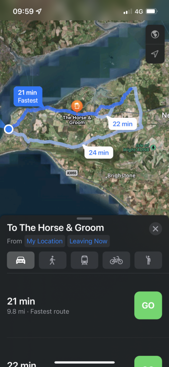
There still seems to be the really infuriating issue where when navigating, the pin is in the correct location, but the directions take you somewhere totally different (screenshot attached)! I usually pay attention to make sure they match, but I’ve been caught out twice this week whilst in a rush.

Of all the types of reports I send to Apple, this is the only type of report they NEVER fix! It’s so annoying.

Any idea if I can raise this issue higher up?
 

Attachments

  • CB9B9266-5C7B-4C05-920A-030B5D69C784.png
    CB9B9266-5C7B-4C05-920A-030B5D69C784.png
    1.9 MB · Views: 88

rdinterman

macrumors 6502
Sep 17, 2012
352
589
Florida
So is there a different server for CarPlay? The gas station near by house is Marathon (which is correct) on my iPhone. On CarPlay it is labeled as a BP.
 
Register on MacRumors! This sidebar will go away, and you'll see fewer ads.