This profile is intended to set fixed values for luminance and white point. But you can create a new preset that uses the same white point, but a different luminance. The procedure is described in the video posted earlier by paalb.Why is display brightness not adjustable with the "Photography (P3-D65)" preset?
Got a tip for us?
Let us know
Become a MacRumors Supporter for $50/year with no ads, ability to filter front page stories, and private forums.
Can't calibrate new XDR MacBook Pro display - missing 'Color' button, calibration option.
- Thread starter Sowelu
- Start date
- Sort by reaction score
You are using an out of date browser. It may not display this or other websites correctly.
You should upgrade or use an alternative browser.
You should upgrade or use an alternative browser.

Yea, using the Colorsync Utility. I'm able to change to the icc profile I want and it asks for password. When I restart, the profile I chose is showing but colors are to the original icc profile. The only thing I'm changing is the white point which I like to set to around 9000.Are you applying the newly created profile using the ColorSync Utility app in the Utilities folder?
What you use as a consumer is not what all these settings are made for. They are made for industry standard compliance. An example: When the printer at a big print factory looks at the prints coming out of the press, he lays it under 5000k (D50) light. If he had a new MacBook he could choose Design and print preset (D50) and would see colors and luminosity that are close in perception.I'm a bit unclear about when to use some of the presets in the Monitors preference panel. Most of these presets enable standardized settings used in certain professional workflows and media. So, if I am viewing a 4K HDR video on YouTube, I probably want to choose the HDR preset. When I am editing photos in Capture One, and intending to print to a wide-gamut inkjet, I probably want the Photography preset. Etc.
But some of the other presets are puzzling. The Internet & Web (sRGB) preset locks brightness at a very low level. Why is this? Does the sRGB standard include a luminance spec?
If I am running a movie from my Macbook Pro to our TV (Sony A1E OLED), using an HDMI cable, which preset is appropriate? HDTV video? Digital Cinema? Or are these presets only useful for getting the correct output on the Macbook Pro itself?
Since I am not working professionally in any of these trades, I am free to set my screens to taste. But I am also curious about how this stuff works.
Your results seem excellent. Low dE, correct gamut and white point, etc. Just the screen seems to be a little dimmer outside of the center. Thank you very much for sharing.Here are my results using video and displaycal
As paalb mentioned, the presets are an easy way to make the monitor closer to a known workflow. For general usage you are free to use the unconstrained default preset and set brightness as it looks good.I'm a bit unclear about when to use some of the presets in the Monitors preference panel. Most of these presets enable standardized settings used in certain professional workflows and media. So, if I am viewing a 4K HDR video on YouTube, I probably want to choose the HDR preset. When I am editing photos in Capture One, and intending to print to a wide-gamut inkjet, I probably want the Photography preset. Etc.
But some of the other presets are puzzling. The Internet & Web (sRGB) preset locks brightness at a very low level. Why is this? Does the sRGB standard include a luminance spec?
If I am running a movie from my Macbook Pro to our TV (Sony A1E OLED), using an HDMI cable, which preset is appropriate? HDTV video? Digital Cinema? Or are these presets only useful for getting the correct output on the Macbook Pro itself?
Since I am not working professionally in any of these trades, I am free to set my screens to taste. But I am also curious about how this stuff works.
The sRGB preset might be useful when dealing with programs that don't support color management. That would fix oversaturation issues, for example. But thankfully all major browsers are now color managed and consider untagged page elements or images correctly as sRGB, so no issues there.
What I don't like about the presets is that the luminance levels are pretty low. That makes sense for professional usage and environments where light is controlled, but even so 80 cd/m2 for photography is pretty dim. I tend to prefer something around 100 or 110 cd/m2 for my particular room and have no problems matching prints to my display.
What hardware device did you use with DisplayCal?Here are my results using video and displaycal
I have the DisplayCal software and a Calibrite ColorChecker iDisplay Pro. I'm wondering if I should create an ICC profile using this combination, or wait as ArtIsRight recommended in the video. I have already set the luminance and used the iDisplay Pro to fine-tune the white point, but I have not yet created an ICC profile.
Yes, I get that. I use a color-managed workflow for my photography hobby: calibrated screens, printer-paper profiles, 4700K halogen lamps, etc.What you use as a consumer is not what all these settings are made for. They are made for industry standard compliance. An example: When the printer at a big print factory looks at the prints coming out of the press, he lays it under 5000k (D50) light. If he had a new MacBook he could choose Design and print preset (D50) and would see colors and luminosity that are close in perception.
On the mini-LED display, HDR videos look different when I select the default preset, "Apple XDR Display (P3-1600)", or the "HDR Video (P3 ST-2084)" preset. The default allows adjustments of brightness (luminance), and a high setting clearly results in unnatural oversaturated colors. A low setting can look wrong, too. The "HDR Video" preset ensures that the color and luminance range parameters are correct, assuming that the content creator used standards. So the preset choices are indeed useful for consumers, at least in this case.
My questions are about the other presets. I don't understand why the sRGB preset is so dark. And I don't know which presets are appropriate, if I want to see a calibrated display of other media, or whether that is possible. I do realize that the visible differences might be slight, and that I can always adjust to taste. I'm not OCD about this, just curious.
For example, if I stream a movie on the Macbook Pro display, which preset would match the content? Is it possible to know (or guess) which standard was used in the production?
When I connect the Macbook Pro for streaming to our Sony A1E OLED TV, the Monitors preference panel shows another group of presets for that device. One of them is simply labeled "Sony TV", and the others are various industry standards, some of which are not available for the computer's own screen. There is also a checkbox to enable HDR on the TV. And, in my tests so far, it looks incredible.
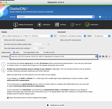
DisplayCAL already works well for those displays with an i1Display Pro. Just select PFS WLED for the corrections, as Matck06 did. I don't have a machine here to test, but his results are 100% normal with that combo.I'm wondering if I should create an ICC profile using this combination, or wait as ArtIsRight recommended in the video.
Or you can just measure and tweak the panel white point as ArtIsRIght showed on the video and keep the default canned profile supplied by Apple. It'd be really close to a custom calibration since the factory calibration seems to be excellent on those displays.
Great. That's what I already did (measure and tweak the panel white point), and it seems great. But I may try DisplayCal to see if it's any different.DisplayCAL already works well for those displays with an i1Display Pro. Just select PFS WLED for the corrections, as Matck06 did. I don't have a machine here to test, but his results are 100% normal with that combo.
Or you can just measure and tweak the panel white point as ArtIsRIght showed on the video and keep the default canned profile supplied by Apple. It'd be really close to a custom calibration since the factory calibration seems to be excellent on those displays.
Yes you are right, I was focusing on the lower part. I think this is a good reference: https://support.apple.com/en-us/HT210435Yes, I get that. I use a color-managed workflow for my photography hobby: calibrated screens, printer-paper profiles, 4700K halogen lamps, etc.
On the mini-LED display, HDR videos look different when I select the default preset, "Apple XDR Display (P3-1600)", or the "HDR Video (P3 ST-2084)" preset. The default allows adjustments of brightness (luminance), and a high setting clearly results in unnatural oversaturated colors. A low setting can look wrong, too. The "HDR Video" preset ensures that the color and luminance range parameters are correct, assuming that the content creator used standards. So the preset choices are indeed useful for consumers, at least in this case.
My questions are about the other presets. I don't understand why the sRGB preset is so dark. And I don't know which presets are appropriate, if I want to see a calibrated display of other media, or whether that is possible. I do realize that the visible differences might be slight, and that I can always adjust to taste. I'm not OCD about this, just curious.
For example, if I stream a movie on the Macbook Pro display, which preset would match the content? Is it possible to know (or guess) which standard was used in the production?
When I connect the Macbook Pro for streaming to our Sony A1E OLED TV, the Monitors preference panel shows another group of presets for that device. One of them is simply labeled "Sony TV", and the others are various industry standards, some of which are not available for the computer's own screen. There is also a checkbox to enable HDR on the TV. And, in my tests so far, it looks incredible.
I get a better result with just the white point adjustment with the help of displaycal and the wled pfs 99% P3 profile then I use the d65 photography P3 profile identical to the video but I do not calibrate the screen because I 'get worse results (ccprofiler or even displaycal) so I advise you to stop at the white point parameter for now. Anyway on an extended verification test with displaycal I get an average DE of 0.28 and the worst patch is 1.28 worthy of a high end screen, with the icc profile generated by displaycal I get an average DE of 0.55 and DE max 2.15
Out of curiosity, what luminance value are you using?I get a better result with just the white point adjustment with the help of displaycal and the wled pfs 99% P3 profile then I use the d65 photography P3 profile identical to the video but I do not calibrate the screen because I 'get worse results (ccprofiler or even displaycal) so I advise you to stop at the white point parameter for now. Anyway on an extended verification test with displaycal I get an average DE of 0.28 and the worst patch is 1.28 worthy of a high end screen, with the icc profile generated by displaycal I get an average DE of 0.55 and DE max 2.15
I always use 100cd it's a good compromise between 80 and 120cdPar curiosité, quelle valeur luminance utilisez-vous ?
Thanks. I'm trying to figure out how to use DisplayCal to adjust the white point. I'm a beginner and have only used it 2-3 times to create an ICC profile, and in that case, I just followed the instructions in this article.I always use 100cd it's a good compromise between 80 and 120cd
When I open DisplayCal on my 14" MBP, the display is not showing up in the "Display" list. What should I choose here, and how do I do a white point adjustment?
Thanks. I'm trying to figure out how to use DisplayCal to adjust the white point. I'm a beginner and have only used it 2-3 times to create an ICC profile, and in that case, I just followed the instructions in this article.
When I open DisplayCal on my 14" MBP, the display is not showing up in the "Display" list. What should I choose here, and how do I do a white point adjustment?
View attachment 1903705
- Open up the display cal app, and plug in your calibration tool, in my case i1 display pro
- It will prompt me to download the latest Argyll (which is a lie. It's downloading v2.1.2), click ok and let it
- Go to https://www.argyllcms.com/downloadmac.html and click on "Intel OS X 10.6 64 bit or later" , it will download a tgz zip file, unzip it and make note of its location, we will need to move it later.
- Go back to the DisplayCal app. Click on "File" up top, click "Locate ArgyllCMS Executables", it should open a bin folder with a bunch of files in it. Navigate to the Library>Download folder where your unzipped ArgyllCMS folder is located (from step 4), and select the "bin" folder
- Displaycal will automatically try to run a bunch of files in that bin folder, and the MacOS will try to stop you because the files came from an unidentified developer. So everytime the "warning: Can't open up file because the developer is unknown" popup shows up, you need to go to that bin folder and do a CTRL+ Right click to force run the file. Then cancel the popup windows. Repeat this a few times until all the files DisplayCal need is not showing the "unknown dev" popup anymore.
- Reboot Displaycal and you should see your monitor being recognized, yay. Pic for proof:
- then you have to put the wled pfs 99% p3 profile surrounded in black, then on the second photo measured by clicking on the chromatic wheel, note the measurement bead and applied as the video published by "artisright"
Attachments
I am curious, is there reasons I should use display cal instead of i1Profiler? This thread is the first time i have heard of it.
- Open up the display cal app, and plug in your calibration tool, in my case i1 display pro
- It will prompt me to download the latest Argyll (which is a lie. It's downloading v2.1.2), click ok and let it
- Go to https://www.argyllcms.com/downloadmac.html and click on "Intel OS X 10.6 64 bit or later" , it will download a tgz zip file, unzip it and make note of its location, we will need to move it later.
- Go back to the DisplayCal app. Click on "File" up top, click "Locate ArgyllCMS Executables", it should open a bin folder with a bunch of files in it. Navigate to the Library>Download folder where your unzipped ArgyllCMS folder is located (from step 4), and select the "bin" folder
- Displaycal will automatically try to run a bunch of files in that bin folder, and the MacOS will try to stop you because the files came from an unidentified developer. So everytime the "warning: Can't open up file because the developer is unknown" popup shows up, you need to go to that bin folder and do a CTRL+ Right click to force run the file. Then cancel the popup windows. Repeat this a few times until all the files DisplayCal need is not showing the "unknown dev" popup anymore.
- Reboot Displaycal and you should see your monitor being recognized, yay. Pic for proof:
- then you have to put the wled pfs 99% p3 profile surrounded in black, then on the second photo measured by clicking on the chromatic wheel, note the measurement bead and applied as the video published by "artisright"
Because the correction matrix (wled pfs 99% P3 macbook) will give you better results on the white point calculation, no matrix is really correct on ccprofiler, you have to wait for X-rite (Calibrite) to update its software by adding a new matrix which will be better than the "white led" I recommend to use displaycal, even better to try for yourself and compare the results.
Thank you for your detailed instructions. I got all the way to step 7, and just want to confirm that I'm doing it correctly, because my calibration window is lacking some options that yours has. Here is what I did, please let me know if it is correct.
- Open up the display cal app, and plug in your calibration tool, in my case i1 display pro
- It will prompt me to download the latest Argyll (which is a lie. It's downloading v2.1.2), click ok and let it
- Go to https://www.argyllcms.com/downloadmac.html and click on "Intel OS X 10.6 64 bit or later" , it will download a tgz zip file, unzip it and make note of its location, we will need to move it later.
- Go back to the DisplayCal app. Click on "File" up top, click "Locate ArgyllCMS Executables", it should open a bin folder with a bunch of files in it. Navigate to the Library>Download folder where your unzipped ArgyllCMS folder is located (from step 4), and select the "bin" folder
- Displaycal will automatically try to run a bunch of files in that bin folder, and the MacOS will try to stop you because the files came from an unidentified developer. So everytime the "warning: Can't open up file because the developer is unknown" popup shows up, you need to go to that bin folder and do a CTRL+ Right click to force run the file. Then cancel the popup windows. Repeat this a few times until all the files DisplayCal need is not showing the "unknown dev" popup anymore.
- Reboot Displaycal and you should see your monitor being recognized, yay. Pic for proof:
- then you have to put the wled pfs 99% p3 profile surrounded in black, then on the second photo measured by clicking on the chromatic wheel, note the measurement bead and applied as the video published by "artisright"
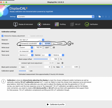
- I selected "chromaticity coordinates" under "Whitepoint" menu. Then I entered the coordinates from the ArtIsRight video. x=0.3127 and y=0.329.
- I clicked on the small icon to the right of the "y", which brought up a measurement dialog. I ran the measurement, and the new values populated into the "x" and "y" box as you can see below.
- For "white level", I chose custom and entered "100" in the box. Then I clicked on the small white square to bring up the white point measurement window. I did a measurement, and the value populated in the box.
- Observer: this doesn't even show up
- Black level: this doesn't even show up
- Gamma: I have "Gamma 2.2" selected, but there are no additional options for me, as there are for you (like "Black output offset", etc.)
Also, do I then need to choose "Calibrate & Profile" to apply the new settings? Or were they already applied when I measured the white point and luminance? I'm concerned that if I click "Calibrate & Profile", it will do the full calibration, which you mentioned is not a good idea just yet.
no you do not touch anything else, just put the wled pfs p3 99% macbook profile afterwards you recovered the coordinates of the white point and the screen brightness with the D65 profile photography P3 cd100 (or others if you have chosen another luminance value example 120cd or 80cd etc ...), then reported the coordinates of the measured white point and the measured luminance in the macos settings of your d65 photography profileThank you for your detailed instructions. I got all the way to step 7, and just want to confirm that I'm doing it correctly, because my calibration window is lacking some options that yours has. Here is what I did, please let me know if it is correct.
That's as far as I got. I noticed that I am lacking a few options that you have:
- I selected "chromaticity coordinates" under "Whitepoint" menu. Then I entered the coordinates from the ArtIsRight video. x=0.3127 and y=0.329.
- I clicked on the small icon to the right of the "y", which brought up a measurement dialog. I ran the measurement, and the new values populated into the "x" and "y" box as you can see below.
- For "white level", I chose custom and entered "100" in the box. Then I clicked on the small white square to bring up the white point measurement window. I did a measurement, and the value populated in the box.
Did I do this correctly?
- Observer: this doesn't even show up
- Black level: this doesn't even show up
- Gamma: I have "Gamma 2.2" selected, but there are no additional options for me, as there are for you (like "Black output offset", etc.)
Also, do I then need to choose "Calibrate & Profile" to apply the new settings? Or were they already applied when I measured the white point and luminance? I'm concerned that if I click "Calibrate & Profile", it will do the full calibration, which you mentioned is not a good idea just yet.
View attachment 1903970
then in target, added the values of the video for the white point d65 (0.3127 / 0.3290) and for the luminance added the value that you put in the profile d65 photography P3, for my case I put in 100cd luminance target because I created a profile with 100cd
I initially started this thread because the baked in and easy to use Display Calibration Assistant was hidden and there was no obvious way to calibrate and color correct my new MacBook Pro's XDR display (as I've done for the past 20 years with every new Mac purchase). A quick, easy, and manual process (by eye).
This was a huge problem for me as my eyes are very sensitive to typical factory calibrations (including Apple's) which tend to have a heavy green and often dingy tint to them - which these XDR displays have (to my eyes). I just wanted to make this display pop and look more vibrant (to the eye) by adding in some much needed red/blue to reduce the green and adjust the white point a bit - as I typically would with my other Macs.
For me, this was not about having the perfect hardware calibration (by numbers, on paper) for actual pro work and pro editing, but I am glad that this thread morphed into a resource for those of you who need proper calibration for your jobs, businesses and hobbies. While a lot if this is over my head, I think I am learning a bit more about 3rd party hardware calibration and software, and it may be something I will look into further.
But for me, at this moment, I just want to be able to color correct my XDR display so that it is pleasing to my eyes (not what the industry calls 'perfect and on point'), and so far, it doesn't look like editing 'Presets' will help me accomplish this. I've tried to edit presets to at least adjust the white point, but it locks the brightness slider and there is no way to color correct with presets. And why is there no on-screen visual of what the desired white point and gamma will look like? You have to input X and Y values? The entire process is not very intuitive and is definitely targeted towards industrial work.
But here's the thing, there are plenty of us MacBook Pro users who are just regular Mac fans who want (and can afford) the best and most powerful Mac portables who enjoy and utilize the power and technology, but who also want to color correct our displays.
I guess I just don't understand why the XDR displays added such a layer of complexity where an average user cannot adjust, color correct and calibrate the display to their liking using built in macOS tools/apps like we've done for decades. Is this Apple's arrogance saying that their factory calibrations are so on point that 'you don't need to adjust the colors', or is there something else going on here? I've been going back and forth with an Apple senior account support rep, but they don't seem to know more than the rest of us in this thread and keep pointing to the limited (and useless to me) Presets.
If my high-end Samsung TVs had no option to adjust colors, darkness, gamma, and so on, and I was left with their awful (but great on paper) factory calibrations (or their oversaturated presets), and required a complex process to change very limited options and with the help of 3rd party hardware or software, they'd be returned in a heartbeat!
So I am hoping that there is a happy medium and Apple will add color correcting and white point adjustment (with on-screen visuals/sliders) to the preset customization process. I don't see how or why this would interfere with the XDR content, nits, and so on. If this is their reasoning, they need to code around that or revamp the Display Calibration Assistant to work well with XDR display technology. The current limitations for color correcting a display on a very expensive machine is just unacceptable in my opinion.
I realize that most people will never adjust their display's color, white point and so on, but I am sure that there are many of us out there that who are affected by these dingy, green tinted, default factory calibrations that we cannot change, and would like to correct it using the very simple to use Display Calibration Assistant (or a more robust and easier to use preset customization process). Based on the professional display calibration videos I've seen with these new MacBook Pros, it looks like Apple's default calibration is very close to what 3rd party hardware calibrators suggest is on point, so if you don't see this green tint, or it doesn't bother you, that's great. For those of us who see it and want to change and correct it, there should be an easy way to do so.
I am still using the Display Calibration Assistant to create and apply color profiles using the workaround I posted, but I would prefer a best of both worlds option where we can color correct our new XDR displays, without using complex 3rd party options, and without losing some of the XDR capabilities while doing so.
Last edited:
You are right, it is not intuitive. But I just discovered you can get those values from Display Calibrator. I have not got my new MacBook Pro yet so I can not check this myself.You have to input X and Y values? The entire process is not very intuitive and is definitely targeted towards industrial work.
Got it, that makes sense. I entered the values and it looks great!no you do not touch anything else, just put the wled pfs p3 99% macbook profile afterwards you recovered the coordinates of the white point and the screen brightness with the D65 profile photography P3 cd100 (or others if you have chosen another luminance value example 120cd or 80cd etc ...), then reported the coordinates of the measured white point and the measured luminance in the macos settings of your d65 photography profile
then in target, added the values of the video for the white point d65 (0.3127 / 0.3290) and for the luminance added the value that you put in the profile d65 photography P3, for my case I put in 100cd luminance target because I created a profile with 100cd
Super happy to have helped you, yes the color accuracy is really excellent without having to calibrate this is the first time I see this on a laptop, it is really equivalent to a professional type screen in terms of uniformity and color accuracy with these settings.J'ai, c'est logique. J'ai pénétrement dans les valeurs et ça a l'air super !
Thank you for this. I was going to reference my preferred saved color profile to input those values, but then remembered that once you edit a preset, the brightness is locked and is no longer adjustable. I honestly don't understand what's behind that.You are right, it is not intuitive. But I just discovered you can get those values from Display Calibrator. I have not got my new MacBook Pro yet so I can not check this myself. View attachment 1904182
Register on MacRumors! This sidebar will go away, and you'll see fewer ads.