Got a tip for us?
Let us know
Become a MacRumors Supporter for $50/year with no ads, ability to filter front page stories, and private forums.
Doubting the notch? Here are some photos.
- Thread starter MacQork
- Start date
- Sort by reaction score
You are using an out of date browser. It may not display this or other websites correctly.
You should upgrade or use an alternative browser.
You should upgrade or use an alternative browser.
- notch
- home bar indicator
- taller than Plus
iPhone X ist not a alternativ to the iPhone 8 Plus.
I hope iPhone X Plus gets wider next year.
[doublepost=1505813086][/doublepost]
- home bar indicator
- taller than Plus
iPhone X ist not a alternativ to the iPhone 8 Plus.
I hope iPhone X Plus gets wider next year.
[doublepost=1505813086][/doublepost]
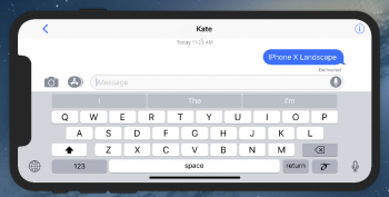
Is there a pic with the X in landscape in iMesssage and the keyboard visible?
Attachments
- notch
- home bar indicator
- taller than Plus
iPhone X ist not a alternativ to the iPhone 8 Plus.
I hope iPhone X Plus gets wider next year.
[doublepost=1505813086][/doublepost]
Thanks for that. It seems that landscape typing might be a bit of a challenge as it is on the Plus.
- notch
- home bar indicator
- taller than Plus
iPhone X ist not a alternativ to the iPhone 8 Plus.
I hope iPhone X Plus gets wider next year.
[doublepost=1505813086][/doublepost]
That UI in messages is a disaster. How could anyone defend the notch
You have a bigger screen but you can‘t use it.
- notch on top or left
- left and right software borders
- big headlines on the top
iOS11 is a mess. I think we have to wait for iOS12 to get a perfect revamped UI design language.
- notch on top or left
- left and right software borders
- big headlines on the top
iOS11 is a mess. I think we have to wait for iOS12 to get a perfect revamped UI design language.
Last edited:
If you're watching video in proper aspect ratio, then no. It's not.
Cool. So let's just get a tiny video that doesn't take advantage of the full "5.8" E2E" screen that so much was sacrificed for.
That UI in messages is a disaster. How could anyone defend the notch
There is nothing to defend. Many hate it, a few love it and the most just don't think of it as an issue.
I am liking the notch a lot. Every app I have seen has looked better/more roomy in my eyes. Some weirdness to landscape, but I never use my phone in landscape so I don't need to worry about it.
[doublepost=1505821853][/doublepost]
Don't know an exact number, but the address bar will get smaller and the bottom bar disappears when you scroll. Same way it works now. If you accidentally swipe control center up all the time then yes, you will likely go to the homescreen a lot.
[doublepost=1505821853][/doublepost]
So, what's the actual usable screen size here, 5"? Look at the wasted space at the top and the bottom. Plus, if your scrolling up to view, you might accidentally swipe up the home bar and it will exit you to homescreen?
View attachment 718828
Don't know an exact number, but the address bar will get smaller and the bottom bar disappears when you scroll. Same way it works now. If you accidentally swipe control center up all the time then yes, you will likely go to the homescreen a lot.
There will be books and movies about this era someday.I'm more concerned about the internal dynamics at Apple than the notch. The notch I can live with.....
The only minds that will be changed are those who think they'll be fine with the notch. Just wait until you're in the pitch dark and only see that hideous display with its non-uniformity drawing your eyes directly to the top, taking your brain activity quite literally away from the content.
You're funny. I remember all your pre-keynote posts where you mocked, in that uber-opinionated fashion of yours, folks who believed Apple would embrace the notch. You just need to let it go, man. The notch is distinctive, iconic and honest. Sir Jony was right and you were wrong. It happens. Just embrace the notch and you'll feel much better.
You just need to let it go, man. The notch is distinctive, iconic and honest. Sir Jony was right and you were wrong. It happens. Just embrace the notch and you'll feel much better.
Oh my...
You actually called him "Sir" Jony. Wow. lol
You're funny. I remember all your pre-keynote posts where you mocked, in that uber-opinionated fashion of yours, folks who believed Apple would embrace the notch. You just need to let it go, man. The notch is distinctive, iconic and honest. Sir Jony was right and you were wrong. It happens. Just embrace the notch and you'll feel much better.
People need to justify their buying, or not buying, decisions.
Still can’t believe it’s really there. It’s horrid.. but Bless it.. saving me $$.
Most videos/pics have been showing it on the left. I think if you make it go on the right side, it'll feel better as we're used to scroll bars being on the right. We're used to ignoring that, perhaps it'll help the notch disappear in our minds easier.
I will make new screenshots and place them! Will post them in an hour or so when I'm home
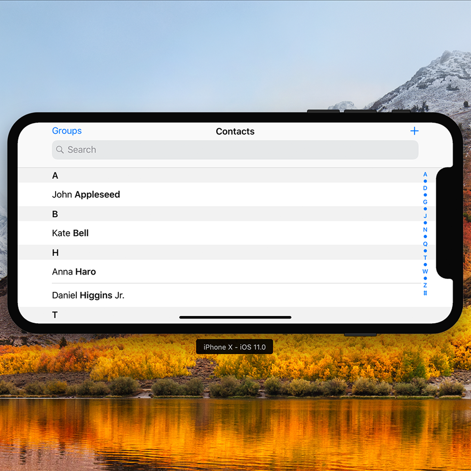
I want to see a picture of the iPhone X with a UITableView like the contacts app.
What do you mean?
Rather have the camera housing than a bezel. Status bar is tucked into the left and right corners thus maximizing display area rather than sitting below a bezel taking up precious pixels and, really, defeating the purpose and benefit of an edge-to-edge display.
While I don't necessarily like how it looks, I don't think it'll affect video. They will black out top and bottom, so in landscape the notch will get blacked out.
Agreed. I think most people will opt to watch video with bars that will black out the notch. However, that makes the viewable area considerably smaller which is still a bit of a downside. Personally, I wouldn't mind the notch much on a short youtube video but it's a no-go on a TV show. I do watch TV while waiting for the subway at times or on a break.
When browsing the web or in apps, I think the notch is a non-issue and people are making a big deal out of nothing. Also, over time content providers will get creative with it and figure out ways to tastefully integrate it or black out the top portion of the screen.
Basically this. I'm not against people not liking it. I just think once you actually get the phone in your hands and have hands on time you would get use to it. I'm looking forward to the phone. If you want something else get the latest Samsung or keep your older iPhone.It really doesn't bother me.
Batman would be proud.
Lol, perhaps thinking I have a batphone would make me "love" it.
Most videos/pics have been showing it on the left. I think if you make it go on the right side, it'll feel better as we're used to scroll bars being on the right. We're used to ignoring that, perhaps it'll help the notch disappear in our minds easier.
Edited the Original Post;
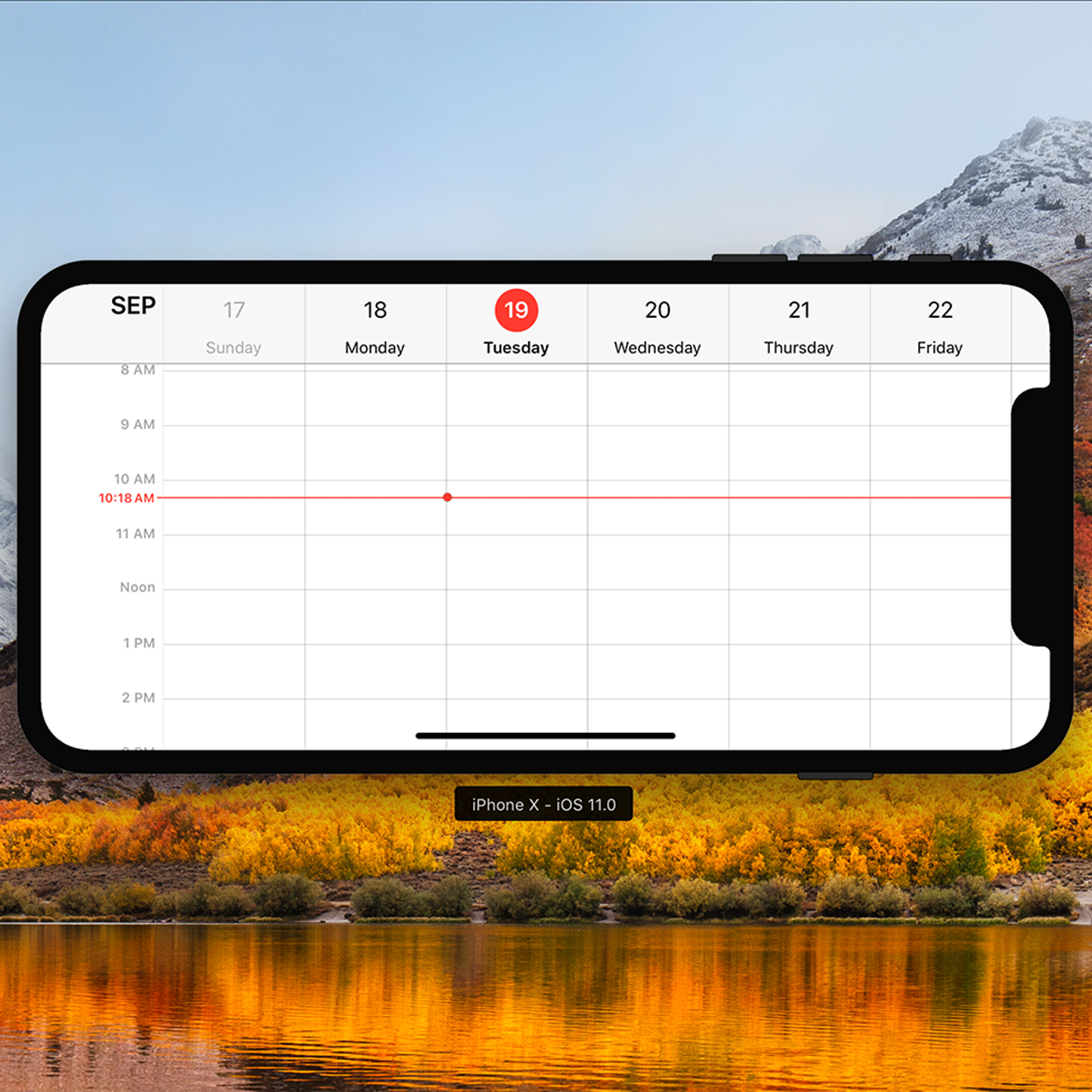
iPhone X Landscape Right-Side Calendar
iPhone X Landscape Right-Side Contacts
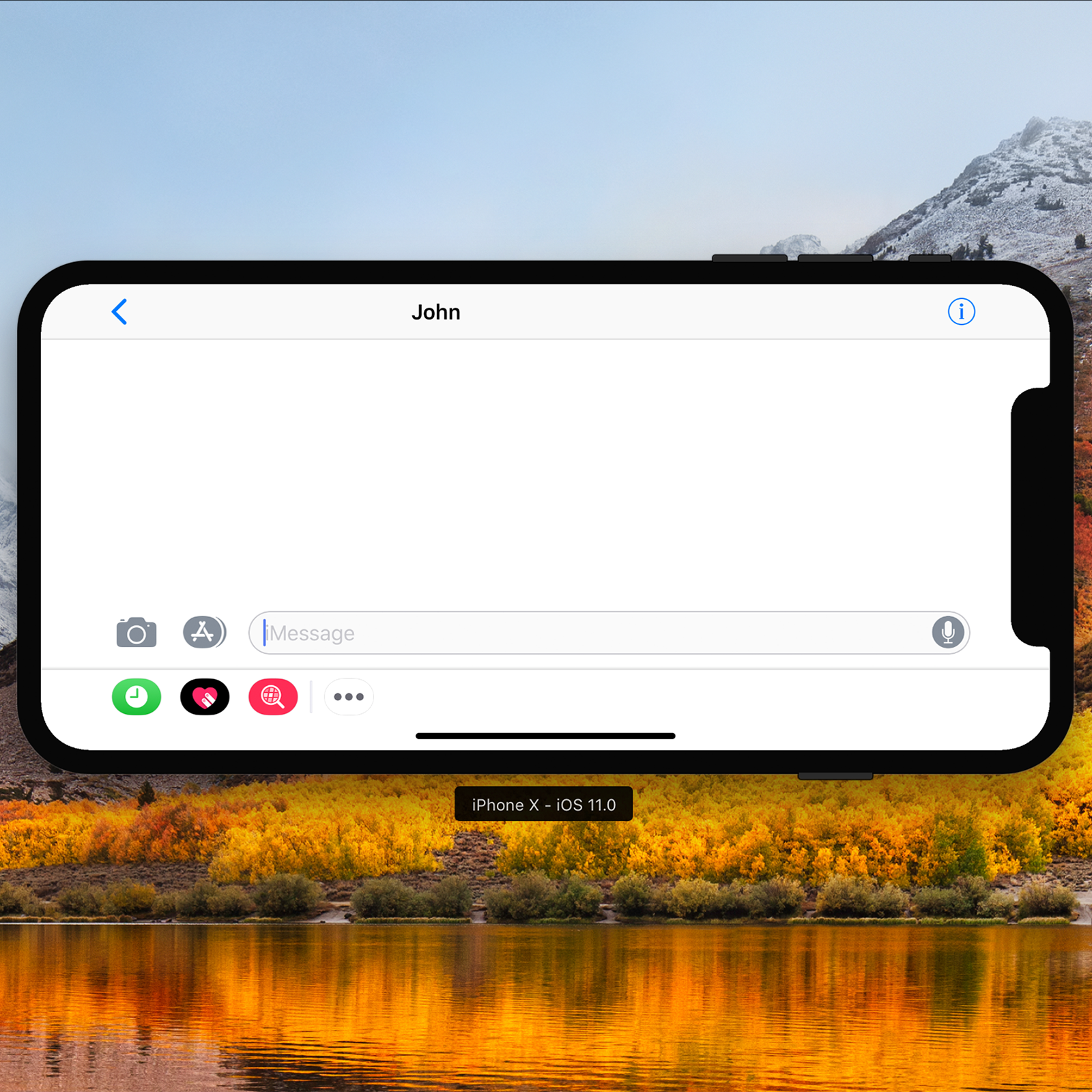
iPhone X Landscape Right-Side iMessage

iPhone X Landscape Right-Side Contacts

iPhone X Landscape Right-Side iMessage

Register on MacRumors! This sidebar will go away, and you'll see fewer ads.


