Become a MacRumors Supporter for $50/year with no ads, ability to filter front page stories, and private forums.
It definitely looks cool and brings additional context on the Home Screen that can be quickly interacted with (read: a smart widget).

I have a few concerns:
- UI with interaction on the top of the screen (difficult with one handed use, big screens, etc). Would make a lot of sense at the position where the new Search button is, just above the home row (in iOS 16).
Maybe we can get it there with a future notchless iPhone?
- Tapping on the sensor / camera array might influence performance due to dirt (e.g. when cooking) or body oil (especially the front camera)
- Takes away screen space as others have mentioned

I guess time will tell if my concerns are valid or not.
 
They've put a lot of money and effort into making this project one of the key features of the new iPhone 14 Pro. So I think they're planning to use this concept for at least 3 more years, before they have the technology that they need to move on to a complete notchless design.

I honestly would question if they'll ever go edge to edge screen. User may not care but Apple def seems to value the "iphone silhouette" and having some physical design that is immediately identifiable as an iPhone, and that becomes much harder when its just a screen.

I have a feeling that this feature could be hated as much as the touch bar on the MBP. Don't get me wrong. I like the concept and how much effort they've put into this. But do I have to clean the "dynamic island" always before shooting a selfie because I always touch that region? Will I accidentally trigger features that I don't want to trigger because I wanted to press something else in the proximity of the dynamic island? I need to see real life usage of that feature before I'll buy the phone.

There is no way it'll be as hated as the touchbar. The touchbar was hated because it replaced far more useful and efficient function keys with a terrible touch screen display that is antithetical to proper keyboard usage (looking down at the keyboard). This new notch takes away nothing and vastly improves the HUD capabilities of the iphone. At worst, its a harmless feature that is nothing but a flashy HUD for notifications. If people hate it, they probably just don't have to use it.
 
  • Like
Reactions: borntrouble
I like the idea, but at end of the day for me the dynamic island is a cool distraction until they move Face ID under the display.
 
that software optimization around that island /pill is still better than having the static island alone finally some innovation from apple. but why didnt they do this in 2018 ?

I mean look at the iPhone X.... the notch is pretty big and there is barely enough space to show anything left and right. It is a huge difference.
 
I prefer the notch on the top, leaving more uninterrupted screen space. Sure, this is smaller, but its lower and creeps up on my usable screen.
 
  • Like
Reactions: scrtagntman
Excellent use of a “notch”!

I feel like the opposite, it’s telling of how mature and stale the smartphone market is at this point. It’s a new minor UI element, that’s being marketed as an enormous innovation. I understand, they have to oversell minor changes, because the yearly iphone releases are the bulk of Apple’s business. But it’s just so ridiculous to see.

I mean the notches, curved edges etc. is just getting a few measly % more screen, is almost meaningless in the grand scheme of the device capability and feel.

Dynamic island is just bandaid on some of the drawbacks of the notch concept, which is underwhelming to begin with. If dynamic island inherently was a good UI concept they could’ve implemented it just as well with or without a notch. And really, if it was without a notch, this wouldn’t have raised any eyebrows.
 
It definitely looks cool and brings additional context on the Home Screen that can be quickly interacted with (read: a smart widget).

I have a few concerns:
- UI with interaction on the top of the screen (difficult with one handed use, big screens, etc). Would make a lot of sense at the position where the new Search button is, just above the home row (in iOS 16).
Maybe we can get it there with a future notchless iPhone?
- Tapping on the sensor / camera array might influence performance due to dirt (e.g. when cooking) or body oil (especially the front camera)
- Takes away screen space as others have mentioned

I guess time will tell if my concerns are valid or not.
I agree that the interaction on the top screen is harder with one handed use, but the regular Pro is much easier to handle with one hand and no one forces you to get a Max model. Getting a max model without having very large hands is kind of accepting some inherent difficulties and this is coming from a 5'5" male.

As for the touching of the camera area while like cooking for you example, I think it could just be done smartly just like touching your phone in general, if you have more dirty fingers and don't want to touch around the camera area just use the phone like you did in the past, I doubt it will be a mandatory use feature.

Screen space...well yeah, but only for brief moments then it goes back to it's normal pill size which is smaller than the notch, if anyone who really values their screen space more then hopefully there is a way to turn off and on the feature so both sides are happy.
 
My guess is, the top area well be completely black and you will see the pill "move" with the content. At least that would make it less weird and seems like an easy solution.
That's a good call. At the moment when you use reachability you see a sort of extreme blurred version of the background but switching this to pure black or even some sort of fade from black to wallpaper would obscure the cutout and keep the "magic" of the dynamic island.

Something like these mockups?

Reach1.png
reach2.png
 
Last edited:
  • Like
Reactions: jambon and Nozuka
What happens to the Island when you are watching a video or a movie?

It seems like a great idea, though wouldn't it be better if it was not there all the time?
 
What happens to the Island when you are watching a video or a movie?

It seems like a great idea, though wouldn't it be better if it was not there all the time?
Good question.
For me showing / watching full screen video (I.e. zoomed YouTube) / photos
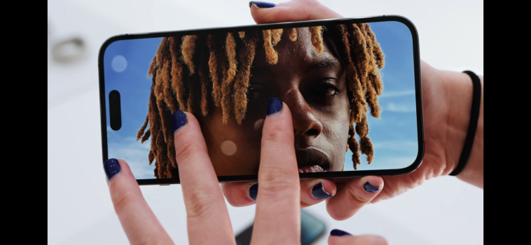
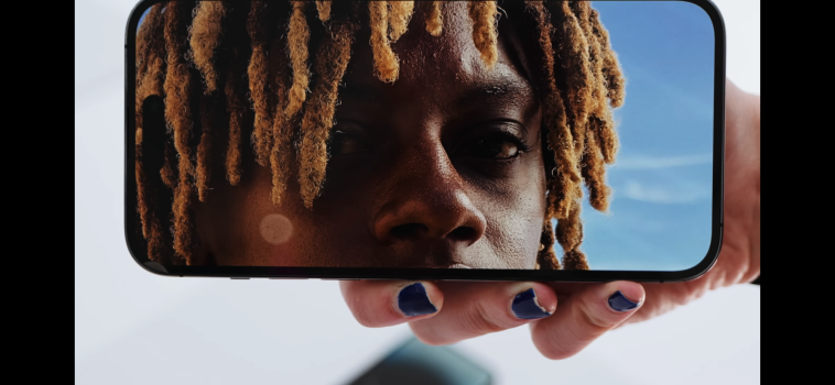
Looks like that:

Phone 14 Pro (@ Sara Dietschy )

92B0E8BC-6C46-41BC-9010-0291D4773039.png

2896BCC1-B8E7-46EA-BA45-86AA8E07EDD5.png

Personally I prefer notch

6BEB6A6C-186B-48B3-B383-572254A566AB.png
 
Last edited:
The notch was ridiculously ugly and super outdated looking in 2022. Thank God I've been on Google Pixel phones with much better design, and no notch except their ugly Pixel 3 XL which was also had a horrendous looking notch, but that was 4 years ago.

This pill shaped selfie camera cutout is at least better looking, I like seeing the wallpaper above it, below the top bezel, just looks cleaner.

The notch was ok in 2017, but by 2020 was already outdated and vomit inducing bad design. I much prefer a rear fingerprint scanner, so you don't need notches or pin hole cutouts on the front of the phone.
 
I'll wait to judge and see if 3rd party apps gets supported. Looks like a few 1st party apps being advertise as of now. It could be like 3d touch, taptic engine, where 3rd party apps took almost a year to fully intergrate the feature.
 
It's a brilliant idea! Android manufacturers must be feeling the burn, they've had that cut out for years and they did nothing with it. I bet they'll be firing up their copying machines in a hurry.

I am an Android user, BTW. Just saying it like it is.
That’s what I was thinking, too. With Material Design, there’s no excuse for any other company not thinking this up first, but also it will be a low bar to clear for copiers. :)
 
I have a feeling that this feature could be hated as much as the touch bar on the MBP.
Oh, it’s a given. Absolutely everything about anything Apple’s ever done is capable of driving huge amounts of internet rage. That’s why posts about Apple are sure to pop up any and everywhere, it’s “engaging content”. :)
 
I have a feeling that this feature could be hated as much as the touch bar on the MBP.
Because it's the new Touch Bar! We've taught people for decades that dynamic user interfaces on this level are a bad idea. There are studies showing that dynamic user interfaces on this level are a bad idea. Microsoft Office is using dynamic UI and it's a terrible experience. Apple introduced dynamic user interfaces with the Touch Bar only to drop it a few years later. They didn't learn their lessen and now we have this. Don't get me wrong, it looks cool, it draws attention it's new so naturally people, especially Apple fanboys, are all over it. But it introduces more problems than it's fixing. The Touch Bar was useful in some cases, this seems more like a gimmick.

There's this thread already which shows part of the problem: https://forums.macrumors.com/thread...c-island-make-the-problem-even-worse.2357591/
So in order to see the clock, cell network, wifi and battery we now have to install widgets to the Home Screen instead of just getting that information from the status bar... epic design mistake.

I do wonder if it can be turned off though and fall back to the "normal" user interface. Apple could have integrated this with the regular notch, instead of an island we would have a expanded notch. Would have worked exactly the same way as the pill (not an island though). They didn't, but it helps to boost iPhone Pro sales. Many people don't upgrade their phones every year anymore, many don't care about more speed or better camera (well, more image processing really), so many buy the "cheap" iPhone instead of the Pro. So what's better to come up with something new, tell people it's the best thing ever and make sales that way for a more expensive product? In three year's they'll drop it and come up with something new anyway. 🤷‍♂️

It's something I have to play around with in the store, as I was set on the Pro Max and am now leaning more towards the Plus. If it can be turned off I might reconsider.
 
i wonder if android world will take note and from a hole users will have something similar
 
Are people really thinking we won't be able to pillarbox widescreen content to avoid the pill like we can with the notch? Where are people getting this? They showed the notch cutting into movies when it first came out too.
 
Dynamic Island is very cool but sadly not enough to get me to swap out my 13 Pro that's been great.
 
The pill hole is there all the time. They are just hiding it by using the space on either side of it for notifications, etc. I would have preferred the notch to be right on top but thinner and smaller so there is no pill shape hole while watching full screen video.
 
  • Like
Reactions: scrtagntman
Dynamic island is clever no doubt about it. But at the end of the day, it's a slightly enhanced notification with some functionality depending on the app being used. My Xs lives to fight another year!
 
The pill hole is there all the time. They are just hiding it by using the space on either side of it for notifications, etc. I would have preferred the notch to be right on top but thinner and smaller so there is no pill shape hole while watching full screen video.
i think everyone saw how it works by now
Buy the iphone 13 then, its on top and smaller. It cannot be slimmer because the dot projector and facetime camera cannot be smaller they cannot bend physics
 
Register on MacRumors! This sidebar will go away, and you'll see fewer ads.