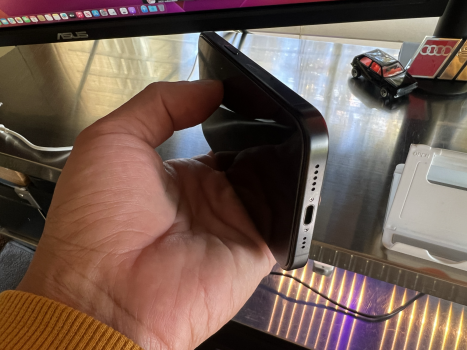
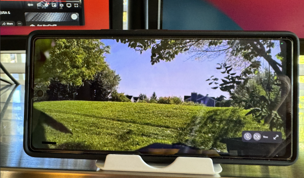
Compared to Apple, I think Google have smashed it out the park with colours this year, particularly with the 8 Pro where all 3 look great. Hazel on the 8 is really good, matte Hazel would have been awesome on the 8 Pro and Coral too. Apple colours are decent but a bit too muted, nothing to stand out. Wet cement is similar to London grey! I do love the Natural case though with it, that combo is killer.
Everyone does like to make a real fuss over colours each year, especially me lol but then we all usually end up putting them in a case and forgetting about them! Which is why I've ordered lots or cases this year to mix it up.
Haha I was so excited when I ordered that Note 10+ in blue and rocked with it a clear case for a little but then slapped cases on it lol
 a hid the colors

Last edited:


 ..excuse me where’s the Pixel 8 …oh sorry we don’t have it …goodbye