right. I went back and read the thread and saw that people have already explained the behavior.. and it appears to be of no use to do soI didn't want to blame you for anything, I just wanted to demonstrate that this topic has been debated to exhaustion and you will probably have seen that I made the same points as you throughout this thread, just like others have done before.
Got a tip for us?
Let us know
Become a MacRumors Supporter for $50/year with no ads, ability to filter front page stories, and private forums.
Green Button - Maximize, Not Full Screen
- Thread starter bladerunner2000
- Start date
- Sort by reaction score
You are using an out of date browser. It may not display this or other websites correctly.
You should upgrade or use an alternative browser.
You should upgrade or use an alternative browser.
- Status
- Not open for further replies.
I see, but based on the recent experience with BTT I'm quite hesitant to try out more such apps - most of them are quite invasive (and in result harder to cleanly uninstall) and it's possible that I'd have to try out several such apps in order to find a decent one.
If you install them from the App Store, they won't be difficult to remove at all and they are not invasive. BTT is indeed a very bad-looking and invasive app (and probably not eligible for the App Store) and does perhaps too much when you want it for just that one function. Most of these tools are simply small programs that run in the background and respond to specific user actions. If they only provide that simple feature set and nothing else, they are pretty lightweight. I've had very good experiences with Window Magnet and the reviews for Cinch and Moom are very positive too.
Some developers provide trial versions outside of the App Store. You might have some luck there.
Edit: trial versions:
http://www.irradiatedsoftware.com/cinch/
http://manytricks.com/moom/
http://blog.boastr.net/downloads-secondbar-bettertouchtool-2/
http://lightpillar.com/window-tidy.html
https://bahoom.com/hyperdock/
Last edited:
Apple NEEDS to figure out what the green button is going to do.
they have.. it's the fullscreen button now.
https://developer.apple.com/library/mac/documentation/UserExperience/Conceptual/OSXHIGuidelines/
they have.. it's the fullscreen button now.
https://developer.apple.com/library/mac/documentation/UserExperience/Conceptual/OSXHIGuidelines/
View attachment 569741
Agreed! It should remain as the default.
What we are asking for is a new feature, the option to set the default behavior of the Green Full Screen button.
Last edited:
Another complaint about the green button:
Apple needs to fix this.
Long time Windows user here. I converted to Mac back in the Jaguar days. Then used Panther and Tiger then went back to Windows XP.
Things I hated about the Mac--like the OP said the inconsistent behavior of the Green Button. Couldn't resize windows from any corner. The Finder was horrible. Some programs like MS Office had uninstallers while some you just dragged to the trash icon.
Apple needs to fix this.
If I were you, I would not use this comment as the support for adding green button option. He does mention green button unpleasant experience, though.Another complaint about the green button:
Apple needs to fix this.
Have you seen my test yesterday? Maybe, it could help you understand more about the original design of this green button.
Another complaint about the green button:
Apple needs to fix this.
I'm sorry, where's the complaint about the green button? The inconsistent behaviour? Fullscreen is not consistent?
I'm sorry, where's the complaint about the green button? The inconsistent behaviour? Fullscreen is not consistent?
No, it's not consistent, as has been proven here:
https://forums.macrumors.com/thread...not-full-screen.1891942/page-10#post-21608774
what about it? he (she?) outlines zooming.. option-clicking the green buttonYou might want to read post 242 by Shirasaki
maps..
the whole canvas is scrollable.. i can go up/down/diagonal etc..
starting in manhattan:
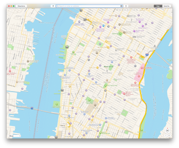
i can scroll to brooklyn:
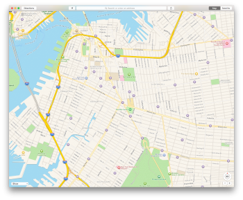
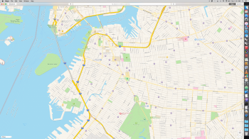
or i can zoom the window which goes to the full available screen size because my screen isn't big enough to capture all available scrollable content:
PREVIEW:
if my window is set like this:

..and i zoom it:
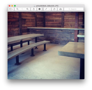
..it goes to that as it's showing all relevant content.. it shrinks in this case as it's eliminating unnecessary (empty) content.. it either expands to show hidden content or shrinks to eliminate empty content..
SAFARI:
if my window is like this: (notice scroll bars on right side and bottom)

..and zoom it:

..it's expanded far enough on the left/right axis to eliminate the scroll bar on the bottom.. if i drag the window further to the right, no new content will be shown.. i've zoomed to the maximize size required to show all relevant content.. there is still a bit of a scroll bar shown on the right because the web page has expanded to the full height of my display but my display isn't large enough to capture the entire page..
FINDER:
window has scroll bars present:
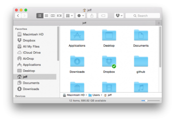
if i zoom it, i can now see everything without needing to scroll..
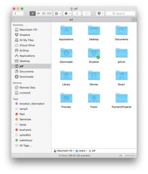
what you all so badly need (?)
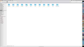
why is that ^ beneficial (maximizing)? it's offering no new info than zooming has given me.. it's also covering up the rest of the stuff on my screen which i need access to.. for instance, i'm probably wanting to move stuff from my desktop into the finder window.. i want to see the entirety on my folder but i still want the desktop visible.. zooming gives me that.
-------
etcetcetc..
do you understand the behavior now? can you predict what will happen when zooming in various scenarios?
Last edited:
If I were you, I would not use this comment as the support for adding green button option. He does mention green button unpleasant experience, though.
Have you seen my test yesterday? Maybe, it could help you understand more about the original design of this green button.
Hating the inconsistencies of the green button is much different than unpleasant.
Agreed! It should remain as the default.
What we are asking for is a new feature, the option to set the default behavior of the Green Full Screen button.
no, that's not what 'we' are asking for..
the thread has a whole bunch of people saying a whole bunch of different things.. some are talking about zooming.. some are talking about maximizing.. some are talking about what the past green button did.. some are talking about what it does now (fullscreen)..
you all aren't a singular voice.. YOU'RE asking for that.. i don't see any WE happening here. sorry.
False.
We're definitely asking for the option to fix the green button behaviour. It's mentioned in the FIRST post of this thread.
it's not broken. it would be incredibly helpful for you to take the 30 seconds required to learn the difference between OS X zooming and windows maximizing.False.
We're definitely asking for the option to fix the green button behaviour. It's mentioned in the FIRST post of this thread.
you're still hung up on that part.
some others in your 'we' are saying. I understand zooming and am making a non-existent to OS X feature request..
ie- you all are not saying the same thing / not a singular voice or request.
it's not broken. it would be incredibly helpful for you to take the 30 seconds required to learn the difference between OS X zooming and windows maximizing.
you're still hung up on that part.
some others in your 'we' are saying. I understand zooming and am making a non-existent to OS X feature request..
ie- you all are not saying the same thing / not a singular voice or request.
Read the thread, particularly this post:
https://forums.macrumors.com/threads...not-full-screen.1891942/page-10#post-21608774
The opening thread by bladerunner2000 is about the Maximize Option.
Some users don't see the need for a Maximize Option. You apparently fit into that category. I have no problem with that. Some users see the need for a Maximize Option. I fit into that category along with several others who have posted in this forum.
If you don't like the idea of an option fine. However, as a teacher I can tell you that this is a Huge issue with many users.
Claiming otherwise is not true.
At any rate, two Excellent options have been presented in this forum. The first by DustyKiddo and the second by HOJX. Neither of these options will affect you or anyone else who desires the status quo.
This proposed option will benefit Apple and its fans. Research studies have proven repeatedly that happy users spend more money.
Take Care and Enjoy your Mac!
how about you read the thread..Read the thread, particularly this post:
https://forums.macrumors.com/threads...not-full-screen.1891942/page-10#post-21608774
I responded to that post (the post of mine right up there with all the screenshots)
you keep saying 'read the thread' but I already read the thread.
why can't you use your own words to answer questions that are asked directly to you? it's a way better form of communication
if you're a teacher then why not teach the students what zooming is?.
If you don't like the idea of an option fine. However, as a teacher I can tell you that this is a Huge issue with many users.
Claiming otherwise is not true.
it's a very simple concept.. more simple than learning some other mundane task such a finding your user library on OS X.
further, you've yet to make a case for 'maximizing'. how is it helpful ? and why is it so bad to drag a window to desired size?
why is it so bad to drag a window to desired size?
Because its tedious, time consuming and extremely annoying for anyone doing actual real work on a computer (not you) while multitasking through many projects and documents, ie; the entire Adobe Creative Suite.
I now have something new, although this would might not support any side in this thread.
Apple uses this "intelligent" way to maximise Windows. I could think it trusts developers too much. Why I say this? Because Apple gives developers full design control of how application window displays contents on screen. This could cause potential inconsistency. Maybe thread viewer has discovered that almost all apps I tested is developed by Apple. But this would be different if applications are developed by other developers.
Thus, asking for a system wide override of green button behaviour is reasonable. We can either let green button behave similar in Windows, or similar to what it was in OS X.
Then, here is another question. Do we Really need such a system wide override? The answer could be somewhat obvious: some needs it seriously while others don't care.
Unlike iOS, OS X is not so close, yet, meaning developers could still use some methods to achieve certain goals, such as this green button issue.
Because its tedious, time consuming and extremely annoying for anyone doing actual real work on a computer (not you) while multitasking through many projects and documents, ie; the entire Adobe Creative Suite.
there are plenty of features/options available for dealing with multiple document windows and/or multiple applications.. hot corners being my choice for expose/mission control, application windows, dashboard, and desktop.. so with only hot corners, i can easily and very quickly move between all open documents and/or applications.. (more easy/fast than clicking buttons or even using keystrokes)
there are other methods available with gestures and keyboard shortcuts which are also customizable..
these are, to me, way more beneficial means to deal with multitasking than the ability to maximize a window (as in, i don't even see how maximizing a window is beneficial for multi-tasking.. a maximized window to me means i want to only concentrate on that particular window with all other distractions being eliminated.. pretty much the opposite of multitasking needs.. in a multitasking environment, zooming makes more sense because it shows maximized window per content instead of a dumb zoom-to-display-size which simply covers any other documents which may be open.. and zooming is a toggle as well.. zoom the window, see the hidden content, copy it or drag it etc.. zoom back to original size)
because what do i do on a computer? how are you coming to the conclusion that i don't do actual real work on a computer? your argument(s) is incredibly weak and further.. complete b.s.for anyone doing actual real work on a computer (not you)
not to mention the fact that you brag all over this site about your hackintosh.. really man, good luck convincing apple they need to tailor osx to your liking while you're using their software illegally.. i'm sure they're going to be very receptive to your complaints
Last edited:
As a former student I can tell you that the average teacher has no idea how things work in real life. The average teacher only knows what's in their textbook (which is fine, you're meant to explain the basics, the theory; understanding and knowing is what you get with experience in real life and actual research). Luckily we have lots of research when it comes to how users use software and they are generally the exact opposite of what's in your textbook. I'd rather listen to those guys then some teacher needing bold text on a forum to get his point across.However, as a teacher I can tell you that this is a Huge issue with many users.
Also, sysadmins and application managers know their users. From what I've seen in my career as both a sysadmin and an application manager at several companies I can tell you that this isn't an issue with many users. Most users don't even know its there and thus don't use it. The behaviour of the green button is only a problem to people coming from Windows and Linux and maybe a few Mac users. Most people don't even know it or care. It's the same thing for the yellow button. The only button raising questions is the red one: it closes the window instead of the app. Most people coming from Windows/Linux expect it to close the app and not the window only.
The maximise functionality as explained by many here doesn't do what they want it to do. Maximising a window to cover up the entire screen estate is exactly the same thing fullscreen mode does with only 1 exception: it still shows the dock and menubar. Everything else like the desktop and other applications are covered up and thus multitasking is rendered impossible. If you really want to use it for multitasking you need things like window snapping a la Windows 7/8/8.1/10, zooming (option-click the green button) or manually resizing the window. The window snapping in El Capitan is not what is meant by that although it is a little step in the right direction. Instead, use tools like better snap tool, better touch tool, moom and so on.
Who cares about the defaults if you can change it via 3rd party software with ease?
I have held down the wrong key and accidentally triggered full screen mode many times. Very annoying. Option-click is simply an incomplete solution.I can't believe there's 11 pages for this. option-clik the green button or double-click the title bar. ooooooooh big deal.
And Apple will lose another user. That simple.
That's something you chalk up to a user being too lazy to do one minor extra step.
If people are leaving an entire system because of *1* single interface issue (one that has a solution) then chances are they wouldn't have enjoyed the system in the first place.
It's like switching from Windows because you don't like how the ribbon options are organized. It's a ridiculous minute point, and chances are you didn't like the system in the first place.
I hate to do so but I am Not that types of user leaving Mac OS X due to green button issue.That's something you chalk up to a user being too lazy to do one minor extra step.
If people are leaving an entire system because of *1* single interface issue (one that has a solution) then chances are they wouldn't have enjoyed the system in the first place.
It's like switching from Windows because you don't like how the ribbon options are organized. It's a ridiculous minute point, and chances are you didn't like the system in the first place.
I simply point out the fact. This user hates green button behaviour, and he/she leaves. Then Apple has one less user using Mac OS X. Oh, maybe, to some extent, this is not suitable to be considered as a fact.
- Status
- Not open for further replies.
Register on MacRumors! This sidebar will go away, and you'll see fewer ads.

