Become a MacRumors Supporter for $50/year with no ads, ability to filter front page stories, and private forums.
Now you're just making things up. Or trying to troll me. :) First of all, I've *never* heard or read anyone complain about iOS7+ being too colorful. I only heard (and felt) hate toward the awful pastel hue/palette (compounded by the equally poor choice of prioritizing white font over those bright pastel colors over black). Secondly, the majority of complaints I've heard (and whined about myself) is that ios7-ios11 is too homogenous and grey/white/light blue, and doesn't use color where it counts.


iOS 6 is pale when you look at it. It used pale version of colors for the UI. Why would I try to troll on something so stupid? Come on man. I am not trying to make things up, a simple Google Search can bring up many results that people hated iOS 7.

1. https://goo.gl/WrZm3d
2. https://goo.gl/bjKpLF
3. https://goo.gl/vtkUoR
4. https://goo.gl/VtA1gm
5. https://goo.gl/BJQ1vV
6. https://goo.gl/lGHai2
7. https://goo.gl/tMkZ3T
8. https://goo.gl/KGqhn
9. https://goo.gl/whL09
10. https://goo.gl/5oyXk6


And, how does that logic make sense in terms of the examples I posted above for: clock app, iMessages app, Settings app, weather, etc. that aren't really skeumorphic (even if much more interesting to look at) but are much more colorful, using color to smartly help define functional areas at times.

I never not even once said all of iOS 6 was skeuomorphic, I said the basic design was. iOS 7 is just as colorful when it comes to these apps. The only difference is that post iOS 6 uses lines and flat colors because 3D design was something that Apple used from 2004-2013. Microsoft also got rid of 3D design with Windows 8 (2012) because 3D was getting old. Most people now will say the newer design is better. Which means your in a minority, arguing with people who disagree with you that your opinion is better, when the vast majority disagree now.

The complaints are so much more skin deep than theme/appearance. The basic UIX architectural changes (i.e., all the changes for the sake of change and not real improvement) are significantly worse now, even with upcoming iOS11, than before 2013, such as the scroll/info wheels, the phone voicemail messages interface, the notes app w/o lines, the photos app that uses white as a background instead of black as it should be, and on and on and on.

This is all a matter of opinion and not absolute fact.
I think it's a fact that iOS now fails in many areas. The new notification center in iOS 11 is a perfect example of bad design. They have to tell you with an arrow and text what to do if you want to see your notifications. The new control center is a mess visually and lacks any hierarchy and it basically forces you to discover hidden menus and functions. Also the widget implementation is stupid as hell. What is the point of having widgets on it's dedicated page? I always thought that widgets are supposed to show information at a glance without me having to open an app. It would be much better to have at least some widgets on home screen for something like a calendar app. I would like to have my Widget Calendar.app on home screen right after I unlock my iPhone and see my events without constantly remember about my events in the upcoming weeks and swipe to the widget page and back. If they really wanted to have widgets in iOS they should've done it like Android.

I don't agree that iOS 6 looked pale. Since iOS 7 it's way over-saturated and cartoonish. Remember when they toned down the messages and phone app icons in iOS 7.1? Steve Jobs said, "design is not just what it looks like and feels like. Design is how it works." I think that now it's more like how it looks than how it works. And it doesn't look great either I think. There are many objective things that are wrong in current Apple designs, you just shouldn't be apologist.

Also, have you seen the Windows Fluent System? They are basically going back to their old Aero design but in a Mac kinda way.
 
Interesting, I actually prefer iOS7 way more than iOS6, when it is shown like that. Very few things I like more in iOS6.
How about this?
iOS 6 vs. 10_1.jpg
iOS 6 vs. 10_2.jpg
iOS 6 vs. 10_3.jpg
 
It’s amazing how many people are such whiners and always find something wrong.

The whiners and snivelers are not worthy of apple. Go get an android and conquer the world!
 
Last edited:
  • Like
Reactions: Jayderek
It’s simpler, easier on the eyes, looks more professional and focuses on what matters. The content.

This sentiment continues to be a mystery to me. :) Now, if someone was as bothered by seeing a realistic-looking compass from 1750 as I am bothered by seeing a completely flat & disinteresting-looking (to me) compass that I think a talented 8th grader could have created, I'm OK with that, as preferences are preferences. But putting skeumorphism/flat appearance preferences aside, I still long to read one convincing argument for why the new button-less, borderlines, context-free, and grey/silver/white-overload UI helps to "get out of the way" of the content. I contend that the ios7-ios11 UI actually gets in the way of efficient & intuitive understanding of the content by virtually completely removing cues that were expertly developed over the years -- i.e., the cues that allowed users to previously say "it just works." And, therefore, the new ios7-ios11 "way" actually gets in the way of the content.

I'm sincerely asking @Hook85: what was getting in the way with the old way for the stopwatch app, where it was readily apparent where the buttons for start, reset, and stop were located, and where the contrasty black top area helped differentiate the bordered & different-colored grey area below, indicating that the bottom area probably served a different function...vs. the ios7-ios11 white puffy cloud-like appearance where everything kinda blends together at first glance until you stopped and thought about things...further compounded by the poor choice of text/contrast at the "buttons," and where the entire ios7-ios11 screen is near impossible to read in the sun vs. the prior UI?
2-3.png


I really could go on forever, but here's another example, using the mail app.

Before:
1) Darker border on top vs. the "email" area: quick mental differentiation of the different "working" zones.
2) Proper use of buttons: easy identification of actions (All Inboxes & arrow buttons) vs. info only (1 of 385).
3) Correct usage of grey/light text: the up arrow button is greyed out/lighter, signifying you can't use it (can't scroll further up).
4) Intuitive prompting of buttons on the left for Reply/Forward/Print, which are clearly different from each other, and where the Cancel button is clearly shaded differently for a quickly subconsciously cueing the user that it serves a much different function than the upper buttons.
5) Good use of high-contrast, defined borders/regions, and bolder fonts, for easier comprehension especially in the sun since the iPhone has historically had very poor readability outdoors (10 years in and still no improvement).
6) Still often hear "it just works" when people talk about Apple.

After:
1) Harder-to-discern bordering/shading all over, allowing all working zones to appear merged; takes additional time to process. No differentiation between the very top status area (all info-only & no actions) vs. the email app header/tools area immediately below (are some of those actionable?).
2) No more buttons: How many options to do actions exist in the top header? is "1 of 2" an action, since it's bolder than the others? Stop & think & experiment.
3) Confusing usage of grey/light text: After decades of intuitively knowing that something greyed-out is not an available option at the moment: Are the "Photo" & "up/down arrows" not permitted to be used at all in this app? Or, since faint light blue is used now to indicate a "button," why aren't "Photo" and the arrows a light blue font? And if Photos & the arrows are actually available options, why isn't the left arrow gray-er to signify it truly isn't available since we're at the top of the message, and prevent me from using it? Stop & think & experiment. Try to not throw your phone down in disgust :(
4) No intuitively discernible buttons for the reply/forward/save image/print areas, where it looks like one big white square with faint lines between the words. Buttons? Info only? Experiment & investigate. Bolded but still thin Cancel button not easily/quickly differentiated from the above items.
5) Poor use of contrast, no discernible borders/regions, thin fonts on a very white workspace. Makes reading an iPhone in the sun even worse than before, as if it could get any worse (but it did).
6) I've honestly not heard "it just works" about Apple items in a loooooooong time. That is pretty sad, folks. Very amateurish presentation/UI now, where the UI seems to get in way of quick understanding/use of the content with almost every reinvented ios7/ios11 interface.

Very respectfully, I ask @Hook85 and anyone else: Please show me how the old way "got in the way" and how the new way doesn't. This is an honest question. I firmly believe it can't be done, but would respect being proven wrong. No pointing to new tools like improved Control Centers that were introduced after ios6, as that could have been done with the (more intuitive) pre-ios7 UI.
Mail.png
 
Last edited:
Speaking of UI, how does one turn off the “[App] is actively using your location” notice?

I get it constantly and never did in iOS 10. I’ve dove through the settings 3+ times and haven’t been able to turn it off.
 
Now you're just making things up. Or trying to troll me. :) First of all, I've *never* heard or read anyone complain about iOS7+ being too colorful. I only heard (and felt) hate toward the awful pastel hue/palette (compounded by the equally poor choice of prioritizing white font over those bright pastel colors over black). Secondly, the majority of complaints I've heard (and whined about myself) is that ios7-ios11 is too homogenous and grey/white/light blue, and doesn't use color where it counts.


iOS 6 is pale when you look at it. It used pale version of colors for the UI. Why would I try to troll on something so stupid? Come on man. I am not trying to make things up, a simple Google Search can bring up many results that people hated iOS 7.

1. https://goo.gl/WrZm3d
2. https://goo.gl/bjKpLF
3. https://goo.gl/vtkUoR
4. https://goo.gl/VtA1gm
5. https://goo.gl/BJQ1vV
6. https://goo.gl/lGHai2
7. https://goo.gl/tMkZ3T
8. https://goo.gl/KGqhn
9. https://goo.gl/whL09
10. https://goo.gl/5oyXk6


And, how does that logic make sense in terms of the examples I posted above for: clock app, iMessages app, Settings app, weather, etc. that aren't really skeumorphic (even if much more interesting to look at) but are much more colorful, using color to smartly help define functional areas at times.

I never not even once said all of iOS 6 was skeuomorphic, I said the basic design was. iOS 7 is just as colorful when it comes to these apps. The only difference is that post iOS 6 uses lines and flat colors because 3D design was something that Apple used from 2004-2013. Microsoft also got rid of 3D design with Windows 8 (2012) because 3D was getting old. Most people now will say the newer design is better. Which means your in a minority, arguing with people who disagree with you that your opinion is better, when the vast majority disagree now.

The complaints are so much more skin deep than theme/appearance. The basic UIX architectural changes (i.e., all the changes for the sake of change and not real improvement) are significantly worse now, even with upcoming iOS11, than before 2013, such as the scroll/info wheels, the phone voicemail messages interface, the notes app w/o lines, the photos app that uses white as a background instead of black as it should be, and on and on and on.

This is all a matter of opinion and not absolute fact.

http://tristanedwards.me/u/what-ios7-should-look-like/

^ Woahhh this design looks amazing compared to Apple's flat design. Holy ****
[doublepost=1498682028][/doublepost]Also, I remember when iOS 7 dropped, and within 3 weeks we had all these jailbreak themes that made the design a lot better overall, through many refinements (some are objective inprovements, like camera app):

Stock-Icons-Ayeris.jpg

[doublepost=1498682843][/doublepost]
Speaking of UI, how does one turn off the “[App] is actively using your location” notice?

I get it constantly and never did in iOS 10. I’ve dove through the settings 3+ times and haven’t been able to turn it off.

The only way to change activity relating to that without jailbreaking is:

Settings-->Privacy-->Location Services-->Change from "Always" to "While Using" or "Never" (if preferred)
 
Last edited:
It’s amazing how many people are such whiners and always find something wrong.

The whiners and snivelers are not worthy of apple. Go get an android and conquer the world!

Why leave an android-like interface for an android interface which was, from the start, a bad imitation of the optimized Apple UI interface. It had to be at least a little differentiated, or else risk copyright infringement. I've looked at android then and over the years, and it always was a second rate way of doing things while Apple had it right from the get-go. Then something bad happened in 2013 and Apple started making theirs look like android and Windows. So here we are today, with Apple barely better, but still better. Very different than several years ago and they were undisputably the best and not just a little better than the competition. So, you are stuck with me for a while here until somebody kicks Jony down to the janitor closet, or Charmin or Kleenex hire him away and let him design all the minimized surfaceless white things he wants.
 
Last edited:
Speaking of UI, how does one turn off the “[App] is actively using your location” notice?

I get it constantly and never did in iOS 10. I’ve dove through the settings 3+ times and haven’t been able to turn it off.

The only way to change activity relating to that without jailbreaking is:

Settings-->Privacy-->Location Services-->Change from "Always" to "While Using" or "Never" (if preferred)

Wait, so they added this constant flashing blue banner as an iOS 11 feature? This wasn't a thing in any previous version.

Thanks.
 
Wait, so they added this constant flashing blue banner as an iOS 11 feature? This wasn't a thing in any previous version.

Thanks.

The blue banner is when GPS is being used constantly (I think that signifies GPS specifically and not simply location) and it has been in place since iOS 7 if I'm not mistaken. Only comes on for me when I use Google Maps.

Idk if the banner looks any different in iOS 11, I'm still on iOS 10.

~Off topic discussion~

See attached screenshot. The only time I got a banner like this in iOS 10 was during an active call (green banner) or active maps navigation.

Now I get it all the time.
 

Attachments

  • IMG_2385.PNG
    IMG_2385.PNG
    348.6 KB · Views: 147
This sentiment continues to be a mystery to me. :) Now, if someone was as bothered by seeing a realistic-looking compass from 1750 as I am bothered by seeing a completely flat & disinteresting-looking (to me) compass that I think a talented 8th grader could have created, I'm OK with that, as preferences are preferences. But putting skeumorphism/flat appearance preferences aside, I still long to read one convincing argument for why the new button-less, borderlines, context-free, and grey/silver/white-overload UI helps to "get out of the way" of the content. I contend that the ios7-ios11 UI actually gets in the way of efficient & intuitive understanding of the content by virtually completely removing cues that were expertly developed over the years -- i.e., the cues that allowed users to previously say "it just works." And, therefore, the new ios7-ios11 "way" actually gets in the way of the content.

I'm sincerely asking @Hook85: what was getting in the way with the old way for the stopwatch app, where it was readily apparent where the buttons for start, reset, and stop were located, and where the contrasty black top area helped differentiate the bordered & different-colored grey area below, indicating that the bottom area probably served a different function...vs. the ios7-ios11 white puffy cloud-like appearance where everything kinda blends together at first glance until you stopped and thought about things...further compounded by the poor choice of text/contrast at the "buttons," and where the entire ios7-ios11 screen is near impossible to read in the sun vs. the prior UI?
View attachment 706243

I really could go on forever, but here's another example, using the mail app.

Before:
1) Darker border on top vs. the "email" area: quick mental differentiation of the different "working" zones.
2) Proper use of buttons: easy identification of actions (All Inboxes & arrow buttons) vs. info only (1 of 385).
3) Correct usage of grey/light text: the up arrow button is greyed out/lighter, signifying you can't use it (can't scroll further up).
4) Intuitive prompting of buttons on the left for Reply/Forward/Print, which are clearly different from each other, and where the Cancel button is clearly shaded differently for a quickly subconsciously cueing the user that it serves a much different function than the upper buttons.
5) Good use of high-contrast, defined borders/regions, and bolder fonts, for easier comprehension especially in the sun since the iPhone has historically had very poor readability outdoors (10 years in and still no improvement).
6) Still often hear "it just works" when people talk about Apple.

After:
1) Harder-to-discern bordering/shading all over, allowing all working zones to appear merged; takes additional time to process. No differentiation between the very top status area (all info-only & no actions) vs. the email app header/tools area immediately below (are some of those actionable?).
2) No more buttons: How many options to do actions exist in the top header? is "1 of 2" an action, since it's bolder than the others? Stop & think & experiment.
3) Confusing usage of grey/light text: After decades of intuitively knowing that something greyed-out is not an available option at the moment: Are the "Photo" & "up/down arrows" not permitted to be used at all in this app? Or, since faint light blue is used now to indicate a "button," why aren't "Photo" and the arrows a light blue font? And if Photos & the arrows are actually available options, why isn't the left arrow gray-er to signify it truly isn't available since we're at the top of the message, and prevent me from using it? Stop & think & experiment. Try to not throw your phone down in disgust :(
4) No intuitively discernible buttons for the reply/forward/save image/print areas, where it looks like one big white square with faint lines between the words. Buttons? Info only? Experiment & investigate. Bolded but still thin Cancel button not easily/quickly differentiated from the above items.
5) Poor use of contrast, no discernible borders/regions, thin fonts on a very white workspace. Makes reading an iPhone in the sun even worse than before, as if it could get any worse (but it did).
6) I've honestly not heard "it just works" about Apple items in a loooooooong time. That is pretty sad, folks. Very amateurish presentation/UI now, where the UI seems to get in way of quick understanding/use of the content with almost every reinvented ios7/ios11 interface.

Very respectfully, I ask @Hook85 and anyone else: Please show me how the old way "got in the way" and how the new way doesn't. This is an honest question. I firmly believe it can't be done, but would respect being proven wrong. No pointing to new tools like improved Control Centers that were introduced after ios6, as that could have been done with the (more intuitive) pre-ios7 UI.
View attachment 706245

I think you just need to accept that people have differing opinions to you even if you don’t understand the reasons.

I don’t find either versions differ in terms of usability, but I much prefer to use the more modern Jony Ive designs. I prefer the way it looks and for that reason I find it easier to use.
 
  • Like
Reactions: Jayderek
I suggest you, people, stop getting high and start using your devices. Leave your philosophical nonsense out of it.

Suggestion not taken. :) Why have a discussion forum at all if discussing preferences is just "philosophical nonsense?" :)

I think you just need to accept that people have differing opinions to you even if you don’t understand the reasons.

I don’t find either versions differ in terms of usability, but I much prefer to use the more modern Jony Ive designs. I prefer the way it looks and for that reason I find it easier to use.

Ok! If you honestly see/feel no difference and it's just a subjective preference then that's good to hear. I see too many differences myself, obviously, and continue to be curious if I'll one day read someone's objective, bulleted list of a few specific pros of ios7-11 UI outweighing a few specific things of ios1-6. I'm not sure it can be done. :)
 
  • Like
Reactions: 040
Suggestion not taken. :) Why have a discussion forum at all if discussing preferences is just "philosophical nonsense?" :)


Ok! If you honestly see/feel no difference and it's just a subjective preference then that's good to hear. I see too many differences myself, obviously, and continue to be curious if I'll one day read someone's objective, bulleted list of a few specific pros of ios7-11 UI outweighing a few specific things of ios1-6. I'm not sure it can be done. :)

This is not a discussion, this a cry baby rant.
 
definitely a fan of the design starting with iOS7. Just gives it a feel of a modern operating system. While the previous designs worked at the time, glad to see they decided to freshen it up.
 
You think your evaluations and posts on this thread were objective?

Oh yes, definitely. But they were mixed in with my subjective critiques. Staying away from personal, subjective preferences of what "looks good" and is "enjoyable," I'd say that objectively, the right tests could be created to show that the "new" UI since iOS7 provides less of:

1) clear differentiation of "zones" or "areas" on a screen, requiring experimentation & trial/error to learn
2) clear differentiation of what's actionable vs. info-only, requiring experimentation & trial/error to learn, or worse - completely missing out on using certain functions since the way to enact it is so hidden
3) the ability to use colored text to decorate a screen and/or use colored text to provide different information, since colored text has often taken the place of a button

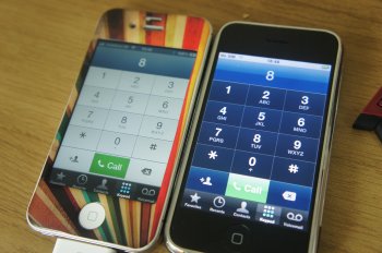
Objectively, there's now less Clarity of differentiation between "zones" or "regions" as indicators that those areas/zones perform different functions: For instance if you'd never worked with the ios7-11 dialer and hadn't yet pressed anything or worked with it, could anyone honestly say they'd know that the area above the round keys is a different "zone" that you could copy/paste a number to, compared to the prior method of having a different-appearing "zone," providing more obvious cues?

new-call-dialer.jpg DSC01858.jpg

Now, after having tripped thru using iOS7-11 for the past 4 years, we've learned to work within the new methods, and I'm using a familiar app here as an example.

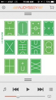
Or: Clarity of differentiation between what's an actionable item vs. what's text/info only. Take for instance the Audyssey music player app that I use for its better interface vs. the stock Music app, below. The medium-grey gear item is an actionable item, as are the medium-grey shopping cart & music treble clef. The darker-grey back/play/advance indicators are actionable, as is the light-grey Airplay/stream indicator (we'll ignore the questions that arise from seeing 3 different shades of grey icons buttons, all of which "work" as actionable items, even though light-grey could be mistaken as an unavailable option...). However the orange header -- is that for display? Is that an action? For the longest time, to me it just looked like a colored graphic to add some eye candy to the typically drab grey/white Jony Ive interface. Turns out that it's actually an actionable item for turning off/on a selected EQ setting for the particular headphones you're using. I had no freaking idea until I accidentally tapped that non-button button. Seriously, what's so wrong with making things like the gear, Audyssey, shopping cart, music clef, and other text/symbols look like pressable buttons?

image1.PNG

Well, if that's not enough of a response that, objectively yes the new iOS7-11 UI resulted in views/interfaces that are less detailed (and, as a result, less intuitive & obvious especially at first glance) since screen appearances/interfaces have been "cleaned" and "simplified" by way of reducing pixels for buttons and hiding some functions off-screen, then it's probably not possible to convince you. :) For some, using these reductions or details for the sake of both a new (at the time) and "cleaner" design are either invisible or acceptable (or both), including how these clean interfaces now often bury certain actions deep behind menus rather than have them out in the open, requiring many more presses & swipes to complete something that before used to be clear/easy/obvious and non-hidden. For me, the objective reduction in "obviousness" and the subjective change/simplification of appearance are pretty awful, unfortunately (for me).
 
Last edited:
  • Like
Reactions: 040
http://tristanedwards.me/u/what-ios7-should-look-like/

Woahhh this design looks amazing compared to Apple's flat design. Holy ****
[doublepost=1498682028][/doublepost]Also, I remember when iOS 7 dropped, and within 3 weeks we had all these jailbreak themes that made the design a lot better overall, through many refinements (some are objective inprovements, like camera app):

Stock-Icons-Ayeris.jpg

[doublepost=1498682843][/doublepost]

The only way to change activity relating to that without jailbreaking is:

Settings-->Privacy-->Location Services-->Change from "Always" to "While Using" or "Never" (if preferred)


I remember when everyone was "improving" iOS7 icons in there own way. But I don't ever remember seeing a single theme that I thought was better than the official icons.
 
Register on MacRumors! This sidebar will go away, and you'll see fewer ads.