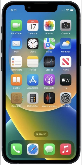
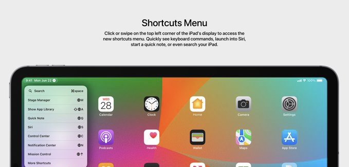
Whereas others can’t seem to pry their fixation from the rather benign home indicator at the bottom of their device(s), macOS-esque neuomorphic system icons is most all I’ve wanted for years now.I’ve noticed that Apple’s icons for new apps this year have had a bit more depth to them than most system app icons on iOS. For example: the icons for Apple Music Classical, Final Cut Pro, and Logic Pro all have a bit more shading, gradient and depth to them. Compare those against the icons for Mail, Messages, and other system apps, and there seems to be a bit of a difference in style. So I’m really hoping for some new app icons for iOS! They don’t have to be radically different, I’m hoping for something similar to macOS app icons. Like the Mail icon actually has an envelope, instead of the ugly flat design. Here’s for hoping! 👍🏻
Last edited:


