That option does not show for me, may be my region, I’m based in NZ.lol, had to use ChatGPT to find that setting in iOS 26:
📌 How to Enable Package Tracking in iOS 26 (Developer Beta)
- Open the Settings app
- Go to Wallet & Apple Pay → Apple Pay Defaults → Order Tracking
- Toggle “Orders Found in Mail” to ON
- (Optional) You can still toggle off “Apple Pay Purchases” if you only want email‑based tracking
Got a tip for us?
Let us know
Become a MacRumors Supporter for $50/year with no ads, ability to filter front page stories, and private forums.
iOS 26 Beta 1 ― Bug Fixes, Changes, and Improvements
- Thread starter Banglazed
- WikiPost WikiPost
- Start date
- Sort by reaction score
You are using an out of date browser. It may not display this or other websites correctly.
You should upgrade or use an alternative browser.
You should upgrade or use an alternative browser.
- Status
- The first post of this thread is a WikiPost and can be edited by anyone with the appropiate permissions. Your edits will be public.
That option does not show for me, may be my region, I’m based in NZ.
I don’t seem to have it in the UK either
The German translators and their love for quotationmarks…Regarding tap to call or see the details of a contact, there is an option now in the settings of the phone appView attachment 2518776
I think this is new, the airplay menu has volume control included now, so you tap a device to airplay and then you can slide to control de volume.
The screenshot is on iPad for surely is on iOS too.
BTW, automix doesn’t work if airplaying

The screenshot is on iPad for surely is on iOS too.
BTW, automix doesn’t work if airplaying
I am so… tempted… to yolo it on my one and only iPhone and download that beta….
*big sweat*
*big sweat*
lol, had to use ChatGPT to find that setting in iOS 26:
📌 How to Enable Package Tracking in iOS 26 (Developer Beta)
- Open the Settings app
- Go to Wallet & Apple Pay → Apple Pay Defaults → Order Tracking
- Toggle “Orders Found in Mail” to ON
- (Optional) You can still toggle off “Apple Pay Purchases” if you only want email‑based tracking
That option does not show for me, may be my region, I’m based in NZ.
Same here, in the EU.Also not showing for me in Australia.
I just have order tracking toggle, no mail toggle.
Oh…Same here, in the EU.
View attachment 2518800
Oops … EU, but with US AppleID for AppStore and US Region/Language (to get Call Recording and iPhone Mirroring here already)…
I did that too, but I lose my subscriptions, and I can only set them up on the US account using a gift card, which is a bit inconvenient. So I switched back to my EU Apple ID.Oh…
Oops … EU, but with US AppleID for AppStore and US Region/Language (to get Call Recording and iPhone Mirroring here already)…
Same. Tried turning backups off and on to see if that does the trick this evening.Has anyone noticed the automatic iCloud backups not working dispite being on WiFi and plugged in overnight. It’s not worked for me since the backup - feedback sent
What did this help with in particular? Stutters or battery life?Try turning Reduce Motion on and reduce transparency temporarily it worked for me
Hehe. Won’t judge it, it’s a first beta there are a lot of translations are still missing. Most of this will change until the final version.The German translators and their love for quotationmarks…
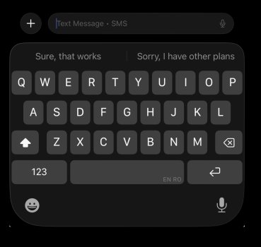
All these borders are intended to change their appearance when you slightly move your phone, like light that’s been interacting with the glass elements. It’s still not fluid and looks pretty harsh. Curious how this will change during the beta phase.Noticing some inconsistency with the outline of the new keyboard. I thought at first that my screen protector was cutting into the display but it looks like there’s just an uneven border around the keyboard. This screenshot is zoomed out. View attachment 2518806
I didn’t notice any change in the border appearance for the keyboard in any of the WWDC videos and there is not change when tilting the phone like there is on the Home Screen with the reflections around the app icons. I doubt this is the intended behavior for the app, especially since it’s unevenly applied around each side of the keyboard. I’ve submitted feedback.All these borders are intended to change their appearance when you slightly move your phone, like light that’s been interacting with the glass elements. It’s still not fluid and looks pretty harsh. Curious how this will change during the beta phase.
Submit submit and again submit feedback, otherwise it will be buggy as hell when it gets released in mid to late September this year!
Thanks in advance 🙏
Thanks in advance 🙏
Where in phone settings is this? I don’t see it.Regarding tap to call or see the details of a contact, there is an option now in the settings of the phone appView attachment 2518776
Figured it out, you need to be on the new phone interface.
Last edited:
Which phone?Well boys it is Joever. I am back on 18.5. The phone got way too hot, animations were super stuttery, and a bunch of my automations and Shortcuts weren't working. I'll see you guys for the RC!
Thx for the heads up. Which phone? I guess I’ll wait for beta 2 or 3 before installing this on my 12 Pro Max.Now having issues where maps crashes when trying to set to a new destination in CarPlay. Think my workaround will be start navigation before plugging into CarPlay. I did notice that I now have more report options on maps on CarPlay and it now shows railroad crossings too. Oddly when taking a screenshot while using CarPlay, it no longer screenshots the CarPlay too. Curious if that’s on purpose or not
Didn't install the beta but was playing with the simulator:
View attachment 2518823
Can anyone try what does "Scan Code" do?
How did you get the simulator? Thanks.
Register on MacRumors! This sidebar will go away, and you'll see fewer ads.


