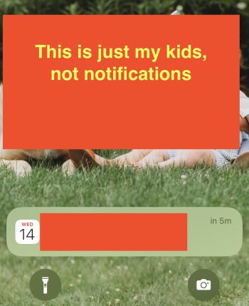
It is pretty bad to have no visual indication of active notifications... this is just basic UI stuff.
Got a tip for us?
Let us know
Become a MacRumors Supporter for $50/year with no ads, ability to filter front page stories, and private forums.
Lock screen Notification location issues [MERGED]
- Thread starter AMTYVLE
- Start date
- Sort by reaction score
You are using an out of date browser. It may not display this or other websites correctly.
You should upgrade or use an alternative browser.
You should upgrade or use an alternative browser.
Definitely not a bug. Apple has perfectly implemented their stupid and misguided vision. It's working as they intended.Maybe it was in another post you didn't quote, but this person didn't say it was a "bug", they said it was a problem. In my opinion, that problem is that the user experience is now hindered. It may not be a bug in that it was not unintentional, but it's still stupid. It may be smooth and functioning as intended, but that doesn't make it good.
I haven't "upgraded" yet but it sounds like once again we are all beta testers. Why don't they take longer and get it right? Every single release has big problems.
iPhones are made, boxed up and put into storage inventory weeks before launch day. This is how they can have 5 million of them (or whatever) in eager hands on launch day.
It's not unreasonable for software developers to discover software defects in the weeks between a "golden master" is imaged for the production line and launch day. So....they can either:
- fix those defects and make a patch available ON launch day
- fix the defects and just not release the patch for a month or two after launch day, so that people don't feel like they're somehow getting screwed by having a patch available ON launch day.
- just not bother looking for and fixing defects in the period of time between the "golden master" image and launch day.
I'm a beta tester and have been using it for weeks, and I still haven't got used to it and still.think it makes no sense at all other than to admire the wall paper. But to me, my reminders are mode important than the wallpaper.But this is what's wrong with people, within seconds after a new thing start complaining about it without giving it due time to assess weter it's actually worse or just new.
And I can tell you already that for 99% of you it's just new and you'll get used to it within weeks.
And you know how I know this because every new big IOS update you get these exact threads complaining about everything for the first few weeks and then it dies down because nobody cares. Prime example being the notch.
A little dot or a number representing a count of the "hidden" notifications would not interfere with the beauty of the wallpaper and if so, provide a way for those that don't want to see it to turn it off.
A little dot or a number representing a count of the "hidden" notifications would not interfere with the beauty of the wallpaper and if so, provide a way for those that don't want to see it to turn it off.
Widgets sacrifice wallpaper beauty for functionality, so you would think that wouldn't matter and could be an easy/helpful option to implement. 🤷♂️
I really think we all need to make sure we are submitting feedback to apple, the same way they changed Safari and gave the option to move the search bar back to the original spot because of the out poor of hate from people. They listen, we just need to speak up.
Essentially, you have notifications on the lock screen. You don't close or interact with them, and unlock your phone. Upon locking the phone again, on the lock screen, no notifications appear even though they have not been dismissed. If you swipe up from between the camera and flashlight widgets, they appear again. So unless you just check there often or knew you had notifications, there is nothing there to tell you there are pending notifications.Could one of you post screenshots of the new behavior? I am in iOS 15 and don't really understand the issues many of you are having.
He should probably just get used to that hole in his house...
Sorry, couldn't resist.
And sometimes, you have to pull up TWICE. I’ve had a few instances where I pulled up and saw notifications, but then pulled up a second time and there were actually MORE notifications! If I hadn’t pulled the second time, I would not have seen them.Essentially, you have notifications on the lock screen. You don't close or interact with them, and unlock your phone. Upon locking the phone again, on the lock screen, no notifications appear even though they have not been dismissed. If you swipe up from between the camera and flashlight widgets, they appear again. So unless you just check there often or knew you had notifications, there is nothing there to tell you there are pending notifications.
If there was an indicator, I'd have absolutely zero issues with the change. I like things decluttered in general.
Or MAYBE your opinion isn't the only one that matters? They have over a billion users to consider and you are just one, regardless of how important it is to you.I’ve reported issues through there for almost a decade. Apple don’t care.
Change for some genuine useful purpose is one thing. Change for the sake of change is something else.
It seems like most change "big tech" adopts is the later, rather than the former.
Could one of you post screenshots of the new behavior? I am in iOS 15 and don't really understand the issues many of you are having.

Above is step one. This is what I get when I swipe down on my unlocked phone from the Home Screen. This makes it look like I have one notification.

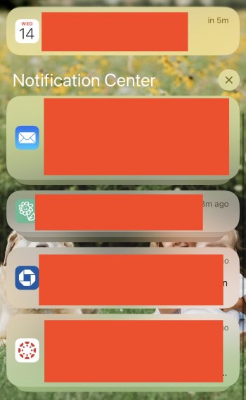
Step two. Swipe up again which reveals more notifications. Multiple mail items are stacked. The next app has multiple items stacked. But the third, which looks like multiple items stacked for the Chase banking app actually turned out to be another app's separate notifications which is shown in the picture below. For those keeping score, that was three swipes to get to all notifications.

Just by reading the explanation, I’m confused. I can’t believe how frustrating it must be in real life.
Just by reading the explanation, I’m confused. I can’t believe how frustrating it must be in real life.
Generally speaking, I don't care what the "new features" of an OS are, provided I can turn them off and pretend they don't even exist (since they are RARELY ever actually useful to me).
One REALLY USEFUL feature an OS could have is a setting called "turn off all the new crap", so you could get it with one click, rather than having to turn off a bunch of stuff individually.
It's pretty bad. I like the new Lock Screen in general, but what they have done to the notifications is terrible.Just by reading the explanation, I’m confused. I can’t believe how frustrating it must be in real life.
The problem is it's not better, it's worse. Instead of seeing all my notifications right away I have to do 3 other steps. I tend to get emails, text and app notifications at the same time. It's very easy to not see some of them, especially the ones that are time critical. Its not about not liking new things, this is not better. Like lock screen widgets, why do I need to change my Home Screen wallpaper every time I want to slightly edit a widget, its not better. Since IOS 1-15 you could do one or the other not be forced into doing both, some would call that a step backwards.But this is what's wrong with people, within seconds after a new thing start complaining about it without giving it due time to assess weter it's actually worse or just new.
And I can tell you already that for 99% of you it's just new and you'll get used to it within weeks.
And you know how I know this because every new big IOS update you get these exact threads complaining about everything for the first few weeks and then it dies down because nobody cares. Prime example being the notch.
So is that the Stack or List option in notifications? I'm thinking List?View attachment 2064347
Above is step one. This is what I get when I swipe down on my unlocked phone from the Home Screen. This makes it look like I have one notification.
View attachment 2064354
Step two. Swipe up again which reveals more notifications. Multiple mail items are stacked. The next app has multiple items stacked. But the third, which looks like multiple items stacked for the Chase banking app actually turned out to be another app's separate notifications which is shown in the picture below. For those keeping score, that was three swipes to get to all notifications.
View attachment 2064367
I’m not him/her, but for me, I switched to List because I was told it’s most like the old way. It is not. Plus, you can choose List, but if you have several notifications, the bottom will still look like Stack. It’s so lame.So is that the Stack or List option in notifications? I'm thinking List?
So is that the Stack or List option in notifications? I'm thinking List?
I’m not him/her, but for me, I switched to List because I was told it’s most like the old way. It is not. Plus, you can choose List, but if you have several notifications, the bottom will still look like Stack. It’s so lame.
Those three options (Count, Stack, List) only apply to new notifications as they come in...the ones that display on your Lock Screen without swiping up yet. (Step one or the first screenshot in that post.) They have no effect on how notifications display after they've moved into the Notification Center. This video shows the differences in those options.
The ones that have moved down to the Notification Center (and have to swipe up to see) are controlled by the 'Notification Group' setting for each individual app. So if you want them all separated individually, then you need to turn it off for each app. Here's another video that goes through everything.
Register on MacRumors! This sidebar will go away, and you'll see fewer ads.

