I'm really interested in this, i did notice from some screenshots that in Control Panel > Appearance there is no option for smooth font
Indeed its missing and it is still not perfect on 3440x1440 but now WAY more usable then before.
I'm really interested in this, i did notice from some screenshots that in Control Panel > Appearance there is no option for smooth font
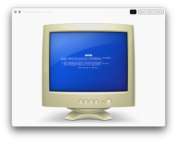
In macOS 10.15 PC are represented by this awful graphics, did Apple change that too in 11.0?
View attachment 927947


No.any new annotation tools in Preview?
Yes.It there still the djinn effect in Big Sur?
No.Can you "hide" third party menu icons in Control Center à la Bartender?
In macOS 10.15 PC are represented by this awful graphics, did Apple change that too in 11.0?
View attachment 927947
Thankfully not.In macOS 10.15 PC are represented by this awful graphics, did Apple change that too in 11.0?
View attachment 927947
I love it.
In macOS 10.15 PC are represented by this awful graphics, did Apple change that too in 11.0?
View attachment 927947
The "Classic" view aka "Use Column Layout" are still there in Mail.app?
Yes.
[Screenshot removed from quote]
I use 3840x1080 monitor. For me, Big Sur default to render desktop at 7680x2160, then downsample to 3840x1080. This will make the fonts looks so much better.Is it only me or does Big Sur improve the rendering of small fonts on sub 4k screens? I have a 34'' Dell 3440x1440 screen that I have to use with a windows desktop because on Catalina the fonts look like its 1982. This seems to have drastically improved on Big Sur for me. Not yet Windows levels of clarity, but way better.
Did anyone else notice this?
I'd wager that this is merely a question of shifting macOS to follow the same nomenclature as the remaining OS'. So next year we will get macOS 12, to go with iOS 15, tvOS 15, watchOS 8. It is easier to remember than 10.x, since you simply skip the first and irrelevant number. It may also be the first step in going away from the naming convention of big releases. 'macOS Big Sur' is an absolutely awful name IMHO.
I use 3840x1080 monitor. For me, Big Sur default to render desktop at 7680x2160, then downsample to 3840x1080. This will make the fonts looks so much better.
I always do this since I use this monitor, but in High Sierra and Mojave, it can only be done via 3rd party software. Now, it's default.
This screen capture comparison shows the difference with HiDPI rendering.
View attachment 928335
Of course, the change in the font itself also helps. But not as much as HiDPI. The font smoothing (anti aliasing) really make font hard to read in non HiDPI environment.

 9to5mac.com
Is it normal that in Safari the "new Tab" icon is now not on the right side of the tabs, but in the "menu" bar
Yes, that's still present, and the same as the one on Catalina:
View attachment 928149
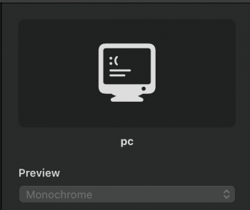
They have a new SF symbol for a "PC" though, which is more modern
View attachment 928150
How the heck do you have a 1080 Ti running? I assume the machine is still running High Sierra before Web Driver support was dropped?This screen capture comparison shows the difference with HiDPI rendering.
That capture is from High Sierra indeed. I am now running Radeon VII. And I am too lazy to make another screen capture / comparison to illustrate difference of fonts rendering between HiDPI and non HiDPI environment.How the heck do you have a 1080 Ti running? I assume the machine is still running High Sierra before Web Driver support was dropped?
There is no absolute relationship between rendering resolution, and the “UI looks like” resolution, and the actual monitor's resolution.Could you elaborate this more about using higher resolution than what monitor is specified?

