AAPLGeek
macrumors 6502a
This:

To this:

It's a major step back in usability but I'm not surprised.
To this:
It's a major step back in usability but I'm not surprised.
Oh yes; with those recent System Preferences versions, at times I've had to hover the cursor around a bit while looking for the settings I want. I hope this revised System Preferences will be easier for me to work with.Man, the amount of complaints here boggles my mind. Have any of you actually used System Preferences in recent macOS versions? Settings are all over the place.
If you're a new user or don't have System Preferences memorized like crazy, why don't you guess where the Dictation settings are? Or where you'd change the default web browser? Or where you'd find the setting for changing your Mac's display name?

It'll take some getting used to, but it's clear that the old design had to go at some point. The app didn't change design in more than 20 years essentially, and it was getting extremely cluttered. I'm here for the change.
I know right, I was crossing my fingers hoping this would be a bug fix and stability update like Snow Leopard/Mountain Lion/High Sierra for Monterey but nope, more half baked features 🙄. I'm starting to think those rumors of the software engineers never really using MacOS as their daily drivers consistently is true. If you used macOS every day you would know the basic features it still needs like "window snapping" for a start.Instead of making macOS look more like the mess in iOS and iPadOS, I wish they would make iOS and iPadOS function more like macOS. I don’t want my Mac to turn into an iPad with a built in keyboard.
TBH, none of the OS updates seem to be anything I can get excited about. If they want to impress me, leave the darn interfaces alone and fix the dang bugs!
Apple today previewed macOS Ventura, its latest operating system for the Mac, and one of the new features is a redesigned and renamed System Settings app that replaces System Preferences on macOS Monterey and previous versions.
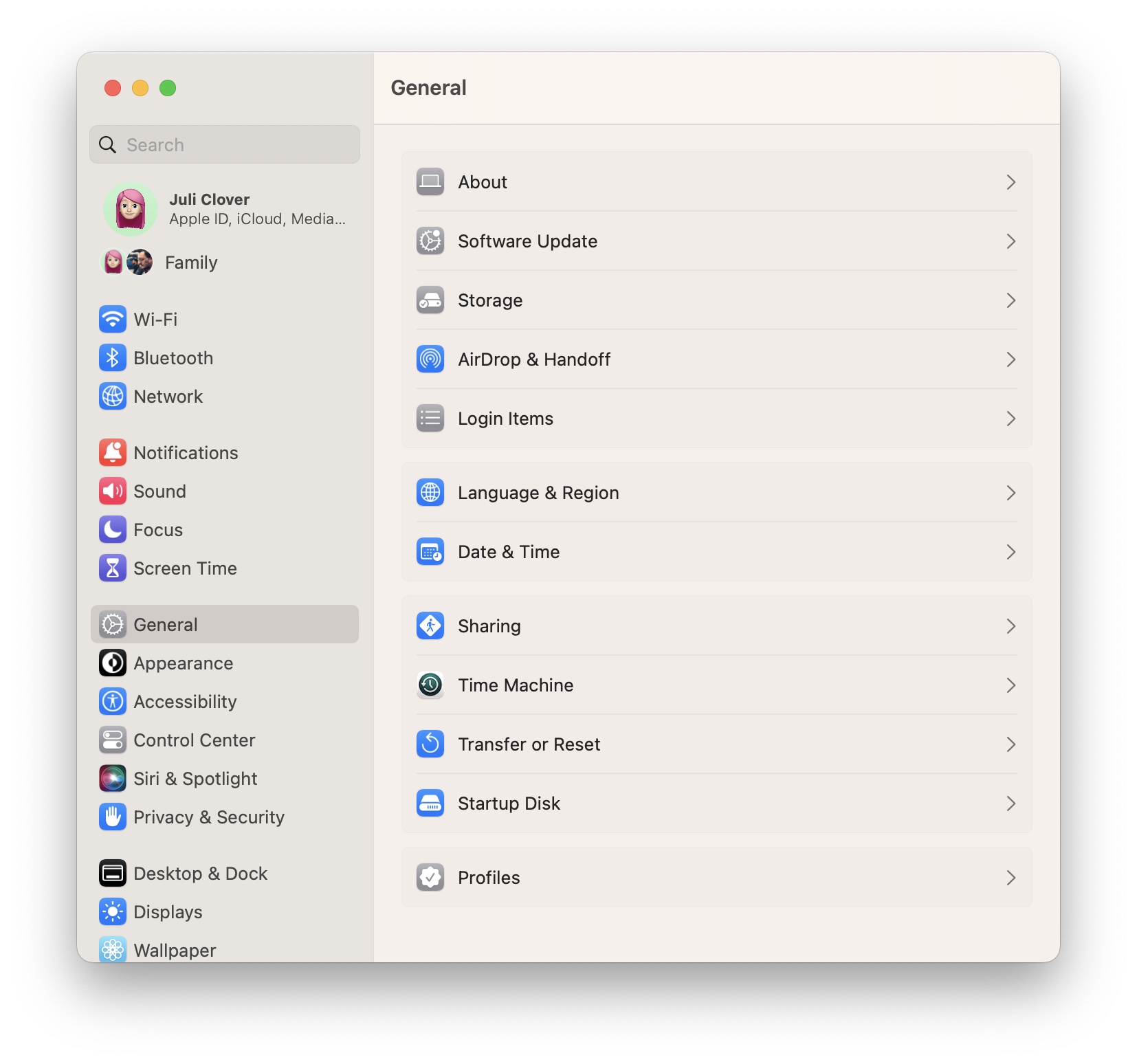
The new System Settings app looks more similar to the Settings app on the iPhone and iPad, with settings placed in a sidebar for easy access.
System Preferences had been the app's name for over 20 years, but System Settings is the new name going forward. The redesigned app is limited to macOS Ventura, which will be publicly released in the fall. The first beta of macOS Ventura was seeded to developers today for testing, and Apple said the first public beta will be released in July.
Article Link: macOS Ventura Features Redesigned 'System Settings' App
exactly. i hit my custom shortcut to bring up system prefs ( Cmd + ‘,’ ) and then Cmd + ‘F’ to focus on the search field. then type away and select the autosuggestion with cursor or arrows.If this allows navigation through the various choices via keyboard, it's a worthwhile update.
More than the redesign, this is the biggest offense. First OS X to just MacOs, then preferences to settings. What’s next? Renaming Safari to “Web Browser”?System Preferences had been the app's name for over 20 years, but System Settings is the new name going forward.
I had this exact same thought. At first I thought the redesign was great because at a glance it seemed to make things more easy to read and locate via a list on the left. Then I noticed it's not alphabetical. To me this is basically over-designing something. I can see what they're going for; related things grouped together, and putting what they think are the most-used features immediately visible. I just don't see how this method could possibly be faster and more efficient for finding things than listing them alphabetically, especially when the list is long enough that it requires scrolling to see everything.It still looks like a mess to me; the left panel is not in alphabetical order and you still need to "hunt and peck" for the item you want, just like you had to with the old version. Every time I go in there it takes me 10-15 seconds to find the right icon, and I don't think this new one is going to change that.
Having a randomly-sorted collection of icons divided into a couple categories that have some logic but also feel essentially arbitrary was, frankly, an awful design. Even after 22 years, half the time I just end up typing something in the search field and looking for the highlighted item (even if said highlight UI was, admittedly, really cool). You can sort alphabetically from the menus, but again, even after 22 years I keep forgetting that's even possible since it's not immediately visible.
View menu -- at least on Monterey, there's the default "by category" option, a sort alphabetically option, and you can have it show checkboxes to hide prefs you don't want visible by default.Wait - what?! What menus are you referring to here? If I've been mildly annoyed going through non-alphabetical system preferences icons all these years for nothing I won't know whether to be happy or sad haha.
I had no idea that that was there! It's there on my 10.14 machine too.View menu -- at least on Monterey, there's the default "by category" option, a sort alphabetically option, and you can have it show checkboxes to hide prefs you don't want visible by default.
Yep, one-by-one macOS is being eroded into a glorified iPad. From random name changes to horrendous UI changes to removing most of the user's control over the computer.Once again. MacOS looking more and more like IOS.
I bet any amount of money when they start using touch screen Macs that macOS and IOS will merge into one.
That's the problem with mature software - there's little of actual value that can be added; but the company feels it has to do something to get people excited and willing to upgrade. Unfortunately that "something" often ends up to be a sideways move at best, and an net negative change at worst.With every release more and more I just want them to leave the things that work alone and fix the things that don’t.
System preferences is a cluttered mess and hasn't changed aside from its frame. This is far more intuitive and easier to find things.
Your biggest problem is that you use Apple Mail. That needs a ground up redesign.
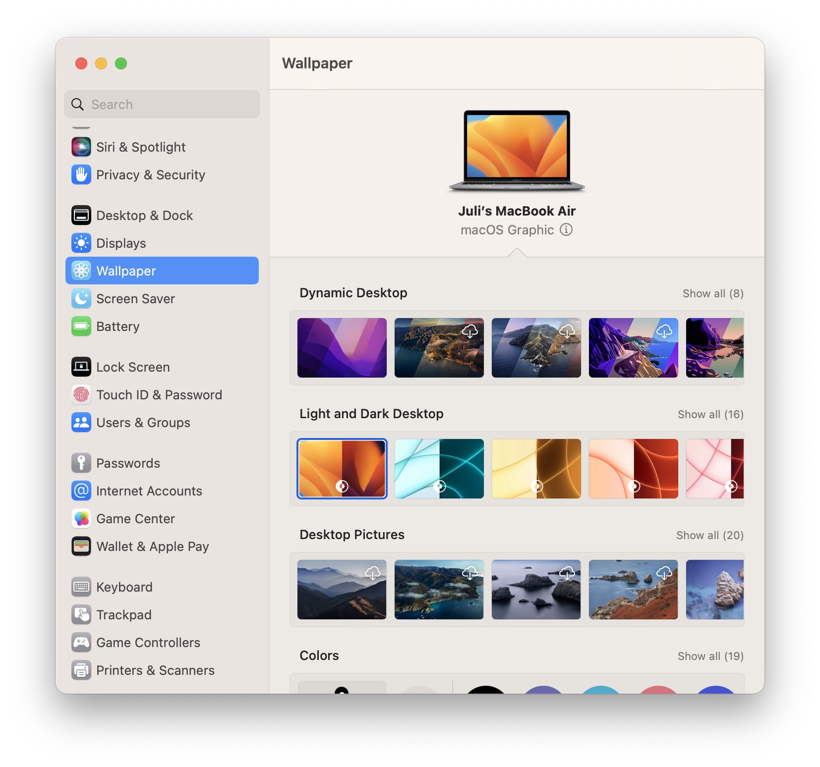
Don't worry that's all they are gonna think of for the next 9 beta. We will get a few new ones for sure!And is it just me, or are they fazing out the dynamic desktop wallpapers in favor of simple dark/light options?
(edit)
They didn’t add a new dynamic this year it seems.

