Got a tip for us?
Let us know
Become a MacRumors Supporter for $50/year with no ads, ability to filter front page stories, and private forums.
Music - Missing Features, Bugs, Issues & Troubleshooting
- Thread starter ErikGrim
- WikiPost WikiPost
- Start date
- Sort by reaction score
You are using an out of date browser. It may not display this or other websites correctly.
You should upgrade or use an alternative browser.
You should upgrade or use an alternative browser.
- Status
- The first post of this thread is a WikiPost and can be edited by anyone with the appropiate permissions. Your edits will be public.
Ok - sorry if this is long, but I just went through the upgrade to Catalina and it pretty bumpy (maybe user error) and I have a few thoughts on the new app coming from someone who's used iTunes for the last 12 years every day (event to listen to music).
Upgrade: So I upgraded from Mojave to Catalina with a carefully curated library with metadata, album artwork, and dozens of playlists with custom images. The upgrade actually went fine - upon first launch nothing had album art, but slowing everything populated. I used the settings to have all my music copied over from the iTunes directory structure to the default Music file hierarchy and everything seemed fine. So I copied this data and the new Music library file to another drive and wipe my iMac clean (I wanted to clean install Catalina and only did the upgrade to get Music set up).
Clean Install: After a very bumpy install process I began setting up my iMac and dragged all the Music library files and audio files. Upon launch everything was there, but there was no album art anywhere and no playlist art. It never loaded and when I went to "Get Info" it was present and I had to click and slightly drag the Album Art tab and then click "Ok" and it would populate, but I have hundreds of albums. I didn't realize that Album Art is now in a different library folder. Well I spent all last night and today trying to fix it: (1) Doug Apple scripts, (2) copying my old iTunes library to a Mojave computer and then updating that computer to Catalina and copying the Music library and library Album Art file, (3) "get album artwork" option in the application - nothing worked. The album art was still on my iPhone and iPad even after updating iCloud Music Library so it was solely the Music app. In the end I said "Screw it" and went one by one through hundreds of albums right-clicking, Get Info, Artwork, *jiggle the artwork metadata already there*, okay. I discovered the randomly like 20 albums simply had no album art at all. I kept a copy of all of my playlist image and one by one reapplied the album art. Now, the small subset of Apple Music songs that I had in my library also have no album art (not even in the Get Info area) and I can't edit those, so I'm just deleting all my Apple Music albums.
I think this process was ridiculously, but I'm willing to blame myself for the clean install, so other than the above, here are my thoughts on the application itself - I have a 70GB library (so small compared to many heart) of about 70% imported CDs and 30% iTunes purchases. Some thoughts for this new app compared to iTunes:
Thanks for reading my rant
Side-note: Why is my Magic Mouse lagging so much on Catalina?!
Upgrade: So I upgraded from Mojave to Catalina with a carefully curated library with metadata, album artwork, and dozens of playlists with custom images. The upgrade actually went fine - upon first launch nothing had album art, but slowing everything populated. I used the settings to have all my music copied over from the iTunes directory structure to the default Music file hierarchy and everything seemed fine. So I copied this data and the new Music library file to another drive and wipe my iMac clean (I wanted to clean install Catalina and only did the upgrade to get Music set up).
Clean Install: After a very bumpy install process I began setting up my iMac and dragged all the Music library files and audio files. Upon launch everything was there, but there was no album art anywhere and no playlist art. It never loaded and when I went to "Get Info" it was present and I had to click and slightly drag the Album Art tab and then click "Ok" and it would populate, but I have hundreds of albums. I didn't realize that Album Art is now in a different library folder. Well I spent all last night and today trying to fix it: (1) Doug Apple scripts, (2) copying my old iTunes library to a Mojave computer and then updating that computer to Catalina and copying the Music library and library Album Art file, (3) "get album artwork" option in the application - nothing worked. The album art was still on my iPhone and iPad even after updating iCloud Music Library so it was solely the Music app. In the end I said "Screw it" and went one by one through hundreds of albums right-clicking, Get Info, Artwork, *jiggle the artwork metadata already there*, okay. I discovered the randomly like 20 albums simply had no album art at all. I kept a copy of all of my playlist image and one by one reapplied the album art. Now, the small subset of Apple Music songs that I had in my library also have no album art (not even in the Get Info area) and I can't edit those, so I'm just deleting all my Apple Music albums.
I think this process was ridiculously, but I'm willing to blame myself for the clean install, so other than the above, here are my thoughts on the application itself - I have a 70GB library (so small compared to many heart) of about 70% imported CDs and 30% iTunes purchases. Some thoughts for this new app compared to iTunes:
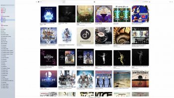
- The artwork in Album view is a bit too give, I wish I could make these thumbnails smaller and see more albums per screen. Also, what on earth is it fixed width? I take the Music app full screen on a 27" iMac and I have unused white space on both sides with a max number of album in a row (see screenshot). Why is this a limit?
- The UI is so gray and then that for the first time at a glance sometimes I don't realize that Music is the foreground application. I'll click it a few times before realizing it is the active application. The lyrics button and play button just look so faded to me.
- I don't like that the "Show Only Downloaded Music" option is now universal. In iTunes, I only wanted to see my owned (downloaded) music in Album view, but I had a playlist for all Apple Music albums I added to my library to try and keep AM a bit separate, but now I have to constantly toggle that button.
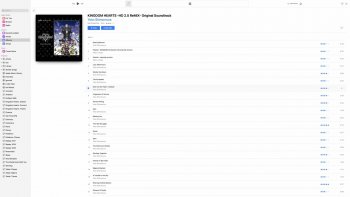
- I'm not a huge fan of how when you click on an Album you're taken to a view consisting of only that album and you can continue to scroll your library, but I can live with that. What I can't stand is why are songs not in two columns anymore if you have a large screen? As you can see in my screenshot, even in full screen I can only get a single column of songs in the Album view rather than the 2/3 columns before - which makes me scroll a lot in albums with 100+ songs.
- Random UI bigs. It will lag, sometimes flash when going between albums, and the animations are sometimes very abrupt.
Thanks for reading my rant
Side-note: Why is my Magic Mouse lagging so much on Catalina?!
Attachments
Like a lot of you, Catalina and Music have been bombs for me. I am running a 2019 top-of-the-line iMac with 128GB of RAM. I should have no issues. In the decade I used my previous iMac I did a nuke and pave once six years after the initial setup. I’ve nuked and paved Catalina at least four times since October. I’ve also spent countless hours over many days with Apple Care, something I never had to do with my old iMac. One of the major issue has been artwork that comes and goes at will. Here’s how I got around that problem:
I determined out of the 22,000 songs in my Music library, the problems were the 2,500 songs from the iTunes Store. If I had ripped the CD from my collection, I had no disappearing artwork; whereas the iTunes artwork was there one minute and gone the next.
So after making careful backups of backups, I wiped out my Music library and re-downloaded every song from the iTunes Store. I saved those to a backup drive and deleted the Music library again. Upon opening Music with no songs present, I turned off all references to the iTunes Store in preferences.
Then I began importing both the songs I’d ripped and those saved from the iTunes Store. I’m up to about 100 albums and 1,500 songs in this process, and I’ve had no issues with vanishing artwork from songs from either source.
I’m taking this slowly because at the same time I’m re-ripping all of my CDs with dBpoweramp and making the metadata as consistent as possible with Tag Editor for both ripped and iTunes Store purchases.
I’ve tried to make this explanation as brief as possible. There are other steps involved, and if anyone wants details, please let me know. I just wanted to point out I solved my problem with artwork coming and going. But I still think Music is a dog, and it’s a very poor practice for Apple to have removed lots of iTunes features from Music.
I’ve had artwork coming and going (or changing) with my self-ripped albums for years with iTunes (probably since iTunes Match or iCloud Music) and now with Music. I don’t think this is anything new, or limited to Music, or to purchased albums. Also, it is not limited to artwork, I’ve had other metadata change, too.
Not in iTunes either…?
[automerge]1590379522[/automerge]
I’ve added your issues to the wiki post. Thanks.Thanks for reading my rant
Last edited:
Nope. I guess it's available only on Mac. (I have windows 10)View attachment 918477
Not in iTunes either…?
[automerge]1590379522[/automerge]
I’ve added your issues to the wiki post. Thanks.
1.0.5.14 seems to have a lot less lag. My main music machine is a 2012 MBP i5/16/2TB and lag is almost gone. Hope they fix the rest with .6. Going to try with my 2020 MBA soon.
1.0.5.14 seems to have a lot less lag. My main music machine is a 2012 MBP i5/16/2TB and lag is almost gone. Hope they fix the rest with .6. Going to try with my 2020 MBA soon.
I can't update until my new Time Machine disk is done encrypting (probably another 5 days or so), but I hope this is the case. Scrolling through album view is pretty laggy just like older versions of iTunes. The last version of iTunes on Mojave was actually pretty smooth so I was surprised to see the regression.
I can't update until my new Time Machine disk is done encrypting (probably another 5 days or so), but I hope this is the case. Scrolling through album view is pretty laggy just like older versions of iTunes. The last version of iTunes on Mojave was actually pretty smooth so I was surprised to see the regression.
I had thought it was just my old MBP that made it laggy but it was just as bad on my new 2020 i5 Air. new version is definitely an improvement for me. Your right Mojave iTunes was great. I miss Mojave sometimes.
I also must admit that I'm disappointed the iCloud syncing still is iffy. If you have a lot of smart playlists that rely on play counts then syncing via cable is still a better option. My recently played list is randomly different between all my devices and even after a day or so most of the songs are there but in different orders and some just don't appear. I would have thought play count syncing would be fixed.
1.0.5.14 Is much improved on my i5 MBP 9,2 but its still really laggy on my i5 MBA 9,1. You have 1 more shot with .6 to make this right before 15 is done Apple!
- When I am playing a song in the list view and then I click Controls -> Go to Current Song (cmd + L) it changes to the album view (and goes back to the song view after clicking on the back arrow). When I do the same thing playing a song from a smart playlist, it remains in the song view.
- After a restart of the app the sorting changes from "Album by Artist/Year" to "Album" in smart playlists.
- Beachball often apperas when using the new search.
Has anyone found a solution to duplicate purchases showing up with the iCloud icon next to them? I just created a new library on a new Mac and imported all my old music and those are fine, but anything new I purchase shows up twice unless I sign out of the store. Maddening!
You can’t share smart playlists so this isn’t really a work around for a lot of cases.The offical work around for this is to share a playlist with yourself containing all the tracks you want to download, open the link in the email, open in Music. Then there will be a download icon next to the context menu:
View attachment 912223
Is this insane? Yes. In iTunes you can select all the songs and hit Download from the right-click context menu. This is missing. I’ve updated the wiki to include this (and also cleaned it up a bit).
No, but you can move all the items from a smart playlist into a playlist by selecting all -> Add to playlist -> New PlaylistYou can’t share smart playlists so this isn’t really a work around for a lot of cases.
This doesn't seem to work at all in 10.15.5No, but you can move all the items from a smart playlist into a playlist by selecting all -> Add to playlist -> New Playlist
Shared a playlist, opened link, clicked open in music, doesn't show cloud download icon, just the option to Add.
Attachments
Last edited:
I don't know why but now since the update (10.14.5) when I'm on the Apple music stuff, if I right click the menus will appear at the top of the screen, but everything is normal if I right click on my library stuff. Also, in a playlist, clicking on the name of the artist do nothing now, instead of before the update when it used to bring me to the artist page.
Very frustrating because for me before the update, the music app was almost bug free.
Very frustrating because for me before the update, the music app was almost bug free.
When I add an album to my library from Apple Music, the Add to library option remains present in Apple Music for that particular record even though the album is, in fact, added to my library. If I click on it a second time, it doesn´t do anything because it is already added. It's a silly, but infuriating, GUI bug.
Anyone else experiencing this?.
Excuse my English.
Anyone else experiencing this?.
Excuse my English.
Yep, having same issues with add to library option. In addition, the vast majority of new releases that I add do not populate the Year, so I have to manually add so my smart playlists update properly.When I add an album to my library from Apple Music, the Add to library option remains present in Apple Music for that particular record even though the album is, in fact, added to my library. If I click on it a second time, it doesn´t do anything because it is already added. It's a silly, but infuriating, GUI bug.
Anyone else experiencing this?.
Excuse my English.
Yep, having same issues with add to library option. In addition, the vast majority of new releases that I add do not populate the Year, so I have to manually add so my smart playlists update properly.
Such weird bugs... I don't understand. They are too silly. 😅
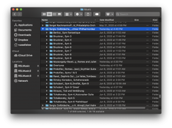
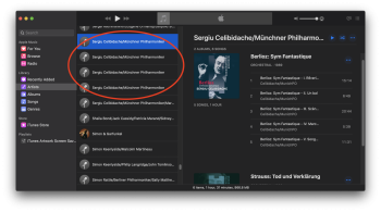
I have an issue (which existed in iTunes) of certain artists' albums being split across multiple, identical names in the "Artists" view (see second pic). All the albums are there; they're just split into 4 groups (in this case) seemingly randomly. Trouble is, in the Music folder, they're organized correctly (see first pic)--all albums in one folder. These are all CD rips and/or downloads from other sites; all have been imported into Music with the tags being modified by me (for consistency) in Music. (Sometimes there are inconsistencies in the Artist field.). Seems to me that the Library database has an issue with this....
This isn't a big problem, but still pretty odd nonetheless. Any ideas on how to resolve it? Thanks.
This isn't a big problem, but still pretty odd nonetheless. Any ideas on how to resolve it? Thanks.
Attachments
In my experience, this can usually be resolved by editing the information for all of the tracks at once, i.e. from a single Get Info window after you've selected everything that is supposed to be grouped together. I usually add a dot (or some other character) to the artist name and then simply remove it again, which magically fixes the issue. Just one of the many peculiarities iTunes has always had.I have an issue (which existed in iTunes) of certain artists' albums being split across multiple, identical names in the "Artists" view (see second pic). All the albums are there; they're just split into 4 groups (in this case) seemingly randomly. Trouble is, in the Music folder, they're organized correctly (see first pic)--all albums in one folder. These are all CD rips and/or downloads from other sites; all have been imported into Music with the tags being modified by me (for consistency) in Music. (Sometimes there are inconsistencies in the Artist field.). Seems to me that the Library database has an issue with this....
This isn't a big problem, but still pretty odd nonetheless. Any ideas on how to resolve it? Thanks.
In my experience, this can usually be resolved by editing the information for all of the tracks at once, i.e. from a single Get Info window after you've selected everything that is supposed to be grouped together. I usually add a dot (or some other character) to the artist name and then simply remove it again, which magically fixes the issue. Just one of the many peculiarities iTunes has always had.
Thank you--that fixed it! A very logical solution to an illogical problem. I actually frequently use this trick to resolve a different, but very possibly related, issue: oftentimes, when editing tags for a single album, Music splits the album into 2 separate albums, with some tracks in one part and the rest on the other part. I then have to "reunify" the two by doing this trick. Very aggravating and time consuming, but at least the fix is relatively simple. Thanks again.
Register on MacRumors! This sidebar will go away, and you'll see fewer ads.


