Become a MacRumors Supporter for $50/year with no ads, ability to filter front page stories, and private forums.

XTheLancerX

macrumors 68000
Aug 20, 2014
1,911
782
NY, USA
I don't like the roundness. It doesn't feel natural to pull a bubble up from the bottom of the screen. Before it felt like a proper drawer coming up, now it's just... I dunno. Not natural.

I get they are trying to fit in with their new bubbly UI, but this is at the expense of UX. Also, it doesn't conform to Notification Center. Not sure if it makes sense for those to match from a UX standpoint anyway, but still. It doesn't seem "symmetrical".

And I hate how audio controls are on a separate page. It feels cumbersome to get to the audio controls now. I used those a lot, as I tend to like to make sure my media volume is down BEFORE going into apps for example in quiet public spaces. On top of that, iOS 10 beta flakiness at the moment makes it really hard to grab the sliders for brightness and volume, it tries to switch pages. Kinda annoying.

But yeah that night shift button doesn't need to take the entire width of the screen. Heck, airdrop and airplay shouldn't even be as big as they are, and they're only half the width!

Oh, lastly. Control center is super annoying on iPad, there's enough space in landscape to have both CC panes on the same screen.. Everything is just so unnecessarily huge it's annoying.
 
  • Like
Reactions: na1577 and ianeb

Creek0512

macrumors 6502
Jun 15, 2012
497
450
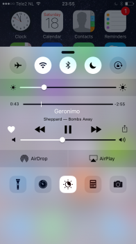
Anyone else notice that Control Center isn't attached to the bottom of the screen?
 

Attachments

  • IMG_1959.PNG
    IMG_1959.PNG
    717.7 KB · Views: 217

ianeb

macrumors member
Sep 29, 2014
33
16
I don't like it, looks kind of ok but such a waste of space. Music controls are another swipe and look lost and 3 buttons are now taking up a third of the space it's crazy. Music controls could have comfortably been kept on the same screen with the album art. Now when I attempt to quickly adjust brightness or volume I occasionally end up swiping to music or back to controls from music. And what do Apple have against making the control centre customisable? They're opening up apps to third part devs, but we still can't add mobile data toggle or any other toggle we want. As others have said, not adding 3D Touch to all of the buttons especially the "switches" is a missed opportunity. It's a shame
 

mattoligy

macrumors 6502
Original poster
May 15, 2010
396
191
Cloud 9
Just finished watching a video review of the new WatchOS by Jeff with 9to5mac and frankly I am blown away by the amount of user customisation opportunities! It is very impressive and this is on a watch... I guess Apple figure a watch is more personal than a phone but personally I think a phone is still very personal and feel confused as to why WatchOS gets this much customisation and iOS does not o_O

 
  • Like
Reactions: ianeb

KALLT

macrumors 603
Sep 23, 2008
5,380
3,415
Anyone else notice that Control Center isn't attached to the bottom of the screen?

It’s a bug. It is attached to the bottom, but due to a glitch you can sometimes drag it upwards.

I don't like the roundness. It doesn't feel natural to pull a bubble up from the bottom of the screen. Before it felt like a proper drawer coming up, now it's just... I dunno. Not natural.

I get they are trying to fit in with their new bubbly UI, but this is at the expense of UX. Also, it doesn't conform to Notification Center. Not sure if it makes sense for those to match from a UX standpoint anyway, but still. It doesn't seem "symmetrical".

And I hate how audio controls are on a separate page. It feels cumbersome to get to the audio controls now. I used those a lot, as I tend to like to make sure my media volume is down BEFORE going into apps for example in quiet public spaces. On top of that, iOS 10 beta flakiness at the moment makes it really hard to grab the sliders for brightness and volume, it tries to switch pages. Kinda annoying.

But yeah that night shift button doesn't need to take the entire width of the screen. Heck, airdrop and airplay shouldn't even be as big as they are, and they're only half the width!

Oh, lastly. Control center is super annoying on iPad, there's enough space in landscape to have both CC panes on the same screen.. Everything is just so unnecessarily huge it's annoying.

Everything is clearly inspired by watchOS. I suppose Alan Dye needed to impose his own signature on iOS too, now that he is the lead UI designer. I just really do not understand Apple’s thinking and their refusal to add even a tiny bit of customisation in this area. iOS 10 feels empowering, but in a sense also more limiting than before in the way that they impose the changes.
 

XTheLancerX

macrumors 68000
Aug 20, 2014
1,911
782
NY, USA
It’s a bug. It is attached to the bottom, but due to a glitch you can sometimes drag it upwards.
It's not a bug... It's the new design. Control Center is a floating bubble now where before it was a blurred drawer. It's very deliberately "disconnected" from the edges of the screen, notice there are page dots at the bottom like the home screen. They want control center to be laid out in pages for differing functions now apparently.
 

KALLT

macrumors 603
Sep 23, 2008
5,380
3,415
Don't think so. Seems intentional to me.

How so? You still have to drag it in and out from the bottom. It makes no sense that it is visually disconnected as shown above. This is clearly an error.

It's not a bug... It's the new design. Control Center is a floating bubble now where before it was a blurred drawer. It's very deliberately "disconnected" from the edges of the screen, notice there are page dots at the bottom like the home screen. They want control center to be laid out in pages for differing functions now apparently.

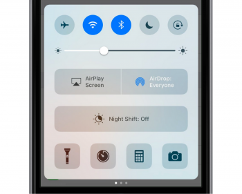
It is disconnected, but not as it is shown above. It is supposed to look like this:
iu.png
 

mattoligy

macrumors 6502
Original poster
May 15, 2010
396
191
Cloud 9
Everything is clearly inspired by watchOS. I suppose Alan Dye needed to impose his own signature on iOS too, now that he is the lead UI designer. I just really do not understand Apple’s thinking and their refusal to add even a tiny bit of customisation in this area. iOS 10 feels empowering, but in a sense also more limiting than before in the way that they impose the changes.

Hopefully the depth of customisation from WatchOS can impose on iOS also. Just seems crazy to me that there's more flexibility on a watch OS than on an iPhone and iPad o_O
 

KALLT

macrumors 603
Sep 23, 2008
5,380
3,415
Hopefully the depth of customisation from WatchOS can impose on iOS also. Just seems crazy to me that there's more flexibility on a watch OS than on an iPhone and iPad o_O

But it’s different, don’t you see? You carry the Watch on your body, so it’s clearly a personal device that warrants customisation options. Doesn’t apply to the iPhone!!
 

Feenician

macrumors 603
Jun 13, 2016
5,313
5,100
Hopefully the depth of customisation from WatchOS can impose on iOS also. Just seems crazy to me that there's more flexibility on a watch OS than on an iPhone and iPad o_O

Not sure what you're referring to here. What can be customized on watch that can't be in iOS?
 

stooovie

macrumors 6502a
Nov 21, 2010
836
314
I don't mind customization but splitting the functionality into two panels is just bad design. Bad discoverability and two swipes for activity that could be achieved with one at all times.
 
  • Like
Reactions: idrisinan

mattoligy

macrumors 6502
Original poster
May 15, 2010
396
191
Cloud 9
But it’s different, don’t you see? You carry the Watch on your body, so it’s clearly a personal device that warrants customisation options. Doesn’t apply to the iPhone!!

From a visual point of view I understand fully, but from a functionality standpoint I do not. In fact I would go one step further and say iOS should be a lot more powerful in this area!

A phone is also carried on your body, you might not wear it but it's still very personal...

Splitting the functionality into two panels is just bad design. Bad discoverability and two swipes for activity that could be achieved with one at all times.

I completely disagree with those saying the separation of elements in to multiple pages was a bad choice. I feel it to be more categorising different functionality in to different areas and appreciate the house keeping! It also paves the way for additional pages of content that could prove to be extremely useful and if it is worked just right the OS could be intelligent enough to not only remember what page you left Control Center on, but open it to different pages based on current activity, time of day and much more. Just like Siri Suggestions.

Not sure what you're referring to here. What can be customized on watch that can't be in iOS?

Watch the review if you haven't already. But generally I mean the overall level of user customisation in multiple areas. It's all the little things!
 
Last edited:

Shirasaki

macrumors P6
May 16, 2015
16,261
11,763
I don't like the roundness. It doesn't feel natural to pull a bubble up from the bottom of the screen. Before it felt like a proper drawer coming up, now it's just... I dunno. Not natural.

I get they are trying to fit in with their new bubbly UI, but this is at the expense of UX. Also, it doesn't conform to Notification Center. Not sure if it makes sense for those to match from a UX standpoint anyway, but still. It doesn't seem "symmetrical".

And I hate how audio controls are on a separate page. It feels cumbersome to get to the audio controls now. I used those a lot, as I tend to like to make sure my media volume is down BEFORE going into apps for example in quiet public spaces. On top of that, iOS 10 beta flakiness at the moment makes it really hard to grab the sliders for brightness and volume, it tries to switch pages. Kinda annoying.

But yeah that night shift button doesn't need to take the entire width of the screen. Heck, airdrop and airplay shouldn't even be as big as they are, and they're only half the width!

Oh, lastly. Control center is super annoying on iPad, there's enough space in landscape to have both CC panes on the same screen.. Everything is just so unnecessarily huge it's annoying.
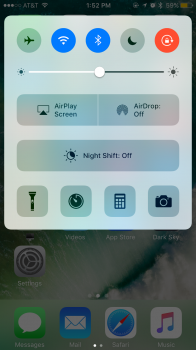
But then control center would take 3/4 screen estate on iPhone? We ignore iPad.
Ugh. This reminds me how control center takes 3/4 screen on an iPhone 4, under iOS 7.
Sure, there are multiple swipes to control volume and brightness. But given volume control always have hardware button, I don't think this is a huge loss. On the contrary, old CC in iOS 9, because the distance between volume control and playback control is too close, I often find myself pausing a song when adjusting volume in CC. I then end up only using hardware button to do so, also because this is fast enough.
Hmm. Perhaps Apple would add more functions on where night shift button is. Perhaps. I also think that button is huge, too big.
 
Register on MacRumors! This sidebar will go away, and you'll see fewer ads.